
Responsive Containers
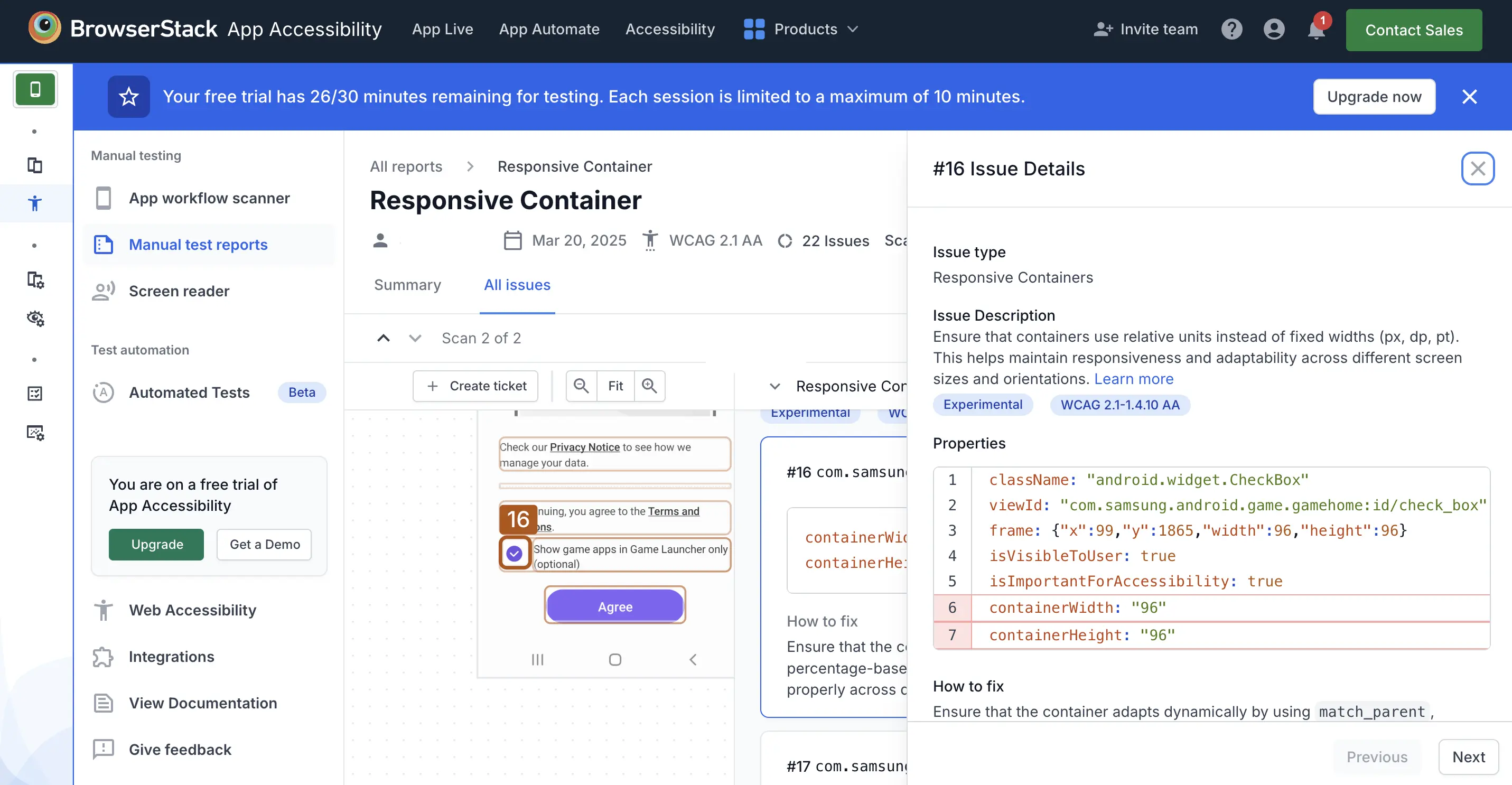
The Responsive Containers rule ensures that UI elements scale and adapt across different screen sizes and orientations. Using fixed-width units like px, dp, or pt can make layouts inflexible, leading to accessibility issues such as content clipping, overflow, or excessive scrolling. This can make it difficult for users with different screen sizes, zoom settings, or larger text preferences to interact with the app.
Instead, use relative units such as percentages (%) for layout sizing, em or rem for scalable text, or platform-specific flexible layout properties. Maintaining this design criteria ensures app usability and readability across different devices, screen sizes, and screen orientations.
- Rule Category :
Readable Text and Layout - WCAG 2.1 SC :
1.4.10 (AA) - WCAG 2.2 SC :
1.4.10 (AA) - Rule Severity :
Serious - Supported Platforms :
Android, iOS
Success Criteria
The specific criterion for success is:
- UI containers should adapt to various screen sizes and maintain visibility and usability of text and interactive elements by resizing dynamically based on screen width and height.
How to fix?
- Avoid using fixed height or width values to maintain responsiveness and adaptability.
- Use relative units to allow containers to scale dynamically.
- Platform-specific recommendations:
To ensure content remains accessible and doesn’t get cut off when it exceeds the viewport, use scrollable or scalable containers appropriate to each platform:-
Android: Use
match_parent,wrap_content, or weight-based layouts like0dpwith layout weights. -
iOS: Use
UIScrollView,UITableView, orUICollectionView. -
React Native: Use
ScrollVieworFlatList. -
Flutter: Use
ScrollView,ListView, orGridView.
-
Android: Use
Example
Consider the following example:
Error:
- The container uses fixed-width instead of relative units.
How to fix:
-
To fix the violation:
- Use
match_parent,wrap_content, or percentage units with weight instead of fixeddpvalues. - Alternatively, define flexible UI elements using
layoutSize.
- Use
Reference
- Learn more about Responsive Containers: 2.1 - 1.4.10 (Level AA) guideline
- Learn more about Responsive Containers: 2.2 - 1.4.10 (Level AA) guideline
We're sorry to hear that. Please share your feedback so we can do better
Contact our Support team for immediate help while we work on improving our docs.
We're continuously improving our docs. We'd love to know what you liked
We're sorry to hear that. Please share your feedback so we can do better
Contact our Support team for immediate help while we work on improving our docs.
We're continuously improving our docs. We'd love to know what you liked
Thank you for your valuable feedback!