Interactive element accessibility label
The Interactive element accessibility labels rule ensures that all UI elements or custom views in an application have a descriptive label. These labels are essential for screen readers to interpret the element’s name, value, and purpose, facilitating accessibility for users with disabilities.
Testing for Interactive element accessibility labels is necessary as it ensures that all users, regardless of their abilities, can navigate and interact with the application effectively.
- Rule Category :
Accessibility Labels - WCAG 2.1 & 2.2 SC :
1.3.1 (A),2.4.6 (AA),4.1.2 (A) - Rule Severity :
Critical - Supported Platforms :
Android,iOS
Success criteria
The rule checks for the following potential violations:
- All interactive UI elements must have a non-null, descriptive accessibility label.
- Custom views used as interactive elements must also have a descriptive accessibility label.
- The labels must be clear and convey the element’s purpose effectively.
AI-powered testing
BrowserStack provides an AI-powered Issue Detection Agent that analyzes interactive UI elements and custom views to evaluate their assigned accessibility labels for accuracy and contextual relevance. If the label is missing or inaccurate, the agent suggests a meaningful and contextually appropriate label based on the element’s role and purpose within the app.
AI-powered results are clearly marked in the report so you can review and apply suggestions as needed.
The Issue Detection Agent performs the following checks:
-
Detects and evaluates accessibility labels
- Identifies whether interactive elements or custom views have an assigned accessibility label (
contentDescriptionfor Android oraccessibilityLabelfor iOS). - Compares the label with the element’s role and context to confirm it accurately describes the element’s purpose.
- Identifies whether interactive elements or custom views have an assigned accessibility label (
-
Suggests meaningful labels
- Generates a descriptive label when the existing one is missing or inaccurate.
- Suggests the label in the same language as the surrounding screen content.
For more information about the Issue Detection Agent, see Issue Detection Agent.
How to fix
You can fix violations manually or by applying the AI-powered fix.
Manual fix
To fix violations related to interactive element accessibility labels:
- Ensure the
contentDescriptionproperty is defined for the element. This label ensures that assistive technologies, such as screen readers, can announce and trigger actions for interactive elements.
To fix violations related to interactive element accessibility labels:
- Ensure the
accessibilityLabelproperty is defined for the element. This label ensures that assistive technologies, such as screen readers, can announce and trigger actions for interactive elements.
AI-powered fix
You can use the AI-powered suggestions to ensure that all interactive elements have appropriate accessibility labels.
The AI engine only generates the suggestions. You must manually review and implement the suggestions in your codebase using the steps mentioned in the Manual fix section.
Example
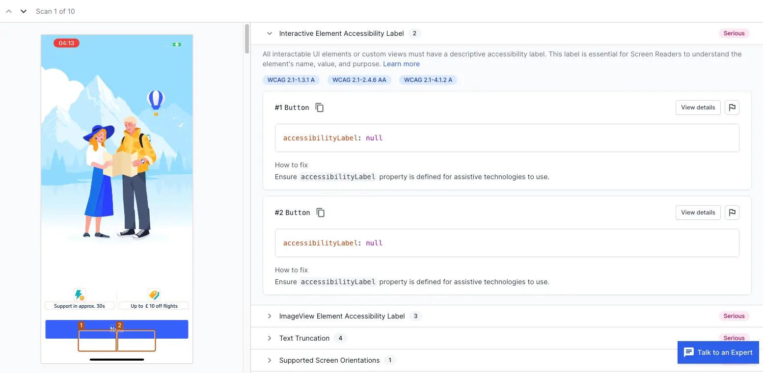
The following example scan report shows an Interactive element accessibility label violation in the app’s interface. The issue is identified for two buttons that lack proper accessibility labels.

Violation
-
Button 1:
The first button, located at the bottom of the screen, currently does not have an accessibility label. This means that a screen reader cannot convey any information about this button to users who rely on assistive technologies. As a result, users with visual impairments won’t know the purpose of this button. -
Button 2:
Similar to the first button, the second button also lacks an accessibility label. This omission means that the button is effectively invisible to screen readers, and users who depend on such tools will not be able to interact with or understand its function.
Fix
To fix these violations, ensure that each button has a clear and descriptive accessibility label. This can be done by assigning a meaningful label that conveys the button’s purpose to assistive technologies.
-
Button 1:
Assign an accessibility label that describes the button’s action, such as “Support in 30 seconds.” This label will inform the screen reader to announce that this button provides support in 30 seconds when activated. -
Button 2:
Assign an accessibility label that describes the button’s action, such as “Discount flights.” This label will enable the screen reader to announce that this button offers a discount on flights when activated.
References
- 1.3.1 Info and Relationships (Level A): WCAG 2.1 · WCAG 2.2
- 2.4.6 Headings and Labels (Level AA): WCAG 2.1 · WCAG 2.2
- 4.1.2 Name, Role, Value (Level A): WCAG 2.1 · WCAG 2.2
We're sorry to hear that. Please share your feedback so we can do better
Contact our Support team for immediate help while we work on improving our docs.
We're continuously improving our docs. We'd love to know what you liked
We're sorry to hear that. Please share your feedback so we can do better
Contact our Support team for immediate help while we work on improving our docs.
We're continuously improving our docs. We'd love to know what you liked
Thank you for your valuable feedback!