View app performance trends
The Trends section shows the trend of a particular performance metric across the selected sessions. It shows the average, highest, and the 90th percentile values of the performance metric.
The Trends section helps you identify the workflows that need optimization. For example, by looking at the CPU usage trends plot, you can identify the workflow that caused highest CPU usage and optimize it accordingly.
On the graph, the X-axis represents builds, ranging from older to newer versions. The vertical Y-axis displays various performance metrics. The five data points displayed within the graph correspond to performance data for each build session. The first data point indicates the metric for the oldest session, and the last point represents the most recent one.
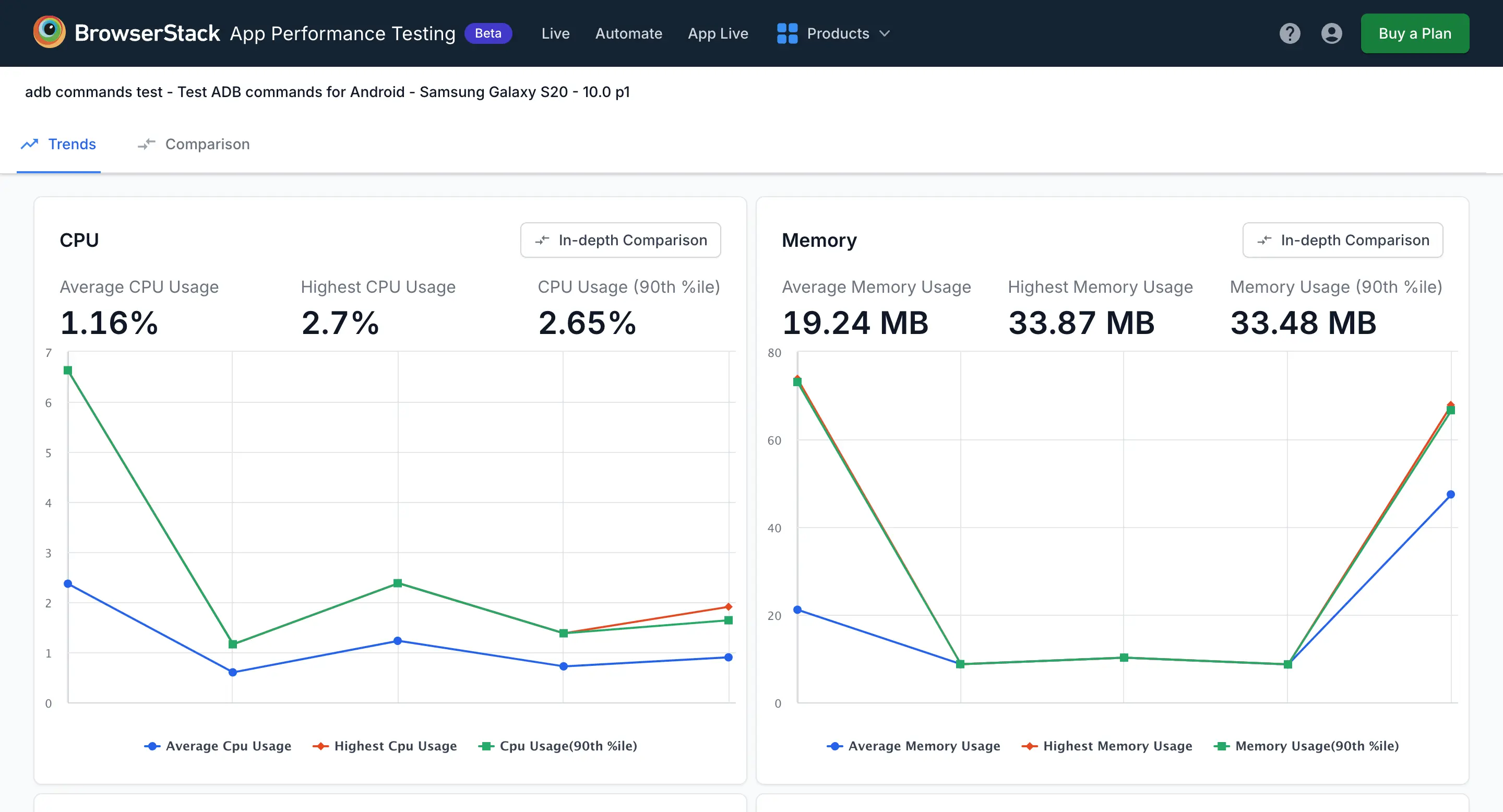
The Trends section provides the following charts:
- CPU
- Memory
- Battery(%)
- Battery(mAH)
- Slow Frames Per Second
- Network Download
- Network Upload
- Disk Read
- Disk Write
CPU
It provides insights into how the processor is performing. It provides the following details:
- Average CPU Usage: Displays the average percentage of CPU usage of the app across all sessions.
- Highest CPU Usage: Displays the highest percentage of CPU usage recorded by the app across all sessions.
- CPU Usage (90th %ile): The 90th percentile of CPU usage is a metric that indicates the maximum value below which 90% of recorded CPU usage measurements fall for all sessions. It shows that for 90% of the time CPU usage is at or below this value. This means that only in the most extreme 10% of cases did the CPU usage go above this level. This helps in understanding typical CPU load and identifying potential performance issues. You can hover over or click on any point in the chart to get more detailed information. For more information, see the Calculation of the 90th Percentile section.
Memory
It displays the following details:
- Average Memory Usage: Displays the average amount of memory consumed by the app across all sessions.
- Highest Memory Use: Displays the maximum memory usage recorded by the app across all sessions.
- Memory Usage (90th %ile): The 90th percentile of memory usage shows the maximum value under which 90% of recorded memory usage falls. This means that for 90% of the time, memory usage is at or below this level. This means that only in the most extreme 10% of cases did the memory usage go above this level. This helps identify typical loads and potential performance issues. For more information, see the Calculation of the 90th Percentile section.
This helps you understand how well the memory is performing and spot any potential issues. You can hover over or click on any point in the chart to get more detailed information.
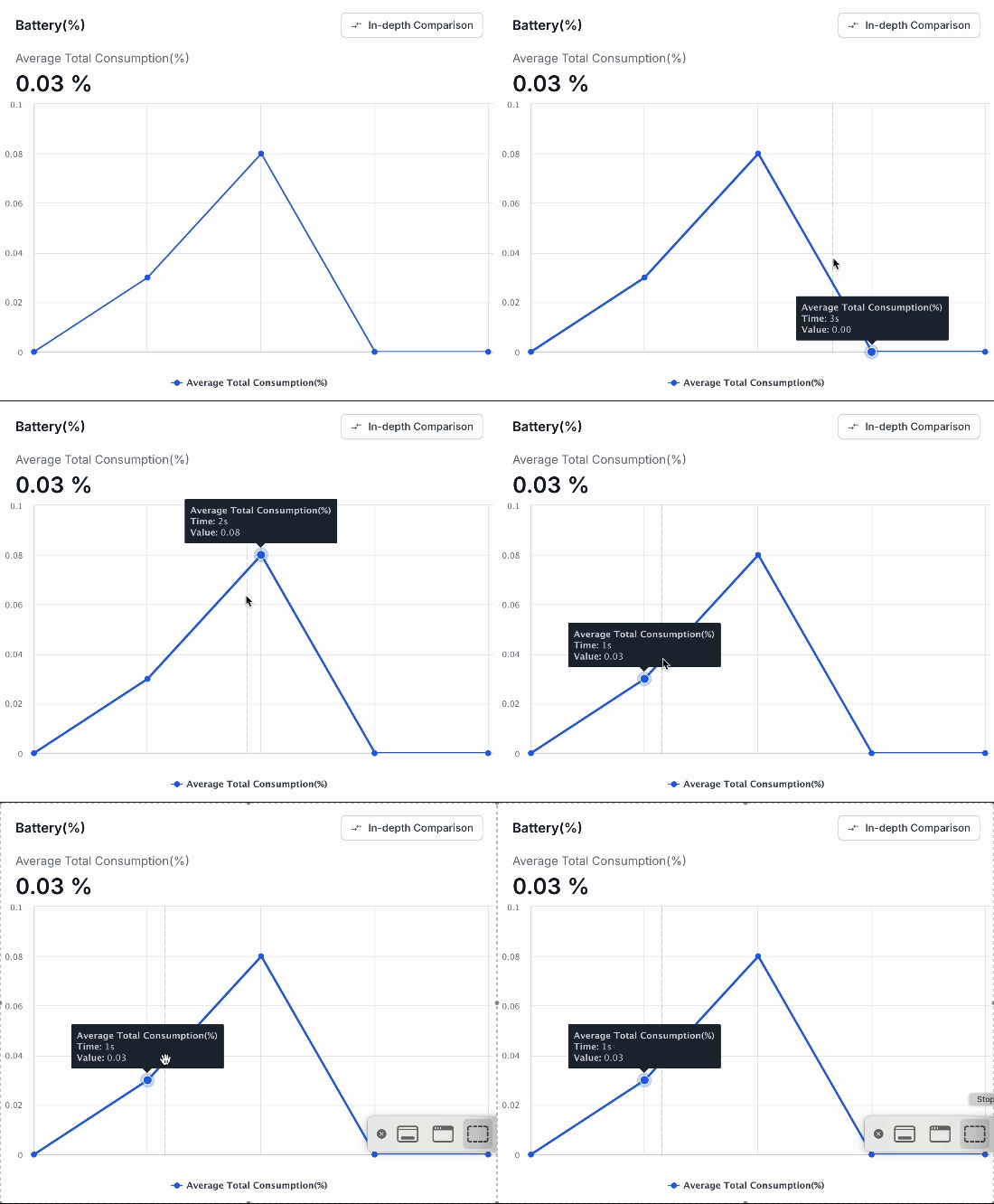
Battery(%)
It displays the average percentage of battery consumed by the app across all sessions. It provides a clear view of battery efficiency and usage patterns. You can hover over or click on any point in the chart to get more detailed information.
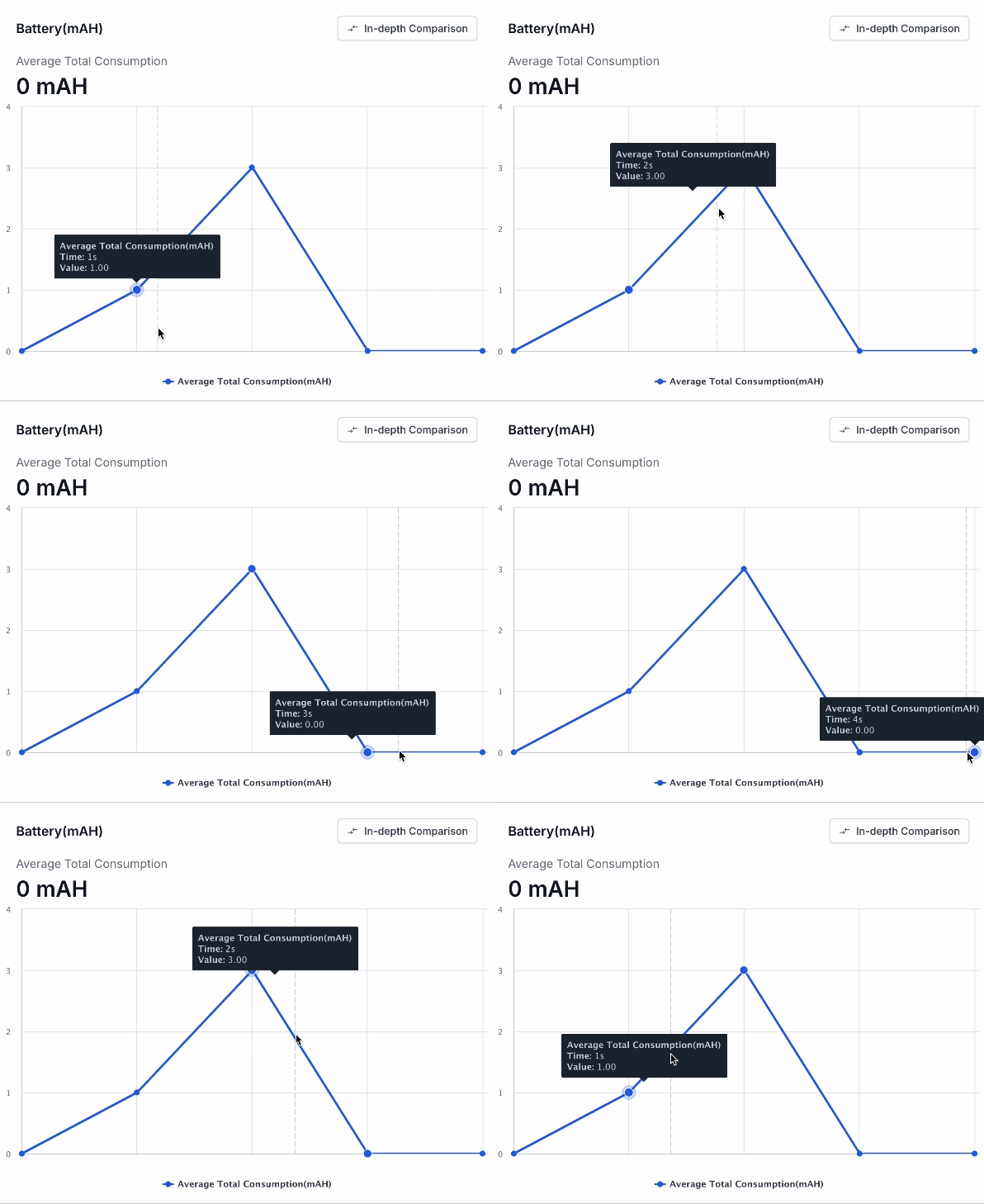
Battery(mAH)
It displays the average total battery consumption in milliampere-hours (mAH) by the app across all sessions. This helps you understand how much battery power is being used in absolute terms. It provides a more detailed look at power consumption across different sessions. You can hover over or click on any point in the chart to get more detailed information.
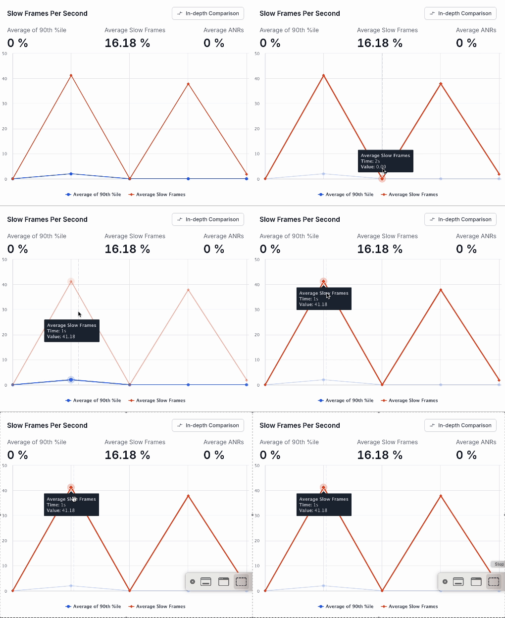
Slow frames per second
It provides a detailed look at frame rate performance:
- Average of 90th %ile: The 90th percentile of slow frames per second (FPS) indicates the maximum FPS value under which 90% of recorded frame rates fall for all sessions. This means that for 90% of the time, the FPS is at or below this level. This means that only in the most extreme 10% of cases did the FPS value go above this level. It helps to identify typical performance loads and potential issues related to frame rate drops. For more information, see the Calculation of the 90th Percentile section.
- Average Slow Frames: Displays the average number of frames that are rendered slowly across all sessions.
- Average ANRs (Application Not Responding): Displays the percentage of time the app is unresponsive across all sessions.
This helps assess how smoothly applications are running and highlights performance issues. You can hover over or click on any point in the chart to get more detailed information.
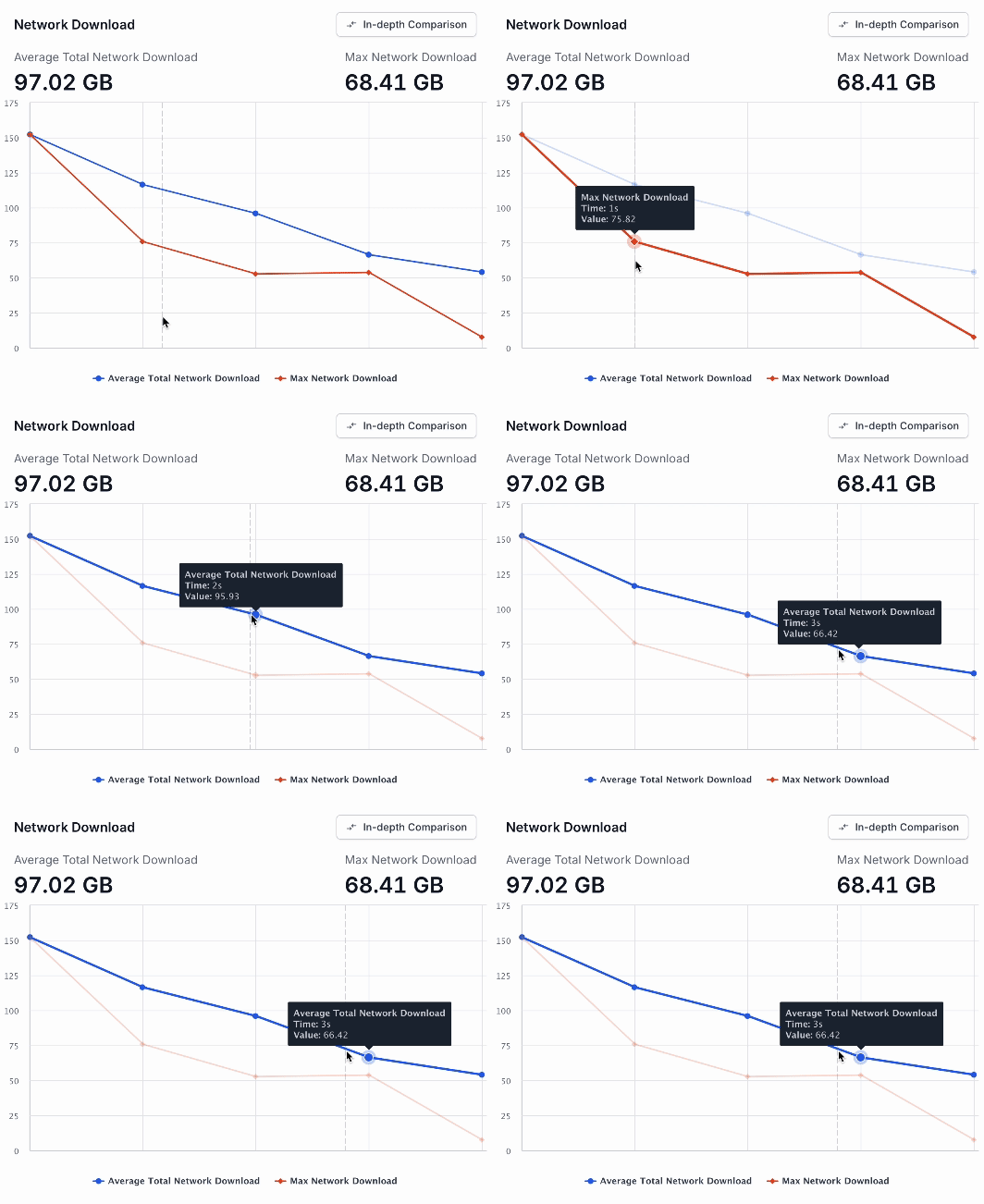
Network Download
It displays the following details:
- Average Total Network Download: Displays the total amount of data downloaded by the app across all sessions.
- Max Network Download: Displays the maximum download rate recorded across all sessions.
You can hover over or click on any point in the chart to get more detailed information.
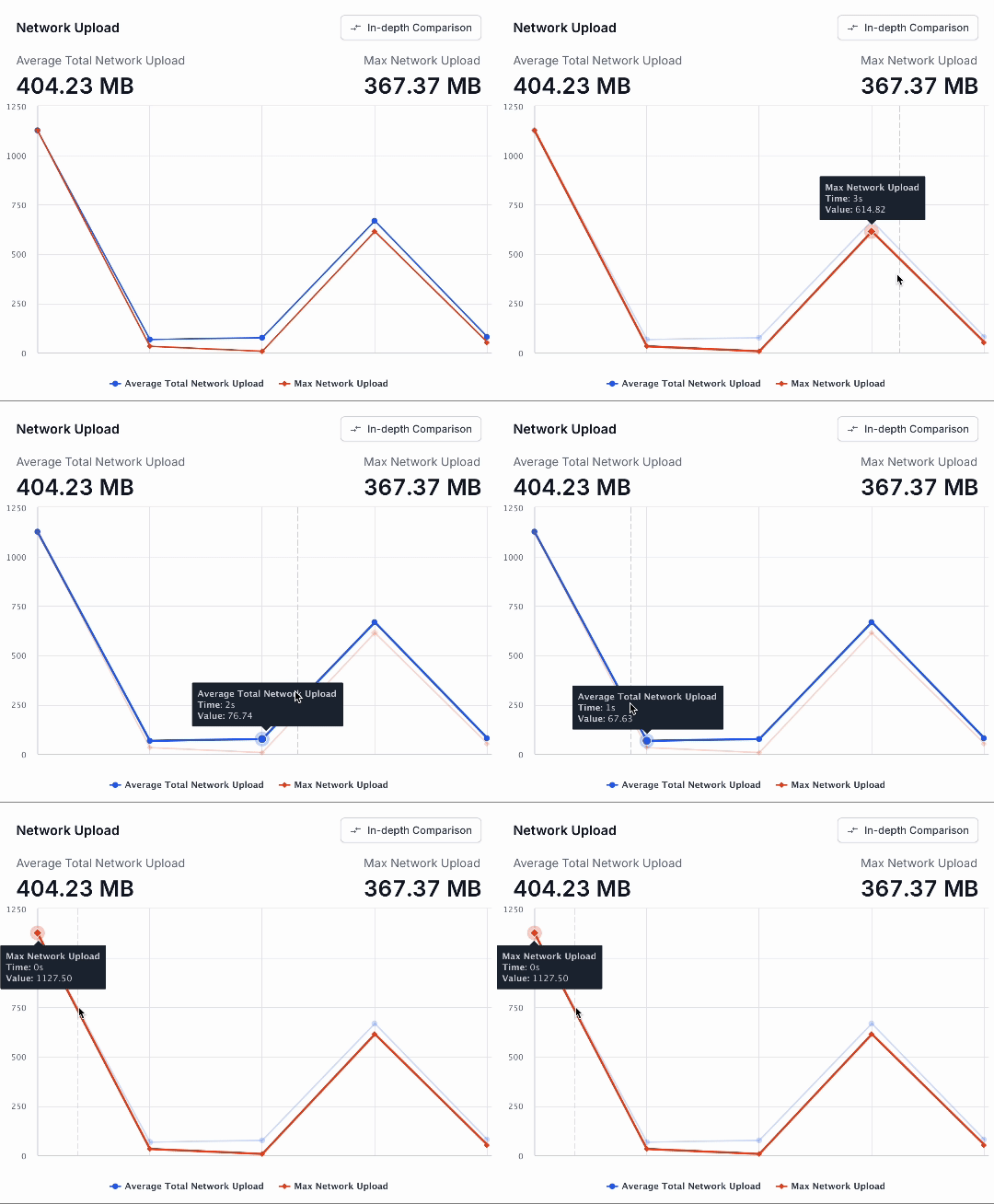
Network Upload
It displays the following details:
- Average Total Network Upload: Displays the average amount of data uploaded of the app across all sessions.
- Max Network Upload: Displays the maximum upload rate recorded by the app across all sessions..
These metrics provide a clear view of network performance and data transfer efficiency.You can hover over or click on any point in the chart to get more detailed information.
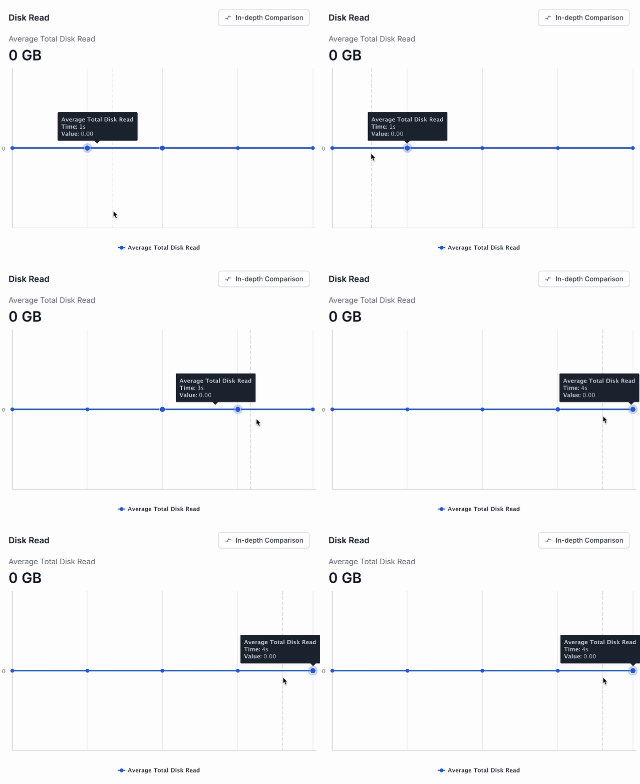
Disk read
It displays the average amount of data read from the disk by the app across all sessions. This metric is essential for understanding disk performance and usage patterns. You can hover over or click on any point in the chart to get more detailed information.
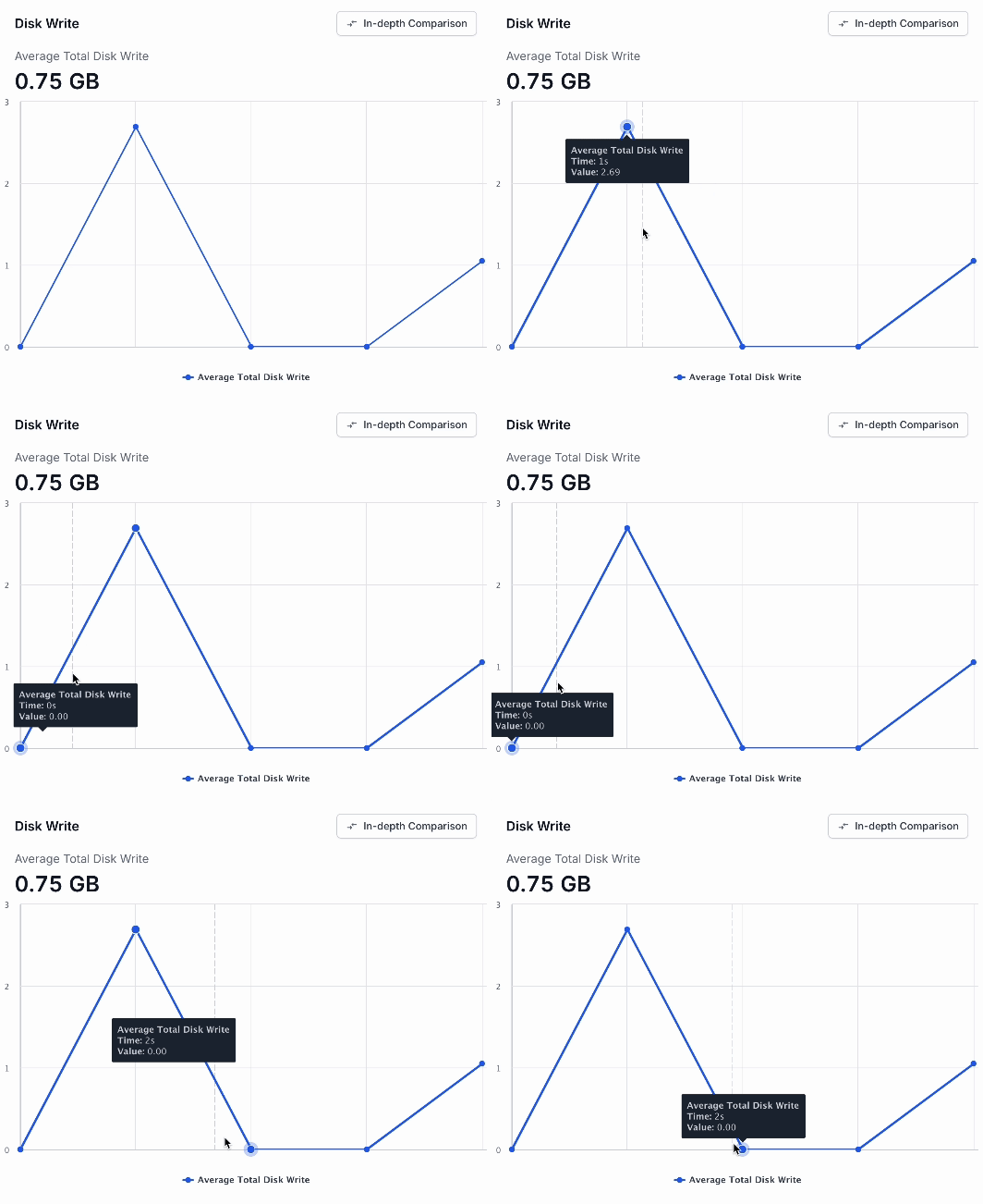
Disk Write
It displays the average amount of data written to the disk on the app across all sessions. This data helps you to manage disk performance, ensure efficient resource use, and maintain the overall health of your storage system. You can hover over or click any point on the chart to get more detailed information.
Click In-depth Comparison to go to the Comparison tab. Alternatively, you can directly click the Comparison tab. It allows you to select and compare metrics from multiple sessions. For more information, see Compare app performance trends.
Calculation of the 90th Percentile
This example illustrates the 90th percentile calculation for CPU usage. Consider a session report where CPU usage percentages are recorded per second. The values are 0.61, 0.7, 0.83, 0.84, 0.86, 1.12, 1.33, 1.87, 2.85, 3.58, 4.2, 5.01, 5.93, and 10.53.
These values are sorted in ascending order.
To calculate the 90th percentile:
-
Count the total values: There are 14 values.
-
Calculate the index = (n+1)×0.90, where n is the total number of values.
=(14+1)×0.90
=15×0.90
=13.5 -
Determine the value: In case index is not an integer, we take an interpolated value close to most of the values. Hence, the value at index 13 = 5.93 is our 90th percentile value.
The same calculation applies to the other metrics:
- Memory Usage at the 90th percentile
- Average of the 90th percentile slow FPS
- Other metrics at the 90th percentile
We're sorry to hear that. Please share your feedback so we can do better
Contact our Support team for immediate help while we work on improving our docs.
We're continuously improving our docs. We'd love to know what you liked
We're sorry to hear that. Please share your feedback so we can do better
Contact our Support team for immediate help while we work on improving our docs.
We're continuously improving our docs. We'd love to know what you liked
Thank you for your valuable feedback!