Responsive
-

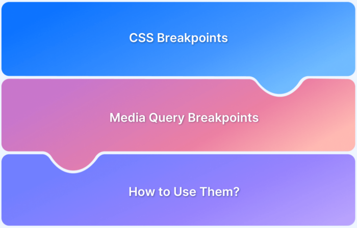
A Complete Guide to CSS Media Query [2026]
What are CSS Breakpoints and Media Query Breakpoints? Learn to define CSS Breakpoints in Responsive Design with examples. Find out.
Learn More -
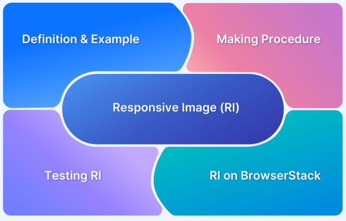
How to make images responsive
Learn how to make images responsive on your website. Try this step-by-step tutorial with code segments included. Run responsive tests on real devices.
Learn More -
How to test Responsive Images
Learn to design a better user experience where responsive images adjust on the user's screen size, pixel density, and device orientation.
Learn More -
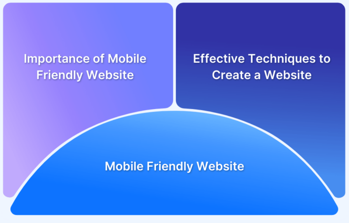
How to make Website Mobile Friendly?
Learn the different ways to you can make your website mobile-friendly, the top examples, how to check if your website is mobile-frienly and more.
Learn More -
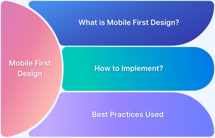
Mobile First Design: What it is and How to Implement it
Learn what is a mobile-first design, the key principles, steps to create it, best tools, top examples of mobile-first website designs and more.
Learn More -
How to make React Native App Responsive?
Learn how to make your React Native app responsive, with example, tips and best practices. Discover importance of responsive app and how to optimize UX.
Learn More -
How to make Angular Project Responsive?
Learn effective methods to make your Angular project or app responsive and the ways to test the responsiveness of your Angular responsive app.
Learn More -
Accessibility and SEO: Improving Web Visibility and Usability
Learn how accessibility SEO improves user experience and search rankings. Explore key strategies to make your website inclusive, user-friendly, and optimized.
Learn More -
How to resize an image using CSS
Images are integral to visual aesthetics of a website design. Learn how to resize an image using CSS using different methods and test their responsiveness
Learn More -
How To Inject JavaScript on a Webpage With Custom Attributes
Learn how to inject JavaScript using custom <script> tag attributes to manage script timing, improve loading speed, and enhance webpage security.
Learn More


