When creating web content, creators pay attention to every detail that contributes to an aesthetically pleasing layout. In order to maintain the highest quality of the website, each element is carefully evaluated. This much attention was not paid to a website a decade ago, but now all these factors have a direct impact on business growth. Here’s an example of a demo website, what will happen if you are not resizing images in CSS.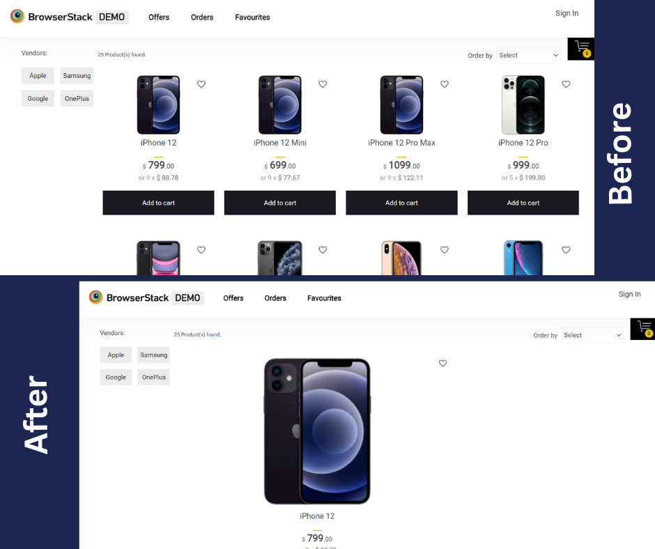 In addition, developers are now more concerned with creating web pages that are responsive. Nowadays, the majority of internet users are using mobile phones and tablets, so it is very important to create a responsive web application in order to broaden your business’s reach.
As a result, the use of responsive testing of websites has increased. It is important for every business to perform a responsive test on its website before it is rolled out to the end users, in order to reach as many customers as possible.
Read More: How to build a website using HTML and CSS
How to resize images in CSS using the image width attribute
You can resize any image in CSS by applying the width attribute in CSS resizes the image relative to the parent container. Also, it will set the same dimension of the images across all the devices it is viewed upon.
Here’s our image without any CSS applied to it.
After applying the width attribute, this is how our image looks. Set the image width to 500px with the following CSS code.
img{
width: 500px;
}
How to resize a responsive image using CSS
Method 1: Resizing a responsive image using the max-width and max-height property
It is really not convenient when the size of the image exceeds the size of the parent container, the max-width and max-height attribute limits the size of the image to not go more than the desired property. The previous method was not much efficient as you would not get a responsive layout when the image is viewed on several devices. The effective solution is to use the max-width property.
Let’s set the width of the image to 50% to stretch it across half of the entire screen, and it will revert the same result irrespective of the devices it is viewed upon.
img{
max-width: 50%;
max-height: 50%
}
Read More: Top Responsive CSS Frameworks
Furthermore, you can also apply the value as auto to the max-height or max-width attribute to prevent any overlapping of any default dimension. This is useful to prevent the image from getting distorted.
img {
height: auto;
max-width: 100%;
}
Method 2: Resizing a responsive image using the Object-fit property
The object-fit property is used to adjust the dimensions of the image to fit it inside the container it is placed upon. It can be applied to both photos as well as videos so as to fit them realistically into the content box. There can be five values to the object-fit attribute, fill, cover, contain, none, and scale-down.
Let’s apply the object-fit property and see the results.
- fill: It resizes the image to fit the content box even if it has to stretch or squish the image.
img{
object-fit: fill;
}
- cover: It resizes the image to fit the content box without maintaining the aspect ratio of the image. The image will be clipped to fit if the aspect ratio of the content box doesn’t match the image.
img{
object-fit: cover;
}
- contain: It resizes the image to fit the given content box maintaining the content box.
img{
object-fit: contain;
}
- none: It doesn’t resize the image at all.
img{
object-fit: none;
}
- scale-down: It resizes the image to its smallest version as if it is specified as none or contain.
img{
object-fit: scale-down;
}
Also Read: How to make images responsive
Method 3: Resizing a responsive image using the background-size property
Another method is to use the background-size property to set the size of the element’s background image. Let’s try this property to set the responsive background image.
- Using contain value with no-repeat
div{
border: 3px solid red;
background: url(dogg.jpg);
background-size: contain;
background-repeat: no-repeat
}
- Using contain value
 div{
border: 3px solid red;
background: url(dogg.jpg);
background-size: contain;
}
- Using cover value
div{
border: 3px solid red;
background: url(dogg.jpg);
background-size: cover;
}
- Using numerical value
div{
border: 3px solid red;
background: url(dogg.jpg);
background-size: 10%;
}
Values of background-size property
The values of background-size property can be specified in the following ways.
- Using the values contain or cover.
- Using the values of either width or height, the non-specified value will be specified as auto.
- You can also set the values of both width and height in either pixels, percentages, or more.
How to Test the Responsiveness of the Resized Image
Testing Responsiveness of Images on Real Devices is a must to ensure it renders correctly on different devices of varying resolutions and screen sizes. Follow the easy steps below to test image responsiveness on real devices:
Read More: How to test Responsive Images
Step 1: Open BrowserStack Responsive Dashboard and enter the URL of the webpage containing the responsive image. If you have created a website on your local machine, you must host your website to test its responsiveness on BrowserStack Responsive.
Step 2: To check responsiveness, click Check.
Step 3: The user can check how the site appears on a certain device after choosing it.
Summing it up
The ability to resize images using CSS is an integral part of web design. This tutorial, explained how to resize images in CSS for responsive websites. For businesses, paying attention to every aspect of their digital presence is critical since even the tiniest error could have a big impact.
Resizing ensures that images are placed correctly inside their containers. Using max-width and max-height properties of CSS helped prevent the image from exceeding its parent container’s size. Thus, helped create a clean responsive website design. When customizing backgrounds with CSS, use the background-size attribute for seamless background resizing.
However, it is also crucial to perform responsive testing on your website to ensure that the design renders well on devices of different screen sizes and resolution. Thereby, making is ready to reach a wider audience. BrowserStack’s Responsive Testing Tool helps you test the responsiveness of your website on various desktop and mobile devices, helping you get a real look and feel of the website.
