Responsive images play a crucial role in delivering fast, visually sharp experiences across different devices. But without proper testing, issues like slow loading, incorrect sizing, or poor image quality can arise, harming user experience and SEO.
Overview
Testing responsive images ensures the right image loads at the right size and resolution, maintaining performance and visual clarity on all screens.
Importance of testing responsive images:
- Ensures images load correctly on all device sizes and resolutions
- Prevents blurry or pixelated visuals by delivering the right image version
- Improves website performance and reduces unnecessary data usage
- Enhances user experience by maintaining fast load times and visual consistency
- Supports SEO by optimizing page speed and mobile friendliness
- Verifies accessibility compliance for all users, including those using assistive technologies
This article explores what responsive images are, why they are essential, and how to effectively test them for optimal performance and quality.
What is Responsive Image?
A responsive image automatically adjusts based on the user’s device characteristics, such as screen size, resolution, orientation, and network conditions, to ensure optimal appearance and performance.
The image loads quickly, appears sharp on any screen, and fits seamlessly within different layouts without stretching or slowing down the page.
In essence, a responsive image adapts to varying screen environments. To achieve this, it should meet the following requirements:
- Crisp rendering across devices: High-resolution displays should receive high-res images, while lower-res devices get appropriately scaled-down versions to avoid unnecessary data usage.
- Flexible with layout changes: Images should stretch or shrink in response to layout adjustments, such as browser resizing or device rotation.
- Available in multiple resolutions: Different versions of the image should be provided so the browser can choose the best fit based on the viewing context.
Example of Responsive Image
Here is an example to illustrate how responsive images work. A 2200px wide image is loaded across different devices, with the only variable being the viewport size. All other factors remain constant. This demonstrates how the browser selects the most appropriate image version based on screen dimensions.
Because the image width matches the viewport width on desktop, the image displays perfectly. On mobile devices, however, the viewport is only 375 CSS pixels wide, and on tablets, it’s around 1024 CSS pixels.
This demonstrates how using the same large image across all devices is inefficient. It highlights the importance of matching image size to screen size, an essential principle of responsive design.
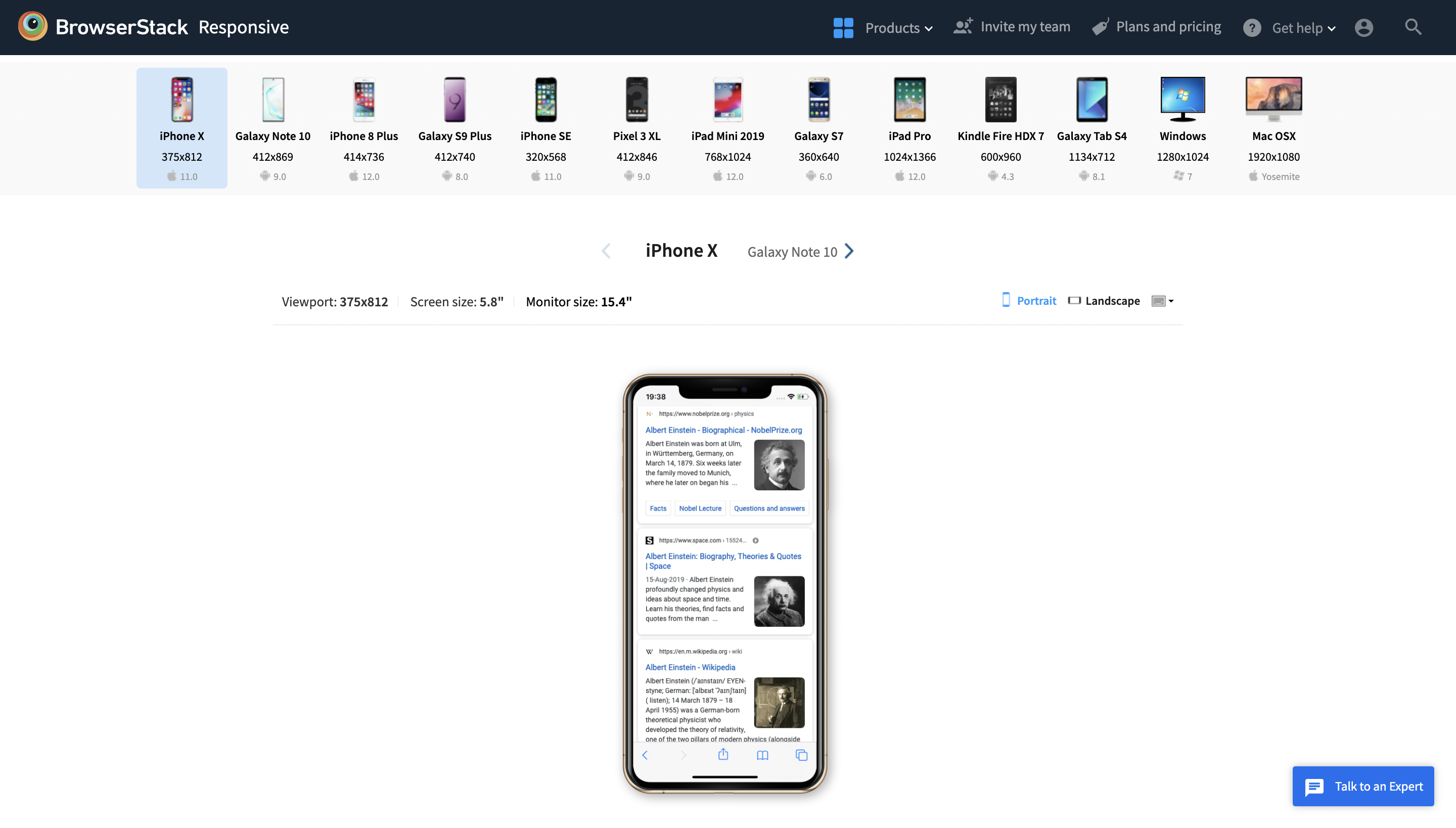
To effectively test and validate responsive images across various devices and screen sizes, platforms like BrowserStack Responsive are invaluable.
This free tool allows developers to preview how websites render on a wide range of real devices, including smartphones, tablets, and desktops, ensuring that images and layouts adapt seamlessly to different screen dimensions.
By providing instant access to real device viewports, BrowserStack Responsive helps identify and fix responsiveness issues before deployment, enhancing the overall user experience.
How are Responsive Images made?
One of the fundamental ways to make an image responsive is by linking its width to the width of its container element. This approach creates a “fluid” image that automatically adjusts based on the container’s size, which can change with the viewport.
By placing an <img> tag inside a container and applying CSS rules such as max-width: 100% and height: auto, the image scales proportionally to fit its container. This ensures that the image resizes appropriately across different screen sizes without distortion or overflow.
Read More: How to make images responsive
Why do you need Responsive Images?
One size does not fit all, as seen in the illustration above. To provide a better user experience, a responsive design should adjust depending on the user’s screen size, pixel density, and device orientation.
Key reasons for using responsive images include:
- Improved Performance: Serving appropriately sized images reduces page load times, especially on mobile networks, leading to faster and smoother browsing experiences.
- Bandwidth Efficiency: Smaller devices receive smaller image files, saving users’ data and reducing server load.
- Better Visual Quality: High-resolution devices display crisp, clear images while lower-resolution screens avoid unnecessary data overhead.
- SEO Benefits: Faster loading pages contribute to better search engine rankings and higher user engagement.
- Adaptability: Responsive images ensure layouts look polished and professional on any screen size or orientation.
Overall, responsive images are critical for modern web design, balancing performance and quality to meet diverse user needs.
Testing Responsive Images
Responsive testing verifies that each image on a webpage is appropriately sized for the user’s viewport. Delivering images larger than the screen results in unnecessary bandwidth usage, longer load times, and automatic downscaling by the browser.
Ensuring images are correctly sized optimizes performance, enhances user experience, and maintains high visual quality.
Responsive Images Testing in Browser
Google Chrome’s DevTools offers a useful and efficient technique for testing and debugging responsive designs. The Device Mode feature offers powerful tools specifically designed for testing and debugging responsive images.
Device Mode stands out among responsive design testing tools because it simulates mobile device functionality directly within the browser, including touchscreen interactions like tapping and swiping. This allows for more accurate testing of how images and layouts behave on real devices without leaving the development environment.
Steps to perform Responsive Test in Browser
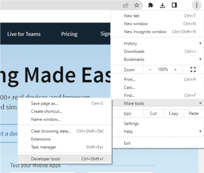
Step 1: Open your website on Google Chrome to begin using Device Mode. Then select More tools > Developer Tools from the Chrome menu by clicking on the Menu button. Developer Tools can be launched using the keyboard shortcuts Ctrl+Shift+I (Windows) or Option+Command+I. (Mac).
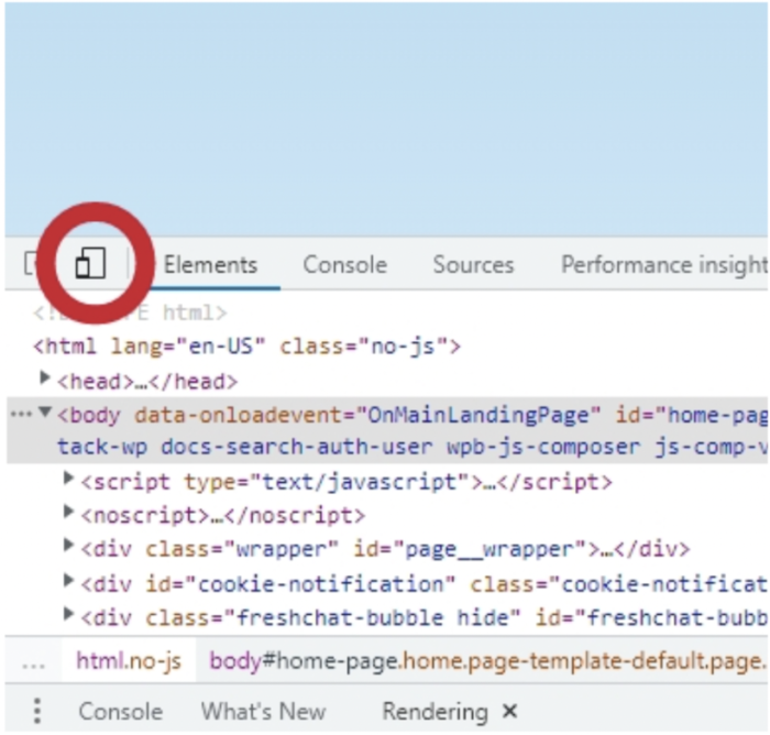
Step 2: Toggle device mode on and off by clicking the device mode icon (it’s a little button that resembles smartphones).
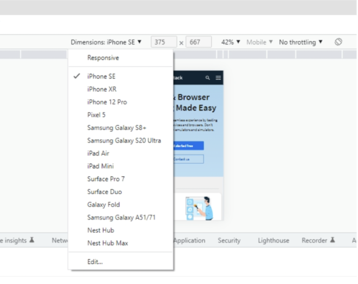
Step 3: This will enable you to test your design’s visual appeal and touch-like interactions on the aforementioned mobile device.
Responsive Image Testing on BrowserStack
Additionally, responsive websites, whether hosted locally or publicly, can be quickly tested on real mobile devices using the BrowserStack Responsive Tool.
This tool facilitates thorough testing of responsive web designs, making it an essential part of the development process. Ideally, every website should be validated using a responsive testing tool to ensure optimal performance across devices.
- Verifies that a website displays correctly across multiple platforms, including desktop and mobile
- Ensures the best user experience on a wide range of devices
- Accounts for diverse screen sizes, device configurations, and other critical factors
- Addresses challenges caused by increasing device fragmentation
Steps to perform Responsive Test using Browserstack
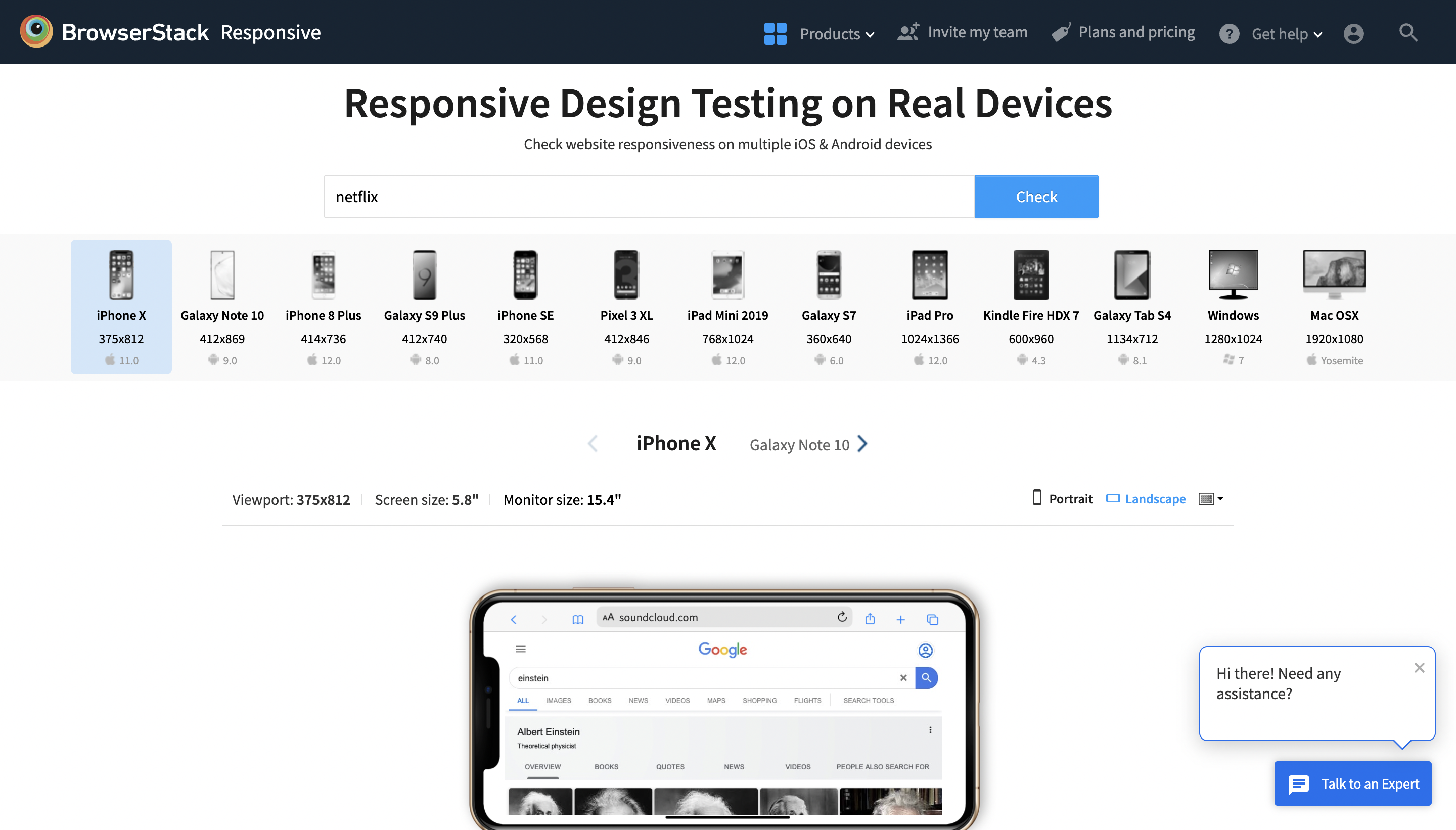
Step 1: The first step is to launch the BrowserStack Responsive Checker Tool and type the URL of the website under test.
Step 2: To check responsiveness, click Check.
Step 3: The user can check how the site appears on a certain device after choosing it.
Conclusion
Responsive images play an essential role in delivering fast, visually appealing, and efficient web experiences across a wide range of devices. Properly testing these images ensures they load quickly, look sharp, and adapt seamlessly to different screen sizes and resolutions.
Leveraging tools like BrowserStack Responsive and automated testing platforms helps streamline this process by providing access to real devices and browsers, reducing errors, and improving overall quality.
Incorporating thorough responsive image testing into the development workflow is essential for creating websites that meet modern user expectations and perform optimally on any device.
