Mobile phones have become an inseparable part of our lives. A report from Statista indicates that the number of mobile phone users is forecast to exceed 7.7 billion by 2028.
Given this significant mobile usage, designers and developers must focus on delivering seamless website UX on mobile devices.
This article explains how to make a website mobile-friendly.
Bear in mind that every mobile device has unique screen sizes and resolutions. To deliver optimal viewing experiences across multiple devices, a website must be fully responsive and cross-browser compatible.
Ways to make a Website Mobile Friendly
With more people browsing the web on their phones than ever before, making your website mobile-friendly is essential. A mobile-friendly site helps visitors navigate easily, keeps them engaged, and makes sure your content shines no matter the screen size.
Here are some practical, user-focused ways to make sure your website looks and works great on mobile.
1. Implement a Responsive Layout
A responsive layout allows a website to rescale itself according to the device used to view it. This makes the website adapt to different screen sizes without any rendering issues. Responsive web design works well for mobile and desktop platforms as the website changes its appearance accordingly.
Having a mobile-responsive website boosts the SEO value of a website as Google prefers indexing and ranking websites that are mobile-friendly. Incorporating a responsive layout goes a long way in assisting websites in ranking higher on Google searches.
Need to check website mobile responsiveness?
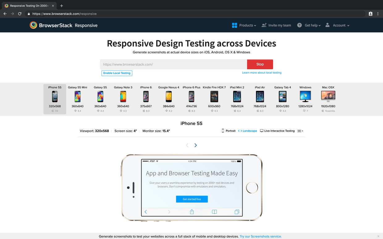
- While developing a mobile friendly website, try running a quick test using BrowserStack Responsive.
- Just enter the website URL, and the tool will immediately display the website on a range of real devices like the Samsung Note 10, iPhone X, iPad Pro, etc.
- Testers can see how a website appears on different devices and start optimizing accordingly to make website mobile friendly.
The responsive checker runs responsive tests on real device-browser combinations. As a result, users get accurate test insights. Thus providing an inclusive experience.
Try BrowserStack Responsive Testing
2. Optimize Website Speed
Speed plays a decisive role in creating the first impression of any website. 47% of visitors abandon a website if it takes more than 2 seconds to load whereas even a 1-second delay in page response can hurt your conversion rates by 7%.
Google considers high speed a positive ranking factor, so web developers must take all the necessary steps to increase website speed.
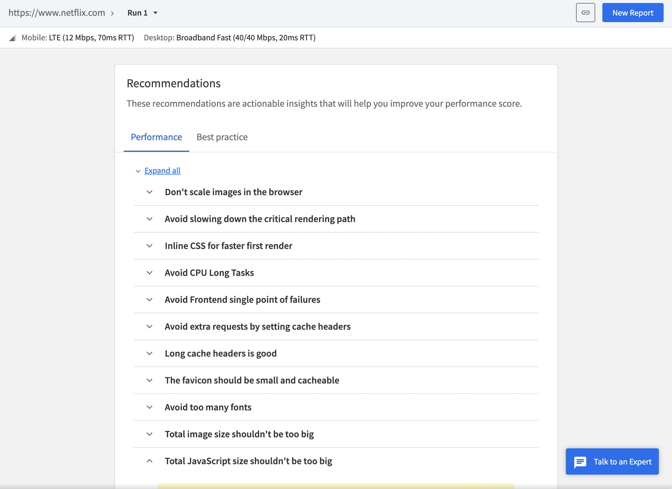
To evaluate a website’s loading time, run a website speed test on BrowserStack SpeedLab. Enter the URL and click on Start. This free tool verifies website speed on multiple real browser-device combinations and displays a score out of 100 for both mobile and desktop platforms.
You not only get reports but also actionable insights to help make website mobile friendly.
3. Subtle Pop-Up Implementation
It isn’t very pleasant for users to encounter sudden pop-ups while browsing web content, especially for mobile users. Sometimes, the X mark (to close the pop-up) is not even adequately visible, thus adding to the users’ annoyance. Developers and designers must ensure that if they have to display ads, they do so in a subtle manner.
Irrelevant pop-up implementation is one of the most common web design mistakes that turns your prospects into irate customers thereby lowering your chances of mobile conversions. Few techniques for subtle pop-up implementation:
- Implement the pop-up only when the reader scrolls down 70% – 80% of the web page.
- Match the pop-up design with a mobile-optimized design.
- Design CTA buttons on the pop-up to be clear and actionable.
4. Incorporate Viewport Meta tag
Incorporating the Meta tag lets developers control the viewport’s width and scaling so that the website is sized correctly on all devices. The viewport meta tag instructs the browser to resize the web page width according to the device screen size it is viewed on.
Also Read: Ideal Screen Sizes for Responsive Design
Use the code snippet below to define the meta element on each web page:
<meta name="viewport" content="width=device-width, initial-scale=1.0">
5. Declutter your Web Design
Web developers must ensure they are not cluttering the website by providing every functionality on the same page. This creates confusion, making it difficult for users to navigate a page with too many elements. Offer only the critical functions upfront since those are the ones users will actively look for. For a seamless user experience, prioritize a neat, minimalist design that makes navigation intuitive.
- Developers can incorporate one of the core elements of modern web design – the Hamburger button on a website.
- Mobile users can open the entire menu with a single click if implemented.
- This makes navigation easier and fosters a richer visual appeal.
Pro-Tip: Once done, consider running a responsive test again to verify if the decluttered website design appears to make your website mobile friendly.
6. Always Test the Website on Real Mobile Devices
An effective way of ensuring that your website delivers an optimal user experience is to test it on real mobile devices.
- Testing on real devices enables the detection and resolution of any issues or discrepancies that a user may face in real user conditions.
- Run every user scenario on as many real browser-device-OS combinations as possible so that customers can experience effortless, effective browsing irrespective of their mobile device.
Testing websites across real iOS and Android devices can be challenging without access to a comprehensive test infrastructure. Now, it is not feasible for every organization to have a mobile testing lab as it involves a significant investment. Using a real device cloud is often a better alternative because it requires zero maintenance.
BrowserStack also includes mobile-specific features such as geolocation testing, push notifications, network simulation, location testing, etc.
Try Testing on Real Devices for Free
7. Update Content Carefully
While experimenting with mobile web designs and content CRO activities, the overall website can take a hit. With a mobile-first design approach taking precedence, it’s crucial to craft and update your website’s mobile content with a pinpointed approach. Make sure that the content is readable on mobile screens and well-oriented.
- Product managers should consider the space restrictions on smaller screens to ensure only critical content elements are prominently displayed and A/b tested if needed.
- Developers can avoid this by opting for visual comparison testing that will avoid any web design mistake from showing up in production.
8. Do not use Flash
Flash makes your website slower, impacting SEO and disrupting the user experience. Flash can make a page take longer to load, and sometimes it is completely incompatible with mobile devices. It is recommended to use HTML5 and CSS instead to make your website more responsive and mobile-friendly.
9. Make the website compatible with both orientations
Unlike desktops which display content in landscape mode only, mobile phones display the screen in both Landscape and Portrait orientations. Hence, you should ensure that the website loads and functions fine in both Landscape and Portrait modes with no UI distortion, glitches, or stretching. You can check it by testing the website in both modes on real devices.
10. Compress images
Large image files can slow down your website, especially on mobile devices with limited data speeds and bandwidth. Compressing images helps reduce file sizes without compromising quality, leading to faster load times and a smoother browsing experience for mobile users.
There are several tools and plugins available to automate image compression, which can also improve your site’s overall performance and search engine rankings. Optimized images make your website more mobile-friendly and enhance user satisfaction by loading quickly and efficiently on all devices.
Conclusion
Developing a website to be mobile-friendly is important but at the same time, the mobile-optimized website should sufficiently deliver a flawless user experience across any device-browser-OS combination.
Mobile devices have significantly changed how people use the internet daily. This trend is set to increase, and more people continue to access the internet primarily via mobile devices yearly. Additionally, as leading search engines like Google continuously seek to make the web a mobile-first search landscape, having a mobile-friendly website must precede developers and testers.
