Developers often assume that layout issues appear only on small screens or large screens.
During my redesign for a retail site, the most severe visual break happened at 912px—a width no one had accounted for. It looked nothing like what designers approved.
And this is exactly why CSS media query breakpoints are essential tools in responsive web design, enabling your layout to adapt seamlessly to different screen sizes and devices.
By using media queries, developers can trigger specific styles and deliver a consistent, user-friendly experience across mobile, tablet, and desktop views—but only if the breakpoints are chosen correctly.
Overview
What are CSS Media Query Breakpoints?
CSS breakpoints are specific points defined in the code where the layout of a website changes to provide an optimal viewing experience across different screen sizes. These are implemented using media queries and are sometimes referred to as media query breakpoints.
Purpose: They ensure website content adjusts to various devices, preventing distortion or misalignment.
Setting Breakpoints:
- Based on Device: Define breakpoints targeting common device widths (e.g., smartphones, tablets, desktops).
- Based on Content: Adjust layout when the content requires more space, regardless of device.
- Using min-width and max-width: These properties in media queries help apply styles conditionally, facilitating responsive design.
This article breaks down exactly what CSS breakpoints and media query breakpoints are, how they differ, and how choosing the right ones prevents those hidden “in-between” failures that only show up when users least expect them.
What are CSS Breakpoints?
CSS breakpoints are specific points, usually defined by screen width, where the layout or design of a webpage adjusts to provide an optimal viewing experience on different devices. These are design decisions that help create responsive layouts.
Example:
A layout might shift from a single-column (for mobile) to a two-column layout at a 768px breakpoint for tablets.
When describing the role of breakpoints in responsive design, Kelley Gordon, Director of Product at Nielsen Norman Group—captures their importance clearly: “Breakpoints are the building blocks of responsive design. They allow designers to adjust the layout to fit the needs of various screen sizes and devices.”
What are Media Query Breakpoints?
Media query breakpoints refer to the specific conditions written in CSS using the @media rule to apply styles at certain screen widths. These are the technical implementation of CSS breakpoints.
Example:
css
@media (max-width: 768px) {

  .menu {

    display: none;

  }

}
This hides the menu when the screen width is 768px or less.
How Media Queries Work? (syntax, cascade)
Media queries allow CSS to apply styles only when certain conditions—such as viewport width, height, orientation, or resolution—are met. They act as conditional rules that the browser evaluates in real time, enabling layouts to adapt as the viewing environment changes. Understanding their syntax and how they interact with the cascade is essential to writing predictable, conflict-free breakpoint logic.
Syntax fundamentals
A media query consists of a media type (commonly screen) and one or more media features wrapped inside conditions. The browser checks these conditions; if they evaluate to true, the enclosed CSS rules are applied.
Basic example:
@media (min-width: 768px) {

  .card {

    display: grid;

    grid-template-columns: repeat(3, 1fr);

  }

}
Here, the grid layout only activates when the viewport is at least 768px wide.
Media queries can include multiple conditions using logical operators:
- and — applies styles only if all conditions are true
- , (comma) — functions as OR, applying styles if any condition is true
- not — negates conditions
- only — prevents older browsers from applying unsupported queries
Example with combined conditions:
@media screen and (min-width: 1024px) and (orientation: landscape) {

  .sidebar {

    width: 300px;

  }

}
How media queries interact with the cascade
Media queries don’t bypass the cascade—they participate in it. When multiple rules affect the same element, the browser resolves conflicts using the standard CSS cascade order:
- Importance (!important)
- Specificity of selectors
- Source order (later rules override earlier ones)
Because media queries often appear at the bottom of a stylesheet, they typically override earlier base styles—but only if their conditions are met.
Example of cascade-driven override:
.button {

  font-size: 14px;

}


@media (min-width: 600px) {

  .button {

    font-size: 16px; /* overrides when condition is true */

  }

}
If two media queries overlap, the one appearing last—or the one with higher specificity—wins.
Example of overlapping queries:
@media (min-width: 700px) { .title { color: blue; } }

@media (min-width: 900px) { .title { color: red; } }
At 950px, both rules match, but red wins because it appears later.
Why understanding cascade matters
Poorly ordered or overlapping media queries can produce unpredictable layout shifts, especially in large codebases. Knowing how the cascade resolves competing rules helps developers:
- structure breakpoints cleanly
- avoid style conflicts near breakpoint boundaries
- maintain predictable responsive behavior
By combining correct syntax with thoughtful cascade management, media queries become a reliable foundation for responsive design rather than a source of hidden layout bugs.
CSS Breakpoint vs Media Query Breakpoint
Here are the differences between CSS breakpoints and Media Query Breakpoints:
| Feature | CSS Breakpoints | Media Query Breakpoints |
|---|---|---|
| Definition | Design-level decision for layout change | Code-level implementation using @media |
| Purpose | Guides layout changes at certain widths | Applies styles based on screen conditions |
| Example | “Switch layout at 768px” (design intent) | @media (max-width: 768px) { … } |
| Can you use it interchangeably? | Yes, in general discussion | Yes, but technically more specific |
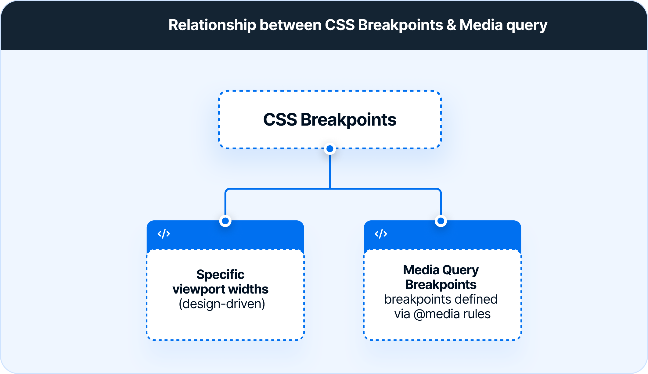
In short: CSS breakpoints are the concept, while media query breakpoints are the implementation using CSS.
Read More: Breakpoints for Responsive Web Design
How to set CSS breakpoints for Responsive Design
There are two main approaches to follow when setting CSS breakpoints for responsive design:
1. CSS Breakpoints based on device
With the current state of device fragmentation, determining breakpoints based on the device can be challenging. New devices are released in the market with increasing frequency, and keeping up with them generally requires significant effort.
Once a new device with a new screen resolution is released, developers will have to return to the CSS and add a new breakpoint. Imagine doing this every time a device is up for sale.
Even so, to cover all bases, one can at least set breakpoints based on the most popular devices used to access a website. Use Google Analytics for this purpose. Simply follow the path below:
Audience > Technology > Browser & OS > Screen Resolution
- Set breakpoints for the 10 device screen resolutions the website is accessed from.
Additionally, use a mobile-first design approach when working on the website layout. Design the site for mobile devices first, as approximately 50% of overall web traffic comes from mobile devices.
One could also set breakpoints for common device groups instead of specific devices:
/* Extra small devices (phones, 600px and down) */
@media only screen and (max-width: 600px) {...}
/* Small devices (portrait tablets and large phones, 600px and up) */
@media only screen and (min-width: 600px) {...}
/* Medium devices (landscape tablets, 768px and up) */
@media only screen and (min-width: 768px) {...}
/* Large devices (laptops/desktops, 992px and up) */
@media only screen and (min-width: 992px) {...}
/* Extra large devices (large laptops and desktops, 1200px and up) */
@media only screen and (min-width: 1200px) {...}
2. CSS Breakpoints based on content
This is an easier approach that covers more ground. In this case, breakpoints are set based on website content. At every juncture in which the content needs a change in layout, a breakpoint is added. This makes media queries easier to code and manage.
A good rule to follow in this regard is to add a breakpoint when the content looks misaligned.
Visualize a paragraph of text. As the screen gets wider, it starts to become distorted, thus hindering readability. Adding a breakpoint here would prevent this from happening. The point of adding any breakpoint is to make content easy to read. This applies to both increasing and decreasing screen width. Whenever the content becomes harder to read because of changing screen size, add a breakpoint.
Look at some examples:
CSS kicks in when the device width is 768px and above
@media only screen (min-width: 768px){
...
}
CSS kicks in within the limits : 768px to 959px
@media only screen and (min-width: 768px) and (max-width: 959px){
...
}Using min-width and max-width for CSS breakpoints
Setting breakpoints is easy with the min-width and max-width properties.
Using max-width helps improve the browser’s handling in the case of small screen sizes. Setting a CSS responsive width is important to access the device on smaller screens:
div.ex1 {
width: 300px;
margin: auto;
border: 2px solid #00FFFF;
}

div.ex2 {
max-width: 300px;
margin: auto;
border: 2px solid #00FFFF;
}
Here in the first div, the box (width) will not resize to fit the screen, whereas the second one (max-width) will resize.
A couple of best practices are:
- When designing with the mobile-first approach (mentioned above), start with setting min-width breakpoints. The default styles should be for smaller device screens. Then, add and adjust for larger screens.
- Conversely, when designing for larger devices, set default CSS for them, and realign for smaller screens with the max-width property.
Confused? Perform a quick check of your website across real devices. Try now.
Types of Media Features Beyond Width
Media queries are often associated with min-width and max-width, but responsive design becomes far more precise when additional media features are used. These features allow styles to adapt to factors like height, orientation, resolution, user preferences, and input capabilities—conditions that influence usability just as much as screen width.
Height-based features
Height queries help adjust layouts when vertical space is limited, useful for devices with toolbars or browser UI that reduce the effective viewport height.
@media (max-height: 700px) { ... }Orientation
Orientation checks whether the device is in portrait or landscape mode. This is useful for rearranging columns, resizing images, or simplifying layouts for horizontal screens.
@media (orientation: landscape) { ... }Aspect Ratio
Aspect ratio queries respond to the proportional relationship between width and height. They are valuable for video-heavy designs, galleries, or layouts requiring fixed proportions.
@media (min-aspect-ratio: 16/9) { ... }Resolution and Pixel Density
These features target high-resolution displays like Retina screens to serve sharper images or adjust fine UI details.
@media (min-resolution: 2dppx) { ... }Pointer and Hover Capabilities
These queries detect the type of input device—mouse, touch, stylus—and whether hover states are available. They help refine UI states for touch users.
@media (hover: none) and (pointer: coarse) { ... }Color Scheme (Dark Mode / Light Mode)
This feature adapts the UI based on the user’s OS-level color scheme preference.
@media (prefers-color-scheme: dark) { ... }Motion Preferences
Some users prefer reduced animations for accessibility reasons. This query ensures motion-sensitive UI adjusts accordingly.
@media (prefers-reduced-motion: reduce) { ... }Color Gamut
Color-gamut queries detect the display’s supported color range, allowing designers to enhance visuals on devices with richer color reproduction.
@media (color-gamut: p3) { ... }These additional media features let developers move beyond simple width-based breakpoints and create responsive experiences that adapt to real-world user conditions, device capabilities, and accessibility needs.
The Media Query Breakpoints to be Used
Obviously, it’s easier to go into website development knowing which CSS media breakpoints to use. The approaches outlined above require some research (with regard to popular devices and the nature of the content), but there are some CSS media breakpoints that are likely to fit most websites.
To start with, study popular frameworks such as Bootstrap, Foundation, and Bulma.
- Bootstrap: 576px, 768px, 992px, and 1200px
- Foundation: 40em and 64em
- Bulma: 768px, 769px, 1024px, 1216px, and 1408px
These frameworks facilitate mobile-first design, which is an industry best practice at this point in time. Therefore, using these breakpoints will offer more effective levels of website responsiveness.
Common Media Query Breakpoints
Use breakpoints for the most commonly used device resolutions used across mobile, desktop, and tablet. These would be:
- 1920×1080 (8.89%)
- 1366×768 (8.44%)
- 360×640 (7.28%)
- 414×896 (4.58%)
- 1536×864 (3.88%)
- 375×667 (3.75%)
Mobile-first vs desktop-first strategy for CSS Media Query Breakpoint
Choosing how to structure media queries—mobile-first or desktop-first—shapes how breakpoints behave, how CSS cascades, and how responsive layouts scale across devices. Both approaches rely on media queries but differ in direction, default styling, and maintainability.
Mobile-first approach
A mobile-first strategy begins with base styles optimized for small screens, then adds enhancements as the viewport grows. This method relies on min-width breakpoints.
How it works:
- Write lightweight, essential styles for mobile by default.
- Layer on more complex layouts and components for larger screens using @media (min-width: …).
Example:
.card {

  display: block;

}


@media (min-width: 768px) {

  .card {

    display: flex;

  }

}
When mobile-first excels:
- Most users access the site on mobile.
- Performance matters, and smaller screens need leaner CSS.
- Layouts naturally scale up as screens get wider.
- Teams want cleaner cascade control—base styles first, overrides later.
Desktop-first approach
A desktop-first strategy begins with a full-featured layout for large screens, then simplifies it for smaller devices. This relies on max-width breakpoints.
How it works:
- Write a complete layout for desktop as the default.
- Add @media (max-width: …) rules to adjust or simplify styles as the screen shrinks.
Example:
.card {

  display: flex;

}


@media (max-width: 767px) {

  .card {

    display: block;

  }

}
When desktop-first fits:
- Applications are primarily used on large screens (dashboards, B2B tools).
- The design system was originally built for desktop and adapted later.
- Layouts scale down more predictably than they scale up.
Key differences that impact breakpoint strategy
Mobile-first and desktop-first are not just coding preferences—they affect how breakpoints are chosen and how styles interact:
- Direction of scalability: Mobile-first scales up from small screens; desktop-first scales down.
- Cascade behavior: Mobile-first tends to produce fewer overrides because base styles naturally apply everywhere.
- Maintainability: Mobile-first often results in cleaner, more predictable CSS in modern responsive design systems.
- Performance: Mobile-first can reduce initial payload for mobile devices by avoiding unnecessary styles.
Which approach is better?
For most responsive websites, mobile-first is recommended because user traffic skews mobile and min-width queries create a more stable cascade. Desktop-first still works well for products built primarily for large screens. Ultimately, the “right” choice depends on where the product’s users are and how the layout evolves across breakpoints.
Using Media Queries for Screen Orientation (Landscape vs Portrait)
Media queries can target not just screen width, but also orientation. This is useful when you want different layouts or styles depending on whether the device is held vertically (portrait) or horizontally (landscape).
Example:
css
@media (orientation: portrait) {

  body {

    font-size: 16px;

  }

}


@media (orientation: landscape) {

  body {

    font-size: 18px;

  }

}
This ensures better readability and layout adjustment based on how a device is held.
Read More: What are Elementor Breakpoints
Logical Operators in Media Queries
Logical operators allow multiple conditions to be combined inside a media query, giving developers much finer control over when styles should apply.
They determine how the browser evaluates media features and which rules activate under specific scenarios. Understanding these operators is important for building breakpoints that behave predictably across screen sizes, orientations, and device capabilities.
and
The and operator requires all conditions to be true for the styles to apply. It is the most common way to combine viewport constraints or pair width with orientation or resolution checks.
@media (min-width: 768px) and (orientation: landscape) {

  .layout {

    grid-template-columns: 1fr 1fr 1fr;

  }

}
This rule applies only when the viewport is at least 768px wide and in landscape mode.
, (comma) — OR
A comma-separated list creates an OR condition. If any one of the queries matches, the styles inside will apply. This is useful when grouping breakpoints with shared styling.
@media (max-width: 480px), (orientation: portrait) {

  .image {

    height: auto;

  }

}
Here, the styles activate for small screens or for any device in portrait orientation.
not
The not operator excludes specific conditions, allowing styles to apply everywhere except the environments defined. It is less commonly used but helpful when targeting all screens except a narrow set of cases.
@media not all and (min-width: 900px) {

  .sidebar {

    display: none;

  }

}
The sidebar hides on all screens that do not meet the large-width threshold.
only
The only operator prevents older browsers that don’t understand media queries from applying the styles. While modern browsers handle queries correctly, this keyword still appears in some production code for legacy support.
@media only screen and (min-width: 1024px) {

  .nav {

    display: flex;

  }

}
Why logical operators matter
Logical operators determine how multiple conditions interact and which rules win when several queries overlap. By using and, commas, not, or only intentionally, developers can craft media queries that reflect real layout needs instead of relying on width alone. This leads to cleaner responsive behavior, fewer style collisions, and more accurate breakpoint targeting.
Browser Compatibility Issues in CSS Media Query
While media queries are widely supported, certain cases and older browsers may pose challenges.
Common issues:
- Older versions of Internet Explorer (especially IE8 and below) have limited or no support.
- High-resolution or unusual aspect ratio devices may require custom breakpoints.
- Some media features (like hover, aspect-ratio) may behave inconsistently across devices.
Pro Tip: Always test across multiple browsers and devices using tools like BrowserStack to ensure consistent behavior.
Best Practices to follow when using Media Query Breakpoints
Here are the best practices to follow when using Media Query breakpoints:
- Start with a mobile-first approach: Write base styles for the smallest screen, then build upward using min-width media queries.
- Use relative units: Use em or rem instead of px to make breakpoints more flexible across different base font sizes and devices.
- Avoid overlapping breakpoints: Ensure your min-width and max-width ranges don’t conflict. Overlaps can cause unpredictable styling and maintenance issues.
Example: Avoid this conflict:
css
@media (max-width: 768px) { ... }

@media (min-width: 768px) { ... }  /* Overlaps at exactly 768px */
Instead, separate them clearly:
css
@media (max-width: 767px) { ... }

@media (min-width: 768px) { ... }- Keep breakpoints minimal: Don’t add a breakpoint for every device — focus on where your layout breaks, not on device types.
- Organize breakpoints by layout change: Group them by design logic (e.g., nav collapse, grid reflow) rather than screen size labels.
- Test on real devices: Use platforms like BrowserStack to verify that breakpoints behave correctly across actual browsers and devices, especially for edge cases.
Automated workflows benefit from validating media query breakpoints during every build. BrowserStack Automate can run responsive tests across multiple device and browser combinations in parallel, ensuring each breakpoint behaves as intended before changes are deployed.
Why Choose BrowserStack to Test Media Query Breakpoints?
Media query breakpoints often behave differently across browsers, devices, and OS configurations, which makes real-world testing essential.
A layout that looks correct in a local browser window can break at intermediate widths, on high-density screens, or when features like dark mode, pointer detection, or reduced-motion preferences are involved.
Testing these conditions accurately requires access to real environments—not emulators or guesses. BrowserStack Automate enables teams to run automated tests across thousands of real browsers and devices, ensuring every breakpoint behaves consistently and every responsive adjustment is validated before release.
Key reasons to use BrowserStack for breakpoint testing
- Real-device coverage ensures breakpoints are validated on actual screen sizes, pixel densities, and hardware configurations rather than approximations.
- Cross-browser testing reveals differences in how engines interpret media features such as orientation, hover, pointer, and color scheme.
- Custom viewport resizing on real devices helps detect layout shifts that occur between common device widths.
- OS-level settings can be tested reliably, including dark mode, reduced motion, and accessibility preferences that influence media query behavior.
- Automated parallel execution on BrowserStack Automate allows teams to integrate breakpoint verification into their CI pipelines and catch regressions quickly.
Conclusion
Obviously, identifying and using CSS breakpoints for responsive design and media queries for all devices is not humanly possible. The best option is to deploy CSS media queries and breakpoints that fit the device preferences of the target audience. Additionally, keeping the content adjustable and adaptable to change would also help to accomplish more in the long-term with reasonable levels of effort.
Once a website has been designed and breakpoints incorporated, remember to test them on real devices to check their responsiveness. Depending on the number of screen sizes in question, checking responsive design is easiest when using a real device cloud.
BrowserStack offers 3500+ real browsers and devices for instant, on-demand cross browser testing on the cloud. Simply sign up for free, choose from among the latest devices, navigate to the relevant website, and start verifying its responsive design.
