How to make React Native App Responsive?
By Vivek Mannotra, Community Contributor - January 24, 2023
React Native is an incredibly powerful and useful tool for building mobile applications with many of the same features and capabilities as a native mobile application, while still leveraging the codebase and development tools of a web project.
React Native is also highly extensible and can be used to create a wide variety of applications including desktop apps. It is also relatively easy to learn and has a large and ever-growing developer community.
Responsive apps ensure that users have a consistent experience regardless of device size or operating system. In this guide we discuss how React Native makes it easier to build responsive apps with its built-in components and powerful styling capabilities.
Why is Responsiveness of React Native Apps important?
Building a responsive app is important because it ensures that your app will function correctly and provide a good user experience on a wide range of devices and screen sizes. A responsive app will automatically adjust its layout and design to fit the specific screen size and resolution of the device it is being used on, making it easy to use and navigate for users.
This is particularly important in the case of react native, as it is a cross-platform framework that is used to build apps for both iOS and Android, which means that your app will need to be able to adapt to the different screen sizes and dimensions of these devices.
Ignoring UI responsiveness can also lead to issues in terms of user retention. If users have a poor experience with an app, they are less likely to continue using it, and may even delete it from their device. This can lead to a decrease in the app’s user base, which can ultimately hurt its long-term success.
Ignoring UI responsiveness can lead to issues such as user frustration, decreased conversions, and decreased user retention. Don’t take our word for it, see what industry leaders have to say about app responsiveness:
- Airbnb’s responsive design played a key role in the success of the company’s mobile app by designing a responsive layout that provides a seamless user experience on a wide range of devices, which helped to increase user engagement and retention.
- In 2018, Google implemented mobile-first indexing, which means that it now uses the mobile version of a website as the primary source for indexing and ranking. This change was driven by the increasing importance of mobile devices in the digital world, and the need for websites to be responsive in order to provide a good user experience on these devices.
- Netflix’s responsive design has played a key role in the success of the company’s streaming service.
How to make Responsive Apps with React Native
To get started with React Native, you’ll need to have the following software installed on your computer:
- Node.js: React Native is built with Node.js, so you’ll need to have it installed to get started. You can download the latest version of Node.js from the official website (or using a package manager like Homebrew (for macOS) or nvm (for Linux).
- React Native CLI: The React Native command-line interface (CLI) is a tool that you’ll use to create and manage your React Native projects. You can install it using npm, which comes with Node.js:
If you are planning to react native as a part of an existing native Android or iOS app, you can follow these instructions for setup.
- A text editor: You’ll need a text editor to write your code. Some popular options include Visual Studio Code, Sublime Text, and Atom.
- An Android emulator or a physical Android device: If you want to build and run your app on Android, you’ll need either an Android emulator (such as the official Android Studio emulator) or a physical Android device.
- Xcode: If you want to build and run your app on iOS, you’ll need Xcode, which is a suite of developer tools for building iOS apps. You can download it from the Mac App Store.
The key to making a react native app responsive is to use the built-in tools and features provided by the framework, such as responsive UI components and flexbox, and to carefully plan and design your app’s layout and styles to ensure that it will be easy to use and navigate.
Here are different ways that you can use to make you React Native App Responsive:
1. Utilize Flexbox
Flexbox is a powerful layout mechanism that can be used to create a responsive UI. It provides a flexible way to lay out elements on the screen without having to manually set sizes, positions, and margins.
Sample Flex Layout:
import React, {Component} from 'react';
import {View, Text} from 'react-native';

export default class MyLayout extends Component {
render() {
const flexD = 'column'
return (
<View style={{flex: 1, flexDirection: flexD, backgroundColor: '#fff'}}>
<View style={{flex: 1, backgroundColor: '#808080'}}>
<Text>'Head'</Text>
</View>
<View style={{ flex: 6, backgroundColor: '#D3D3D3'}}>
<Text>'Body'</Text>
</View>
<View style={{ flex: 1, backgroundColor: '#808080'}}>
<Text>'Foot'</Text>
</View>
</View>
);
}};
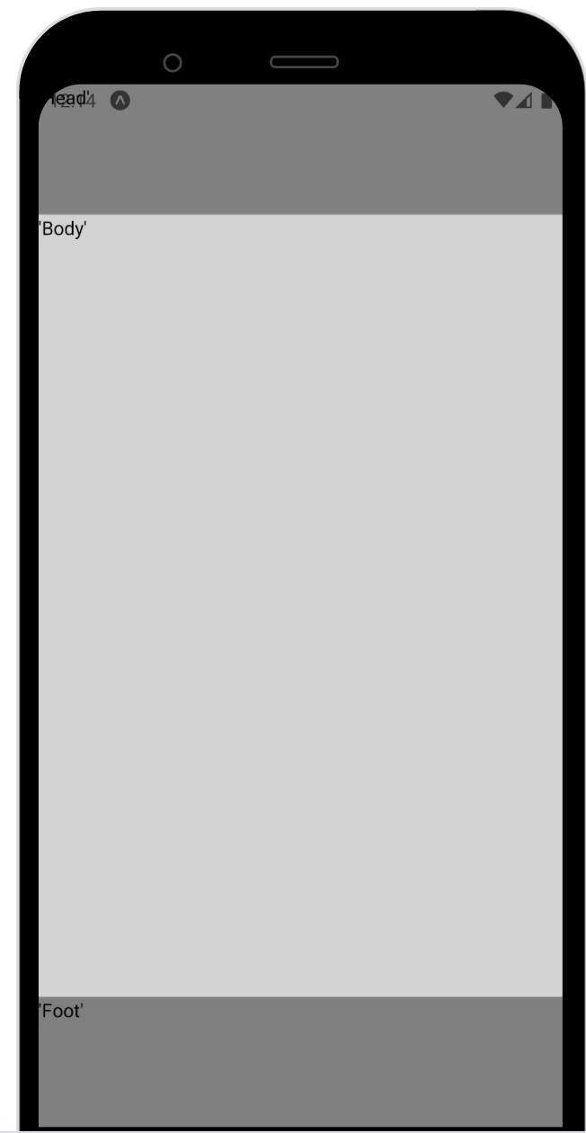
This code generates a simple flex layout with a header, footer and a body container
Output:
2. Create Responsive Components
Components can be made responsive by adjusting their size and position based on a device’s screen size. This can be done with the help of various available configurations provided by React.
Use the Style property to add CSS to any component or text. Use various components to created nested structures according to your design needs.
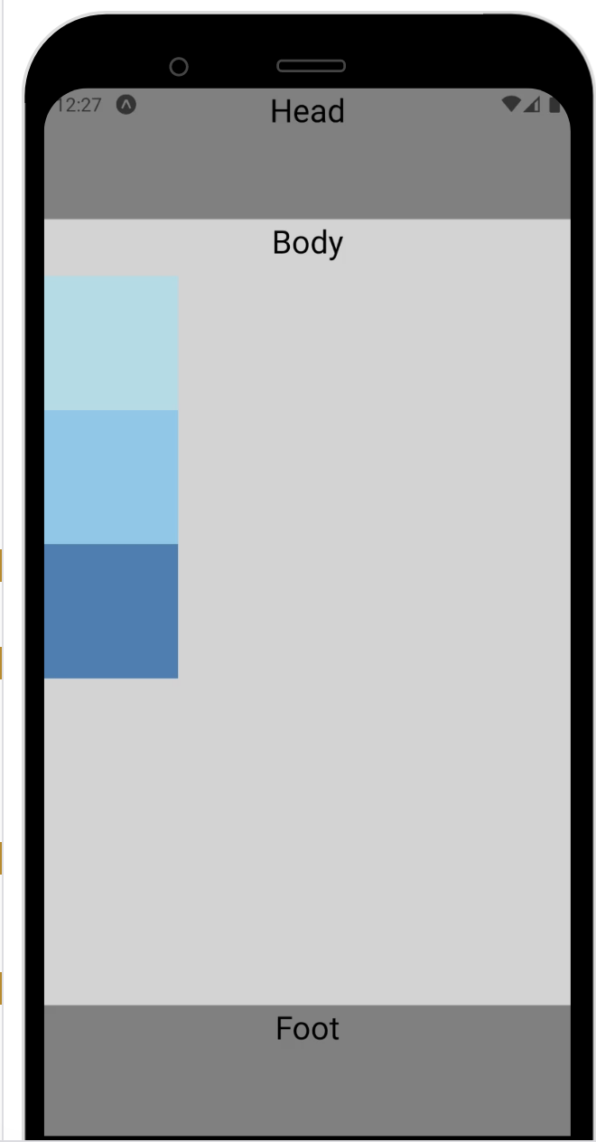
Adding style attribute and child elements to the previous example:
import React, {Component} from 'react';
import {View, Text, StyleSheet} from 'react-native';

export default class MyLayout extends Component {
render() {
const styles = StyleSheet.create({
box: {
width: 100,
height: 100,
},
label: {
textAlign: "center",
marginBottom: 10,
fontSize: 24,
}});
const flexD = 'column'
return (
<View style={{flex: 1, flexDirection: flexD, backgroundColor: '#fff'}}>
<View style={{flex: 1, backgroundColor: '#808080'}}>
<Text style={[styles.label]}>Head</Text>
</View>
<View style={{ flex: 6, backgroundColor: '#D3D3D3'}}>
<Text style={[styles.label]}>Body</Text>
<View style={[styles.box, { backgroundColor: "powderblue" }]}/>
<View style={[styles.box, { backgroundColor: "skyblue" }]} />
<View style={[styles.box, { backgroundColor: "steelblue" }]} />
</View>
<View style={{ flex: 1, backgroundColor: '#808080'}}>
<Text style={[styles.label]}>Foot</Text>
</View>
</View>
);
}};
Output:
3. Avoid Hardcoded Values
Using hardcoded values for sizes, margins, and positions can make an app unresponsive. Instead, use platform-specific styling, relative sizing, and media queries to create a responsive UI.
In order to achieve the best results for your case, you might have to adjust many available parameters that are part of the layout configuration like:
- flexDirection: This property determines the direction of the main axis. It can be set to ‘row‘ (horizontal) or ‘column‘ (vertical).
- alignItems: This property determines how children of a container are aligned along the cross axis (perpendicular to the main axis). It can be set to ‘flex-start‘, ‘center‘, ‘flex-end‘, ‘stretch‘, or ‘baseline‘.
- justifyContent: This property determines how children of a container are positioned along the main axis. It can be set to ‘flex-start‘, ‘center‘, ‘flex-end‘, ‘space-between‘, ‘space-around‘, or ‘space-evenly‘.
- height and width: These properties determine the size of a component in pixels. You can set them to a fixed value (e.g. height: 100) or to a percentage of the parent container (e.g. height: ‘50%‘).
By combining these properties and adjusting their values, you can create responsive layouts that adapt to the dimensions and orientation of the device screen.
4. Use Relative Sizing
Using relative units such as ‘%‘ or ‘em‘ allows components to be sized according to the size of the device’s screen. This makes it easier to create a responsive UI.
This way, your components will automatically adjust to the screen size and orientation of the device they are running on.
In the example above, we can change the dimensions of the elements to use percentages:
const styles = StyleSheet.create({
box: {
width: '80%',
height: '30%',
margin: '0 auto'
}
Output:
You can use the Dimensions API to determine the dimensions of the screen on which the app is running, and use this information to size and position your components accordingly.
const {height, width} = Dimensions.get('window');
the height and width values can be used to dynamically calculate other values inside your app. Lets update the dimensions of the box in the above example using the Dimension API:
const { width, height } = Dimensions.get('window');
const styles = StyleSheet.create({
box: {
width: width * 0.6,
margin: '0 auto',
height: height/6,
},
Output:
 5. Use Platform-specific Styling
React Native allows developers to write platform-specific code that will be compiled to native code for each platform. This means that developers can write platform-specific styles for their components to ensure that they look and behave as expected on each platform.
For example, suppose you have a button component that you want to use in your app. You can create a stylesheet for the button that will be used on iOS devices, and another stylesheet for the button that will be used on Android devices.
- Define style:
 // Styles for the button on iOS devices
iosButton: {
backgroundColor: '#007AFF',
padding: 10,
borderRadius: 5,
},
// Styles for the button on Android devices
androidButton: {
backgroundColor: '#3F51B5',
padding: 10,
borderRadius: 5,
}
- Switch based on platform:
<Button title='Click Here' style={Platform.OS === 'ios' ? styles.iosButton : styles.androidButton}>
Click Here
</Button>
We can only explore limited depth here in this guide, but these examples are enough to give you a handle on the basics and a starting point for you to explore further in-depth and use-case-specific configurations that you can achieve once you gain expertise over the platform.
Furthermore, beyond the official toolset, you have practically the largest front-end dev communities in the world to reference from, so rest assured you will find access to thousands of libraries and communities where you can learn how to implement high-performance user interfaces using React Native.
For a full list of React Native layout properties click here.
Testing Responsive React Native Apps
Testing is a crucial part of any app development process, and React Native Apps are no exception. React Native allows developers to create native mobile apps using JavaScript (JSX), making it a popular choice for many businesses.
However, testing React Native apps can be challenging, as it requires a combination of manual and automated testing on different devices and platforms.
One powerful way to implement automated testing for React Native apps is to use a device cloud such as BrowserStack.
BrowserStack is a cloud-based platform that provides access to a wide range of real devices for testing purposes. This allows developers to run manual and automated tests on a variety of devices, including iOS and Android devices, without having to physically access the devices.
To test a React Native app using BrowserStack, developers can use the BrowserStack App Live and App Automate tools.
Test React Native Apps on Real Devices
Testing React Native Apps Manually
These tools allow developers to upload their app to the BrowserStack cloud, where it can be tested on a variety of devices and operating systems.
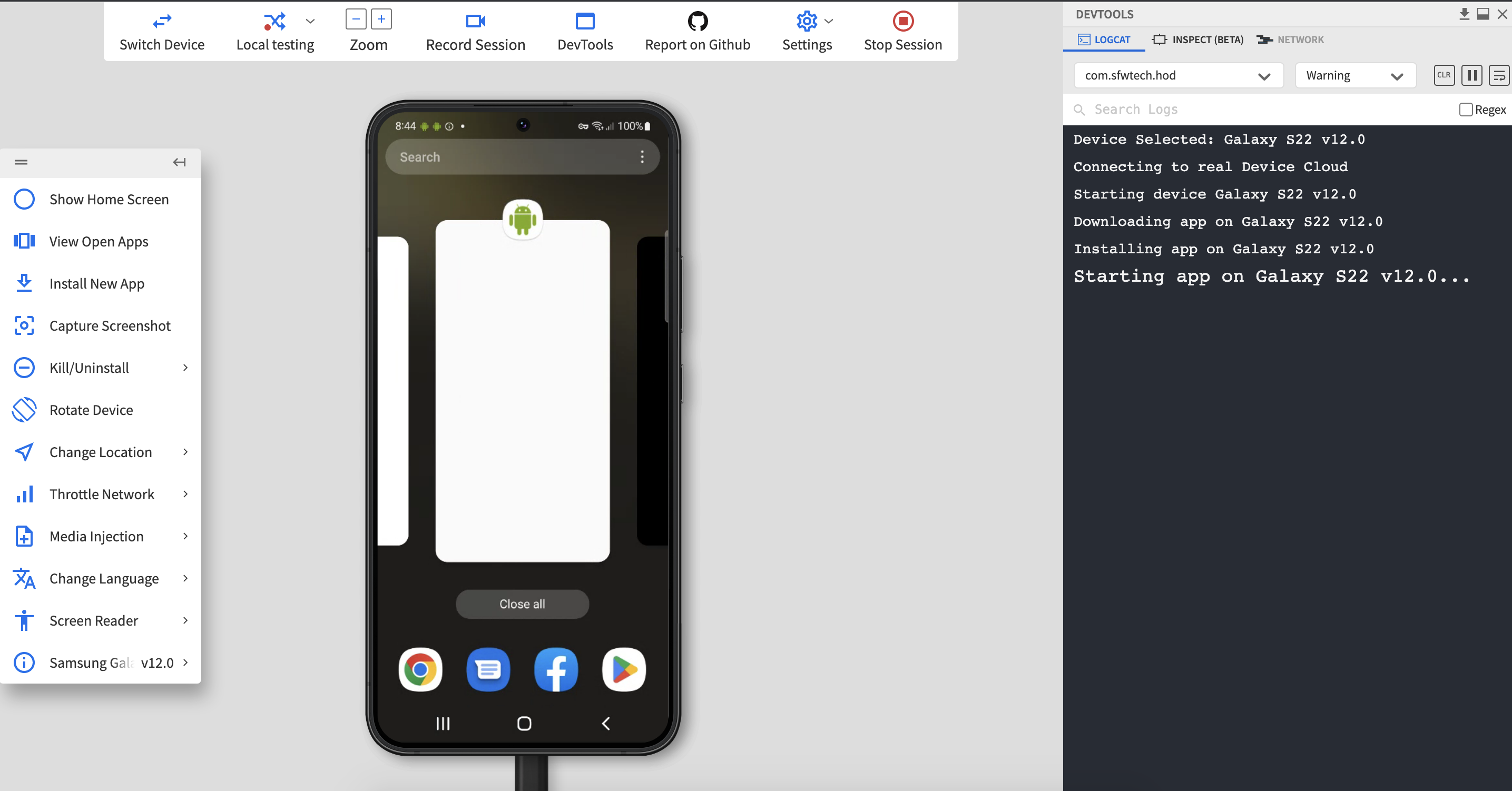
Step 1 Sign Up to access BrowserStack App Live
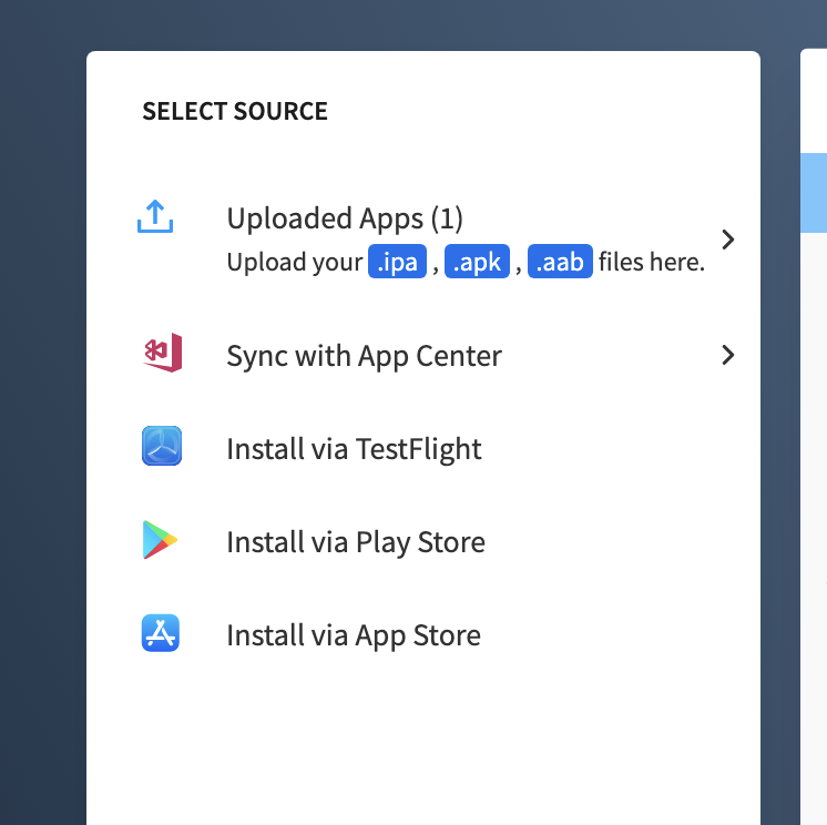
Step 2 Specify how you want to import the app, choose from the available options.
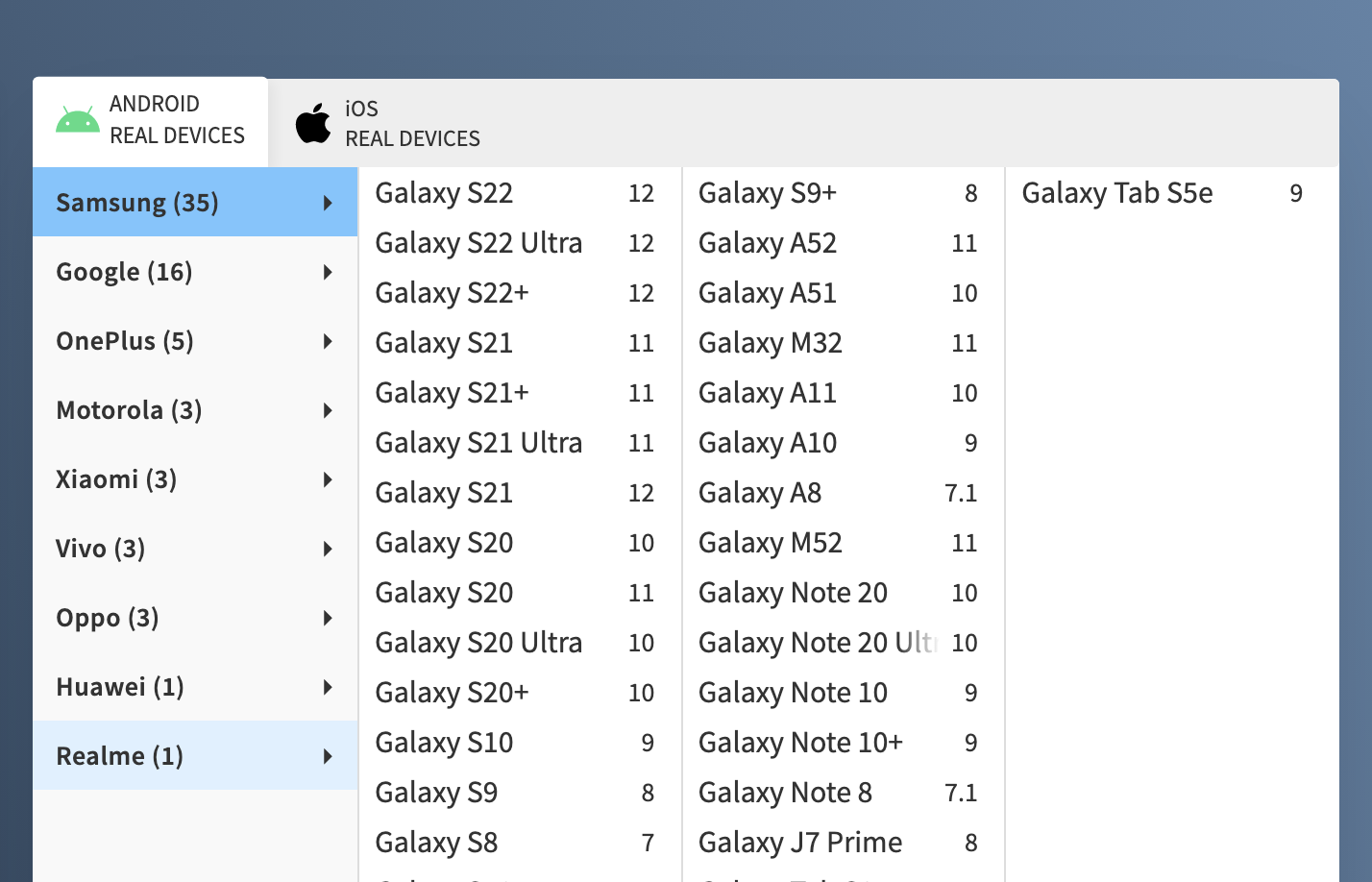
Step 3 Select the device on which you want to run the app.
Step 4 Easily debug on any platform with access to devtools and other control features, smoothly evaluate responsiveness on real devices over the cloud.
The tool also provides a range of capabilities, such as test scripting and test execution, that make it easy to automate testing processes.
Testing React Native Apps using Automation
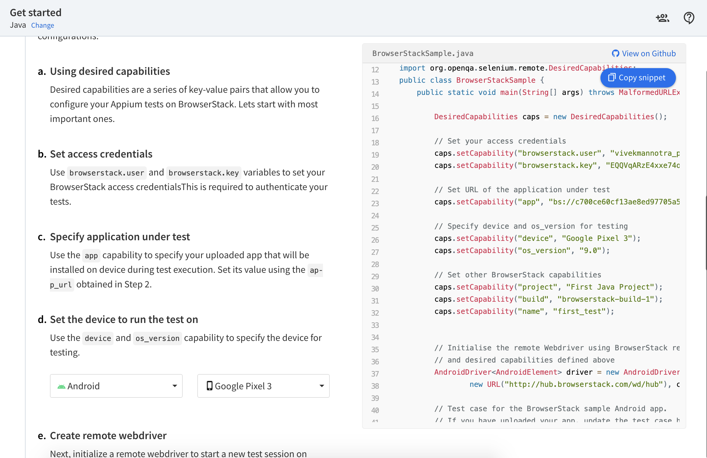
Step 1 Sign up for BrowserStack App Automate
Step 2 Follow the quick integration guide for the language and framework of your choice and run your first automation test script.
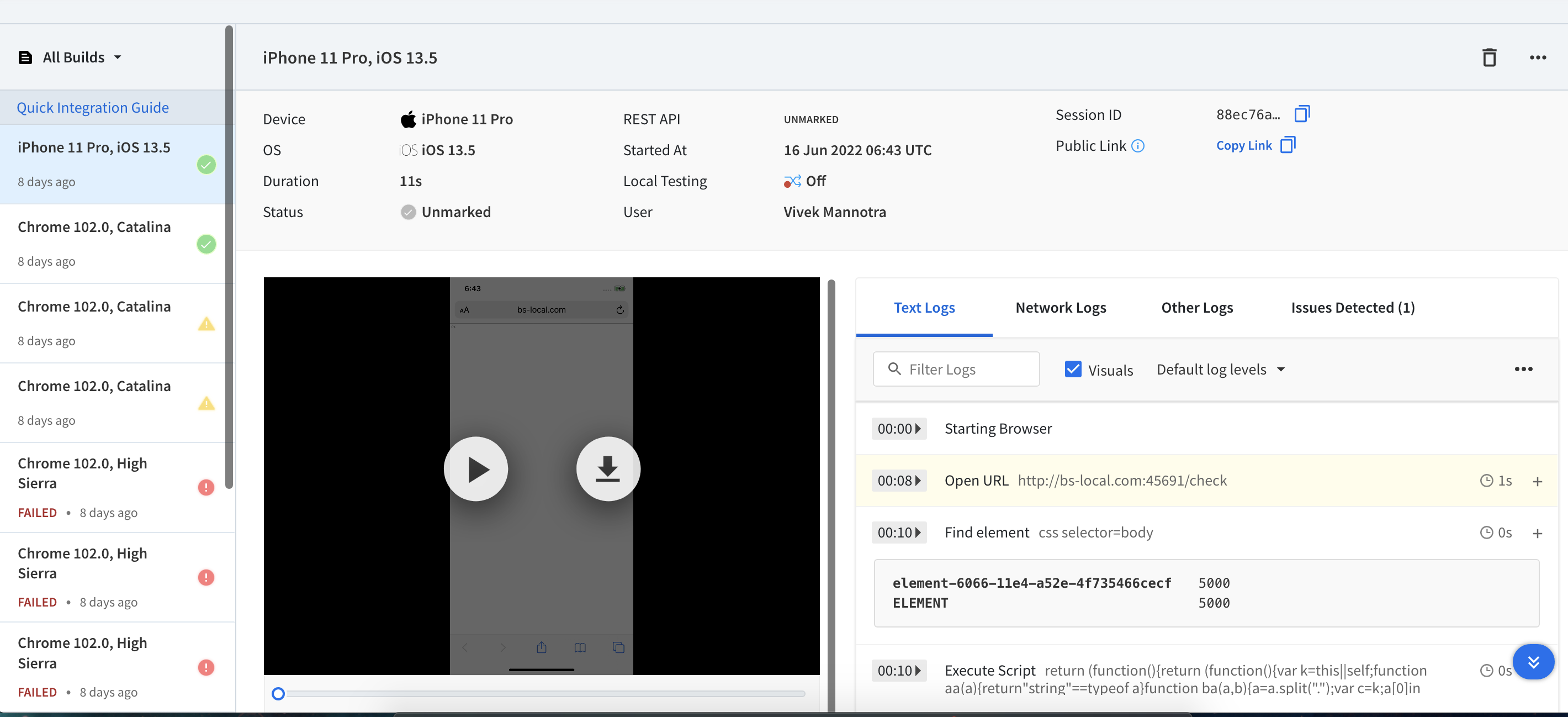
Step 3 Access test results on the dashboard from anywhere.
In addition to automating testing processes, integration with CICD (Continuous Integration and Continuous Delivery) is essential for ensuring that the testing process is integrated into the app development workflow.
By integrating testing with CICD, developers can automate the process of running tests as part of their development process. This allows developers to quickly and easily identify and fix any issues that may arise, helping to ensure that the app is of high quality.
Learn more about supported integrations.
Test React Native Apps on Real Devices
Overall, testing React Native apps can be challenging, but using a device cloud such as BrowserStack and integrating testing with CICD can help to make the process more efficient and effective.
By automating testing processes and integrating them into the development workflow, developers can ensure that their React Native apps are of high quality and ready for release.
Best Practices of making React Native App Responsive
Here are some best practices for developing responsive and fast React Native applications:
- Use a style guide and follow it consistently. This will help ensure that your code is readable and maintainable.
- Start by defining the application’s goals and target audience, as well as the specific features and functionality that the app will offer.
- Use a modular approach to app development, dividing the application into smaller, independent components that can be easily maintained and updated.
- Use a responsive design approach to ensure that the app looks and works well on a variety of different devices and screen sizes.
- Use platform-specific code to separate platform-specific code. This will make it easier to maintain your code and reduce the risk of introducing bugs.
- Use the shouldComponentUpdate() lifecycle method to optimize performance. This method allows you to prevent a component from re-rendering if its props or state haven’t changed.
- Use the useDebugValue() hook to display a custom label for a custom hook in the React DevTools. This will make it easier to understand the purpose and behavior of your custom hooks.
- Use the useEffect() hook for managing side effects in your components. This will help keep your code clean and organized, and it will make it easier to test and debug your application.
- Use the Redux library for managing global state in your application. This will make it easier to manage complex state, and it will make your code more scalable and maintainable.
- Use the Expo platform for building and deploying your React Native applications. This will make it easier to develop and test your application, and it will make it easier to distribute your app to users.
- Test the app extensively on a range of devices and platforms, using tools like BrowserStack which provide access to 3000+ real devices and browsers or native emulators or simulators.
- Use third-party libraries and components to speed up development and avoid reinventing the wheel.
- Follow best practices for writing clean, maintainable code, including using clear and consistent naming conventions, commenting and documenting code, and following the latest coding standards.
- Invest in continuous integration and deployment tools to automate the build and release process, and ensure that new features and updates are released quickly and efficiently.
- Monitor app performance and user feedback closely, and make regular improvements and updates to ensure that the app continues to meet the needs of users.
- Keep up-to-date with the latest developments in the React Native ecosystem, including new features and tools, and be prepared to adapt and evolve the app as needed.
It’s important to keep in mind that responsiveness and performance are key factors in the success of a mobile app. By following best practices and paying attention to these aspects of your app development process, you can create apps that are both responsive and performant, which can help to increase user engagement and retention.
We hope this guide has provided you with useful information on how to build responsive apps using React Native. Armed with the right tools and knowledge, you can create apps that provide a great user experience on any device.
