keyboard-focus-visible
Ensure that all components with keyboard focus are visually identifiable.
Rule Severity : Critical
Description
Whenever a user interfacing element receives keyboard focus, it must be visually identifiable. The best technique to visually distinguish an element that receives focus is to use a visible border.
Users with visual difficulties like color blindness might struggle to identify which element has keyboard focus. To improve the user experience of such users, elements that receive keyboard focus need to be visually identifiable.
The most efficient way to distinguish elements with keyboard focus is to use a visually identifiable border.
Example
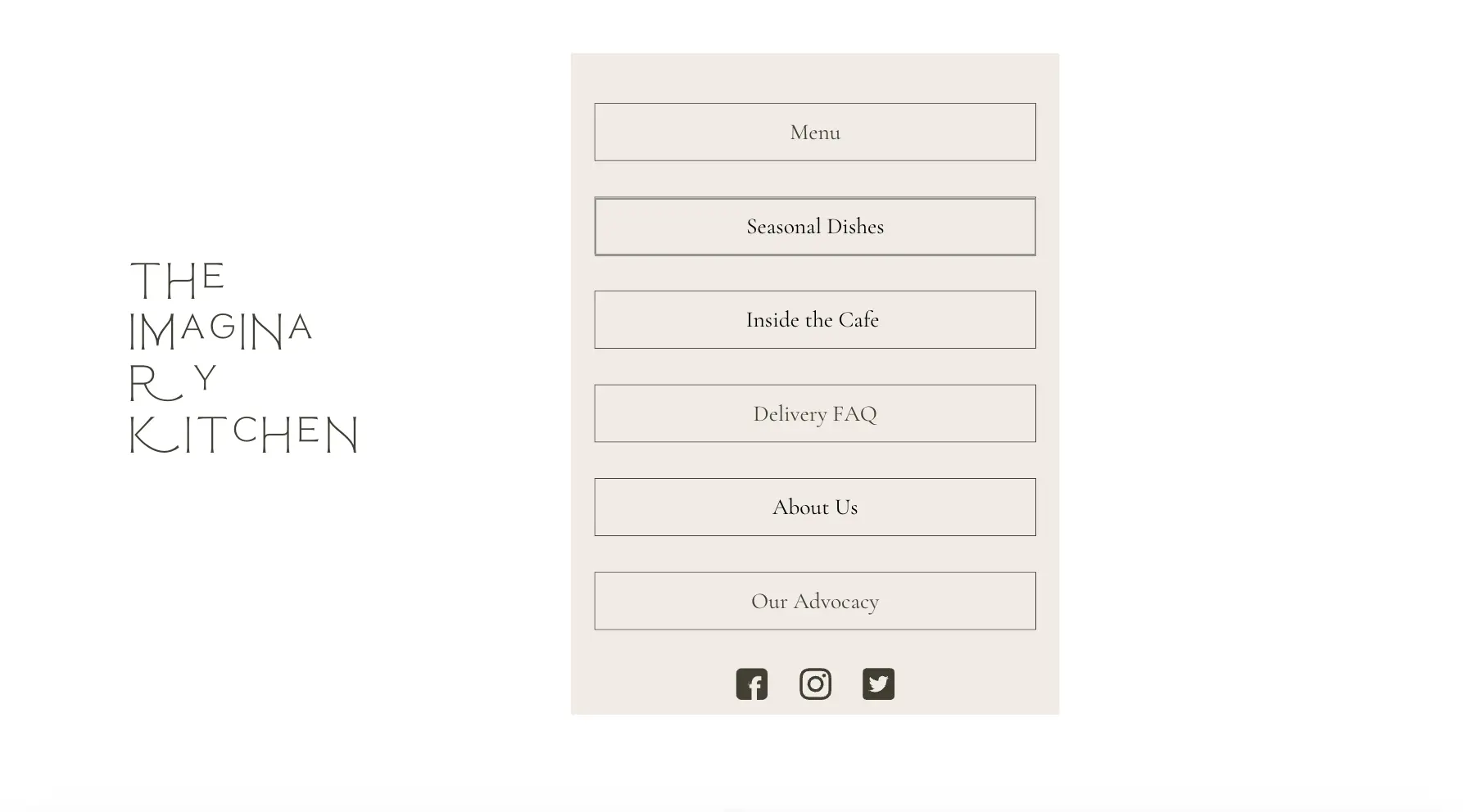
Consider the following image:

The button ‘Seasonal Dishes’ has keyboard focus. Although the appearance of the button changes slightly, it is hard to differentiate it from the background.
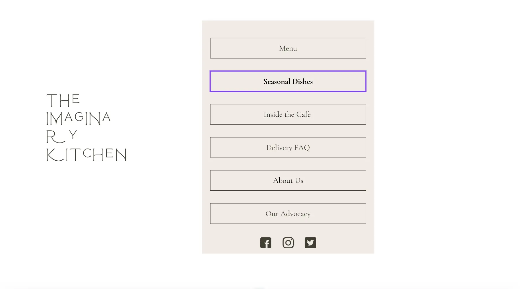
In contrast, consider the following image:

Here, the button ‘Seasonal Dishes’ gets a bright purple background when it receives keyboard focus. This contrast from the grey background and the bold text makes it easy for a user to identify that the button has keyboard focus.
In the following example code, it is not easy to visually identify if the button has keyboard focus. This is because it doesn’t have a border (outline: none) when it receives focus.
<!DOCTYPE html>
<html lang="en">
<head>
  <meta charset="UTF-8">
  <meta name="viewport" content="width=device-width, initial-scale=1.0">
  <title>Keyboard Focus Button</title>
  <style>
    body {
      font-family: Arial, sans-serif;
      display: flex;
      justify-content: center;
      align-items: center;
      height: 100vh;
      margin: 0;
      background-color: #f9f9f9;
    }
    .no-border-button {
      background-color: #007bff;
      color: white;
      padding: 10px 20px;
      font-size: 16px;
      border: none;
      border-radius: 5px;
      cursor: pointer;
    }
    .no-border-button:focus {
      outline: none;
      background-color: #0056b3;
    }
    .no-border-button:active {
      background-color: #0056b3;
    }
  </style>
</head>
<body>
  <button class="no-border-button">Click Me!</button>
</body>
</html>
The following sample code corrects the issue in the earlier example:
<!DOCTYPE html>
<html lang="en">
<head>
  <meta charset="UTF-8">
  <meta name="viewport" content="width=device-width, initial-scale=1.0">
  <title>Keyboard Focus Button</title>
  <style>
    body {
      font-family: Arial, sans-serif;
      display: flex;
      justify-content: center;
      align-items: center;
      height: 100vh;
      margin: 0;
      background-color: #f9f9f9;
    }
    .focus-button {
      background-color: #007bff;
      color: white;
      padding: 10px 20px;
      font-size: 16px;
      border: none;
      border-radius: 5px;
      cursor: pointer;
      transition: outline-offset 0.2s ease-in-out;
    }
    .focus-button:focus {
      outline: 4px solid #ff5722;
      outline-offset: 4px;
      box-shadow: 0 0 0 4px #ffeb3b;
    }
  </style>
</head>
<body>
  <button class="focus-button">Click Me!</button>
</body>
</html>
The following features help to distinguish the button whenever it receives focus:
- A bright orange (#ff5722) outline for the border.
- A yellow (#ffeb3b) shadow effect.
- An outline-offset for visual separation from the button.
How to fix?
Follow these steps to fix any violations in the keyboard-focus-visible rule:
- Add a visible border when an element receives keyboard focus. A contrast ratio of 3:1 between the focussed and non-focussed states is ideal.
- Use a contrasting two-color focus indicator to ensure visibility on both light and dark backgrounds.
- Use the default browser focus indicator to highlight elements in focus.
Reference
We're sorry to hear that. Please share your feedback so we can do better
Contact our Support team for immediate help while we work on improving our docs.
We're continuously improving our docs. We'd love to know what you liked
We're sorry to hear that. Please share your feedback so we can do better
Contact our Support team for immediate help while we work on improving our docs.
We're continuously improving our docs. We'd love to know what you liked
Thank you for your valuable feedback!
