
Insights - Keys Wins & Focus Areas
Learn how to enhance testing performance using Key Wins and Focus Areas. Identify successes, spot improvements, and analyze team metrics.
The Insights feature in Quality Dashboard provides a comprehensive view of your organization’s performance. It highlights Key Wins for positive trends and Focus Areas for metrics that need improvement. Each insight includes a summary of the trend, a visualization chart with team filters, team-wise comparisons, and detailed resolutions or impacts.
View Insights
To view insights on Quality Engineering Insights:
- Go to Quality Engineering Insights.
- On the Home page, locate Key Wins or Focus Areas.
- Click See all.
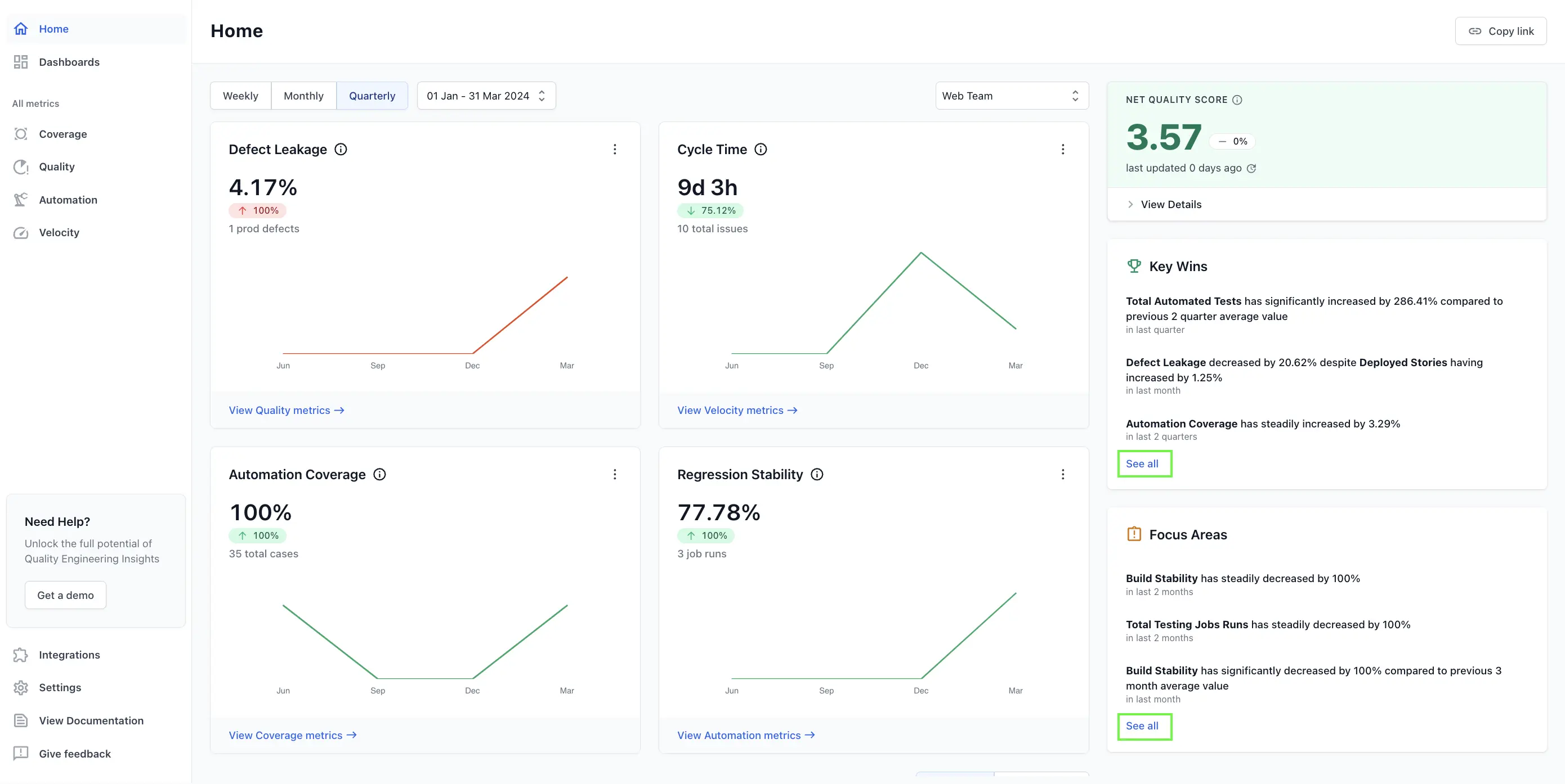
- On the Insights page, you can switch between the following two tabs:
- Key Wins: Highlights the areas where performance is strong.
- Focus Areas: Highlights the areas that require improvements.
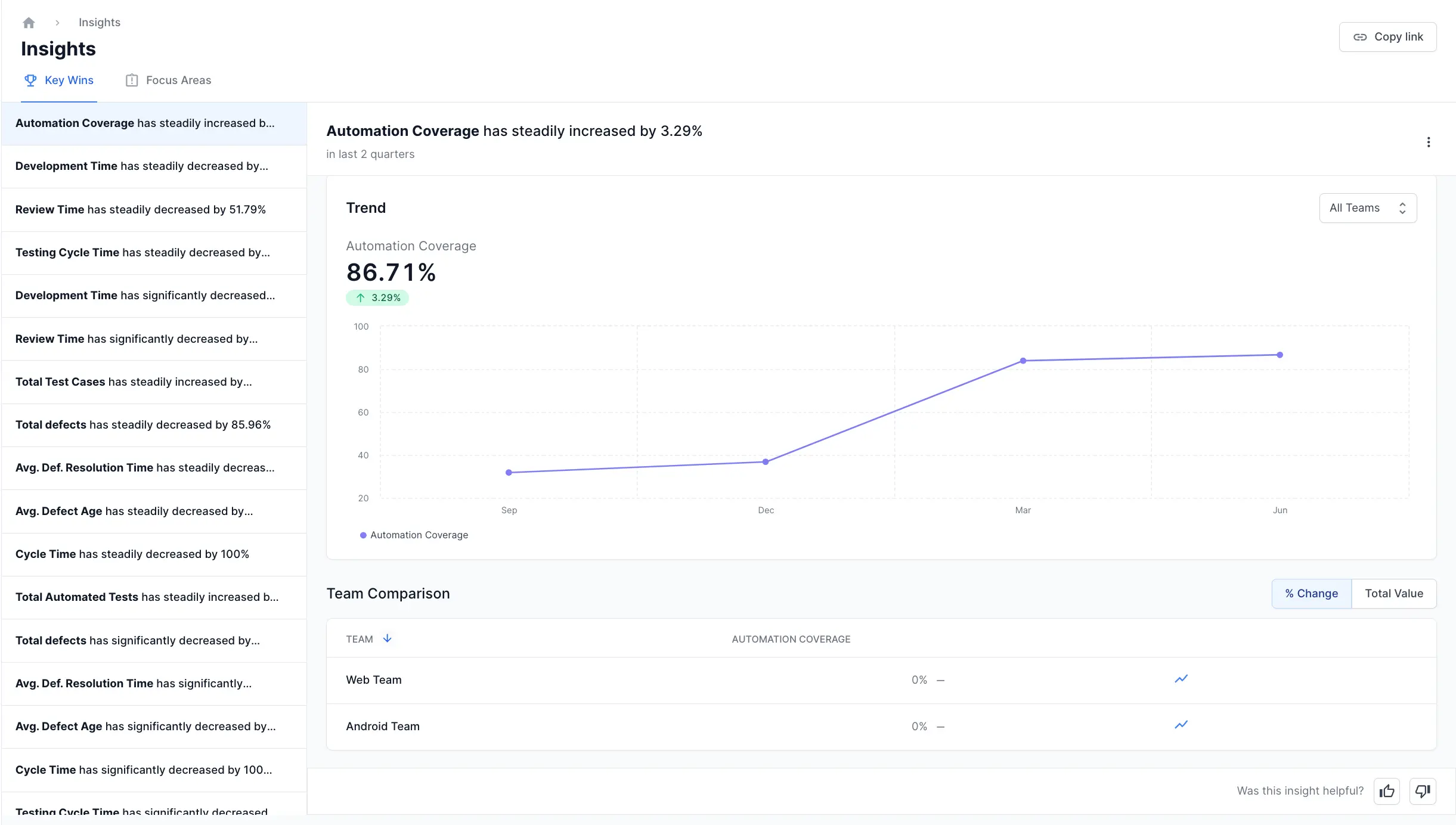
Key Wins
Showcases significant successes in automation coverage, defect management, and other critical performance indicators. For example, the Average Defect Resolution Time has decreased. This indicates that your team is resolving issues more quickly which is significant achievement for the team.
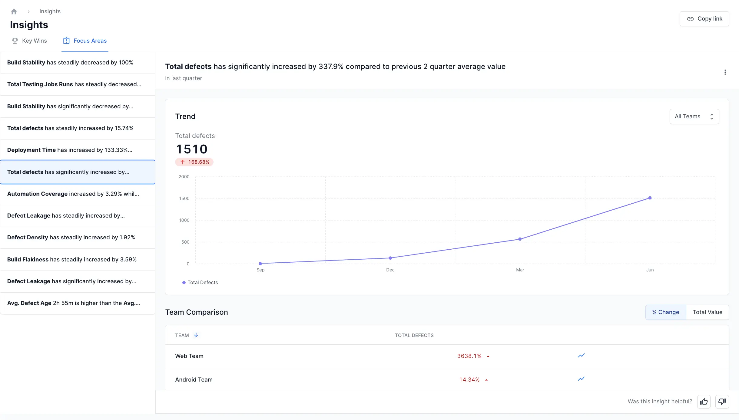
Focus Areas
This helps in identifying critical issues that need attention. For example, if Defect Leakage increases, it means more issues are being discovered after release. This highlights the need to improve the testing process to catch more issues before they reach customers.
Components of Key Wins & Focus Areas
Both Key Wins and Focus Areas provide the following visual representation:
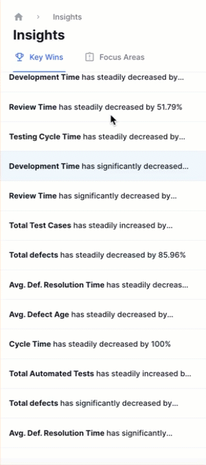
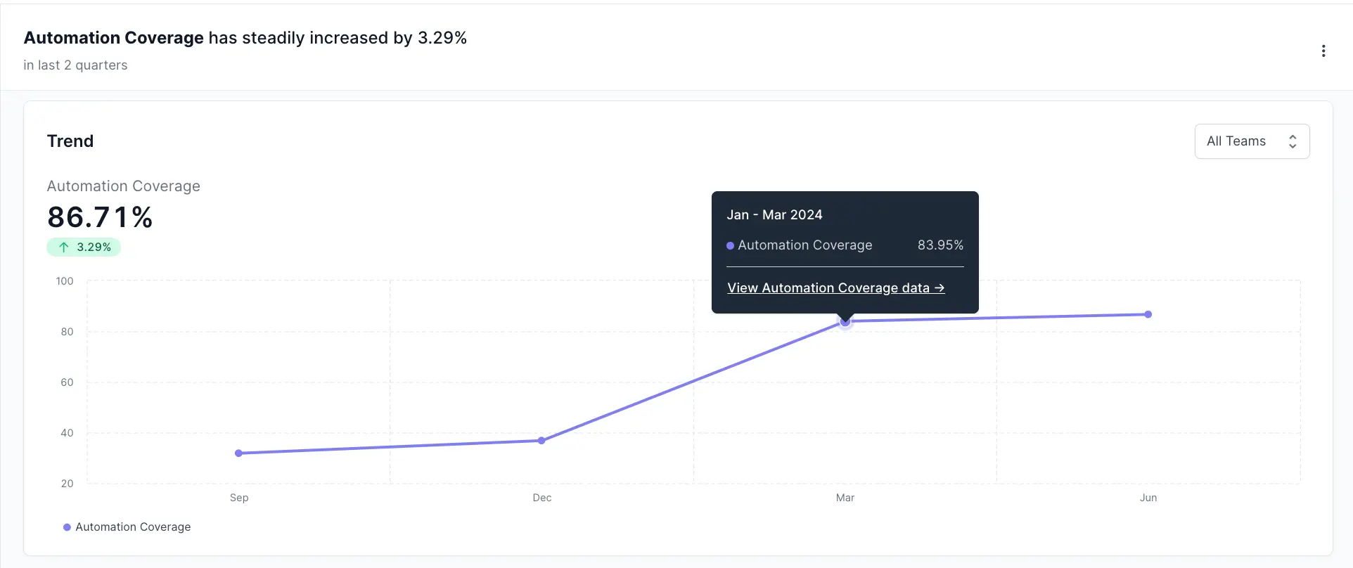
- Metric Performance List: Provides a quick list overview of key metrics, highlighting trends over specified time periods - weekly, monthly, quarterly. You can select one of the metric to view trends. Learn more about metrics here.
-
Trend chart: Shows the changes in metrics over time. You can identify spikes or drops in data. This allows a better understanding of trends and performance. Click the datapoints to view more details. The Teams drop-down allows you to view trends for each team or view combined data for all teams.
-
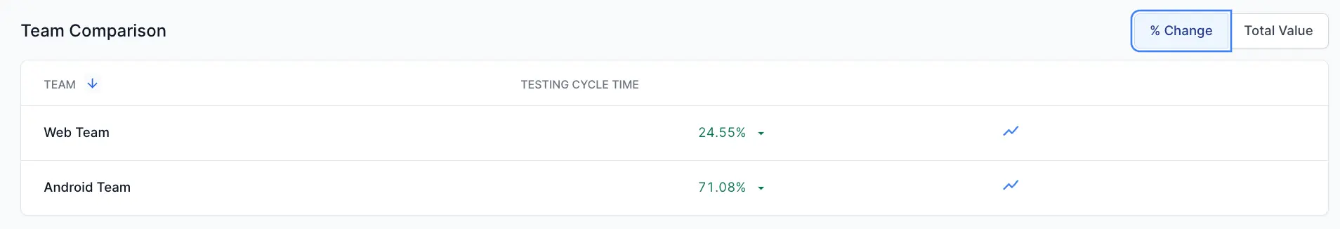
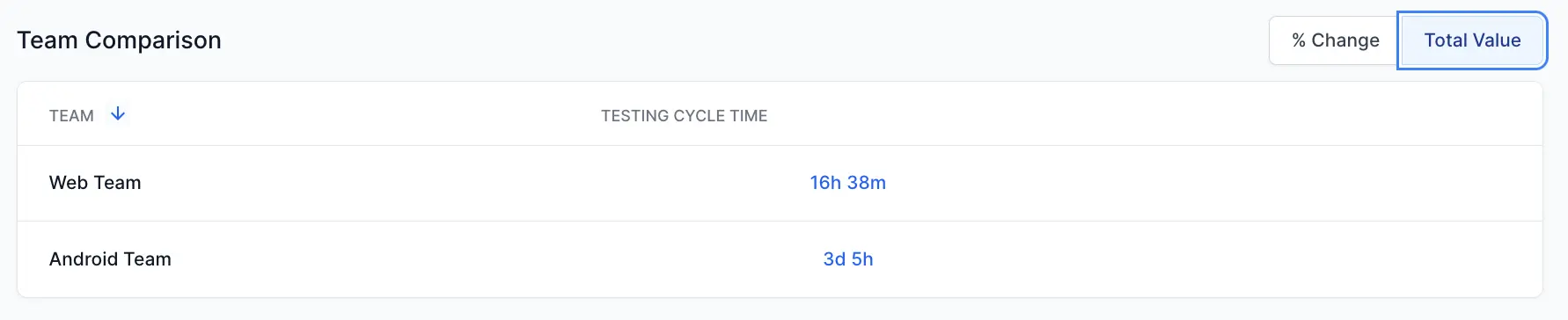
Team Comparison: Provides a comparative analysis of team-wise metrics. This comparison helps pinpoint which teams are contributing most to the overall trend, providing insights for targeted improvements. It includes the following two tabs:
-
% Change: Shows percentage changes for the metric for each team. It highlights the increase or decrease in metrics.
-
Total Value: Displays the total values related to the metric for each team.
-
-
Details: Provides a brief summary of how a metric has changed over time. It provides resolutions for focus areas and positive impacts in case of key wins.

We're sorry to hear that. Please share your feedback so we can do better
Contact our Support team for immediate help while we work on improving our docs.
We're continuously improving our docs. We'd love to know what you liked
We're sorry to hear that. Please share your feedback so we can do better
Contact our Support team for immediate help while we work on improving our docs.
We're continuously improving our docs. We'd love to know what you liked
Thank you for your valuable feedback!