UI testing ensures that applications not only function well but also deliver a smooth, consistent user experience across browsers, devices, and screen sizes. However, testers often encounter recurring UI issues that can break workflows, frustrate users, and hurt business credibility.
Overview
The 5 Most Common UI Issues in Testing of Web and Mobile Applications
- Cross-Browser Adaptability: Inconsistent rendering across Chrome, Firefox, Safari, or older versions.
- Form Validation Bugs: Input fields failing on invalid characters, max-length limits, or password rules.
- Usability Flaws: Poor navigation or missing key features frustrate users.
- Page Layout Inconsistencies: Broken responsiveness across devices and screen sizes.
- Broken UI Elements: Non-functional buttons, fields, or links leading to app crashes.
UI Testing Checklist to Identify and Prevent Common Issues
- Validate brand consistency: fonts, colors, spacing, and button styles.
- Review typography, spelling, and grammar for readability.
- Test interactive elements like menus, forms, and CTAs for proper behavior.
- Confirm responsiveness across multiple devices, screen sizes, and orientations.
- Monitor navigation speed and performance of critical UI components.
This article explains the 5 most frequent UI issues in testing and provides a practical checklist to help QA teams catch and fix bugs before release.
Most Common Bugs or UI Issues in Web Applications
Here is the list of the most common bugs or UI issues in web applications:
- Cross Browser Adaptability Bugs
- Form Validation Bugs
- Usability Bugs
- Inconsistencies in the Page Layout across Devices
- Broken UI Elements leading to Misbehaviour
Cross Browser Adaptability Bugs
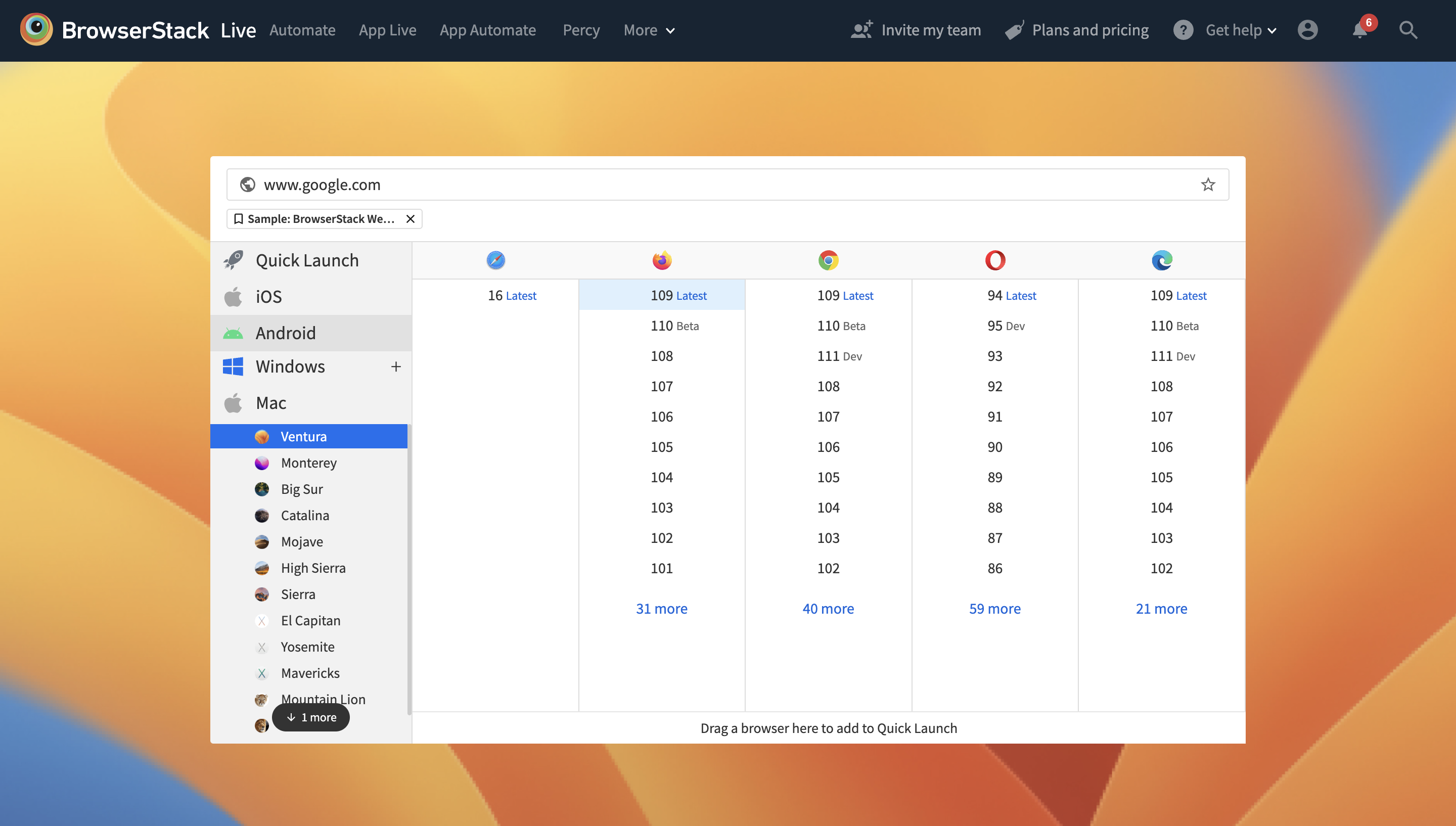
If a web app is not tested for cross-browser compatibility, it may lead to a bad user experience and eventually result in revenue loss. Hence, QAs must perform browser compatibility testing for their web applications using test automation frameworks like Selenium. This helps ensure that their web apps are easily accessible by users across multiple browsers. It also allows users who might be using older browser versions to use a web app with no issues.
Read More: How to Test on Older Browser Versions
BrowserStack offers QAs the ability to perform cross browser testing on real browsers like Chrome, Firefox, Safari, etc., including their older versions. Sign up for free, and start testing.
Form Validation Bugs
These bugs are often overlooked as they are considered a low priority. In this case, a form might misbehave or throw errors if invalid characters are entered in the validation fields. Surpassing the maximum length of an input field also leads to a grave UI issue.
Developers must follow certain practices to avoid a malfunction while setting up the validation logic. Best practices include:
- Limiting the number of characters for specific fields like Zip Code, ID, and Telephone numbers. For example, You can restrict the maximum length of the Zipcode field to 6 digits. Care must also be taken to ensure that certain countries (like the UK) have alpha-numeric Zip codes, which should be permitted.
- Defining the maximum length of the alpha-numerical password a user can set. Pre-define if special characters are supported. For example, for users to set strong passwords, the password policy can be as follows:
- The password should be alpha-numerical
- The password must contain a minimum of 6 characters and a maximum of 15 characters.
- Password must have a special character like @, ! or ().
Following the practices above, developers can ensure that the most common bugs in web applications are avoided and provide enhanced data integrity.
Usability Bugs
If the developed web application is not user-friendly, it might be annoying for end-users. If users cannot easily access the application’s critical functionalities, it translates to a bad user experience. All key functionalities or features must be available on the home page or main menu.
Easy navigation helps users understand all key features of the application and also enhances the user experience. Developers should design in a way that facilitates an easy understanding of the app architecture for the user. You can do this by providing quick tutorials when a user explores the app for the first time or by providing a Help section.
Inconsistencies in the Page Layout across Devices
Web applications tend to suffer from rendering inconsistencies when accessed through devices with different screen sizes. Such bugs might lead to the loss of potential customers and revenue, especially in the case of e-commerce sites or apps. Hence developers must conduct or access research on the mobile-browser combinations used by the target audience. Then accordingly, they can focus on testing and optimizing for those mobile devices and browsers.
This ensures that the web app is responsive across multiple devices like tablets, smartphones, desktops, etc. Teams can use tools like a Responsive checker to ensure that their page layouts are consistent and flawless across devices.
Broken UI Elements leading to Misbehaviour
Dysfunctional UI elements like buttons or text fields might remain uncovered during initial testing. However, these bugs are critical and can damage the web app’s functionality if not eliminated early. Such bugs might end up crashing an entire mobile or web application. For example, an ‘Update Profile’ button in the profile settings may not be functional, and repeated clicks might crash the app.
Also Read: How to test in real user conditions
Teams must verify that every site component is thoroughly tested before launching it. The list of bugs detailed above can offer QAs some awareness of what bugs to look out for to identify and debug easily and quickly. This streamlines the testing process, resulting in better time, effort, and resource management in the overall development span.
I am text block. Click edit button to change this text. Lorem ipsum dolor sit amet, consectetur adipiscing elit. Ut elit tellus, luctus nec ullamcorper mattis, pulvinar dapibus leo.


