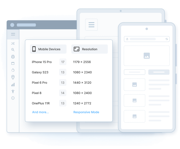
Screen Resolution Testing
Instantly test your website on different screen resolutions across the latest Android and iOS devices, like iPhone, Pixel, Samsung Galaxy, and more.

Trusted by more than 50,000 customers globally
Features
Replace your device labs
Devices are available for everyone, all the time, without any setup. View all mobile features.
Test website resolutions
Check your site across device sizes, viewports and screen resolutions. Test now.
Frequently Asked Questions
Screen resolution testing refers to testing or validating the appearance of websites across numerous devices (desktops, tablets, mobiles) having different screen resolutions. It helps ensure that web pages render accurately and viewers get an optimized browsing experience when they access websites from different device-browser combinations.
Screen resolution testing of a website requires monitoring website appearance on multiple real devices (mobile and desktop). However, it is not feasible for all individual QAs or teams to set up an extensive device lab just to perform testing on different screen resolutions.
An easy way to address this challenge is to use a cloud-based testing tool like BrowserStack’s Responsive Checker. Simply enter the URL of their website under test into the address bar and click on Check. The tool will instantly load the website across multiple real and latest devices(iPhone X, Galaxy Note 10, iPad pro, Windows, Mac OSX) with varied screen resolutions – 375×812, 412×869, 1280×1024, and more.
For comprehensive screen resolution testing, use BrowserStack Live. Its real device cloud provides teams with 3000+ real devices & browsers. Simply sign up for a free trial or opt for a suitable plan and start with screen resolution testing on desired device-browser combinations. No complex setup involved. Testers can also interact with web elements and perform scroll and pinch or zoom operations to mimic end-user activity in the real world.
Testing website resolution on emulators or simulators is not as effective in delivering accurate results compared to testing on real devices. This is because emulators and simulators are software programs that mimic the functionality of real devices up to a great extent. However, they can not match the performance of an actual device as there are binary translations involved while using them that make them slower.
Moreover, finding and installing emulators for every device, particularly the ones that are recently launched is extremely difficult. Given this, it is better to opt for a tool that offers real devices for instant testing.
Listed below are key advantages of performing screen resolution testing on real devices:
- Instantly test website in different screen sizes and resolutions
- Discover visual bugs for specific resolutions faster
- Gain accurate test results every time
The responsive tool helps testers instantly view a website across different device types (smartphones, tablets, desktops) with distinct screen resolutions. Users simply need to enter the URL, and the tool immediately loads the website across the available device screens.
Users can also scroll the entire website on the desired device from the available devices. Additionally, they can also view their websites in Portrait and Landscape modes on these devices.
Individual developers and teams prefer conducting screen resolution testing of websites on BrowserStack for multiple reasons:
- Teams get instant access to 3000+ real devices and browsers for comprehensive screen resolution testing
- Teams or individual user do not need to worry about any complex set up or configurations
- All real devices are hosted in a secured cloud, and one can access them remotely 24×7 at their convenience
- Using BrowserStack Live, one can also interact with the website on a particular device apart from just viewing it to understand how the different pages and elements render on the different screen sizes.
With BrowserStack Live, users can check websites on different resolutions in four easy steps –
- Log in to your BrowserStack Live account. If you don’t already have an account, sign up for free.
- Navigate to the Live dashboard.
- Select the real device-browser combination on which to test the website. Since these are real devices, you will be able to see how the site renders on that particular device resolution.
- If you choose a desktop device (based on selected OS) to test on, the Options menu will display a provision to change screen resolution. Use it to resize the resolution from the same device.
- Once the site opens on that particular device, browse through it to check how it works on that device.
Repeat the process with as many real devices to check how the website responds to different resolutions – all in real-time.
Another quick approach to check the website on multiple resolutions, is to use the Responsive Checker tool.
Your website is accessed by users from different mobile and desktop devices. Hence, to ensure the website is rendered evenly, it is essential to test on real devices with different screen resolutions to deliver a seamless user experience.
