CSS Subgrid: What is it and Why do you need it
By The Nerdy Geek, Community Contributor - December 3, 2024
CSS Subgrid is an extension of the CSS Grid Layout, designed to address limitations in nested grid structures.
While CSS Grid revolutionized web design with its two-dimensional layout system, Subgrid takes it further by enabling nested elements to align seamlessly with their parent grid.
This feature simplifies complex layouts and ensures consistent alignment, making web design more efficient and responsive.
This article explores the concept of CSS Subgrid and its importance.
- What are CSS Grids?
- What are CSS Subgrids?
- Advanced Layout Features with CSS Subgrids
- Subgrid for Columns
- Subgrid for Rows
- Subgrid in Both Dimensions
- No Implicit Grid in Subgridded Dimensions
What are CSS Grids?
CSS Grids is a two-dimensional layout system introduced to streamline the creation of grid-based structures in web design.
Unlike CSS Flexbox, which operates in a single direction (either row or column), CSS Grids span both axes, enabling precise placement of elements across rows and columns. This functionality simplifies the process of creating structured, responsive layouts and reduces reliance on outdated methods like floats and positioning.
However, while CSS Grids revolutionized layout design, they encountered limitations when handling nested grids within a grid-based layout.
What are CSS Subgrids?
CSS Subgrids were introduced to address the challenges of nested grids in complex designs. Subgrids allow child grid items to inherit and align directly with the rows and columns of a parent grid, ensuring consistent alignment and layout across nested elements.
With this feature, there is no need for manual adjustments in nested grids, making it easier to design, manage, and maintain intricate grid-based layouts.
By resolving the complexities of nested structures, CSS Subgrids enhance the capabilities of the CSS Grid system for modern web development.
Advanced Layout Features with CSS Subgrids
CSS Subgrids introduce advanced capabilities for layout management, solving many of the limitations inherent in nested grids. By inheriting track definitions directly from the parent grid, Subgrids ensure precise alignment and consistency, even in complex layouts. They are particularly useful for creating responsive and scalable designs.
Below are some examples demonstrating the use of CSS Subgrids in different scenarios.
Subgrid for Columns
Subgrid enables child elements to inherit the column tracks of a parent grid. Below, a grid layout is created with nine equal-width columns and four rows, each at least 100px tall. The .item spans multiple columns and rows and is itself defined as a subgrid for columns, allowing .subitem to align seamlessly within it.
html
<div class="grid">

  <div class="item">

    <div class="subitem"></div>

  </div>

</div>
css
.grid {

  display: grid;

  grid-template-columns: repeat(9, 1fr);

  grid-template-rows: repeat(4, minmax(100px, auto));

}


.item {

  display: grid;

  grid-column: 2 / 7;

  grid-row: 2 / 4;

  grid-template-columns: subgrid;

  grid-template-rows: repeat(3, 80px);

}


.subitem {

  grid-column: 3 / 6;

  grid-row: 1 / 3;

}
Subgrid for Rows
Here, rows are defined as a subgrid, while columns follow a standard grid layout. This configuration ties the rows of the child grid to the tracks of the parent grid, maintaining alignment.
html
<div class="grid">

  <div class="item">

    <div class="subitem"></div>

  </div>

</div>
css
.grid {

  display: grid;

  grid-template-columns: repeat(9, 1fr);

  grid-template-rows: repeat(4, minmax(100px, auto));

}


.item {

  display: grid;

  grid-column: 2 / 7;

  grid-row: 2 / 4;

  grid-template-columns: repeat(3, 1fr);

  grid-template-rows: subgrid;

}


.subitem {

  grid-column: 2 / 4;

  grid-row: 1 / 3;

}
Subgrid in Both Dimensions
A subgrid can be defined for both rows and columns, binding the layout entirely to the parent grid. This ensures alignment across both dimensions.
html
<div class="grid">

  <div class="item">

    <div class="subitem"></div>

  </div>

</div>
css
.grid {

  display: grid;

  grid-template-columns: repeat(9, 1fr);

  grid-template-rows: repeat(4, minmax(100px, auto));

}


.item {

  display: grid;

  grid-column: 2 / 7;

  grid-row: 2 / 4;

  grid-template-columns: subgrid;

  grid-template-rows: subgrid;

}


.subitem {

  grid-column: 3 / 6;

  grid-row: 1 / 3;

}
No Implicit Grid in Subgridded Dimensions
Subgrids do not automatically create additional tracks. In the example below, if there are more items than the subgrid tracks can accommodate, they overflow into the last defined track.
html
<div class="grid">

  <div class="item">

    <div class="subitem">1</div>

    <div class="subitem">2</div>

    <div class="subitem">3</div>

    <div class="subitem">4</div>

    <div class="subitem">5</div>

    <div class="subitem">6</div>

    <div class="subitem">7</div>

    <div class="subitem">8</div>

    <div class="subitem">9</div>

    <div class="subitem">10</div>

    <div class="subitem">11</div>

    <div class="subitem">12</div>

  </div>

</div>
css
.grid {

  display: grid;

  grid-template-columns: repeat(9, 1fr);

  grid-template-rows: repeat(4, minmax(100px, auto));

}


.item {

  display: grid;

  grid-column: 2 / 7;

  grid-row: 2 / 4;

  grid-template-columns: subgrid;

  grid-template-rows: subgrid;

}
To allow for additional tracks, remove the grid-template-rows definition and use grid-auto-rows.
css
.item {

  display: grid;

  grid-column: 2 / 7;

  grid-row: 2 / 4;

  grid-template-columns: subgrid;

  grid-auto-rows: minmax(100px, auto);

}
Importance of CSS Subgrids
Below are the key reasons of why you need CSS subgrids:
- Improved Grid Relationship: CSS Subgrids allow child grids to inherit the track structure from the parent grid, avoiding the issue of independent grid behavior in nested grids.
- Simplified Maintenance: Unlike nested grids that require managing two separate grids, subgrids provide a more streamlined approach, reducing complexity and maintenance.
- Enhanced Responsiveness: Subgrids solve responsiveness issues in nested grids, ensuring websites are flexible and fast, especially on mobile devices.
- Better Layout Control: Subgrids offer more precise control over element positioning, making complex layouts more efficient and adaptable.
How Does CSS Subgrid Work: Example
Element positioning was one of the major CSS challenges that initially seemed to be solved by using CSS Grids, which was the first true two-dimensional layout system. On the contrary, CSS Flexbox was a one-dimensional layout system, but overall both helped position the elements in a predefined grid-based layout.
Still, one unsolved use case of nested elements was to be aligned with the outer grid, which was finally solved by CSS Subgrids. Subgrid introduced an intuitive approach to aligning all items that are nested on multiple levels to a single outer grid.
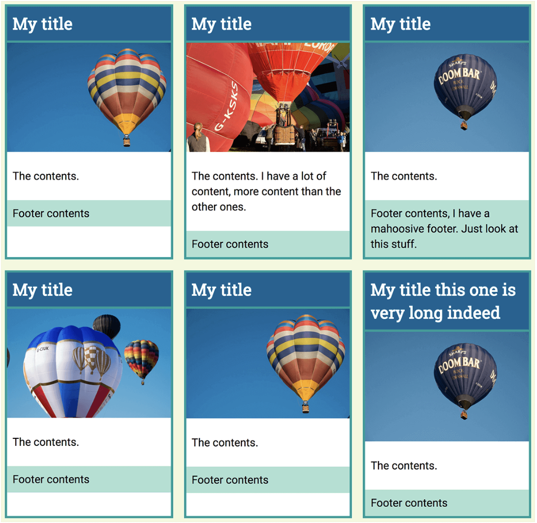
This can be understood better with an example taken from Mozilla hacks: see the following card image showing a layout built with nested grids (using multiple grid properties).
In this layout, the underlying issue becomes apparent. The third grid has a caption longer than the others. As a result, the row for that particular heading adjusts independently, causing uneven space due to the row above it.
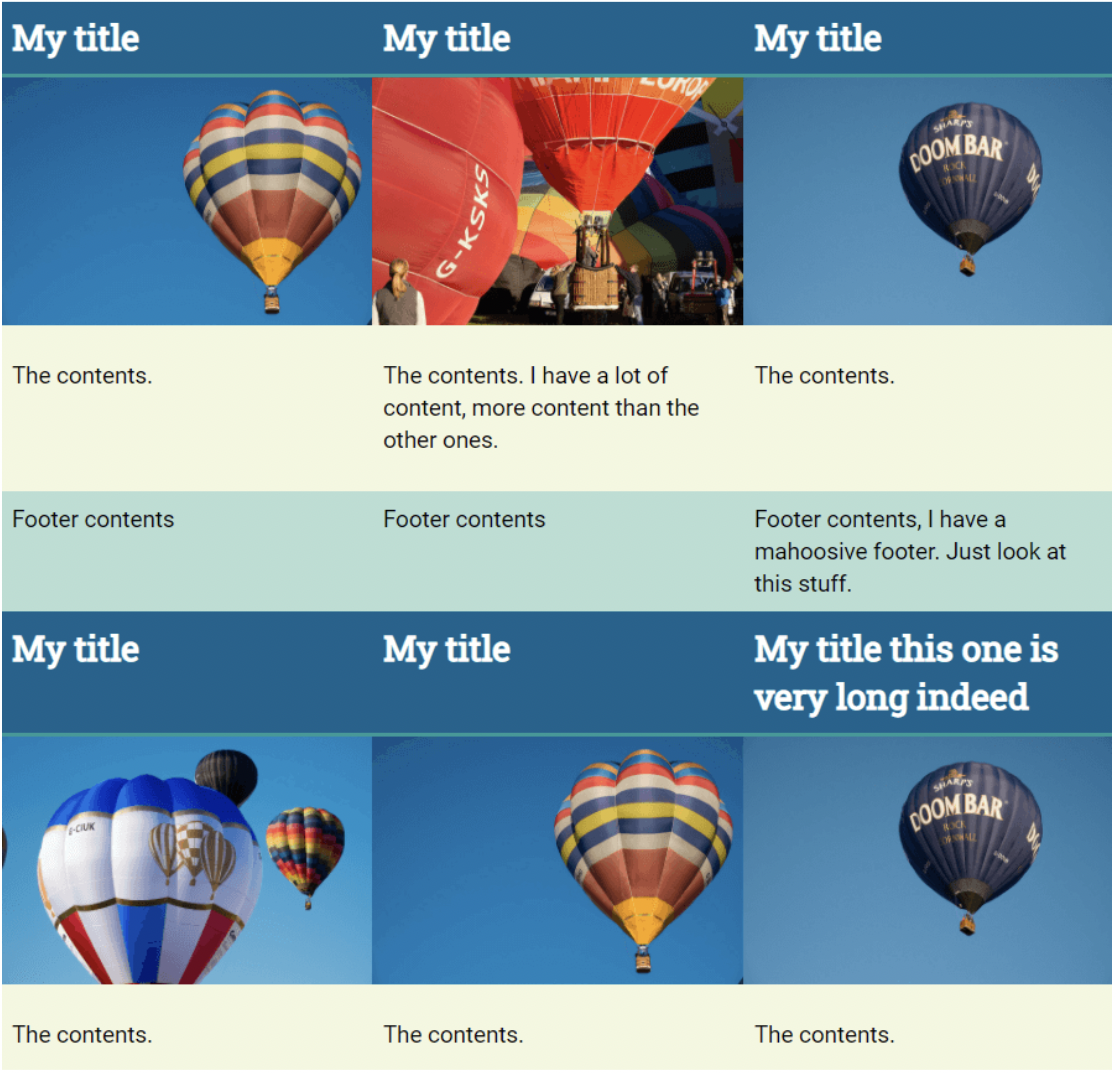
Now, when the same layout is designed using the CSS Subgrid property, the space is adjusted evenly, looking clean and consistent.
The space is automatically adjusted based on the parent’s reference, eliminating the need for extra JavaScript code. This is how CSS Subgrids make complicated website designs flawless.
Interesting Read: How to Create Browser-Specific CSS Code
How to create a simple CSS Subgrid
Below are the steps to help you create a simple CSS Subgrid
Step 1 – Create the main grid container, its grid item, and subgrid items, as seen below.
<div class="main-grid-container">
<div class="grid-item">
<div class="subgrid-item"></div>
<div class="subgrid-item"></div>
</div>
</div>
.main-grid-container {
display: grid;
}
Step 2 – Make the grid item a grid container using the code below.
.grid-item {
display: grid;
}
Step 3 – Create a subgrid inside the grid item, turning it into a grid container.
.grid-item {
display: grid;
grid-template-columns: subgrid;
grid-template-rows: subgrid;
}
So this way, without explicitly defining column and row tracks, you can establish subgrids, and grid definition was inherited from the .main-grid-container. This way, instead of explicitly defining column and row tracks, a subgrid was established, and grid definition was inherited from the .main-grid-container.
Browser Compatibility with CSS Subgrids
In today’s digital world, with easy access to different browsers, desktop and mobile devices, users can access web applications on the go anywhere, anytime. Browser compatibility is essential to deliver a consistent user experience as they operate across different browsers, platforms, and devices.
Imagine you have tested your application using Chrome; however, the end user is using Firefox and encounters some major glitches while using the application in Firefox. Issues like these can be easily discovered and rectified if we adopt Browser Compatibility tests in our Test Cycle. With CSS Subgrids, it even becomes more crucial to support cross-browser compatibility tests owing to the reason it solves the problem of nested grids.
Try Cross Browser Testing on Real Devices
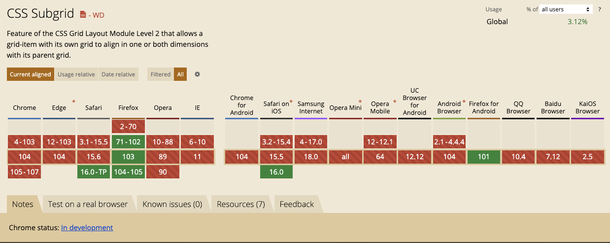
Whether CSS Subgrids is supported by the browser versions or not is essential to understand so that these features can be leveraged to offer a seamless experience. The browser versions’ support for various features is analyzed using Caniuse.com as shown below:
It can be clearly observed from the image below that Safari, Firefox, Firefox for Android, and Safari on iOS offer the support for CSS Subgrid; however, still most of the browser versions of Chrome, Edge, Opera, and IE don’t provide the support for CSS Subgrid. Hence it is important to tweak the CSS code in such a way that the user experience remains consistent across different browsers.
This clearly emphasizes how the Browser Compatibility tests are much pivotal in the entire test cycle for any websites based on CSS Subgrid, as this will ensure a seamless user experience across any supported browsers.
But, maintaining a lot of devices and browsers is not a cakewalk and can cost a lot of time and effort. However, with BrowserStack you can get rid of the task of maintaining those devices and can actually focus on the testing cycle.
Conclusion
BrowserStack’s Real Device Cloud allows access to a fleet of 3500+ desktop browsers and real mobile devices, providing wide coverage for Cross Browser & Platform Testing. One can also leverage the power of automation testing to check cross-browser compatibility over the BrowserStack’s real device cloud, saving both time and cost incurred. This allows developers and QAs to build applications to retain and delight users through its seamless user experience.
