Website User Experience (UI/UX) Checklist
By Somosree Roy, Community Contributor - November 28, 2024
UI and UX are often used in tandem regarding website visuals. Both are critical considerations to ensure the website visualization is correct, even though each has its strong stand and relevance. With websites getting more complex in visuals, layers, and functionality, avoiding common web design mistakes is paramount for ensuring the seamlessness of its prelaunch is a prerequisite.
“User Interface” and “User Experience” are two entirely different components equally crucial to designing and building a fantastic website.
- The user experience (UX) is about how a person feels when using your website or application.
- In contrast, the user interface (UI) is typically tied to the web portal’s aesthetic and functional design.
This comprehensive checklist explains the importance of various UI/UX features and improvises over multiple iterations during development and testing.
Website UI/UX Checklist
As a quick run-through, how do you expect a website to look? It should have:
- Good Home page navigation
- Legible content
- Wonderful visuals
- Convenient and effective layout
- Conducive contact form
Even if a developer, web content writer, and designer have done their part, an UI/UX tester must conduct visual testing to ensure the entire website is packed well from all fronts. That’s when teams have done their part and cleared off everything to go ahead in the UI/UX mockup stage.
With a complete web application checklist already in place for your guidance, let’s take you through a website’s UI/UX checklist through 9 comprehensive checkpoints.
1. Content Reigns Supreme
In terms of both users and search engines, content is one of the key elements of modern web design. Users want text that honestly answers their questions and is food for thought for their searches. Search engines are constantly on the lookout for new and original content.
This list will assist you in improving the content for the user experience:
- Content is original and not plagiarized. It provides genuine value to users’ inquiries.
- Content should be explicit and attractive to the eye
- Easy to read and composed in a simple language
- Use appropriate headings, subtitles, and paragraph structures
- Utilize visual content marketing
- Appropriate internal linking
2. Homepage Design
The homepage of your website is the first and most significant page visitors notice. The most crucial information must be displayed on the website’s home page, much as important news is featured on the front page of newspapers. Users are encouraged by design to explore the website more.
Here are vital suggestions to create a unique and functional home page for your website:
- Simple to comprehend homepage design
- Use of pertinent, high-res photos and videos
- Include links to each subpage
- Clearly state the business location and contact information
- All significant updates/changes are visible on the home page
- Have a distinct call to action (CTA)
- Provide a link to the terms and conditions and privacy page
- On all devices and browsers, the page loads quickly and as intended in the UI/UX framework
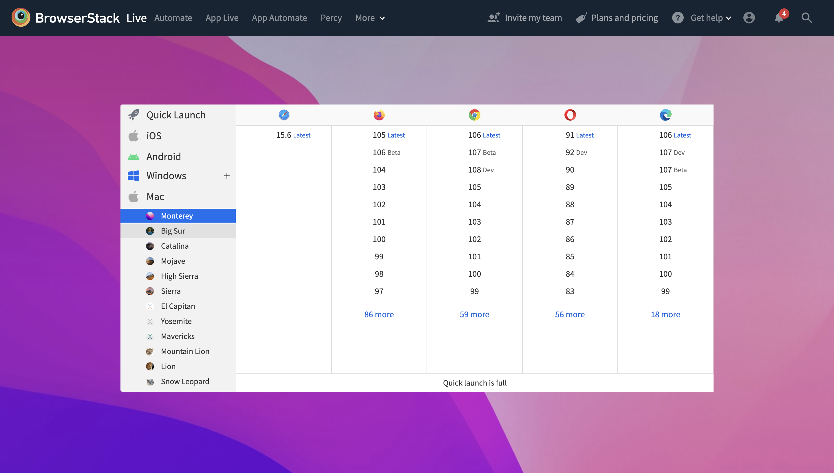
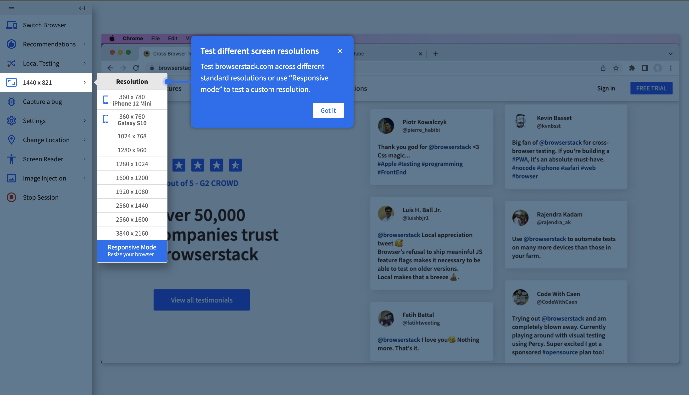
The initial free testing on BrowserStack Live lets you test your website across multiple device-browser-OS combinations.
Easily toggle between browser combinations and screen resolutions your users will most likely frequently use for visiting your website.
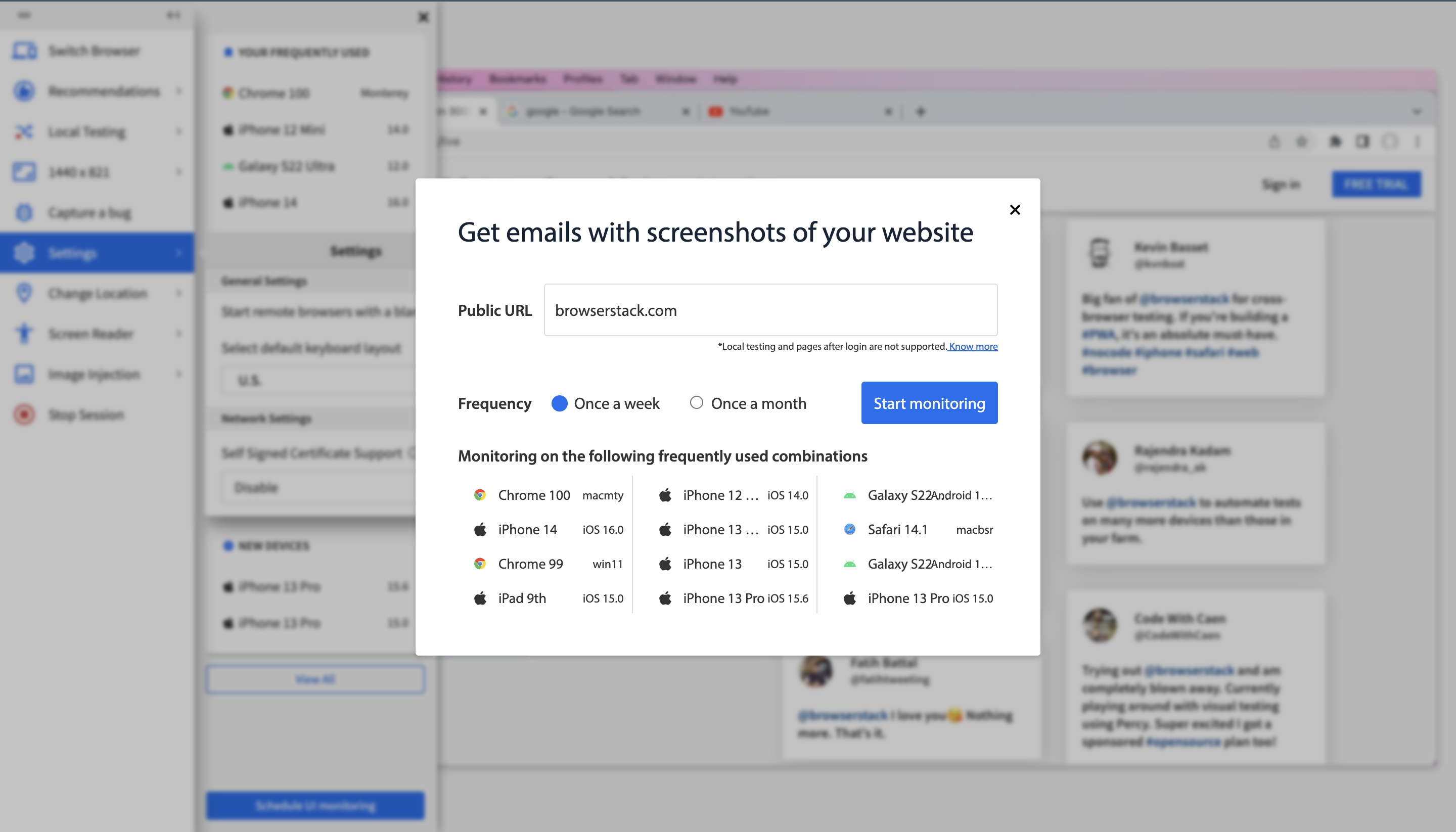
Also, schedule UI monitoring for effective website updates to release quality and bug-free experiences.
Once your free trial exhausts, check out the value-for-money pricing plans calibrated according to different needs and testing requirements.
3. Website Layout
Designing the layout users want to view requires understanding user perception and interest. Any website’s layout is its foundation. Once you know user interests, you may take the steps below to ensure you have created the ideal layout for your intended audience.
- It has a responsive web design.
- Important information appears first.
- All content and images are displayed in suitable pixels.
- Users see fewer or relevant pop-ups only.
- Variety of sign-in options with a consistent design and content.
- Include links to relevant pages.
Whether it’s native or hybrid software on Android or iOS, you must test device viewports in different screen resolutions to provide the best UI compliance.
Read More: How to create a Responsive Website
4. Website Navigation
Users move between pages of a website using the navigational system. It must be simple to comprehend and targeted at the website’s objective. You need to ensure there is no sluggish loading.
The following checkpoints will assist you in creating a good and intelligent navigation system for your site.
- The primary navigation is simple to locate and comprehend.
- The home page has a link to the logo.
- Users can quickly determine where they are on a website.
- Optimize the structure of the URLs.
- Every significant link is visible
- Clear navigational labels are present.
- The website search function is fully functional.
- The content’s primary keywords are linked to the relevant sites.
- The website’s ultimate aim is emphasized throughout the entire navigation path.
- On each page, include a clear call to action.
5. Functionality over Everything
Although functional testing might not be the best method for understanding visual flaws, it can highlight potential issues. The exchange of messages, app memory modification, and biometrics are required. Ensure the visual bugs do not disrupt the basic application functionality.
Did you check for Cross Browser Compatibility?
With Chrome, Safari, Bing, Yahoo, Firefox, and Microsoft Edge on the top picks, ensuring your website UI/UX is compatible across different browsers makes sense. Users have their preferences and settings in their gadgets for the browser engines. More so, on the professional front, each business counts on its specific browser setting, considering the SEO, ranking, domain expertise, and several factors.
Try Cross-Browser Testing for Free
6. Automated Visual Testing
Now that you have checked the cross-browser compatibility, do you want to automate the visual testing bit for a flawless UI? Increase visual coverage across your UI and eliminate the risk of visual shipping bugs. Avoid false positives and get quick, deterministic results with reliable visual regression testing.
- Spot your visual bugs before the visitors do. Get started with Percy and enjoy the benefits of capturing screenshots, comparing against a baseline, and highlighting the changes.
- Review visual changes with every iteration you make with Percy.
7. Website Accessibility Testing
Even though the accessible design is created primarily for people with impairments, it frequently enhances the user experience. While accommodating the ones with temporary or permanent disabilities, the accessible design also frequently accommodates those with temporary or situational restrictions.
For instance, closed captions improve the viewing experience for folks with hearing loss while also being helpful for individuals who are watching a movie quietly next to a baby sleeping.
Follow-Up Read: Website Accessibility Testing Checklist
Do you have Contact forms in place?
The most crucial component of any website is its forms. An effective form can increase your online conversion rate. Here’s how to create a form that people want to fill out.
- Field labels include standard terms.
- It emphasizes the necessary fields.
- There are no lengthy dropdown menus.
- Provide appropriate error messages.
- Avoid all diversion.
- Describe how to complete the form correctly.
- Have a message that confirms your submission.
- Have fewer fields than are necessary.
8. Performance & Scalability
A mobile app is prepared to provide seamless performance if it is scalable. So, your website needs to be scalable to ensure the convenience of all your users. Test the UI mechanism using various traffic, load, install/uninstall duration, and end-user scenarios if you want it to function smoothly.
Ticking every point of this UI/UX testing checklist is worth it, and only the success of your website will prove that. It may affect your daily tasks, from quicker work to reduced stress and more reliable results. This UI/UX checklist can be used to develop procedures and enhance your design processes even further.
9. Website Loading Speed
When we talk about a website, speed is one of the most important factors that decide any website’s ranking on Google, traffic, and conversion rate. According to statistics, 40% of visitors will abandon a website if it takes more than three seconds to load.
Test using BrowserStack Speedlab to have a high-performing and speed-loading UI for your website over any console and browser.
Read More: How to test Website Loading Speed
10. Mobile Friendly Design
With more people browsing the web on their phones than ever before, making your website mobile-friendly is essential. A mobile-friendly site helps visitors navigate easily, keeps them engaged, and makes sure your content shines no matter the screen size.
Read More: How to make Website Mobile Friendly?
Test your website on real Android and iOS phones using BrowserStack Live. It provides access to 3500+ devices and browsers with its extensive real device cloud.
Conclusion
UI UX testing is the most innovative and wisest way to ensure that the joint work of designers, content creators, and designers is exemplary. It ensures that your website is ready to be rolled out in every sense. You will not want your website to end up with bugs, lazy loading, and lingering navigation bothering your users.
Check the device compatibility of your website across browsers, screens, and consoles to be 200% sure of its UI and UX. Are you geared up toward making the grand launch of your app?
Now with understanding the nitty-gritty of the UI UX checklist for the website version of your app, why not jump next into the mobile app testing checklist before making the release?
