30 Website Design Tips to follow in 2025
By Vivek Mannotra, Community Contributor - December 5, 2024
Website design is the foundation of every successful website. If you are looking to perfect it, check out this guide. It shares the key fundamentals and practical tips for a flawless website design with excellent user experience.
- What is Website Design?
- What are Website Design Guidelines?
- Top 30 Website Design Guidelines
- Best Practices for Web Design
- Why is Design pivotal in Website Development?
- Challenges in Creating Strong Web Design Layout
- How to Design a Website?
- Why Test Website Design on Real Devices?
- How to Test the Design/UI of a Website?
What is Website Design?
Website design refers to the process of planning, creating & arranging the elements of a website including its layout, structure, colors, fonts, graphics, and overall user experience (UX).
The goal of website design is to create a visually appealing and functional site that is easy to navigate, engaging, and accessible for users.
It involves both the aesthetic aspects (like visual design and branding) and the technical elements (like responsiveness, usability, and interactivity) to ensure that the site meets the needs of its audience and performs well across different devices and screen sizes.
Read More: 11-Step Website Design Checklist
What are Website Design Guidelines?
Website design guidelines are best practices for creating functional, visually appealing, and user-friendly websites. These guidelines focus on ensuring that your site is easy to navigate, accessible, and provides a seamless experience for visitors.
By following these principles, businesses can improve user engagement, build trust, and achieve their online goals.
Here are some essential website design guidelines:
1. Simplicity
- A clean and simple design is crucial for a positive user experience.
- Avoid cluttering your site with unnecessary elements that may distract or confuse users.
- Focus on what’s important to your users and keep your design minimal yet effective.
- Limit your color palette to a maximum of five colors.
- Use no more than three easy-to-read typefaces.
- Use only graphics that serve a purpose and help users complete tasks.
2. Visual Hierarchy
- Ensure that your website elements are organized in a way that guides users’ attention to the most important parts first.
- For example, using bold headlines or large buttons for calls to action (CTAs) makes it clear where the user’s focus should be.
3. Navigability
Navigation should be intuitive, allowing visitors to find what they need without confusion.
- Keep navigation simple and near the top.
- Use breadcrumbs so users can trace their steps.
- Include a search bar for easy keyword searches.
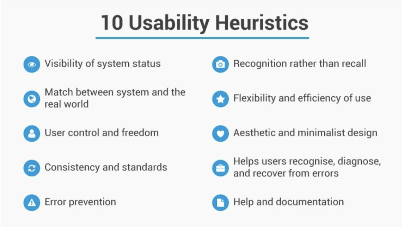
4. Consistency
- Maintain consistent design elements such as color schemes, typography & layout across all pages of the site. This helps to create a unified & professional experience for users.
- Example: Airbnb’s help pages maintain the same layout throughout, making it easy for users to navigate.
5. Responsivity
- Your website must be responsive, meaning it should automatically adjust to fit any screen size, whether the user is on a desktop, tablet, or smartphone.
- With mobile traffic accounting for nearly half of all web traffic, ensuring your site is responsive is critical to maintaining a good user experience.
6. Accessibility
- Design your website with accessibility in mind so that everyone, including people with disabilities, can use it. Follow the Web Content Accessibility Guidelines (WCAG) to ensure your site meets the needs of a diverse user base.
- This includes providing content that is perceivable, operable, understandable, and robust.
7. Conventionality
- Adhering to common web conventions makes your site more intuitive for users.
- Example: Placing your logo at the top left and using standard navigation layouts helps users feel comfortable and reduces confusion.
8. Credibility
- Trust is essential when designing a website.
- Be transparent with your content, such as clearly displaying your products, services, and pricing.
- Include easily accessible contact details and provide upfront information about your business to increase credibility.
9. User-Centricity
- Focus on the needs and preferences of your users.
- Conduct user testing to gather feedback and improve your website design based on real user experiences.
- Tools like Crazy Egg and Loop11 can help analyze how users interact with your site and guide design decisions.
Top 30 Website Design Guidelines
Once the planning phase is complete, you should have all the business/functional requirements recorded in a well-formed document, only then you should start designing the user interface for the website.
No matter what design tool you are using, here are some tips that will help you approach the UI design process with more clarity:
1. Keep it simple for business: Websites that are heavily focused on commerce should prioritize simplicity in their user interface. Think about sites like Amazon and Google, which have minimalistic designs that prioritize functionality and ease of use over resource-heavy visual effects.
2. Consider intricate UIs for brochure sites: Websites that are designed to act as brochures or portfolios for a company or individual can benefit from more visually appealing UI elements like designer fonts, parallax, 3D effects etc.
3. Prioritize usability for target audience: The target audience should always be considered when designing the user interface. For example, a younger demographic may prefer more modern design and more functions, while an older demographic may prefer a simpler design and lesser functional options.
4. Prioritize critical elements: Ensure that the user interface is easy to navigate and that users can find important UI elements quickly. Use clear and concise labels and provide contextual information to guide users.
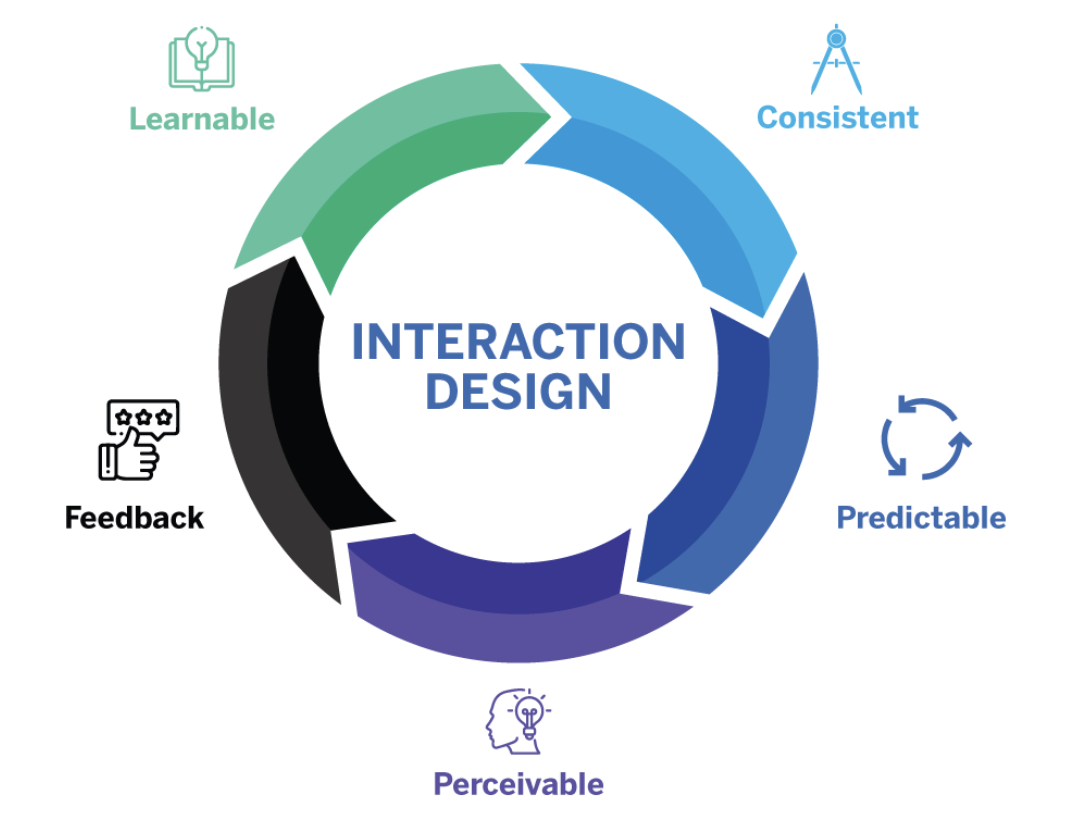
5. Provide feedback: Provide feedback to users when they take actions on the website. For example, display a message when a form is submitted or show a loading indicator when content is being loaded.
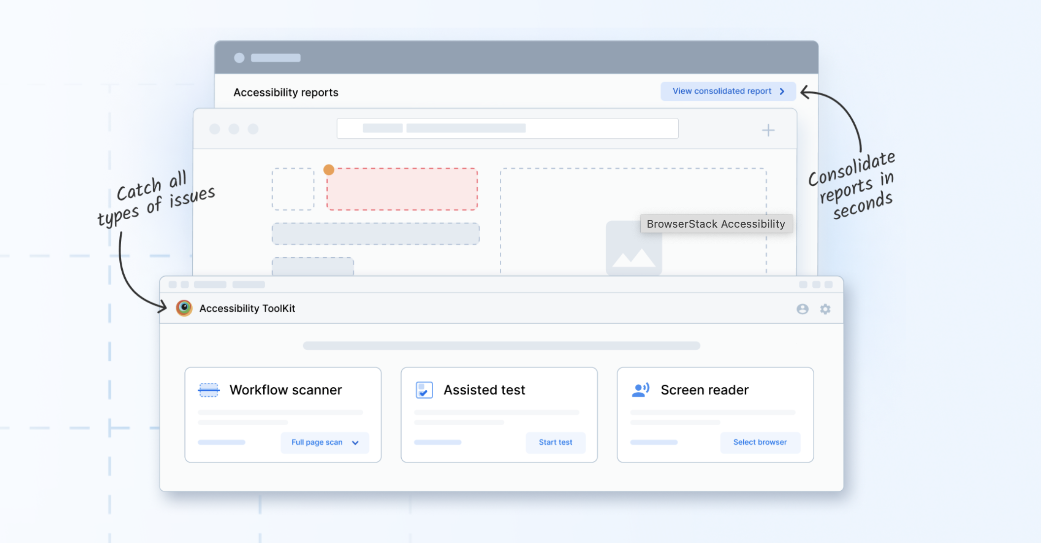
6. Incorporate accessibility features: Consider users with disabilities when designing the user interface. Incorporate accessibility features like keyboard navigation, alt tags for images, and proper color contrast.
7. Offer help and support: Make sure users have access to help and support resources, such as a FAQ page or contact information for customer support. This can help build trust and ensure a positive user experience.
8. Use white space effectively: White space, or the empty space between design elements, can be used effectively to make the interface less cluttered and improve readability.
9. Test with users: User testing is a valuable tool for determining the effectiveness of a website’s user interface. Test the site with users of varying levels of tech-savviness to identify any areas that may be confusing or difficult to navigate.
10. Keep up with industry trends: Staying up to date with industry trends can help inform the design of the website. For example, if a particular design style is becoming popular in a given industry, it may be financially beneficial to incorporate elements of that style into the website’s user interface.
11. Understand HTML, CSS, and JavaScript specifications: Having a deep understanding of the latest HTML, CSS, and JavaScript specifications will allow you to design websites that are optimized for the latest web technologies.
12. Use modern TypeScript (TS) features: Modern JS features like TypeScript or ES6 can make your code more efficient and easier to maintain. These are especially helpful with large teams and projects where type-setting and modularisation are priorities.
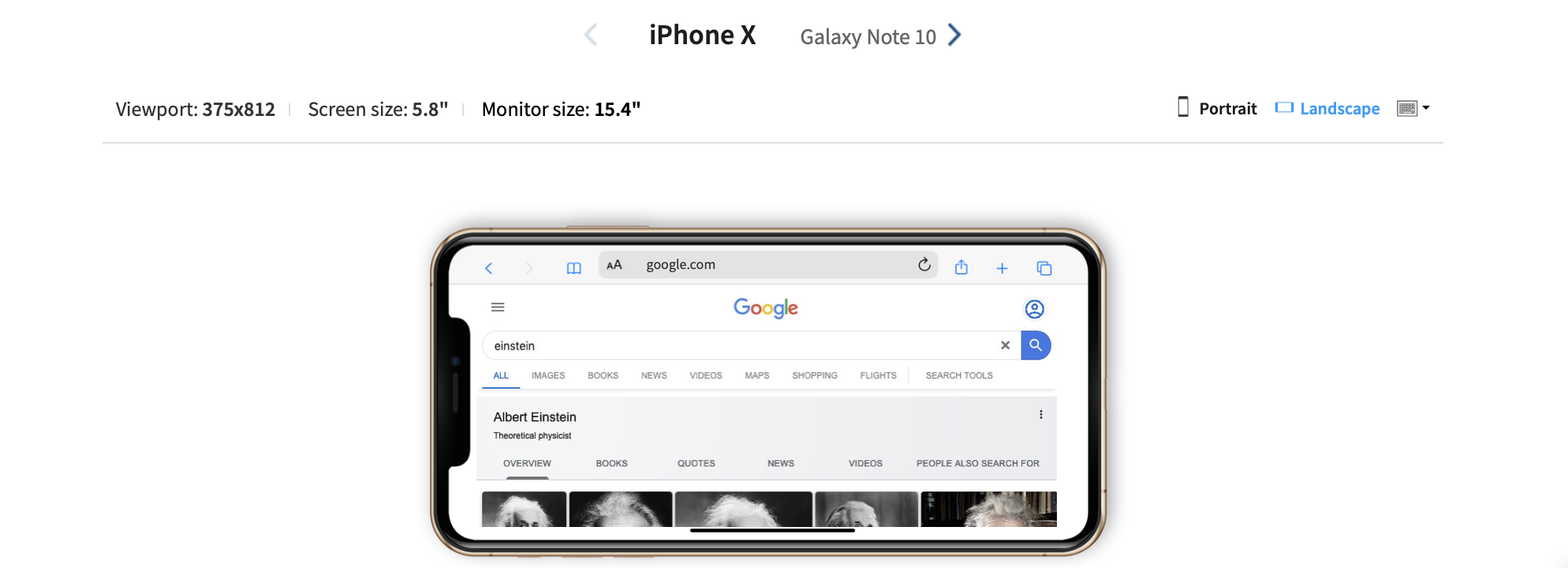
13. Use responsive design: With more and more users accessing the web on mobile devices, it’s important to use responsive design techniques to ensure your website looks and functions well on all devices.
Check responsive across a range of devices
14. Use lightweight libraries: While frameworks can be helpful, they can also add unnecessary weight to a website. Instead, use lightweight libraries that are specific to the task at hand.
15. Focus on accessibility: Accessibility is an essential aspect of web design. Ensure that your designs are accessible by following WCAG 2.1 guidelines and using ARIA attributes.
16. Optimize for performance: Performance is key to a good user experience. Optimize your designs for performance by minimizing HTTP requests, compressing files, and using caching techniques.
17. Use progressive enhancement: Start with a basic website design and add more advanced features and functionality as needed. This allows your website to function for all users, regardless of their browser or device.
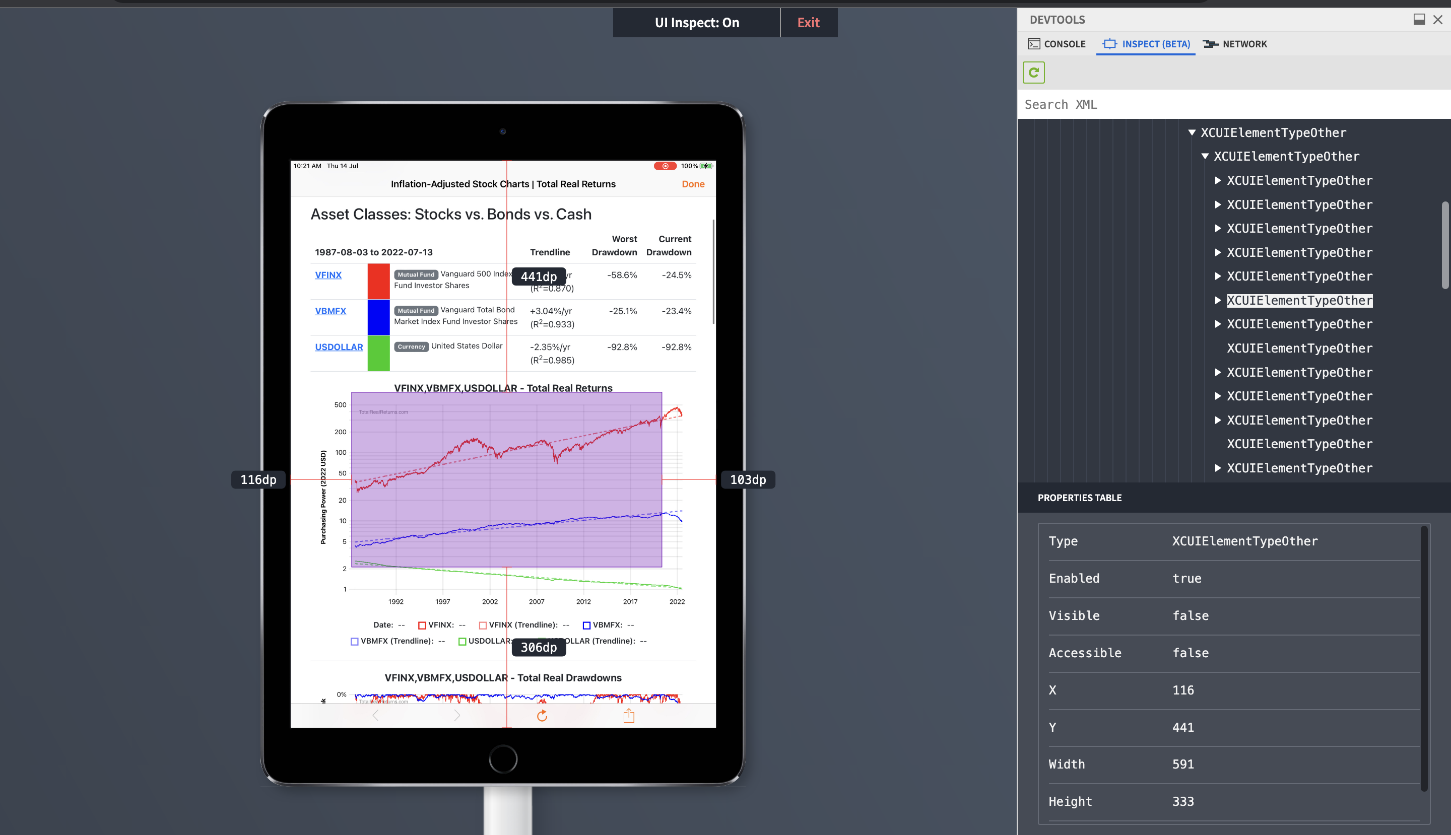
18. Use testing tools: Use browser dev tools and automated testing tools to ensure that your website functions correctly and displays correctly across different browsers and devices.
19. Use modular design: Modular design involves breaking down a website into smaller, reusable components. This makes it easier to create a consistent design and make changes to the website as needed.
20. Use design patterns: Design patterns can help you create user-friendly website designs that are intuitive and easy to use.
21. Design for Automation: Scaling website design and development efforts is highly resource intensive. Hence, always design your website with automated testing in mind from the beginning. This can help you be efficient and catch issues early in the development process.
22. Design for CICD: CI/CD is the industry standard way of building checks and balances into the release cycle itself. Use version control to manage your code and design assets. This makes it easier to roll back changes if necessary and ensures consistency across multiple developers/teams/versions.
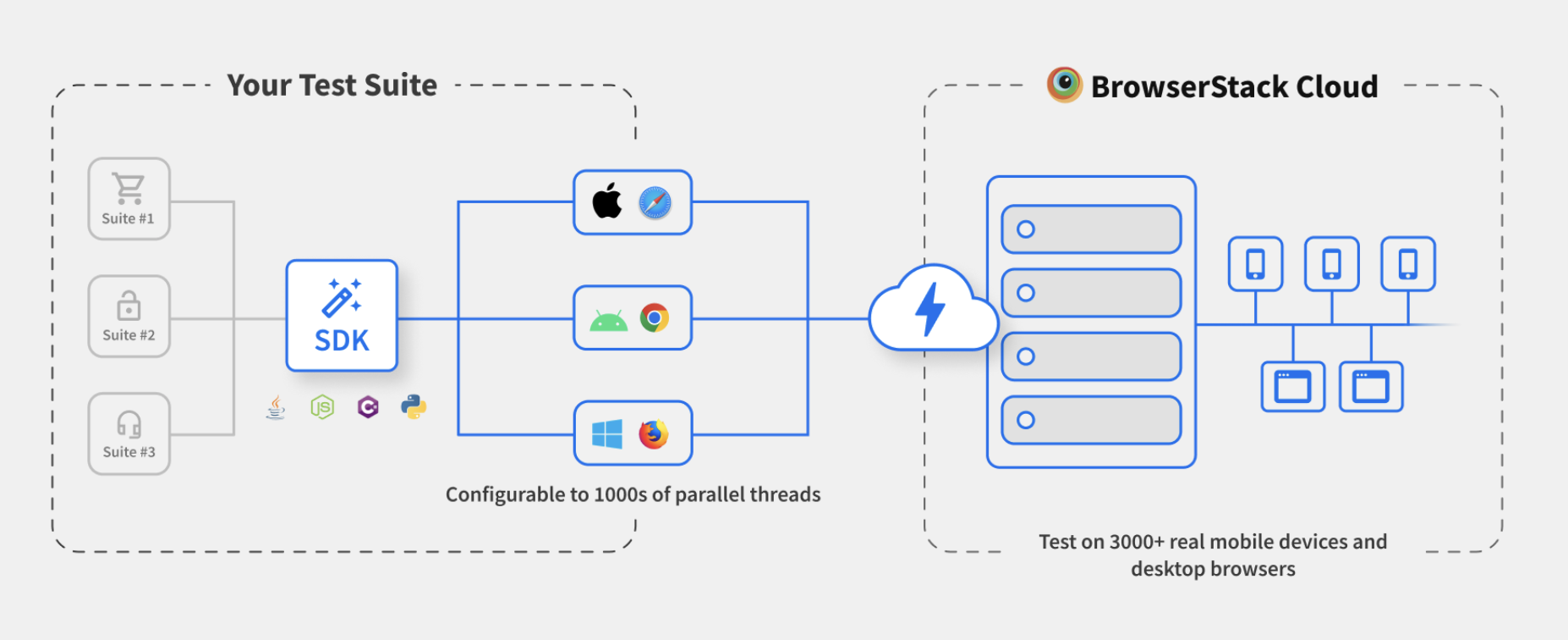
23. Ensure web security: Ensure that your website is built with security in mind and implement measures such as SSL certificates, firewalls, and secure authentication methods.
24. Ensure browser compatibility. Test your website on multiple browsers and devices to ensure that it works seamlessly on each one.
Test Browser compatibility on Real Devices and Browsers
25. Don’t overcomplicate your design: Keep the user interface simple and intuitive, so users can easily navigate and find what they need.
26. Don’t use too many animations: While animations can add visual interest, too many can slow down your website and distract users from the main content. Use animations sparingly and purposefully.
27. Don’t use too many pop-ups: Pop-ups can be annoying for users, especially if they appear too frequently or are difficult to close. Use pop-ups sparingly and ensure that they are easy to dismiss.
28. Don’t use too many images: Large images can slow down your website and increase load times. Use images sparingly and compress them for faster loading times.
29. Don’t use too many plugins or third-party integrations: These can slow down your website and make it more vulnerable to security threats. Only use plugins that are necessary and keep them up to date.
30. Don’t underestimate the power of content: Your website should have high-quality, engaging content that is relevant to your audience and features of your website. In absence of original and relevant content technical prowess could easily be proven futile.
Best Practices for Web Design
Creating a well designed website involves a balance between aesthetics, functionality & user experience. Here are some best practices to guide your web design process:
- Simplicity: Keep the design clean & minimal by focusing on essential elements. Avoid clutter & make sure that everything serves a purpose.
- Mobile Responsiveness: Design your site to adapt seamlessly to all screen sizes from desktops to smartphones. Mobile friendly design is crucial for user engagement.
- Fast Load Times: Optimize images, reduce scripts, and use efficient coding to ensure quick page loading. Users expect fast responses.
- Clear Navigation: Use intuitive menus, visible links, and breadcrumbs to guide visitors effortlessly through the site.
- Visual Hierarchy: Arrange elements so users focus on the most important content first. Use size, color, and spacing effectively.
- Consistency: Maintain a uniform layout, color scheme & typography across all pages to enhance user experience.
- Accessibility: Ensure your site is usable for everyone, including people with disabilities, by following WCAG guidelines.
- Call-to-Action (CTA): Include clear and compelling CTAs, such as “Sign Up” or “Learn More,” to encourage user interaction.
- Credibility: Use professional design, quality content & visible contact information to build trust with users.
- Testing and Feedback: Continuously test your design for functionality and gather user feedback to improve usability and aesthetics.
Why is Design pivotal in Website Development?
The role of design in web development goes beyond the visual aesthetics. The simplest way to understand it better is to look at the various layers of consideration involved in the web design process:
Design for functionality
- User Experience: Good web design takes into consideration the user’s + business’ needs and aims to provides a seamless, intuitive experience. Users should be able to easily find what they’re looking for and navigate the site without feeling lost or frustrated.
- First impressions: The design of a website is often the first thing a user will notice, and it can make or break their initial impression of the site.
- Accessibility: Web design plays a key role in ensuring that a website is accessible to all users, regardless of their abilities. This includes designing for those who may be visually or hearing impaired, or who use assistive technologies to access the web.
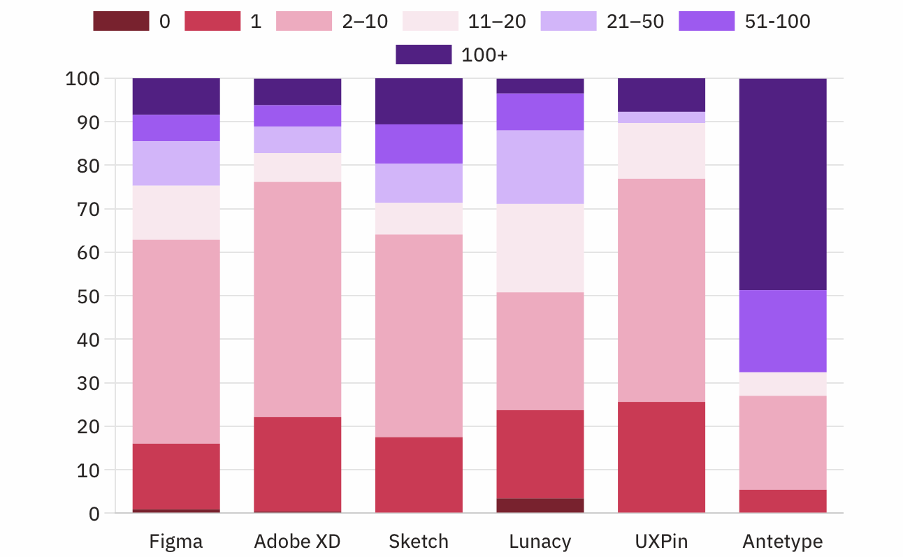
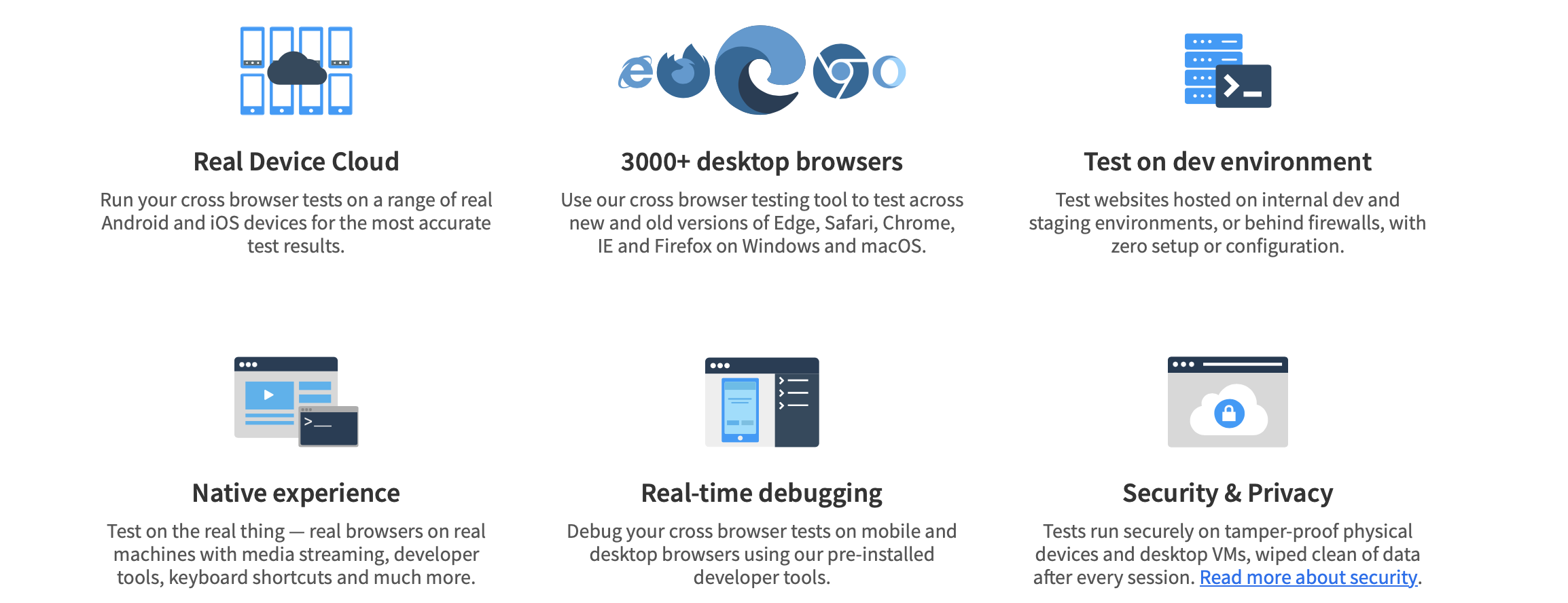
- Functionality: A well-designed website should be optimized for performance, load quickly, and work well on all devices, from desktops to mobile phones and beyond. Cross browser compatibility has historically been one of the biggest challenge for web developers.
Read More: Cross Browser Compatibility Issues to Avoid
- Branding: A website is often a company’s first point of contact with potential customers, and the design of the site can communicate a brand’s message and values. Consistent branding across a website can help build trust and credibility with users.
Design for human perception
- Attention span: Studies have shown that users have a short attention span when browsing the web, and a well-designed website can help grab and hold their attention. Before you trust someone’s advice on how many seconds, just know that there are better approaches.
- User engagement: A well-designed website can help foster user engagement, which is important for ensuring users come back. Call-to-action (CTA) is a term used to describe actions resulting in successful conversions.
- Information processing: The way information is presented on a website has a significant impact on how users process and retain it. All websites, apps and computational activity in essence is information processing, hence the term Information Technology (IT).
- Visual perception: The visual design of a website can affect how users perceive the content and the brand behind it. Many principles and techniques of human perception established in other domains like Cinema, Advertising find relevant analogies in web design.
- Usability: Web design plays a crucial role in website usability, which refers to how easy it is for users to accomplish their goals on a website. Instructional design is the broader field which informs web designers in this regard.
Design for proper coding
- Responsive design: With the increasing prevalence of mobile devices, a well-designed website should be optimized for viewing on all devices. Many advocate for mobile-first designs, that morph and adapt on larger screens, as a standard approach.
- Search engine optimization (SEO): Good web design can have a significant impact on a website’s search engine ranking. Although, different search engines have slightly different ranking logic, knowing basics of the underlying web semantics is a decent start.
- Performance: A well-designed website should load quickly and perform well, which is essential for keeping users engaged. There are many more ways to evaluate performance, but most would agree that load time, network and battery usage are universal factors.
- Scalability: A website that is designed with scalability in mind can adapt and grow as the business or organization behind it grows. This is especially true for tech start-ups and growing businesses.
- Security: Good web design practices can also help improve a website’s security. Bad web design can leave vulnerabilities which can lead to disaster if not checked.
Design for easy maintenance
- Content updates: A well-designed website should make it easy to update and add new content, which is essential for keeping users engaged and up-to-date.
- Bug fixes: Even the best-designed websites may encounter bugs or errors from time to time. Having a standard procedure for addressing them is a must have.
- Cost: Cost is a factor for running websites, including but not limited to the domain, hosting and 3rd party integration expenses. If not optimized, can lead to big holes in your wallet.
- Backups: Regular backups are essential for protecting a website’s content and ensuring that it can be easily restored in the event of a data loss or security breach. If not from start, after reaching critical mass this should definitely be considered.
- Upgrades: As technology evolves and new web standards emerge, it’s important to ensure that a website is up-to-date and compatible with the latest technologies. Outdated dependencies are a common source for app vulnerabilities.
Since we’ve laid out a broad framework of understanding the range of factors/variables web designers have to consider while designing a website, lets now dive into some practical and useful tips for designing and delivering amazing websites.
Challenges in Creating Strong Web Design Layout
Here are the challenges for creating strong web design layout:
User Experience (UX) Challenges:
- Ensuring intuitive navigation across devices
- Maintaining consistency in design elements
- Establishing a clear visual hierarchy
- Considering accessibility for users with disabilities (e.g., screen readers, color contrast)
Responsive Design Challenges:
- Adapting layouts for various screen sizes, especially mobile devices
- Ensuring cross-browser compatibility (Chrome, Firefox, Safari, etc.)
Performance and Load Time Issues:
- Optimizing design elements (images, animations, videos) to prevent slow load times
- Writing clean, efficient code for faster performance
Content Organization:
- Balancing content density with sufficient white space
- Accommodating dynamic content (e.g., blog posts, product listings) without breaking the layout
Trend vs. Timeless Design:
- Keeping up with design trends without making the website look outdated quickly
- Aligning the layout with brand identity while remaining modern and functional
Interactive Elements:
- Using interactive elements (hover effects, animations) without overwhelming users
- Designing a user flow that guides visitors toward conversion actions (e.g., sign-ups, purchases)
SEO Considerations:
- Ensuring the layout is SEO-friendly with proper HTML structure, header tags, and content optimization
Collaboration Challenges:
- Bridging the gap between design and development teams
- Incorporating client feedback while maintaining best practices
Scalability and Flexibility:
- Designing layouts that can grow as the website expands
- Ensuring that the layout works seamlessly with CMS (Content Management Systems)
Security and Privacy:
- Integrating security features (e.g., secure forms, encryption) within the layout without compromising design
Global and Cultural Considerations:
- Designing for a global audience, including language and cultural differences
- Handling right-to-left text and region-specific design preferences
Solutions to Overcome Challenges:
- Wireframing and prototyping to visualize the layout early on
- Conducting user testing to identify and fix usability issues
- Prioritizing mobile-first design principles
- Optimizing performance through image compression and lazy loading
- Iterating based on feedback and design trends for continuous improvement
How to Design a Website?
Follow these step-by-step instructions to design a professional and user-friendly website:
Step 1: Define Purpose and Goals
- Clearly identify the purpose of your website ( for example, e-commerce, blog, portfolio).
- Set measurable goals such as increasing traffic, generating leads, or driving sales.
Step 2: Identify Target Audience
- Understand your audience’s demographics, preferences & needs.
- Tailor your website’s design & features to meet their expectations.
Step 3: Plan Structure
- Create a sitemap to outline the structure & hierarchy of your website pages.
- Design wireframes to visualize the layout and content placement on each page.
Step 4: Choose Design Elements
- Pick a consistent color scheme & typography that aligns with your brand.
- Use relevant graphics & visuals that enhance user engagement.
Step 5: Develop and Optimize
- Build the website using platforms like WordPress, Wix, or custom coding.
- Optimize for responsiveness, fast loading & search engine visibility (SEO).
Step 6: Test and Launch
- Perform usability testing to identify & fix errors.
- Ensure the website functions well across all devices and browsers before launching.
Step 7: Maintain and Update
- Regularly update content and monitor website performance.
- Address technical issues promptly to maintain a seamless user experience.
Why Test Website Design on Real Devices?
Testing website design on real devices is crucial to ensure:
- Responsiveness Across Devices: Real devices help you verify that the website adjusts properly to different screen sizes, orientations, and resolutions (for example, smartphones, desktops, and tablets).
- Accurate User Experience: Simulators cannot fully replicate the behaviors of real devices, such as touch gestures, hardware interactions or device-specific quirks.
- Browser and OS Compatibility: Real devices enable testing across diverse browsers and operating systems to identify inconsistencies and ensure seamless performance.
- Network Variability: Testing on real devices helps check performance under various network conditions, from high-speed Wi-Fi to slower mobile networks.
- Real-world Scenarios: Identify issues related to battery consumption, memory usage, or app conflicts that may not show up in emulators.
How to Test the Design/UI of a Website?
Testing website design ensures it’s visually appealing, functional, and user friendly.
Key steps include:
- Plan Testing Scope: Identify design elements, devices & browsers to test.
- Check Visual Consistency: Verify fonts, colors, layout & spacing match the design.
- Test Responsiveness: Ensure the site adapts smoothly across devices and screen sizes.
- Perform Cross-Browser Testing: Validate compatibility on Chrome, Safari, Firefox, and others.
- Validate Navigation: Test menus, links, and buttons for usability.
- Assess Accessibility: Ensure compliance with accessibility guidelines for all users.
- Optimize Performance: Check loading times and reduce heavy graphics.
- Collect Feedback: Use tools like Crazy Egg to gather insights and improve the design.
Conclusion
Mastering website design is no easy task, given the constant evolution of the digital landscape. However, armed with the right tips and strategies, you can overcome these challenges and create exceptional websites that leave a lasting impression.
BrowserStack Percy empowers you to perfect your website designs by automating visual testing. Ensure pixel-perfect consistency across browsers, devices, and screen resolutions. Catch UI bugs early, maintain design integrity, and deliver exceptional user experiences every time.
