Visual testing is a crucial component of modern software development. It ensures that applications function correctly and present a consistent and appealing interface to users. This article will share some best practices of visual testing that you can implement.
Overview
Best Practices for Visual Testing
- Establish clean baselines: Capture baselines only when the UI is stable to ensure accurate future comparisons.
- Automate in CI/CD: Run visual tests on every build for early regression detection.
- Set tolerance levels: Use sensible thresholds to avoid noise from minor rendering differences.
- Update baselines regularly: Refresh baselines after intentional UI changes and document them.
- Collaborate with design & dev: Align on expected visuals early to resolve discrepancies quickly.
- Focus on critical journeys: Prioritize high-impact pages and flows to cover essential UI first.
- Test across browsers/devices: Validate UI consistency across real browsers, OS versions, and devices.
- Use AI/smart comparisons: Leverage AI diffing to distinguish meaningful changes from irrelevant ones.
- Define clear requirements: Specify which UI elements and states must be validated.
- Version-control baselines: Track and restore baseline images just like code.
- Maintain your test suite: Review tests and baselines periodically to keep them reliable.
This article will share some best practices of visual testing that you can implement.
What is Visual Testing?
Visual Testing, sometimes called visual UI testing, verifies that the software user interface (UI) appears correctly to all users. Essentially, visual tests check that each element on a web page appears in the right shape, size, and position. It also checks that these elements appear and function correctly on a variety of devices and browsers. In other words, visual testing factors in how multiple environments, screen sizes, OSes, and other variables will affect software.
Visual tests generate, analyze, and compare browser snapshots to detect if any pixels have changed. These pixel differences are called visual diffs (sometimes called perceptual diffs, pdiffs, CSS diffs, UI diffs).
Read More: Top 17 Visual Testing Tools
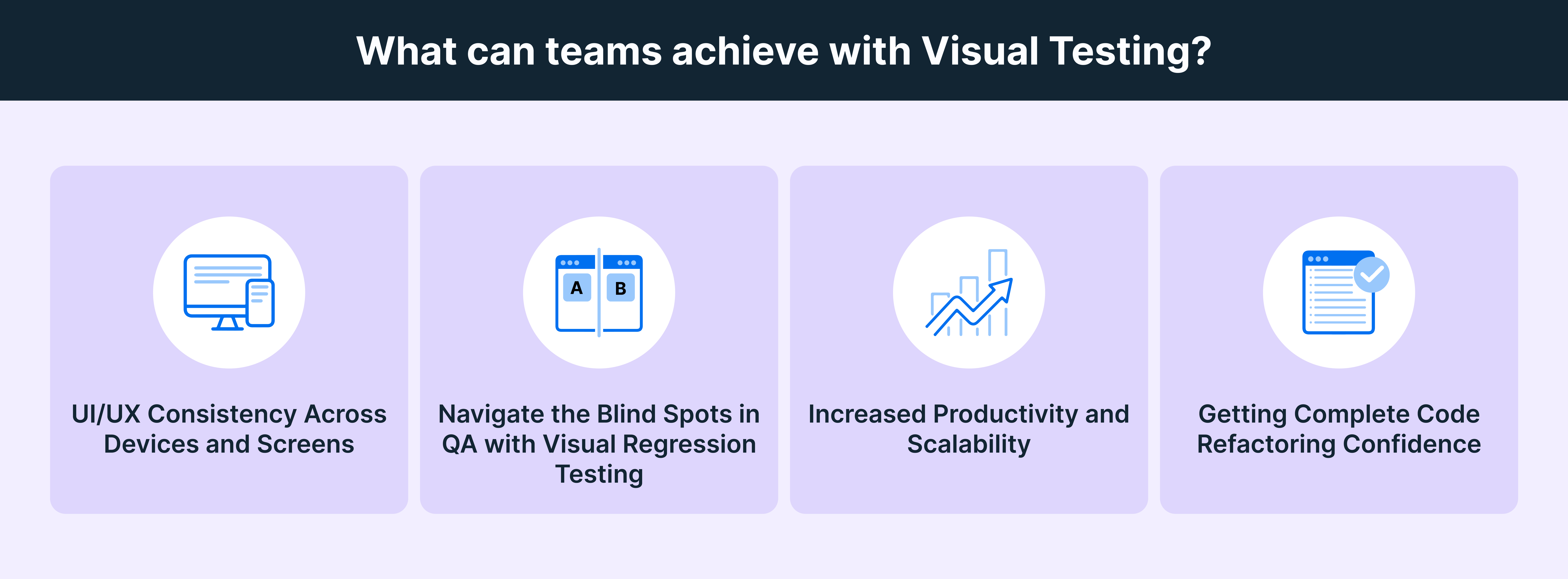
What can Teams Achieve With Visual Testing
Given below is a list of things that teams can achieve with visual testing:
- UI/UX Consistency Across Devices and Screens: Automated visual testing ensures the user interface remains stable amid changes like CSS updates, covering all UI elements across various browsers and screen sizes for comprehensive reliability.
- Navigating QA Blind Spots with Visual Regression Testing: Visual regression testing identifies visual bugs that functional and manual testing may miss. It compares screenshots across devices and resolutions to help QA teams spot discrepancies.
- Enhanced Productivity and Scalability: Automated visual testing delivers faster, more precise results while being cost-effective. Its scalability benefits developers, designers, and marketers by streamlining design verification and updates.
- Confidence in Code Refactoring: Visual testing reduces uncertainty during coding by automating bug detection, allowing for confident deployments with assurance that the app appears correctly across all browsers and screens.
Benefits of Visual Testing
Here are some key reasons why you should perform visual testing:
- Increased Efficiency with Automated Testing: Automated visual testing reduces the time and effort needed for manual testing, minimizing the risk of human error and ensuring comprehensive coverage of all scenarios in complex applications.
- Enhanced Visual Accuracy: By incorporating visual testing alongside functional tests, organizations can identify crucial visual discrepancies that impact user experience, ensuring elements like alignment, pixel accuracy, and responsive design are consistently evaluated.
- Streamlined Responsive Design Verification: Automated visual testing simplifies maintaining a uniform visual appearance across various devices and screen sizes, making it easier to adapt to the growing diversity of platforms.
Strategies for Visual Testing
Below are the key strategies for visual testing:
- Automation: Implementing test automation streamlines UI reviews, reducing time and effort while minimizing human error.
- Parallelization: Running automated tests parallelly across various configurations accelerates the testing process without sacrificing quality.
- Testing on Real Devices: Utilizing real devices, particularly through cloud-based platforms, ensures accurate visual testing across a wide array of OS and device combinations.
- Testing on Mobile Browsers: Conducting visual tests on mobile browsers is essential, given that over half of global web traffic comes from mobile devices.
- Coverage: Ensuring comprehensive testing coverage is critical to prevent revenue loss and guarantee optimal user experience across all devices and screen resolutions.
Best Practices for Visual Testing
Here are the best practices for Visual Testing:
- Perform system tests first: Don’t run visual tests before ensuring that every feature works exactly as intended. Invest maximum effort at the unit tests level so that later-stage tests (usually covering larger sections of the software) do not return significant issues – which inevitably take more effort to resolve.
When in doubt about what order tests should be structured in, just refer to the testing pyramid. Tests should go in the following order: Unit Tests > Integration Tests > UI Tests - Create small specs: Creating smaller specs is helpful because if an issue does emerge, it is much easier to detect. Specs with greater detail can not only lead to more errors (because they tend to cover larger sections of software) but also make debugging more difficult because more code needs to be investigated.
It is best to limit each spec to the layout details of a single web element. Don’t create one spec for one website page. Each webpage comprises multiple web elements, and its corresponding spec will require enormous amounts of detail. Instead, craft small specs for each element that accurately tests them, and when put together, fully defines the webpage. - Use dedicated specs: There are millions of elements on every single website and app. To run visual tests that take each of them into account, testers will have to use structured, dedicated specs to ensure that they do not miss any visual elements.
Try using the following blueprint for visual tests:
Header > Main Section > Scroll Section 1 > Scroll Section 2 > Footer
Create a full spec for the page by using the above as the main sections. Then, start running tests for each section.
Take the example of the header. It may look something like this:
Automated visual tests should be programmed to test each element and gauge whether they align with the baseline requirements in terms of pixels.
- Use relevant logs: It is easy to assume that visual UI testing bugs can be identified simply by looking at the images of the bug-ridden interface and comparing them to baseline images.
This isn’t always applicable. Sometimes, the discrepancy is so minuscule that it can be detected in terms of pixel differences but not with the human eye. In such cases, the tester needs more data to detect the cause of the discrepancy.
Logs related to the software test help provide the data testers need. Visual logs with timestamps can be helpful with this. But what’s necessary is some kind of key identifier that can be linked to the visual error. Otherwise, testers have to comb through all the code and images to figure out the issue.Consider using a tool that would help with logging. For instance, Percy by BrowserStack grabs screenshots, identifies visual changes, and informs the testing team of all changes. - Use Baseline Images Effectively: Establish reliable baseline images representing the expected UI. These images serve as a reference point for future visual tests, helping to identify unintended changes accurately.
- Define Critical Elements to Test: Identify and prioritize the key components of your UI that significantly impact user experience. Focus testing efforts on these critical elements to ensure high-quality visuals where they matter most.
- Automate Screenshots and Compare Changes: Implement automated screenshot capture for consistent comparison against baseline images. This process helps detect visual discrepancies quickly, streamlining the identification of issues across different screens and resolutions.
- Review and Update Visual Tests Regularly: Regularly audit and refresh visual tests to align with design changes and updates. This practice ensures that tests remain relevant and effective in catching new visual bugs or discrepancies as the application evolves.
- Start with the basics: When verifying a web element, start with the following questions:
- Is the element of the right size?
- Is the element placed within a parent element, if it is supposed to be so?
- Is the element inside another element, if it is supposed to be so?
- Is the element located on the top/bottom/right/left of another element?
- Are all elements aligned accurately relative to each other and in the broader context of the webpage structure?
Obviously, like most forms of testing, visual testing should be ideally automated. This requires the right tool: one which manages the test process and generates reports for manual testers to study and approve/disapprove.
Visual Testing with BrowserStack
In visual testing, the primary goal is to make sure that your app looks as good as it functions, on every browser and every device. Percy by BrowserStack helps you achieve exactly that by bringing automated, AI-driven visual testing into your workflow so teams can catch meaningful UI changes early and ship with confidence.
Key Features of Percy:
- Automated Visual Regression: Captures and compares UI snapshots on every commit, instantly flagging layout or style regressions.
- Visual AI Engine: Filters out noise from animations, dynamic content and pixel-level differences to reduce false positives.
- Visual Review Agent: Highlights impactful changes with bounding boxes, provides human-readable summaries and accelerates review workflows by up to 3×.
- Shift-Left Friendly: Integrates with CI/CD, functional tests, Storybook and Figma for continuous visual coverage.
- No-Code Visual Monitoring: Scan thousands of URLs across real browsers/devices, schedule checks and compare environments with zero setup.
- Flexible Monitoring & Coverage: Schedule scans, review historical results, compare staging/production, test authenticated pages and catch visual issues proactively.
- Broad Integrations: Works seamlessly with major frameworks, CI tools and SDKs for quick onboarding.
Pricing:
- Free Plan: Up to 5,000 screenshots/month.
- Paid Plans: Start at $199/month, with enterprise options available.
Conclusion
As UI complexity and platform variety continue to grow, visual testing is crucial. When you anchor your process with clean baselines, focused specs, cross-browser/device coverage, and thoughtful automation, you transform visual QA from a bottleneck into a strategic advantage. When teams collaborate early, define what “correct” looks like, and let the right tools handle the noise, every release becomes a statement of quality. Embrace these practices today, and you’ll not only catch regressions, but also build interfaces that look polished, perform reliably, and inspire confidence in every click.
Useful Resources for Visual Testing
- How to capture Lazy Loading Images for Visual Regression Testing in Cypress
- How to Perform Visual Testing for Components in Cypress
- How to run your first Visual Test with Cypress
- How Visual Diff Algorithm improves Visual Testing
- How is Visual Test Automation changing the Software Development Landscape?
- How does Visual Testing help Teams deploy faster?
- How to perform Visual Testing for React Apps
- How to Run Visual Tests with Selenium: Tutorial
- How to reduce False Positives in Visual Testing?
- How to capture Lazy Loading Images for Visual Regression Testing in Puppeteer
- How to migrate your Visual Testing Project to Percy CLI
- Why is Visual Testing Essential for Enterprises?
- Importance of Screenshot Stabilization in Visual Testing
- Strategies to Optimize Visual Testing
- Best Practices for Visual Testing
- Visual Testing Definitions You Should Know
- Visual Testing To Optimize eCommerce Conversions
- Automate Visual Tests on Browsers without Web Drivers
- Appium Visual Testing: The Essential Guide
- Top 17 Visual Testing Tools


