Users access websites and apps on a wide range of devices, from smartphones and tablets to desktops and smart TVs. Each device has different screen sizes, resolutions, and browser behaviors. A responsive design ensures a smooth experience, but it doesn’t always work as expected.
UI responsiveness testing verifies that a website or app adapts correctly across devices, maintaining functionality, layout, consistency in design, and performance.
Overview
Why UI Responsiveness Testing is Important?
- Ensures smooth user experience across all devices.
- Boosts engagement & conversions by reducing UI issues.
- Improves SEO rankings for better visibility.
- Maintains brand consistency in design and layout.
- Optimizes performance by identifying UI and speed issues.
- Enhances accessibility for all users.
Types of UI Responsiveness Testing
- Cross-Platform Testing
- Visual Testing
- Design Testing
- Natural Gestures Testing
- Website Speed Testing
- Accessibility Testing
Key Factors Affecting UI Responsiveness
- Screen Sizes & Resolutions
- Device Compatibility
- Browser Differences
- Network Conditions
- Touch vs. Click Interactions
- Performance Optimization
- Viewport & Orientation Changes
- Third-Party Integrations
This article explores UI responsiveness testing, its importance, key factors, testing types, tools, and best practices to ensure optimal user experience.
What is Responsive Design?
Responsive design is an approach to web design that ensures a website adapts and looks good on all devices and screen sizes, from desktops to smartphones.
What is UI Responsiveness Testing?
UI responsiveness testing verifies how a website or application adapts to different devices, screen sizes, resolutions, and browsers. It ensures the UI remains visually consistent, functional, and user-friendly across various platforms.
This testing checks for:
- Proper layout adjustments across screen sizes.
- Smooth navigation and interaction on different devices.
- Compatibility with multiple browsers and operating systems.
- Performance under varying network conditions.
The goal is to deliver a smooth user experience, regardless of how or where the website or app is accessed.
Why is UI Responsiveness Important?
A well-designed UI must adapt across different devices to provide a consistent user experience. Poor responsiveness can lead to usability issues, frustration, and lost engagement. Here’s why UI responsiveness is crucial:
- Enhanced User Experience: A responsive UI ensures smooth navigation, readability, and interaction across all screen sizes.
- Higher Engagement & Conversions: Users are more likely to stay on a site and complete actions (for example, purchases, sign-ups) if the UI is easy to use.
- Better SEO Rankings: Google prioritizes mobile-friendly and fast-loading websites, improving search visibility.
- Cross-Device Accessibility: Ensures usability across desktops, tablets, and mobile devices.
- Brand Consistency: Maintains uniformity in design, fonts, and colors, reinforcing brand trust.
- Improved Performance: Optimized responsiveness reduces load times and enhances site speed.
Key Factors affecting UI Responsiveness
Several factors influence how well a UI adapts across devices, browsers, and screen sizes. Maintaining responsiveness requires addressing these key aspects:
- Screen Sizes & Resolutions: Websites must adjust layouts, fonts, and images dynamically for different screen resolutions and aspect ratios.
- Device Compatibility: Different devices interpret CSS, JavaScript, and media queries differently, affecting rendering.
- Browser Differences: Variations in browser engines (Chrome, Safari, Firefox, Edge) can impact UI elements, animations, and responsiveness.
- Network Conditions: Slow or unstable internet connections can affect how quickly content loads and functions.
- Touch vs. Click Interactions: Mobile users rely on gestures (tap, swipe, pinch) instead of mouse clicks, requiring optimized interactions.
- Performance Optimization: Heavy images, unoptimized scripts, and excessive CSS can slow down responsiveness.
- Viewport & Orientation Changes: UI should adjust smoothly when switching between portrait and landscape modes.
- Third-Party Integrations: Embedded widgets, ads, and iframes may behave differently across platforms, affecting UI responsiveness.
Types of UI Responsiveness Testing
Ensuring a smooth user experience across devices requires different types of UI responsiveness testing. Each type focuses on specific aspects of adaptability, functionality, and performance.
Cross-Platform Testing
Cross Platform Testing verifies that a website or app renders and functions correctly across different browsers, devices, and operating systems. Ensures consistency across Chrome, Firefox, Safari, and Edge, as well as desktops, laptops, tablets, and smartphones with varying screen sizes and resolutions.
BrowserStack provides real-device cloud testing on real browsers and devices and enables developers to test UI responsiveness across platforms without maintaining an in-house device lab.
Visual Testing
Most responsive design tests start with visual testing. This testing ensures that the UI of the app/website looks the same across devices and browsers. For example, the color of a banner on an Android app may look different across various Samsung mobile phones, possibly due to differences in color codes. Similarly, the color of a CTA button may look a shade darker on a mobile phone than on an Ipad.
Read More: 13 CTA Design Examples to Boost Conversions
Visual testing ensures that such inconsistencies are resolved before an app/website is made public. Minor visual differences don’t affect much, but inconsistencies in branding assets, including brand logo, font, etc., often cause trust issues among users, thereby compromising user adoption. Hence, visual testing is important.
Visual testing is often the first step in responsive design testing. Testers take the intended UI design of the app/website and compare the look and feel across various screen-device-OS combinations. It is often performed manually, which makes the entire process cumbersome as minute changes are hard to catch with the naked eye. Automated visual tests are more prominent in the testing community. However, there are a few things that one must look for when selecting a visual testing tool.
- Device and Browser Support
- Accessibility
- Automated testing
- Integrations and Supported Framework
- Snapshot Stabilization
- Budget
Percy checks all the above checkboxes and allows you to perform visual testing with a breeze.
Design testing
Frameworks like Bootstrap, Foundation, etc. allow developers to build responsive websites using HTML, CSS, and JavaScript. Certain elements of a user interface, however, might not render properly. So, it’s essential to test various elements of a website across various screen sizes. The major elements to test are
- Content: Content should be easily readable. In responsive web design, font resizes to adapt to the screen size.
- Images: Images have a fixed resolution. So, they often pixelate when they are scaled to higher screen sizes. Responsive design takes this into account and offers a way to store images for different screen sizes. Developers often store images in multiple sizes, which are accessible on their corresponding screen sizes.
- Navigation menu: Navigation menu helps users navigate around websites easily. In small screen sizes, the navigation menu sometimes takes too much space and hides other elements behind it. A responsive navigation menu adapts its size; it reduces to a hamburger icon or sandwich icon and expands when a user clicks on it.
- Tables: Tables on small screen sizes often break and overlap with other elements of the design. Responsive tables can adapt to fit the screen size and are easy to read.
- Clickability: Ensure that buttons (especially CTAs) are easily clickable and do not overlap with other elements on the website.
- Orientation: Mobile users frequently use their cell phones to access websites and apps. So, a design must be seamless horizontally too. Smooth vertical and horizontal scrolls ensure a good user experience.
Natural Gestures Testing
The common hand gestures such as pinch in, pinch out, tap, scroll, etc. are intuitive. A study reports that kids learn these gestures of using phones before they learn verbal communication. So, it’s essential to perform gesture tests to check the response of websites against common natural gestures.
Website Speed Testing
The speed at which your website loads on a particular device-browser combination can have an immense impact on conversions.
Website load speed is also an essential factor used by Google to rank websites. Lower loading speed may result in poor rankings on the Google search engine. Certain design elements, such as images and unused JavaScript code can reduce website loading speed.
Also Read: How to Lazy Load Images in Javascript
Tools to check website speed:
- PageSpeed Insights is a free tool that can be used to test website loading speed. Google Search Console is another free tool where you can get insights about the Core Web Vitals (CVW) of a website. These tools however have limited capabilities. For instance, PageSpeed tests are made generally on a selective browser-device-network combination.
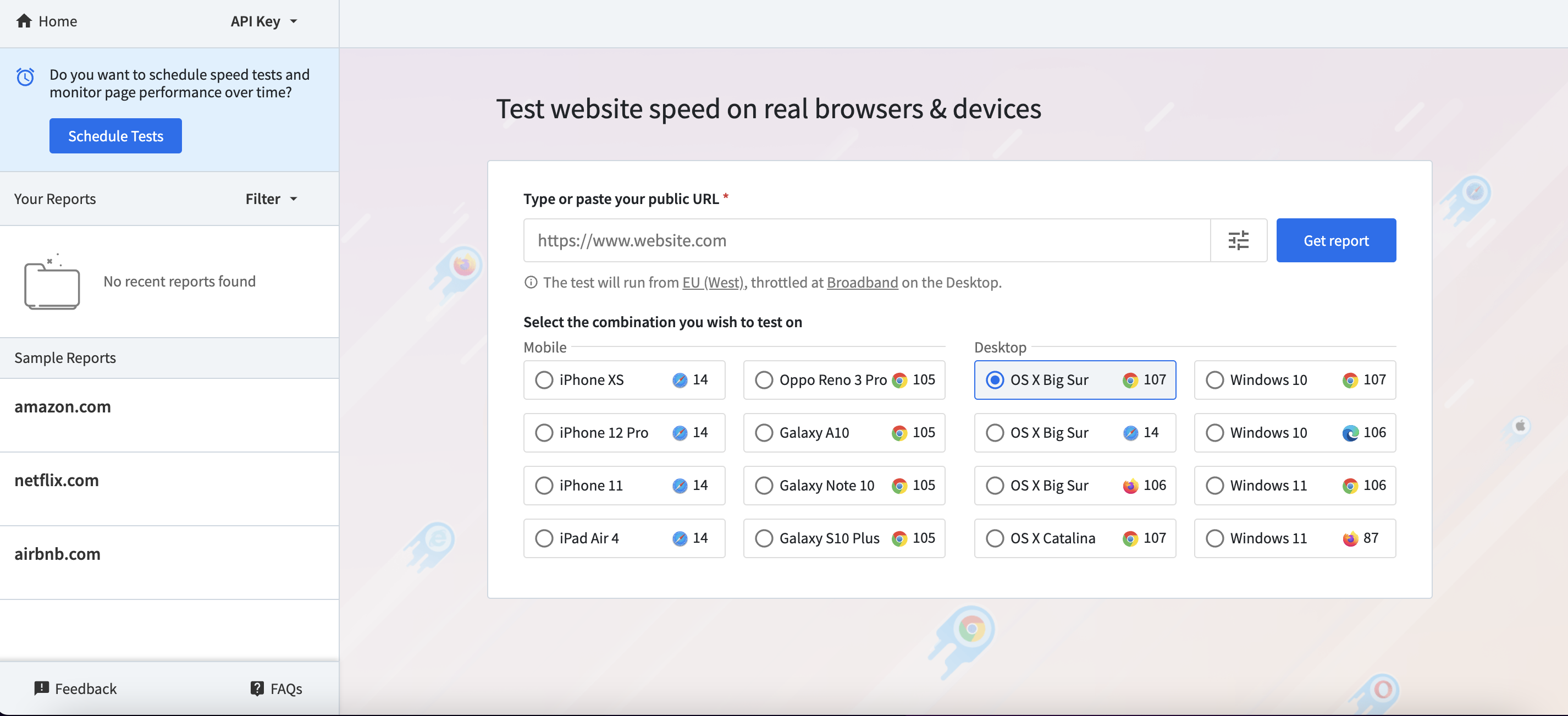
- BrowserStack’s SpeedLab tool gives you insights about website speed and Core Web Vitals. It further expands the scope of website speed testing by allowing testing on 3500+ browsers and devices, and various networks, including Edge, 2G, 3G, 4G, and others.
Read More: Guide to UI Performance Testing
Accessibility Testing
Accessibility testing allows test engineers to ensure that their website is accessible to visually impaired users.
Mobile phones and other hand-held devices are increasingly becoming an essential need. According to a Deloitte report, developed countries have nearly 90% mobile phone penetration, while 80% of their population own a smartphone. A significant portion of this population is differently abled, which requires web developers to make their websites accessible to the visually impaired population as well.
A responsive web design ensures that a website adapts to the screen size of the device on which it is accessed. However, due to changes in browser settings, mobile software updates, coding errors, etc. a website may not respond the way it is intended to on certain devices. This may result in a bad user experience, leading to lower adoption of the website or conversions.
To overcome this problem, responsive web design testing is carried out. It helps reduce churn and improve engagement.
How to Choose the Right Browser-Device Combinations
Today, countless mobile phone brands exist worldwide, each offering different ways to access a website. Adding laptops, desktops, and tablets further expands the number of device-browser combinations, making UI responsiveness a critical challenge.
Testing on different screen sizes available and on various browser-device combinations is not easy, at least not with limited resources in a testing team. So, it’s extremely important to come up with a responsive web design testing strategy to meet your testing goals.
The goal of a responsive web design testing strategy is simple: test for the maximum possible number of viewports and viewport-browser-device combinations. To do this, find out where your maximum traffic comes from. Then, you need to come up with a list of the right devices to test your app or website on.
Read More: What is Automated UI testing?
Tools for UI Responsiveness Testing
Testing UI responsiveness requires reliable tools to ensure seamless performance across different devices, browsers, and network conditions. Here are some essential tools:
- BrowserStack: A cloud-based platform that enables real-time testing on 3500+ real devices and browsers, ensuring accurate results across different environments. It provides multiple options like Percy for automated visual regression testing of UI, App Percy for visual regression testing of mobile apps, and Live for Gesture and Network testing.
- Google PageSpeed Insights: Analyzes website speed and responsiveness, offering recommendations for performance improvements.
- GTmetrix: Evaluates website performance and responsiveness, offering insights on load times and optimization.
- WebPageTest: Provides detailed performance analysis, including responsiveness under different network conditions.
Read More: UI Automation : Everything you need to know
Difference between UI Testing and UI Responsiveness Testing
Here are some of the differences between UI testing and UI responsiveness testing:
| Aspect | UI Testing | UI Responsiveness Testing |
|---|---|---|
| Purpose | To verify the functionality and behavior of user interface elements. | To ensure the UI adapts correctly across various devices, screen sizes, and resolutions. |
| Focus Areas | Button clicks, form submissions, navigation flows, error messages, and element visibility. | Layout adaptability, element resizing, repositioning, readability, and visual consistency across devices. |
| Testing Method | Functional and automated/manual testing of UI components and workflows. | Manual device testing, browser resizing, or automated visual regression tools. |
| Tools Commonly Used | Selenium, Cypress, Playwright, TestCafe, etc. | Chrome DevTools (responsive mode), BrowserStack Responsive tool, Percy, etc |
| Example | Verifying that a “Login” button triggers the correct backend action. | Ensuring the “Login” button is clearly visible and positioned correctly on mobile and tablet screens. |
Best Practices for UI Responsiveness Testing
For a good user experience across all devices and platforms, follow these best practices for UI responsiveness testing:
- Adopt a Mobile-First Approach: Begin design and testing with smaller screens first, then scale up to larger devices.
- Test on Real Devices and Browsers: Validate UI behavior on actual smartphones, tablets, and desktops across multiple browser versions.
- Verify Responsive Breakpoints: Check that layouts adjust smoothly at standard screen widths like 320px, 768px, 1024px, and beyond.
- Ensure Touch & Gesture Responsiveness: Verify that gestures like tap, swipe, pinch-to-zoom, and scroll work seamlessly on touchscreen devices.
- Leverage Responsive Design Mode in DevTools: Use browser DevTools to simulate different devices and screen sizes for quick layout testing.
- Simulate Varied Network Conditions: Test UI performance under slow, unstable, or offline networks using network throttling tools.
- Confirm Text and Image Scalability: Ensure fonts and images resize correctly without affecting readability or causing layout shifts.
- Maintain Accessibility Across Screens: Check color contrast, screen reader support, keyboard navigation, and focus indicators on all screen sizes.
- Automate Visual Regression Testing: Use tools like Percy to detect unintended layout changes during development.
- Replicate Real-World Usage Scenarios: Test screen rotations, zoom levels, sticky headers, modals, and edge cases under practical conditions.
How BrowserStack helps in UI Responsiveness Testing?
Here is how BrowserStack can help with UI responsiveness testing:
- Perform manual interactive testing of your UI on real devices and browsers to check layout responsiveness and user interactions.
- Test touch gestures like tap, swipe, pinch-to-zoom, and scroll on real mobile devices.
- Check UI responsiveness under different browser versions and operating systems to identify browser-specific layout issues.
- Test portrait and landscape orientation changes to ensure layout stability.
- Use built-in browser DevTools to inspect elements, fix layout bugs, and debug responsiveness issues in real time.
Run automated visual regression tests to detect UI layout shifts and visual inconsistencies across screen sizes after code changes.
3. App Percy
Automate UI responsiveness testing for mobile apps by comparing screenshots against baseline images to detect layout shifts and visual inconsistencies across screen sizes and devices.
Conclusion
UI responsiveness testing provides a frictionless user experience across devices, browsers, and network conditions. BrowserStack simplifies this process by providing real-device cloud testing.
Percy offers automated visual regression testing and also helps check responsiveness across devices. App Percy does the same for mobile apps. Using Live, you can conduct in-depth manual testing for responsive behavior and functionality of websites across multiple platforms. These tools enable teams to detect and fix UI responsive issues efficiently.


