Understanding storybook jest
By Priyanka Bhat, Community Contributor - December 27, 2024
The user interface is crucial to any software application and contributes significantly to the overall user experience. Modern development uses a component-driven approach, where individual components are developed and integrated later. This enables early-stage testing of components.
Storybook helps developers create and test components in isolation, running outside the application to avoid project dependency issues. When integrated with Jest, a testing framework for unit and integration tests, Storybook’s capabilities are enhanced, offering powerful testing features.
- What is a Storybook Jest?
- Benefits of using Storybook Jest
- How to set up Jest and Storybook
- Step 1: Install the Storybook and Jest
- Step 2: Create a Jest configuration File
- Step 3: Configure Storybook
- Step 4: Configure Jest for Typescript
- Step 5: Integrate Jest with Storybook
- Step 6: Create a Sample Component and Stories
- Step 7: Create a Jest Test for the Button Component
- Step 8: Execute the Storybook and Jest tests
What is a Storybook Jest?
Storybook Jest is an integration of the Jest testing framework into Storybook. This combination allows writing and executing unit tests for independent components. By integrating Jest into Storybook, developers can validate that components render correctly, handle props as expected, and maintain visual consistency through testing.
Developers can use libraries like React Testing Library or Enzyme with Jest to simulate user interactions and verify component behavior in a Storybook-isolated environment. This helps ensure the components function correctly in all different use cases, streamline the testing process, and maintain the standards across the UI components.
Read More: What is Storybook Testing?
Benefits of using Storybook Jest
Here are the benefits of using Storybook Jest:
- Individual components can be tested in isolation, ensuring they function correctly, considering the overall application context.
- It allows for combining visual workflow and functional testing during the development stage.
- Storybook Jest can enhance collaboration between cross-functional teams like design, testing, and development teams.
- It helps streamline the development and testing process with integration.
- Storybook Jest can be used to enforce standards like unit tests and coverage across the UI components.
- It allows developers to create reusable tests, which minimizes maintenance.
- Using Jest and Storybook with popular UI libraries like React allows for validating the component’s behavior without integration.
- It helps to make changes, validate them, and enhance debugging quickly.
How to set up Jest and Storybook
Storybook and Jest help to design, develop, and test the UI component in isolation. They can test the component with the overall application context without integrating it with the actual components.
Below are the steps to integrate Storybook and Jest.
Pre-requisite:
- Download and install the NodeJS
- Download and Install IDE (VS Code preferable)
Step 1: Install the Storybook and Jest
Open your project directory, and open the terminal in the directory. Using the below command, install Jest and Storybook
npm install --save-dev jest @storybook/reactStep 2: Create a Jest configuration File
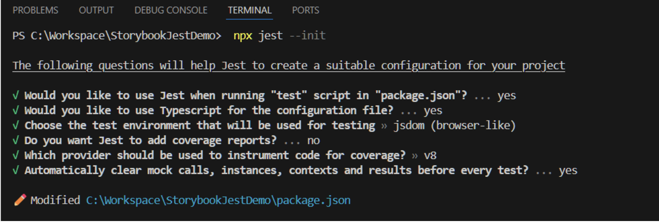
Jest requires a jest.conf.js file, which you can create manually or using the command below.
npx jest --initCLI might ask you a set of questions, and you can provide project-specific answers.
Below answers are provided for demo purposes.
After completing the above command, you should see the jest.config.ts file created in your project root folder.
Step 3: Configure Storybook
Storybook requires few initial configurations, the storybook CLI can be invoked using the below command.
npx sb initduring the installation, it will ask you specific questions, and you can provide project-specific answers. The below answers are provided for example purposes.
Upon completing the installation storybook launches at http://localhost:6006
Step 4: Configure Jest for Typescript
Install dependencies
ts-jest is a preprocessor for jest. This allows the transpile and running of the typescript code on the fly during the execution. Using the below command, install the required dependencies for Jest typescript
npm install --save-dev typescript ts-jest @types/jest ts-node jest-environment-jsdomConfigure tsconfig.json
Once the installation is complete, create a tsconfig.json in your root directory using the configuration below.
{

      "compilerOptions": {

        "target": "es5",

        "module": "commonjs",

        "esModuleInterop": true,

        "sourceMap": true,

        "jsx": "react",

        "baseUrl": ".",

        "paths": {

          "*": ["types/*"]

        }

      }

    }
Configure jest.config.js
Use the below configuration for jest.config.js, which is located in your project root folder
module.exports = {

      // ...

      preset: 'ts-jest',

      testEnvironment: 'jsdom',

      testMatch: [

        '**/__tests__/**/*.ts?(x)',

        '**/?(*.)+(spec|test).ts?(x)',

      ],

    };
Step 5: Integrate Jest with Storybook
Storybook integration with Jest requires @storybook/addon-storyshots dependencies and the same needs to be configured in the main.js file.
Install Storybook Jest
npm install --save-dev @storybook/addon-storyshotsConfigure .storybook/main.js
Update the existing add-on settings in main.js with the below code.
module.exports = {

      // ...

      addons: ['@storybook/addon-storyshots'],

    };
Install the React testing library.
The React testing library allows you to simulate events like clicks, hovers, etc. Install the dependencies using the below command.
npm install @testing-library/reactStep 6: Create a Sample Component and Stories
Create component
Here’s how to create a sample component with a button
//MyComponent.tsx

import React from 'react';

type MyComponentProps = {

  text: string;

};

const MyComponent: React.FC<MyComponentProps> = ({ text }) => {

  return <div>{text}</div>;

};

export default MyComponent;
Create a story for the above component
// MyComponent.stories.tsx

import React from 'react';

import { Meta, Story } from '@storybook/react';

import MyComponent from './MyComponent';

export default {

  title: 'Example/MyComponent',

  component: MyComponent,

} as Meta;

const Template: Story<{ text: string }> = (args) => <MyComponent {...args} />;

export const Default = Template.bind({});

Default.args = {

  text: 'Hello, Storybook!',

};

// Story with custom text

export const CustomText = Template.bind({});

CustomText.args = {

  text: 'This is a custom story!',

};

// Empty text story

export const EmptyText = Template.bind({});

EmptyText.args = {

  text: '',

};
In the above story, 3 Stories are created, one with default, one with custom text, and another with empty text story.
Step 7: Create a Jest Test for the Button Component
import React from 'react';

import { render, screen } from '@testing-library/react';

    import MyComponent from './MyComponent';

    import '@testing-library/jest-dom/jest-globals';

    import '@testing-library/jest-dom';


    describe('MyComponent', () => {

      it('should render with default text', () => {

        render(<MyComponent text="Hello, Storybook!" />);

        expect(screen.getByText('Hello, Storybook!')).toBeInTheDocument();

      });


      it('should render with custom text', () => {

        render(<MyComponent text="This is a custom story!" />);

        expect(screen.getByText('This is a custom story!')).toBeInTheDocument();

      });


      it('should render with no text', () => {

        const { container } = render(<MyComponent text="" />);

        expect(container.firstChild).toBeEmptyDOMElement();

      });

    });
In the above test, there are 3 tests.
- Default text: it renders the component using the render() function with the default text ” Hello, Storybook”
- Custom text: this test renders the component with the custom text we provided
- Empty text: In this test, it should render the empty component
Step 8: Execute the Storybook and Jest tests
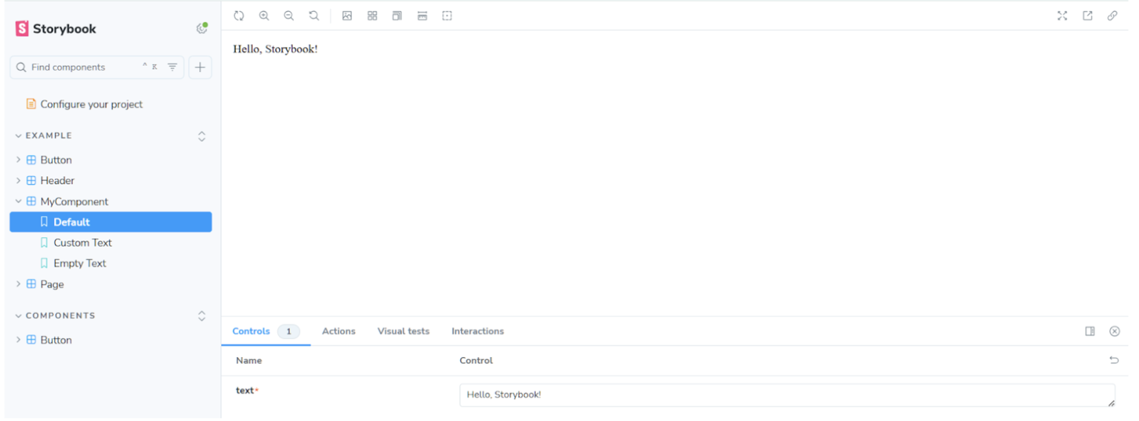
Using the terminal enter the below command to launch the storybook
npm run storybook After executing the above command, you shouldsee the storybook screen in the browser as shown below
Open another terminal and enter the below command to execute the Jest Test
npx jest Mycomponent.test.tsxOutput
What are Portable Stories in Jest?
Portable stories allow us to reuse the code we write in stories in the Jest test. This means that stories can be shared across the jest tests and stories.
This helps write the tests based on the stories we create for our UI components. It also helps to ensure the visual representation and tests are in sync. In this way, stories can be used for the component’s visual and functional aspects.
Benefits of Portable Stories
Here are some benefits of portable stories in Jest:
- Tests are written based on the story. This avoids any mismatches between your visual design and logic.
- Updating a story in Storybook automatically updates the corresponding tests, reducing maintenance effort.
- There is no need to put duplicate effort into writing the tests and stories for each component; this enables a high degree of reusability.
Example of Portable Stories
Below are some examples of portable stories in Jest:
Example component
// PortableComponent.tsx

import React from 'react';

type PortableComponentProps = {

  label: string;

  onClick?: () => void;

};

const PortableComponent: React.FC<PortableComponentProps> = ({ label, onClick }) => {

  return <button onClick={onClick}>{label}</button>;

};

export default PortableComponent;
Example of Stories
In the above code, a simple button component is being created using React
// PortableComponent.stories.tsx

import React from 'react';

import { Meta, Story } from '@storybook/react';

import PortableComponent from './PortableComponent';

export default {

  title: 'Example/PortableComponent',

  component: PortableComponent,

} as Meta;

const Template: Story<{ label: string; onClick?: () => void }> = (args) => <PortableComponent {...args} />;

export const Primary = Template.bind({});

Primary.args = { label: 'Primary Button' };

export const Secondary = Template.bind({});

Secondary.args = { label: 'Secondary Button' };
Using the component, multiple buttons such as Primary and Secondary are being created. Additional buttons can be created as needed.
Example of Jest Test for Portable Stories
Using the above stories we can write Jest tests like below
// PortableComponent.test.tsx

import React from 'react';

import { render, fireEvent, screen } from '@testing-library/react';

import { Primary, Secondary } from './PortableComponent.stories';

import '@testing-library/jest-dom/jest-globals';

import '@testing-library/jest-dom';

describe('PortableComponent', () => {

  it('should render the primary button', () => {

    render(<Primary {...Primary.args} />);

    expect(screen.getByText('Primary Button')).toBeInTheDocument();

  });

  it('should render the secondary button', () => {

    render(<Secondary {...Secondary.args} />);

    expect(screen.getByText('Secondary Button')).toBeInTheDocument();

  });

});
Two tests have been written, one for the primary button and another for the secondary button, by importing them from the PortableComponent.stories file instead of the component. This approach uses the stories to write the tests.
Output
The Difference between Storybook Jest and Storybook addon-jest
Storybook Jest and Storybook addon-jest are both useful in writing the Jest tests. However, the major difference is that Storybook Jest tests are executed using the command line, while storybook add-on-jests are executed and visible in the Storybook UI.
| Feature | Storybook Jest | Storybook Jest Add-on |
|---|---|---|
| Usage | Runs the tests in the command line | Displays Jest test results within the Storybook UI |
| Integration to Storybook | Integrates Jest with Storybook helps in component testing | Test results are visible in the storybook UI |
| Purpose | Used for running jest tests | Used to show Jest test results in Storybook |
| Results | Results are shown in the command line | Results are displayed in the storybook UI |
How to Integrate BrowserStack with Storybook?
BrowserStack offers integration with Storybook through Percy. It is a visual testing tool that helps ensure the UI components look consistent across different browsers. This integration simplifies running visual tests on your Storybook components in the cloud.
By using Percy, you can automate the testing of various UI component states, ensuring they appear correctly on multiple devices and screen sizes and detect any visual discrepancies.
Step 1: Sign up or log in to a BrowserStack account to get started.
Step 2: Navigate to the Percy tool on the BrowserStack homepage.
Step 3: Create a Percy Project and Copy the Percy Token
Step 4: Set the Token as an environment variable in your machine
Example:
set PERCY_TOKEN="<your token here>"Step 5: Install the dependencies using the below command
npm install --save-dev @percy/cli @percy/storybookStep 6: Execute the Percy Storybook
There are different ways to execute the storybook with Percy the simpler approach is using the below command.
npx percy storybook http://example.storybook-url.com
Benefits of Integrating Storybook with BrowserStack
Here are the benefits of integrating Storybook with BrowserStack:
- Easy Integration: Storybook and Percy integration is straightforward, requiring minimal configuration and no major changes to the existing codebase.
- Simplified Visual Testing: The process streamlines visual testing, making it an essential part of UI development by ensuring consistency across components.
- Cloud-Based Tool: Percy operates as a cloud-based service, minimizing the setup needed within your project, which makes it easy for teams to adopt.
- Advanced Features: Percy includes powerful tools like an advanced visual engine, responsive diffs, and snapshot stabilization, helping to detect a wide range of visual discrepancies.
- Faster Reviews: By automating the detection of visual changes, Percy accelerates the review process, ensuring quicker iterations and smooth code deployment.
- Scalable and Adaptable: Percy is designed to scale with organizations of all sizes, supporting a variety of project scopes and workflows.
- CI/CD Compatibility: Integrates smoothly with continuous integration and delivery pipelines, promoting automation and aligning visual testing with modern development practices.
- Cross-Browser Testing: Allows testing UI components across multiple browsers and screen resolutions, offering detailed insights with reduced effort.
Common Errors when using Storybook Jest
Here are some common errors you can face while using Storybook Jest:
- toBeInTheDocument() function not defined. This issue is caused because of the below-missing imports:
import '@testing-library/jest-dom/jest-globals';

import '@testing-library/jest-dom';
Once you add the required import, error should go away
- Jest Environment Not Set to jsdom
The Jest environment runs in a nodejs environment by default. When performing any dom-related actions in the test, it throws an error.
The error below may be caused by using the wrong test environment, see https://jestjs.io/docs/configuration#testenvironment-string.Consider using the "jsdom" test environment.ReferenceError: document is not definedAdding the below line in the jest.config.(js|ts) resolves the issue
testEnvironment: 'jsdom',- Jest or Storybook Not Recognizing TypeScript Files
By default, typescript files are not recognized in Storybook and Jest. To make the tsx file work, it is important ensure the tsconfig.js file is properly configured and the jest.config.js file has the below settings.
preset: 'ts-jest', and   testMatch: [

'**/__tests__/**/*.ts?(x)',

'**/?(*.)+(spec|test).ts?(x)',

],
Read More: Understanding Storybook Action
Best Practices for Storybook Jest
Below are some best practices for Storybook Jest:
- Prefer portable stories and jest tests, this ensures both visual elements and functionality are in sync.
- Design the components and stories as independently as possible
- Consider covering all possible scenarios in component testing in Jest
- Enable coverage report in Jest using flags like collectCoverage: true, coverageDirectory: “coverage”,
- Consider cross-browser testing and visual testing using BrowserStack
- Maintain documentation and add comments in the code to enhance the readability
Conclusion
Jest and Storybook are valuable for enhancing UI component quality. However, given the complexity of modern applications, ensuring compatibility across browsers, platforms, and devices is equally important.
BrowserStack Automate facilitates cross-browser testing to maintain application quality. It provides real user environments, making it easier to identify edge-case scenarios. Integrating these tests into a CI/CD pipeline further improves test coverage during regression testing and ensures automated deployment with all necessary validations.
