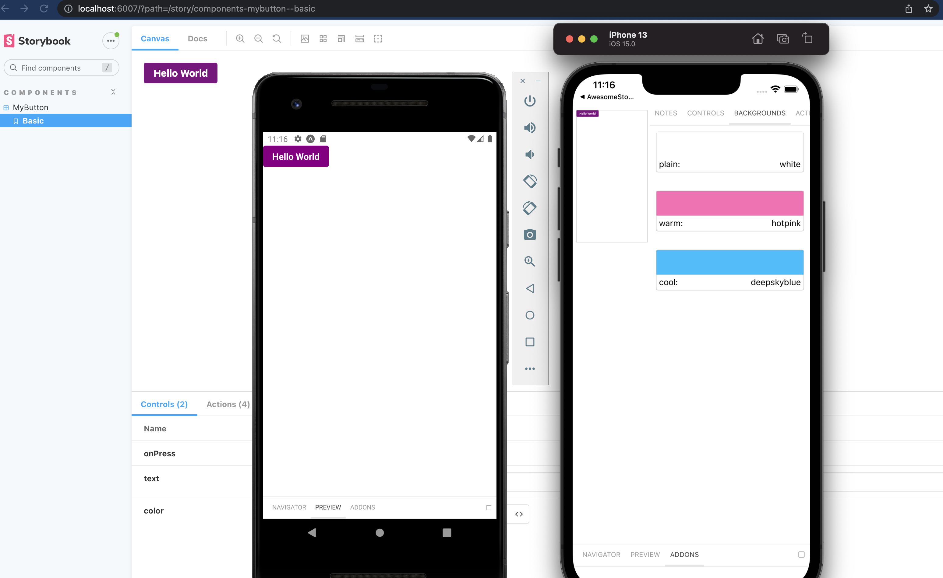
Storybook is an open-source tool that provides an interactive playground to develop, test, and browse your components, making it an invaluable tool for component-driven development in React.
Overview
What is Storybook for React
Storybook for React allows developers to develop UI components in isolation. It serves as a frontend workshop for UI development. Using it, developers can build React components detached from the business logic and context of their app.
What Storybook Does
- Facilitates isolated component development
- Offers interactive component libraries
- Centralized visual documentation
- Supports Component Testing
- Enhances functionality with Addons
Benefits of Using Storybook in React
- Component Isolation
- Enhanced Visual Documentation
- Faster UI development
- Customizable UI
- Seamless Integrations
Learn what is storybook in React, how to use Storybook for React and the best practices with this comprehensive guide.
What is a Storybook for React?
Imagine a Storybook for React as your personal guide, helping you build a house, where each room represents a UI component of your React application. You, as the architect, have the freedom to design each room independently, without worrying about how it will fit with the rest of the house. This is the beauty of Storybook.
It allows you to develop and test UI components in isolation, just like you would design a room without the constraints of the entire house.
Read More: What is Component Testing? (with Examples)
Suppose you are building an e-commerce website. You have various components like the navigation bar, product card, shopping cart, etc. Now, each of these components has its own functionality and design. With storybook react, you can focus on one component at a time, perfecting its design and functionality without worrying about the rest of the application. You can experiment with different styles, play around with the functionality, and once you are satisfied, you can integrate it into your application.
Moreover, Storybook provides you with a playground where you can see your component in action. You can interact with it, test it, and make sure it works as expected before integrating it into your application. This not only improves the quality of your components but also makes the development process more efficient.
So, in essence, storybook react is like your personal tutor, guiding you through the process of building high-quality, reusable UI components for your React application. It gives you the freedom to focus on one component at a time, perfect it, and then move on to the next one. And the best part is, you can see your progress in real-time, making the learning process more interactive and fun.
Read More: What is Storybook Testing?
Functions of Storybook
The following are the main functions of Storybook in React:
Functions of Storybook
- Isolated Component Development
- Interactive Component Libraries
- Component Testing
- Storybook Addons
- Reuse Components
- Testing Support
- Integrations
- Document Components
1. Isolated Component Development: Lets you develop and test React components in isolation without having to depend on the app’s structure.
2. Interactive Component Libraries: Offers an interactive UI to visualize, and interact with different variants and states of the components.
3. Component Testing: Storybook can be used in visual testing to assist developers to check the rendering of each component. .
4. Storybook Addons: Storybook provides a variety of Addons to enhance its functionality. This includes A11y for accessibility testing, Knobs for dynamic component state changes etc.
5. Reuse Components: It facilitates component reusability by letting you display, test and modify components with having to go for a full app rebuild.
6. Testing Support: Storybook integrates with testing libraries like Jest and React Testing Library to help write and run unit and integration tests for components easily.
7. Seamless Integrations: Storybook can integrates smoothly with development tools like GitHub, Bitbucket, and CircleCI along with frontend frameworks, like Vue and Angular.
8. Document Components: Storybook can generate visual documentation of your components automatically as you develop them. This helps in better collaboration between developers, testers and designers.
Why Use Storybook in React?
Here are the reasons why you should use Storybook in React:
- Develop and test components independently without needing a full application
- Generate interactive and visual documentation for components automatically
- Speed up UI development with real-time previews and component state management
- Customize UI to align with specific project requirements
- Integrates smoothly with testing tools to ensure accessibility and consistency.
How to use Storybook for React?
Using storybook react is like having a personal playground for your UI components. Let’s imagine you’re building a Lego castle. Each Lego block is a component of your castle. Now, wouldn’t it be great if you could build and test each Lego block separately before adding it to your castle? That’s exactly what Storybook allows you to do.
To start using Storybook for React, you first need to install it in your project. You can do this by running the following command in your terminal:
npx -p @storybook/cli sb init
This command will add Storybook to your project and set up some basic configuration. Once Storybook is installed, you can start it by running:
npm run storybook
This will start the Storybook server and open a new tab in your browser where you can interact with your components.
Now, let’s say you’re building a button component for your application. You can create a new file called Button.stories.js and write your stories there. A story is basically a state of your component. For example, you can have a story for a button with a text, a button with an emoji, a disabled button, etc.
Here’s how you can write a story for your button component:
import React from 'react';
import { storiesOf } from '@storybook/react';
import Button from './Button';

storiesOf('Button', module)
  .add('with text', () => <Button>Click me</Button>)
  .add('with emoji', () => <Button>😀 😎 👍 💯</Button>)
  .add('disabled', () => <Button disabled>Don't click me</Button>);
Now, when you run Storybook, you can see your button component in different states and interact with it.
In essence, Storybook provides a sandbox environment where you can build, test, and document your UI components in isolation, making your development process more efficient and fun.
Also Read: React Testing: How to test React components?
Getting Started with Storybook for React
Getting started with storybook react involves a few steps, but once you’ve set it up, it becomes an invaluable tool for developing and testing your React components. Here’s a step-by-step guide:
Prerequisites: Before you start, make sure you have a React project set up. Storybook needs to be installed into a project that is already set up with a framework. You can use the Create React App to bootstrap a new React project.
Installation: To install Storybook, navigate to your project’s root directory and run the following command:
npx sb init
This command will install the necessary dependencies, set up the required scripts to run and build Storybook, add the default Storybook configuration, and even add some boilerplate stories to get you started.
- Running Storybook
Once Storybook is installed, you can start it by running:
npm run storybook
This command will start the Storybook server and open a new tab in your browser where you can interact with your components.
- Creating a Story:
Stories in Storybook represent a single state of a component. To create a story, you need to create a new file with the .stories.js extension. For example, if you have a Button component, you can create a Button.stories.js file.
Here’s an example of what a story might look like
import React from 'react';
import { Button } from './Button';

export default {
  title: 'Example/Button',
  component: Button,
};

const Template = (args) => <Button {...args} />;

export const Primary = Template.bind({});
Primary.args = {
  primary: true,
  label: 'Button',
};
In this example, Primary is a story for the Button component. The args object defines the props that the component receives.
- Testing Components: Storybook provides a sandbox environment where you can test your components in isolation. You can interact with your component, change its props, and see how it behaves. This allows you to ensure that your component works correctly in all possible states.
- Documentation: Storybook also allows you to create documentation for your components. You can add a parameters field to the default export of your .stories.js file to add a description of the component, its props, and the stories you’ve created.
Creating Your First Story in Storybook
Storybook is all about stories. Each story represents a single state of a component. For example, if you’re creating a button, you might have different stories for its default state, hover state, and disabled state.
To create a story, you first need to add a new file to your project. This file should be in the same directory as your component and should be named ComponentName.stories.js. Inside this file, you’ll define all the stories for that component.
Let’s take a look at an example. Suppose you’re creating a button component. Your story file might look something like this:
import React from 'react';
import { Button } from './Button';
export default {
  title: 'Button',
  component: Button,
};

export const Text = () => <Button>Click me</Button>;
export const Emoji = () => <Button>😀</Button>;
In this example, we’ve defined two stories for our button: one for the default text button and one for a button with an emoji. The title field in the default export determines how the component will be named in the Storybook app.
Once you’ve defined your stories, you can start Storybook by running npm run storybook in your terminal. This will start the Storybook server and open the Storybook app in your browser. Here, you can see your stories and interact with them.
Remember, the goal of Storybook is to make it easy for you to develop and test your components. So don’t worry if you don’t get everything right the first time.
BrowserStack’s Percy revolutionizes Visual Testing as a flexible, user-friendly SaaS application. It allows you to review visual results from anywhere, streamlining the process of accepting or rejecting builds. This enhances the review process and expedites the development and testing of UI components.
For a more in-depth understanding, consider exploring how to perform Storybook Visual Testing and how to test UI components with Percy on BrowserStack.
Best Practices for using Storybook in React
Storybook is a fantastic tool for developing and showcasing React components in isolation. It allows you to visualize different states of your UI components and develop them outside of your application.

- Organize your Stories
Just like you would organize your components in a thoughtful directory structure, you should also organize your stories. Storybook provides a default way to organize your stories by using a nested structure. For example, if you have a Button component, you might have a directory structure like this:
src
├── components
│   ├── Button
│   │   ├── Button.js
│   │   ├── Button.stories.js
│   │   └── Button.test.js
In your Button.stories.js file, you might have something like this:
import React from 'react';
import { Button } from './Button';

export default {
  title: 'Components/Button',
  component: Button,
};

const Template = (args) => <Button {...args} />;

export const Primary = Template.bind({});
Primary.args = {
  primary: true,
  label: 'Button',
};
This way, your Button story will appear under the “Components” section in the Storybook UI.
- Use Controls and Actions
Controls and Actions are two essential addons that come with Storybook. Controls allow you to create interactive examples in your storybook. Actions allow you to handle events in your components with mock functions.
Here’s an example of how you can use controls and actions in your Button component:
import React from 'react';
import { Button } from './Button';

export default {
  title: 'Components/Button',
  component: Button,
  argTypes: {
    backgroundColor: { control: 'color' },
    onClick: { action: 'clicked' },
  },
};

const Template = (args) => <Button {...args} />;

export const Primary = Template.bind({});
Primary.args = {
  primary: true,
  label: 'Button',
};
In this example, the backgroundColor control allows you to change the color of the button directly from the Storybook UI. The onClick action logs a “clicked” message in the actions panel whenever you click the button.
- Document your Components
Storybook allows you to write markdown documentation for your components using the Docs addon. This is a great way to provide usage instructions and document the different props your component accepts.
Here’s an example of how you can document your Button component:
import React from 'react';
import { Button } from './Button';

export default {
  title: 'Components/Button',
  component: Button,
  parameters: {
    docs: {
      description: {
        component: `
          This is a Button component. It accepts a \`label\` prop and an \`onClick\` prop.
        `,
      },
    },
  },
};

const Template = (args) => <Button {...args} />;

export const Primary = Template.bind({});
Primary.args = {
  primary: true,
  label: 'Button',
};
In this example, the parameters.docs.description.component property allows you to write markdown documentation for your Button component.
- Use Storybook for Component-Driven Development (CDD)
Storybook is a great tool for Component-Driven Development (CDD). This means developing your components in isolation, starting from the smallest components and working your way up to larger components. This approach can help you to create more reusable components and can make it easier to test your components.
Remember, the key to getting the most out of Storybook is to use it as a part of your development workflow, not just as a tool for showcasing your components.
Also Read: How to perform Storybook Visual Testing?
Using Addons in Storybook
Addons are like extra tools or features you can add to Storybook to make it even more powerful. They’re like apps you can install on your phone to do more things. For example, you might install a weather app on your phone to check the forecast, or a game to play when you’re bored. Similarly, you can install addons in Storybook to do more things.
Here’s how you can use addons in Storybook:
- Installing an Addon: First, you need to install the addon. It’s like downloading an app from the app store. For example, if you want to install the @storybook/addon-actions addon, you would run npm install @storybook/addon-actions –save-dev in your terminal.
- Registering the Addon: After you’ve installed the addon, you need to tell Storybook that you want to use it. This is like opening the app on your phone. You do this by adding the addon to the addons array in your .storybook/main.js file. For example:
module.exports = {
  addons: ['@storybook/addon-actions/register'],
};- Using the Addon in a Story: Now that you’ve installed and opened your addon, you can start using it. Each addon is used in a different way, depending on what it does. For example, the @storybook/addon-actions addon can be used to log the actions of a component. Here’s how you might use it in a button component:
import { action } from '@storybook/addon-actions';
import { Button } from './Button';

export default {
  title: 'Button',
  component: Button,
};
export const Text = () => <Button onClick={action('button-click')}>Click me</Button>;
In this example, whenever you click the button, the action will be logged in the Storybook interface. It’s like when you tap an app on your phone and it opens – you can see and interact with the app.
Remember, addons are there to help you, so don’t be afraid to use them. And if you’re not sure how to use an addon, you can always look up its documentation or ask for help. Just like you might ask a friend how to use a new app you’ve downloaded on your phone.
Conclusion
Storybook for React is a revolutionary tool that transforms UI development. It enables the creation and testing of UI components in isolation, enhancing efficiency and quality. It’s a personal tutor, a sandbox, and a playground, all in one, guiding developers through the process of building reusable components. With its support for best practices, comprehensive documentation, and powerful addons, Storybook is more than a tool—it’s a comprehensive platform for component-driven development, making it an indispensable asset for every React developer.
Discover the power of seamless testing with BrowserStack. With over 3500+ real browsers and devices available for interactive manual testing through Live, and automated Selenium testing via Automate, you can ensure your application’s flawless performance. Dive into mobile app testing with App Live and App Automate. Trust in BrowserStack for accurate, reliable results.
Frequently Asked Questions (FAQs)
- Is storybook good for React?
Yes, Storybook is beneficial for React as it provides a live, reusable component library, enhancing UI development and testing efficiency.
- Why do we need storybook in React?
Storybook provides a live, visual platform to develop and test UI components, enhancing efficiency and organization.


