Storybook is used to develop UI components in isolation, and is particularly effective when used with Angular.
Overview
What is Storybook in Angular?
Storybook for Angular is a tool for developing and testing Angular UI components in isolation from the app’s business logic and context.
Benefits of Using Storybook for Angular
- Component Isolation
- Centralized Visual Documentation
- Reusable Components
- Quicker UI development
- Customizable UI
- Addon Ecosystem
- Seamless Integration with third-party tools
Learn everything about Storybook for Angular, including how to set up Storybook with Angular, how to use them together, best practices, and more with this comprehensive guide.
What is Storybook for Angular?
In Angular development, components are the building blocks of your application. But how do you ensure each block is robust and ready to play its part in the grand structure? Enter Storybook, a tool designed to put each component through its paces, in isolation from the rest.
In Storybook angular each story represents a single state of your component (of Angular website), allowing you to visualize and test them in isolation.
For instance, let’s consider a ‘Login Form’ component. This component might have various states – an initial state, a loading state when the form is submitted, a success state when the login is successful, and an error state for failed login attempts.
With Storybook, you can create a separate story for each of these states. You can then view these stories in Storybook’s user interface, allowing you to see exactly how your ‘Login Form’ component behaves in each state, without having to manually trigger these states in your application.
In essence, Storybook for Angular is a powerful tool that helps developers build robust, well-tested components by providing a controlled environment to view and test each component in isolation.
Read More: What is Storybook Testing?
Why Use Storybook in Angular?
Here are the reasons why you should use Storybook in Angular:
- Develop and test components in isolation without depending on the application as a whole
- Build modular, reusable components that smoothly integrate across different parts of the app
- Generate interactive and visual documentation for components automatically
- Accelerate UI development with real-time previews and component state management
- Customize UI to meet specific project needs
- Utilize addons for tasks like accessibility testing, performance optimization, and more.
- Integrate seamlessly with testing tools to ensure accessibility and consistency.
Read More: Top 20 Performance Testing Tools
How to add Storybook to Angular app?
Adding Storybook to an Angular application involves a few steps.
Step 1. Install Node.js and npm on your system.
Step 2. Install the Angular CLI globally using below command.
npm install -g @angular/cli
Step 3. Create a new Angular project using the Angular CLI with the command
ng new my-angular-storybook-project
You can replace “my-angular-storybook-project” with your desired project name.
Step 4. Navigate to the project directory using
cd my-angular-storybook-project
Step 5. Initialize Storybook in your project with the command
npx -p @storybook/cli sb init --type angular
This command sets up the necessary configuration files and dependencies.
Step 6. Finally, start Storybook by running
npm run storybookHow to use Storybook for Angular?
Storybook, an open-source tool for Angular and other frameworks, empowers developers to build UI components in isolation. It provides a sandbox to test various scenarios and edge cases, ensuring component reliability.
Storybook’s out-of-the-box features simplify UI development and documentation, making it easier to share components across teams. Supporting Markdown and MDX enables robust documentation and style guides, fostering consistency in larger projects.
With Storybook, developers create component stories to visualize and interact with specific states, facilitating efficient testing and debugging.
You can use Storybook for Angular effectively by:
- Using Stories Effectively: Each story in Storybook represents a single state of a component. Make sure to create stories for all the different states of your components. This will allow you to test each state in isolation and catch any issues early on.
- Documenting your Components: Use Storybook’s support for Markdown and MDX to create detailed documentation for your components. This will make it easier for other developers to understand how to use your components and when to use them.
- Sharing your Storybook: Storybook makes it easy to share your components and their documentation with others. This can be incredibly useful for collaboration, especially in larger teams.
- Integrating Storybook into Workflow: Make Storybook a core part of your development workflow. Use it to develop and test your components in isolation before integrating them into your app. This can help to catch issues early on and speed up the development process.
Read More: How to perform Storybook Visual Testing?
Getting Started with Storybook for Angular
To get started with Storybook for Angular, it is important to get all the prerequisites and set up handy. Here’s how you can get those ready:
Prerequisites of using Storybook for Angular
- Ensure you have Node.js and npm installed on your system.
- Install the Angular CLI globally by running the command:
npm install -g @angular/cli
Setting Up Storybook for Angular
Here are the steps to setup Storybook for Angular:
Step 1. Create a new Angular project using the Angular CLI with the command:
ng new my-angular-storybook-project
You can replace “my-angular-storybook-project” with your desired project name.
Step 2. Follow the prompts to customize your project, and then navigate to the project directory using the command
cd my-angular-storybook-project
Step 3. Initialize Storybook in your project with the command
npx storybook initThis command will automatically detect that you are using Angular and set up the necessary configuration files and dependencies.
Step 4. Start Storybook by running:
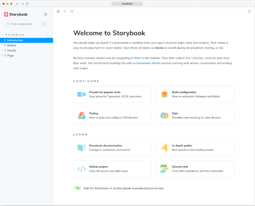
npm run storybookStep 5. Now, open your browser and navigate to http://localhost:6006 to see your Storybook instance up and running as seen below.
Creating and Testing Angular Components with Storybook
Step 1. Generate a new Angular component using the Angular CLI with the command:
ng generate component my-component
Step 2. Modify the HTML and TypeScript files as needed for your component.
Step 3. Create a new Storybook story for your component. Inside the src/app/my-component folder, create a new file named my-component.stories.ts.
Add the necessary content to the file to define your stories.
Step 4. With Storybook running, refresh your browser at http://localhost:6006.
- You should now see your component listed in Storybook’s component catalog.
- Click on it to view the component and interact with it.
Step 5. Under the Controls tab on the bottom panel, you can see a list of all inputs and outputs. You can modify those default values to see changes live on the canvas.
Step 6. Under the Actions tab, you can see all events or outputs of your component.
- For example, if you click on the component in the canvas, you can see the event appearing on the list.
- This way you can debug events to see if they are working properly and if they are passing the correct data around.
Advanced Techniques to Enhance Development with Angular and Storybook
Below are some of the advanced techniques used in Storybook Angular:
- Custom Decorators: Custom decorators are a powerful way to extend the capabilities of Storybook and Angular. By creating custom decorators, you can add extra functionality or behavior to your components’ stories, making them more interactive and dynamic.
Custom decorators enable you to simulate various scenarios and use cases, enhancing your development workflow and facilitating better component testing. - Component-Driven Development (CDD) Approach: Component-Driven Development (CDD) is an advanced technique that emphasizes building applications one component at a time. Instead of developing entire pages or features, you focus on creating and refining individual components in isolation.
By using Storybook as the central hub for developing and showcasing components, you can adopt the CDD approach effectively. This methodology encourages collaboration, reusability, and a more systematic development process. - Integration with Testing Frameworks: To ensure the reliability and stability of your components, it’s essential to incorporate testing into your development process. Storybook integrates seamlessly with popular testing frameworks like Jest and Cypress.
Jest is a unit testing framework that allows you to test individual components in isolation, while Cypress is an end-to-end testing framework that enables you to test component behavior across the entire application. Integrating Storybook with these testing frameworks provides comprehensive test coverage, ensuring that your components function as intended.
Read More: How to Ensure Maximum Test Coverage?
Creating a Button Component with Different States
Let’s create a simple Button component with different states like ‘Default’, ‘Hover’, and ‘Active’.
Step 1. First, generate a new Angular component using the Angular CLI with the command ng generate component Button.
Step 2. Modify the HTML file of the Button component to look like this:
<button class="btn" [ngClass]="{ 'btn-hover': isHover, 'btn-active': isActive }">{{ label }}</button>
Step 3. Now modify the TypeScript file:
import { Component, Input } from '@angular/core';

@Component({
  selector: 'app-button',
  templateUrl: './button.component.html',
  styleUrls: ['./button.component.scss']
})
export class ButtonComponent {
  @Input() label = '';
  @Input() isHover = false;
  @Input() isActive = false;
}
Step 4. Now, let’s create a new Storybook story for the Button component. Inside the src/app/button folder, create a new file named button.stories.ts. Add the following content to the file:
import { Story, Meta } from '@storybook/angular/types-6-0';
import { ButtonComponent } from './button.component';

export default {
  title: 'Button',
  component: ButtonComponent,
  argTypes: {
    backgroundColor: { control: 'color' },
  },
} as Meta;

const Template: Story<ButtonComponent> = (args: ButtonComponent) => ({
  component: ButtonComponent,
  props: args,
});

export const Default = Template.bind({});
Default.args = {
  label: 'Default',
};

export const Hover = Template.bind({});
Hover.args = {
  label: 'Hover',
  isHover: true,
};

export const Active = Template.bind({});
Active.args = {
  label: 'Active',
  isActive: true,
};
With Storybook running, refresh your browser at http://localhost:6006. You should now see the Button component listed in Storybook’s component catalog. Click on it to view the component and interact with it.
Best Practices for using Storybook in Angular
When using storybook angular, it’s essential to follow some best practices to ensure you’re getting the most out of these tools. Here are some key points to keep in mind:
- Hierarchical Organization of Stories: One of the essential practices is to organize your stories hierarchically using the / separator in the story title. By doing so, you can categorize related stories and group them logically. This hierarchical structure keeps your stories organized and makes it easier to navigate through various components and their variations.
Button
  /Primary
  /Secondary
Input
  /Default
  /With Placeholder
  /Disabled
- Utilize the storiesOf API: Leverage the storiesOf API to create more complex stories that demonstrate multiple component states or variations. This allows you to showcase the full range of component behavior and interactions effectively. With storiesOf, you can encapsulate different component states in separate stories, providing a clear picture of how the component behaves under various conditions.
import { storiesOf } from '@storybook/angular';

storiesOf('Button', module)
  .add('Primary', () => ({
    template: '<app-button variant="primary">Click Me</app-button>',
  }))
  .add('Secondary', () => ({
    template: '<app-button variant="secondary">Click Me</app-button>',
  }));
- Implement a Design System or Pattern Library: To ensure consistent styling and component usage across your Angular application, it’s highly recommended to establish a design system or pattern library. A design system defines a set of reusable components, styles, and guidelines that maintain a unified visual language throughout your application. Integrating Storybook with a design system allows you to showcase components within the context of your established design principles, making it easier for your team to maintain design consistency.
- Regularly Update Storybook: Keep your Storybook instance up to date by regularly updating it to take advantage of the latest features and improvements. Storybook evolves rapidly, and staying current ensures you have access to the best tools and features available. Regular updates also help you avoid compatibility issues with other libraries and dependencies.
- Document Components and Stories: Documentation is crucial for successful collaboration among developers. When using Storybook in Angular, document your components and stories to provide context and guidance to other team members. Well-documented stories make it easier for developers to understand how components should be used and what variations are available. Consider adding descriptions, examples, and usage guidelines to your stories to enhance clarity and promote efficient development.
Conclusion
In conclusion, Storybook is not just a tool but a game-changer for Angular developers. It’s not only streamlining the development process but also fostering collaboration and ensuring consistency across large projects. Renowned companies like IBM, Airbnb, Lyft, Slack, and Twitter, among thousands of others, leverage Storybook for their front-end development. It’s instrumental in building top design systems like Shopify Polaris and IBM Carbon.
Using Storybook, you can enhance your Angular projects, delivering high-quality, robust applications that stand the test of time. Storybook for Angular can transform your UI development process and help you create applications that truly stand out.
BrowserStack offers a comprehensive solution that integrates seamlessly with Storybook for Angular, a tool that allows you to develop and test UI components in isolation. But what truly sets BrowserStack apart is its integration with Percy, a next-generation tool for Visual Testing.
As a SaaS application, Percy provides unparalleled flexibility, allowing you to review visual results from anywhere, at any time. Moreover, BrowserStack’s Real Device Cloud enables you to test your Angular components across a wide range of browsers, operating systems, and devices.


