Storybook is a popular open-source tool for developing UI components in isolation. It simplifies component development, testing, and documentation without depending on APIs or backend systems. With support for visual, accessibility, and cross-browser testing, Storybook fosters better collaboration between design, development, and QA teams. Its Actions feature helps log and debug user interactions within components, improving the development workflow.
Overview
What are Storybook Actions?
- Definition: A feature to log and debug user interactions in UI components.
- Use Cases: Button clicks, form submissions, input changes, mouseover, etc.
- Add-on: Available via @storybook/addon-actions and @storybook/test.
- Purpose: Avoids writing custom loggers, provides real-time feedback during development.
Setup Prerequisites for Storybook Actions
- Install NodeJS and VSCode.
- Install Storybook.
- Install required packages:
npm install –save-dev @storybook/test
npm install –save-dev @storybook/addon-actions
Using Storybook Actions in UI Development
- Args Approach: Logs events directly via args: { onClick: fn() }.
- Play Functions: Simulate user interactions for testing.
Storybook Action Handles
- Monitor multiple events: handles: [‘click .btn’, ‘mousemove’].
- Track input changes:
<MyComponent onClick={action(‘button-click’)} onChange={action(‘input-change’)} />
This guide explains Storybook Actions, how to set them up, use them in UI development, advanced techniques, best practices, and integration with visual testing tools like Percy.
What are Storybook Actions?
Storybook actions are a special feature that allows developers to log and debug interactions within UI components. It captures events triggered by user interactions such as
- button clicks
- form submissions
- input changes
- mouseover, etc.
This feature is useful in building interactive components. Developers do not need to write and maintain custom loggers.
Storybook actions are available as an add-on called @storybook/addon-actions. It doesn’t require a complex setup. You may need to perform only basic configurations. Once configurations are done, you can start using this add-on wherever required. There is also one more way to include actions using the @storybook/test package with fn() function.
Read More: What is Storybook Testing
How to set Storybook Actions?
Storybook actions are simpler to configure once the storybook and other required packages are ready. Now start the setup process with pre-requisites
Pre-requisites
Step 1: Install Required Packages
To use the storybook actions, you need two dependencies, namely @storybook/addon-actions and @storybook/test
Install the add-on using the below command
npm install --save-dev @storybook/test

npm install --save-dev @storybook/addon-actions
Note: These components are often included with the Storybook installation by default. If they are not already installed, the command provided above can be used to install them.
Step 2: Import and use the Actions in stories
Using the import option allows the Actions to be incorporated directly into stories, as demonstrated in the example below.
Generic Snippet
import { fn } from '@storybook/test';

import { withActions } from '@storybook/addon-actions/decorator';

export default {

  title: 'Any Title',

  component: Compent_Name,

  args: { onClick: fn() },

}
Or
export default {

  title: 'Any title',

  component: Button,

  parameters: {

    actions: {

      handles: ['<replace_with_event_name>', 'click .btn'],

    },

  },

  decorators: [withActions],

};
In the code, the @storybook/test and @storybook/addon-actions/decorator libraries are imported to enable Storybook actions. The first example uses args: { onClick: fn() } to log events, while the second example employs parameters: { actions: { handles: [] } } to specify the necessary event handlers for Storybook actions.
Using Actions in UI Component Development
As mentioned earlier, Actions are very helpful in debugging and logging. The storybook recommends using the fn() function for Actions. A simple example is demonstrated below.
Example
// Button.js

import React from 'react';

export const Button = ({ onClick, children }) => (

  <button onClick={onClick}>{children}</button>

);
// Button.stories.js
import { fn } from '@storybook/test';
import { userEvent, within, expect } from '@storybook/test';
import React from 'react';
import { Button } from './Button';
export default {
title: 'Example/Button',
component: Button,
args: { onClick: fn() },
};
const Template = (args) => <Button {...args} />;
export const PrimaryButton = Template.bind({});
PrimaryButton.args = {
children: 'Primary Button',
};
PrimaryButton.play = async ({ canvasElement }) => {
const canvas = within(canvasElement);
const button = canvas.getByRole('button'); // Find the button in the DOM
await userEvent.click(button);
};In the code, args: { onClick: fn() } is defined at the component level, enabling action logging when either user interactions or the play function triggers the button.
The play function for PrimaryButton simulates a user click event. Once this event is fired, the corresponding actions are logged, allowing for easy observation of user behavior.
Output
Using Actions with Action Handles
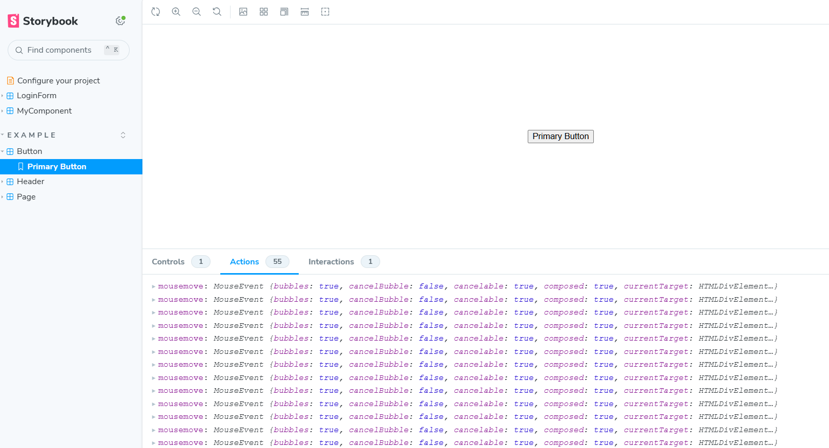
Storybook enables you to log actions for various HTML events. The following code demonstrates how to log actions specifically for mouse movement events.
Example
import { userEvent, within, expect } from '@storybook/test';

import { withActions } from '@storybook/addon-actions/decorator';

import React from 'react';

import { Button } from './Button';

export default {

  title: 'Example/Button',

  component: Button,

  parameters: {

    layout: 'centered',

    actions: {

      handles: ['mousemove', 'click .btn'],

    },

  },

  decorators: [withActions],

};
The code utilizes [‘mousemove’, ‘click .btn’] and decorators: [withActions] to monitor mouse move events and button clicks. This configuration logs these actions in the Storybook dev tools, allowing for easy monitoring and analysis.
Output
Using Actions for Input Change
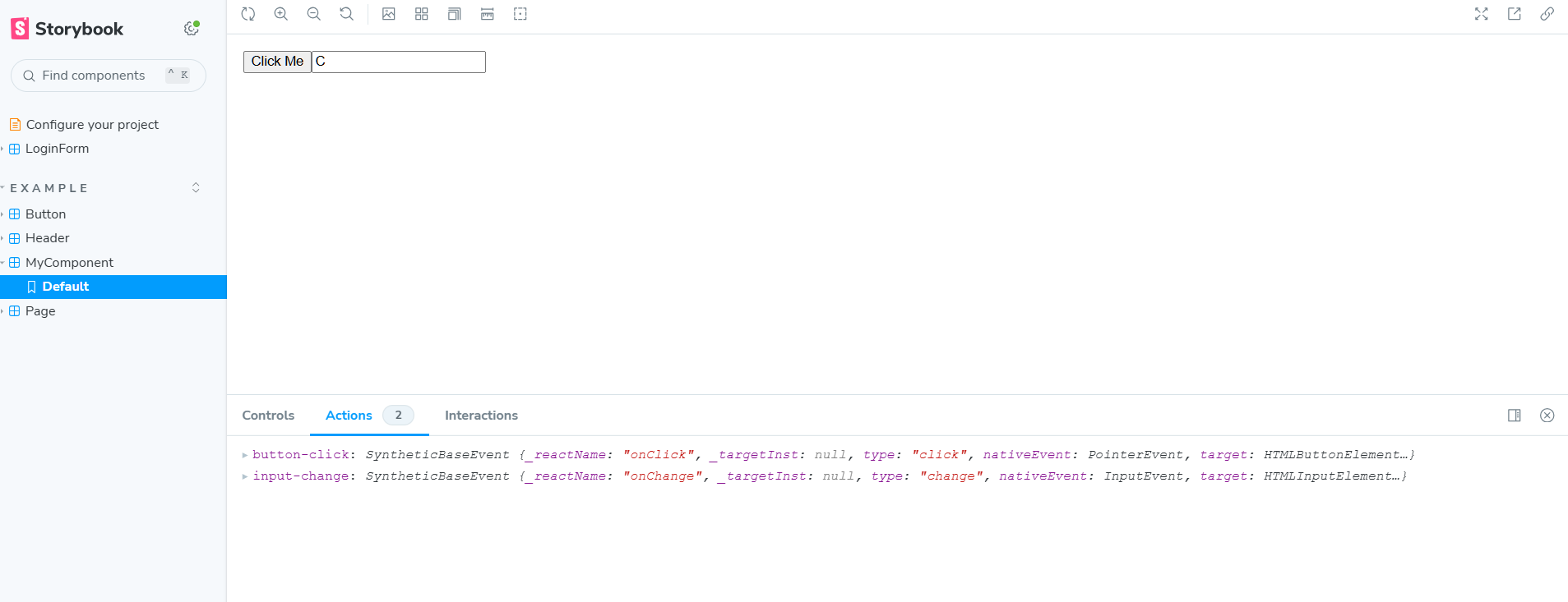
Storybook actions can also be implemented for input change events, enabling the logging and tracking of user input interactions within the Storybook dev tools.
Example
// MyComponent.js

import React, { useState } from 'react';

export const MyComponent = ({ onClick, onChange }) => {

  const [inputValue, setInputValue] = useState('');

  return (

    <div>

      <button onClick={onClick}>Click Me</button>

      <input

        type="text"

        value={inputValue}

        onChange={(e) => {

          setInputValue(e.target.value);

          onChange(e);

        }}

        placeholder="Type something..."

      />

    </div>

  );

};
// MyComponent.stories.js
import React from 'react';
import { MyComponent } from './MyComponent';
import { action } from '@storybook/addon-actions';
export default {
title: 'Example/MyComponent',
component: MyComponent,
};
export const Default = () => (
<MyComponent
onClick={action('button-click')}
onChange={action('input-change')}
/>
);The code implements the actions function for two events: click and onChange. The onChange action is particularly useful for tracking input changes. When the component renders, any of these events—whether from user interaction or simulation—are logged as actions. This provides valuable insights into user behavior.
Output
Advanced Techniques with Storybook Actions
Storybook actions provide many advanced capabilities, including using regular expressions, creating custom actions, using multiple action handles, etc.
1. Actions with Regular Expressions
Storybook supports regular expression-based action matching. For instance, to match all events starting with “on,” stories can be defined below.
Snippet
import { Button } from './Button';

export default {

  component: Button,

  parameters: { actions: { argTypesRegex: '^on.*' } },

};
2. Custom Action Handlers
Storybooks allow for the definition of custom actions, so there is no need to rely solely on default actions. The snippet below demonstrates how to set up custom action handlers.
Snippet
const customAction = (actionName) => (event) => {

  console.log(`Custom actions demo ${actionName}:`, event);

};

export default {

  title: 'Example/CustomActionButton',

  component: Button,

};

export const CustomActionButton = () => (

  <Button onClick={customAction('custom-click')}>Clicked</Button>

);
3. Action logging with Multiple Actions
You can also log multiple actions by defining them in an array of handles, as mentioned below.
Snippet
export default {

  title: 'Example/ParameterizedActions',

  component: Button,

  parameters: {

    actions: {

      handles: ['mouseover .btn', 'click .btn'],

    },

  },

};Best Practices for Storybook Actions
Here are some key considerations when working with Storybook actions:
1. Actions Not Logging:
This issue may occur if add-ons are not registered. To resolve it, ensure the action add-on is registered in the storybook/main.js file.
2. Event Handlers Not Triggering:
This may be due to incorrect imports or unexported events from components. Using Storybook’s play function can help simulate user interactions and resolve this issue.
Best Practices:
- Use consistent naming conventions to keep stories clean and simple.
- Use play functions to simulate interactions and verify that actions are working correctly.
- Avoid using multiple actions within a single story.
- Organize imports carefully; similar functions may be available in different packages, so choose wisely.
- Limit the use of add-ons to only those that are necessary.
How to integrate Storybook with BrowserStack Percy?
Storybook offers integration with various tools, including Percy, for visual regression testing. Percy, a dedicated tool for visual regression, provides a range of features to validate UI components, streamlining the UI development process through automation.
Read More: How to perform Storybook Visual Testing
To begin integrating Percy with Storybook, create an account on Percy and log in.
Step 1: Create a Percy project and copy the Percy Token.
Step 2: Set the Percy Token as an environment variable in your machine.
Example:
set PERCY_TOKEN="<your token here>"
Step 3: Install the dependencies.
To execute story projects on Percy, you need to have the required dependencies in your system. Dependencies can be installed using the below command
npm install --save-dev @percy/cli @percy/storybook
Step 4: Execute the Percy Storybook
There are different ways to execute the storybook with Percy the simpler approach is using the below command.
percy storybook http://storybook-url
Read More: How to use Storybook Arg Types
Benefits of integrating Storybook with Percy
Integrating Percy with Storybook offers powerful benefits for UI development, enabling efficient visual regression testing with minimal configuration.
Percy’s robust features help catch visual defects early, streamline the review process, and ensure a polished user experience across different browsers.
- Facilitates quick visual regression testing, speeding up the UI development process.
- Detects UI defects early, which helps reduce costs.
- Reduces the need for manual testing by automating visual tests.
- Requires minimal setup as a cloud-based platform, with no need for code changes.
- Supports cross-browser testing to ensure consistent visual quality across browsers.
- Stabilizes dynamic content before comparison, providing accurate test results.
- Integrates seamlessly with CI/CD pipelines, enhancing the overall development workflow.
Conclusion
Storybook is a versatile, developer-friendly tool that offers powerful features like Actions for effective UI debugging without backend dependencies. When combined with play functions, these capabilities maximize efficiency.
With support for integrations such as Percy, Storybook enables automated UI testing and seamless CI/CD integration. Together, these features streamline the development process, helping teams build and test UIs more efficiently and confidently.


