Visually appealing content keeps users engaged and encourages interaction. An image gallery organizes images effectively, enhancing a website’s appeal and conveying its purpose.
Commonly found on portfolio sites, e-commerce platforms, and photography websites, it improves user experience and engagement.
In this article, you will learn how to create a responsive image gallery for your website using HTML and CSS.
What is a Responsive Image Gallery?
A Responsive Image Gallery is a collection of images in a grid-like fashion in a flexible layout that adjusts its size automatically based on the viewport.
A photo gallery is a common feature in a modern website that enhances its aesthetics and makes it more visually appealing. It allows users to explore the website’s content in an organized and friendly manner.
This user-friendly feature enhances branding and story-telling, hence reaching a wider audience.
Moreover, implementing a responsive image gallery aims to optimize images for all screen sizes. A responsive layout enhances user experience, improves SEO, loads webpages faster on all devices, and more. Responsiveness is a mandatory condition in the modern world as it ensures wider user coverage.
Read More: How to build a website using HTML and CSS
How to Build a Responsive Image Gallery
Here’s a practical demonstration of how to build a responsive Image Gallery using HTML and CSS.
Prerequisites for Creating a Responsive Image Gallery
- Knowledge of HTML elements and use of CSS for styling.
- Understanding of responsiveness of a webpage through media queries, and CSS layouts.
- Understanding of third-party CSS frameworks such as Bootstrap.
- Any IDE of your choice.
Learn More: Top 7 CSS Frameworks for Developers
There are several techniques to do so. Here are the most efficient ways:
Create an HTML file. This HTML file will be the structure or skeleton of your website.
<!DOCTYPE html>

<html lang="en">

<head>

    <meta charset="UTF-8">

    <meta name="viewport" content="width=device-width, initial-scale=1.0">

    <title>Responsive Image Gallery</title>

    <link rel="stylesheet" href="styles.css">

</head>

<body>

    <h1>Responsive Image Gallery</h1>

    <div class="gallery">

        <div class="gallery-item"><img src="./images/1.jpg" alt="Image 1"></div>

        <div class="gallery-item"><img src="./images/2.jpg" alt="Image 2"></div>

        <div class="gallery-item"><img src="./images/3.jpg" alt="Image 3"></div>

        <div class="gallery-item"><img src="./images/4.jpg" alt="Image 4"></div>

        <div class="gallery-item"><img src="./images/5.jpg" alt="Image 5"></div>

        <div class="gallery-item"><img src="./images/6.jpg" alt="Image 6"></div>

    </div>

</body>

</html>
Read More: Top Responsive CSS Frameworks
1. Using Flexbox layout
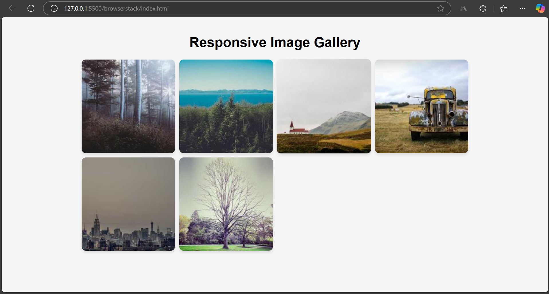
Flexbox is a layout technique to align elements in a row or column effectively to maintain responsiveness. Using a Flexbox layout is a good technique for small and simple projects.
/* Reset and Basic Styling */

body {

    font-family: Arial, sans-serif;

    text-align: center;

    margin: 0;

    padding: 20px;

    background-color: #f5f5f5;

}

/* Gallery Container */

.gallery {

    display: flex;

    flex-wrap: wrap;

    justify-content: center;

    gap: 10px;

    max-width: 900px;

    margin: auto;

}

/* Gallery Items */

.gallery-item {

    flex: 1 1 calc(25% - 10px);

    max-width: calc(25% - 10px);

    overflow: hidden;

    border-radius: 10px;

    box-shadow: 0 4px 6px rgba(0, 0, 0, 0.1);


}

.gallery-item img {

    width: 100%;

    height: auto;

    display: block;

}

/* Responsive Design */

@media (max-width: 600px) {

    .gallery-item {

        flex: 1 1 calc(50% - 10px);

        max-width: calc(50% - 10px);

    }

}
Learn More: How to Create Responsive Designs with CSS
2. Using CSS Grid layout
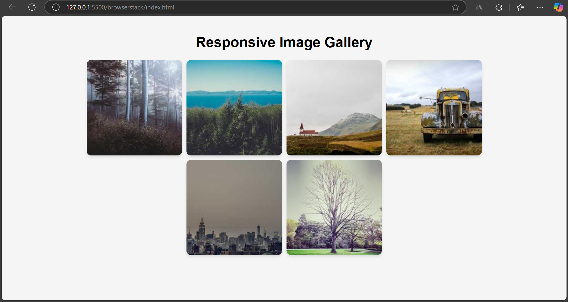
CSS Grid is a layout model in CSS that allows you to align images into rows and columns easily. CSS Grid is a two-dimensional model which means it can simultaneously work along rows and columns.
However, Flexbox is a one-dimensional layout system and can only work either row or column at a time.
/* Reset and Basic Styling */

body {

    font-family: Arial, sans-serif;

    text-align: center;

    margin: 0;

    padding: 20px;

    background-color: #f5f5f5;

}

/* Gallery Container */

.gallery {

    display: grid;

    grid-template-columns: repeat(auto-fit, minmax(200px, 1fr));

    gap: 10px;

    max-width: 900px;

    margin: auto;

}

/* Gallery Items */

.gallery-item {

    overflow: hidden;

    border-radius: 10px;

    box-shadow: 0 4px 6px rgba(0, 0, 0, 0.1);

    transition: transform 0.3s ease-in-out;

}

.gallery-item img {

    width: 100%;

    height: auto;

    display: block;

}

/* Responsive Design */

@media (max-width: 600px) {

    .gallery {

        grid-template-columns: repeat(auto-fit, minmax(150px, 1fr));

    }

}
Desktop View
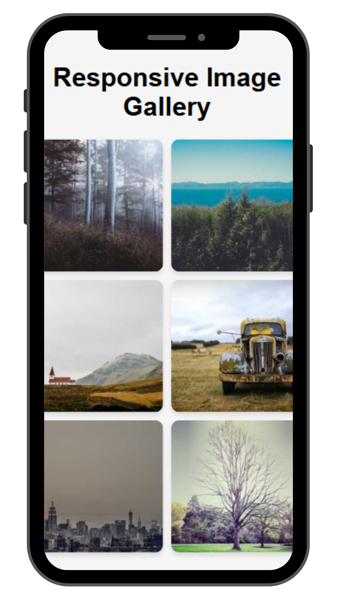
Mobile View
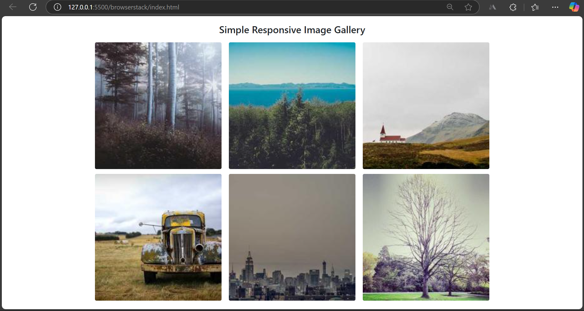
3. Using Bootstrap
Bootstrap is a third-party framework that contains pre-built sets of CSS and JavaScript components. It does not require any more CSS to make the components responsive; all the components are responsive by default.
Here’s the script you need to add to your HTML document to link Bootstrap CSS to your project.
<link href="https://cdn.jsdelivr.net/npm/bootstrap@5.3.0/dist/css/bootstrap.min.css" rel="stylesheet">
Here’s how you can create a responsive image gallery using Bootstrap.
<!DOCTYPE html>

<html lang="en">

<head>

    <meta charset="UTF-8">

    <meta name="viewport" content="width=device-width, initial-scale=1">

    <title>Basic Responsive Image Gallery</title>

    <link href="https://cdn.jsdelivr.net/npm/bootstrap@5.3.0/dist/css/bootstrap.min.css" rel="stylesheet">

    <style>

        .gallery img {

            width: 100%;

            height: auto;

            border-radius: 5px;

        }

    </style>

</head>

<body>

<div class="container mt-4">

    <h2 class="text-center mb-4">Simple Responsive Image Gallery</h2>

    <div class="row gallery">

        <div class="col-lg-4 col-md-6 col-12 mb-3">

            <img src="./images/1.jpg" class="img-fluid" alt="Gallery Image">

        </div>

        <div class="col-lg-4 col-md-6 col-12 mb-3">

            <img src="./images/2.jpg" class="img-fluid" alt="Gallery Image">

        </div>

        <div class="col-lg-4 col-md-6 col-12 mb-3">

            <img src="./images/3.jpg" class="img-fluid" alt="Gallery Image">

        </div>

        <div class="col-lg-4 col-md-6 col-12 mb-3">

            <img src="./images/4.jpg" class="img-fluid" alt="Gallery Image">

        </div>

        <div class="col-lg-4 col-md-6 col-12 mb-3">

            <img src="./images/5.jpg" class="img-fluid" alt="Gallery Image">

        </div>

        <div class="col-lg-4 col-md-6 col-12 mb-3">

            <img src="./images/6.jpg" class="img-fluid" alt="Gallery Image">

        </div>

    </div>

</div>

</body>

</html>
Some advanced techniques for Responsive Image Gallery
To enhance the visuals of your responsive image gallery, you can leverage some advanced techniques that provide a better user experience.
Here are some of the advanced techniques you can utilize for a responsive image gallery.
Hover Effects for Images
Hover effects are animation effects when a user hovers their mouse over an HTML element. It can be seen in several elements, such as buttons, images, etc. It is widely used in web design to enhance the user’s visual experience.
Read More: How to test Responsive Images
Some common hover effects for images are opacity, transparency, zoom effect, and shadow. The Hover effect uses the ‘:hover’ pseudo CSS class.
Here’s the syntax as follows:
selector:hover {

    /* CSS properties to apply on hover */

}
Lazy Loading for Optimization
Lazy loading is a technique in which images are delayed until their location appears on the viewport. The primary purpose of this technique is to make the webpage load faster and thus enhance the user experience.
In modern websites, images are not loaded unless the user scrolls down to the image’s location. This reduces the load time of the webpage and improves performance.
Read More: Implementing Lazy Loading in React
Here’s the syntax of how one can apply lazy loading:
<img src="image.jpg" alt="Lazy Image" loading="lazy">
Test Responsiveness on Real Devices with BrowserStack
Ensuring a website renders correctly across different screen sizes and resolutions is crucial for a seamless user experience.
Testing on real devices helps detect CSS issues, layout inconsistencies, and performance bottlenecks for timely debugging.
Steps to Test Responsiveness on Real Device Cloud with BrowserStack Live:
- Sign in to BrowserStack Live and enter the website URL.
- Select from a wide range of real mobile and desktop devices.
- Interact with the site in real time to check its appearance and performance across different screens.
Benefits of Testing with BrowserStack Live:
- Accurate Results: Test on real devices to identify actual rendering issues.
- Multiple Device Options: Access the latest and legacy devices with different screen sizes.
- No Setup Required: Cloud-based testing eliminates the need for physical devices.
- Faster Debugging: Identify and fix responsiveness issues in real user conditions.
Challenges of Building a Responsive Image Gallery
Your journey of developing a responsive image gallery might throw some hurdles along the way.
Here are certain challenges one might face and their effective solutions:
1. Large images increase page loading time, affecting the page’s user experience and SEO. To resolve these issues, one should always optimize all the images used on the webpage, including using lazy loading.
<img src="image.jpg" loading="lazy" alt="Responsive Image">
Optimizing images also involves using formats like WebP, JPEG, or AVIF, which load faster on the web.
Learn More: How to Lazy Load Images in Javascript
2. If the images don’t scale proportionately to the size of the screen it is viewed on, it doesn’t give a good impression.
To resolve this issue and ensure the images scale properly, one should use CSS properties like max-width: 100% and height: auto.
img {

    max-width: 100%;

    height: auto;

    display: block;

}
3. All the images used in the image gallery might not have the same aspect ratio, and thus the uneven dimensions will give an absurd look to your image gallery.
To resolve this issue you should make use of the CSS object-fit property. Wrap all the image gallery items inside a single div container, and set the attribute value to ‘cover’.
.gallery-item-container {

    width: 100%;

    height: 200px;

    overflow: hidden;

}

.gallery-item img {

    width: 100%;

    height: 100%;

    object-fit: cover;

}
Best Practices for Building a Responsive Image Gallery with HTML and CSS
Here are specific approaches one should consider practicing while developing a responsive image gallery with HTML and CSS to boost their efficiency:
- Instead of static or fixed values, one must always rely on relative units such as em, rem, %, vw, and vh to define heights, widths, padding, margins, etc.,
- To ensure that the images scale proportionally and avoid overflowing ,one may consider using the object-fit CSS property and setting the attribute value to ‘cover’ to maintain aspect ratios.
- To maintain the project’s responsiveness, always consider a Flexbox or CSS Grid layout. This eases the process of making the website responsive. Certain third-party frameworks, such as Bootstrap and Tailwind CSS, do the same task effectively.
- Large images on smaller devices take more time to load. Therefore, one should consider the lazy-loading technique.
- A mobile-first design is a good approach to developing your project. It ensures the core components are available on all devices, and further components are built upon them. This approach prioritizes essential functionalities and adds complex features as screen size increases without affecting responsiveness.
- While designing a website’s responsiveness, one must consistently test using browser Dev tools and Real Devices. This allows one to spot real-world issues early on in the development cycle.
Useful Resources for CSS
Tutorials
- Advanced CSS Tutorial
- Understanding Sibling Selectors in CSS
- Understanding CSS radial-gradient() function
- How to position Text Over an Image using CSS
- How to resize an image using CSS
- How to use CSS rgba() function correctly?
- Handling Images in HTML and CSS: Everything you need to know
- Dynamic Rendering using HTML and CSS
- Why CSS Position Sticky is Not Working
- A complete guide to CSS Media Query
- CSS Subgrid: What is it and Why do you need it
- What are CSS Breakpoints and Media Query Breakpoints
- How to Create Responsive Designs with CSS
- CSS Selectors in Cypress
- CSS Selector in Selenium: Locate Elements with Examples
- CSS Selectors Cheat Sheet (Basic & Advanced)
Differences
- CSS Grid vs Bootstrap: Which one is better for you?
- What is Responsive CSS vs Reactive CSS?
- Xpath Vs CSS Selector: Key Differences
Frameworks
- Top Responsive CSS Frameworks
- Top 7 CSS Frameworks for Developers
- What are CSS Modules and why use them?
Browser Compatibility & Cross-Browser Testing
- Browser compatibility with CSS Gradients
- Browser Compatibility of Cursor Grab & Grabbing in CSS
- How to Create Browser Compatible Smooth Scrolling with CSS and JavaScript
- How to Create Browser Specific CSS Code
- Fixing Browser Compatibility Issues with CSS Opacity & RGBA
- CSS techniques for Improved Cross Browser Compatibility
Conclusion
An Image Gallery organizes images on a website, enhancing visuals and user experience. A responsive gallery adapts to different screen sizes without distortion.
It can be built using Flexbox, CSS Grid, or Bootstrap, with features like hover effects, lightbox, and lazy loading for better interactivity.
Testing on real devices ensures flawless performance. Before deployment, BrowserStack offers a cloud-based platform for real-world testing across devices and OS combinations.
