Ever wondered how businesses prioritize through Responsive Web Design trends? With the evolution of design taking new meaning each year, your responsive website design elements will drive the core of providing a fulfilling online experience. Mixing flawless functionality with a clean, straightforward design on different devices-OS-browser combinations will be pivotal for online entities.
Overview
Latest Responsive Web Design Trends
- Mobile-First and Adaptive Layouts
- Fluid and Variable Fonts
- CSS Container Queries
- Viewport-Based Typography and Spacing
- Advanced Grid and Flexbox Layouts
- Dark Mode and User Preferences
- Scroll-Based and Motion UI with Touch-Based Controls
- Aspect Ratio Control
- Progressive Web Apps (PWAs) and Offline Support
- Accessibility-Driven Responsive Design
This guide article teaches the importance, best practices, common mistakes to avoid and latest trends while opting for a responsive web design that is also mobile-friendly.
What is a Mobile Responsive Web Design?
Mobile responsive web design is a widely implemented approach that enables web pages to render well across various mobile devices (desktops, smartphones, tablets, laptops) with different window or screen sizes and resolutions. Web developers, especially front-end developers, focus on developing mobile-friendly websites as users interact more with the website through smartphones.
Also Read: 6 Common Web Design Mistakes To Avoid
Importance of Responsive Web Design
Given the growth in smartphone users, there has been a remarkable increase in website traffic and responsive web design challenges. This drastic change drives us to conclude that people’s expectations regarding how a website should appear on a mobile device have also changed.
The importance of choosing specific Responsive Web Design trends can be projected into the following benefits:
- Intuitive Website Navigation across device-browser-OS combinations
- SEO benefits for better search page rankings
- Lower bounce rates and higher conversions rates
- Improved overall Website User Experience
- Better device compatibility coverage for your user base
One can conclude the importance of esponsive website design to cater to rapidly growing online users through smartphones. A web developer builds a user-friendly website to reach the maximum audience. Google recommends that all websites be mobile-friendly and assigns an extra weight for responsiveness when indexing a page. Responsive webpages thus have superior search positions.
As a result, organizations must invest resources in browser compatibility testing and testing across various real devices.
Latest Responsive Web Design Trends
Responsive web design continues to evolve with advancements in technology and user expectations. Here are some of the latest trends shaping modern responsive design:
1. Mobile-First and Adaptive Layouts
With mobile devices dominating web traffic, designers prioritize a mobile-first approach, ensuring seamless experiences on smaller screens before scaling up to larger ones. Adaptive layouts that dynamically adjust based on device type provide improved usability.
2. Fluid and Variable Fonts
Typography plays a crucial role in user experience. Variable fonts allow for dynamic adjustments in weight, width, and style, improving readability across different screen sizes without requiring multiple font files.
3. CSS Container Queries
Unlike traditional media queries that adapt based on viewport size, container queries adjust elements based on their container’s size. This makes components more flexible and reusable in different contexts.
4. Viewport-Based Typography and Spacing
Instead of using fixed sizes, designers leverage CSS units like vw (viewport width) and vh (viewport height) for typography and spacing. This ensures that text and elements scale proportionally with the screen.
5. Advanced Grid and Flexbox Layouts
CSS Grid and Flexbox allow for more sophisticated and responsive layouts without relying heavily on media queries. Modern techniques, such as subgrid and auto-layout properties, enable better content alignment and reflowing across screen sizes.
Follow-Up Read: What is Cross-Browser Visual Testing?
6. Dark Mode and User Preferences
Many websites now include dark mode support using CSS prefers-color-scheme, adapting styles based on the user’s system preference. This enhances accessibility and reduces eye strain.
7. Scroll-Based and Motion UI with Touch-Based Controls
Responsive designs now incorporate scroll-triggered animations and motion effects using CSS animations and JavaScript libraries like GSAP.
Additionally, with the rise of mobile and tablet users, touch-based controls such as swipe gestures, tap-based interactions, and haptic feedback are becoming essential.
Features like horizontal scrolling carousels, pull-to-refresh actions, and touch-friendly navigation enhance usability on touch-enabled devices.
8. Aspect Ratio Control
CSS aspect-ratio property helps maintain consistent proportions for images, videos, and UI components across different devices without using complex media queries.
9. Progressive Web Apps (PWAs) and Offline Support
Many websites are evolving into PWAs, offering offline access, push notifications, and app-like experiences, ensuring usability even in low-network conditions.
Read More: How to test Progressive Web Apps (PWAs)
10. Accessibility-Driven Responsive Design
Modern designs focus on inclusive UX, leveraging semantic HTML, ARIA roles, and contrast adjustments to ensure accessibility for users with disabilities across devices.
How to make a Website Responsive?
Following are a few best practices a web developer should follow to make a website responsive:
- Including the <meta> tag element in all the pages: It helps to set the viewport of all web pages, instructing the browser on how to resize the page. Following is a code snippet for defining the meta element on each web page.
<meta name="viewport" content="width=device-width, initial-scale=1.0">
The example below shows how a web page is rendered with and without a viewport meta tag.
Without Viewport meta tag vs With Viewport meta tag

- Making the images responsive using the CSS max-width property: Responsive images scale automatically to fit any size across various devices in the browser. Once the CSS max-width property is set to 100%, the image is easily scalable. Example of the related code snippet:
<img src="img_girl.jpg" style="max-width:100%;height:auto;">
- Making the text responsive: One must set the text size with ‘vw’ (viewport width) unit to make the text size scalable. A related code snippet is as follows:
<h1 style="font-size:10vw">Hello World</h1>
- Making the video player responsive: Similar to the images, the video player can be made to scale flexibly once the CSS property “max-width” is set to 100%
- Using Media Queries: Using media queries is another standard method in responsive web designing besides resizing images and text elements in which one can define different styles for different browser sizes.
<style>
.left, .right {
float: left;
width: 30%; /* The width is 30%, by default */}.main {
float: left;
width: 70%; /* The width is 70%, by default */}/* Use a media query to add a breakpoint at 900px: */
@media screen and (max-width: 900px) {
.left, .main, .right {
width: 100%; /* The width is 100%, when the viewport is 900px or smaller */}
}</style>
Most Common Mistakes to Avoid for Responsiveness
To keep up with web design trends, here are a few common mistakes to be avoided, as prescribed by Google:
- Web developers must ensure that the Google bot can easily access the CSS, JavaScript, and image files used on the website
- Avoid using media or any other content that is incompatible with mobile devices
- Avoid faulty redirects for mobile users (i.e., A mobile user’s original request should be redirected to the appropriate mobile site’s URL)
- Avoid interstitials that cover up the original content. It may be frustrating for a visitor.
- A web developer must avoid the usage of tiny fonts, which may result in an awful viewing experience.
How to check if a website is Mobile Responsive?
Manually testing the website across various devices for responsiveness using the developer tools in the browser can be tedious. As visual test automation is slowly gaining importance, there are tools available in the market to quickly determine the responsiveness of a particular website across multiple devices and browsers.
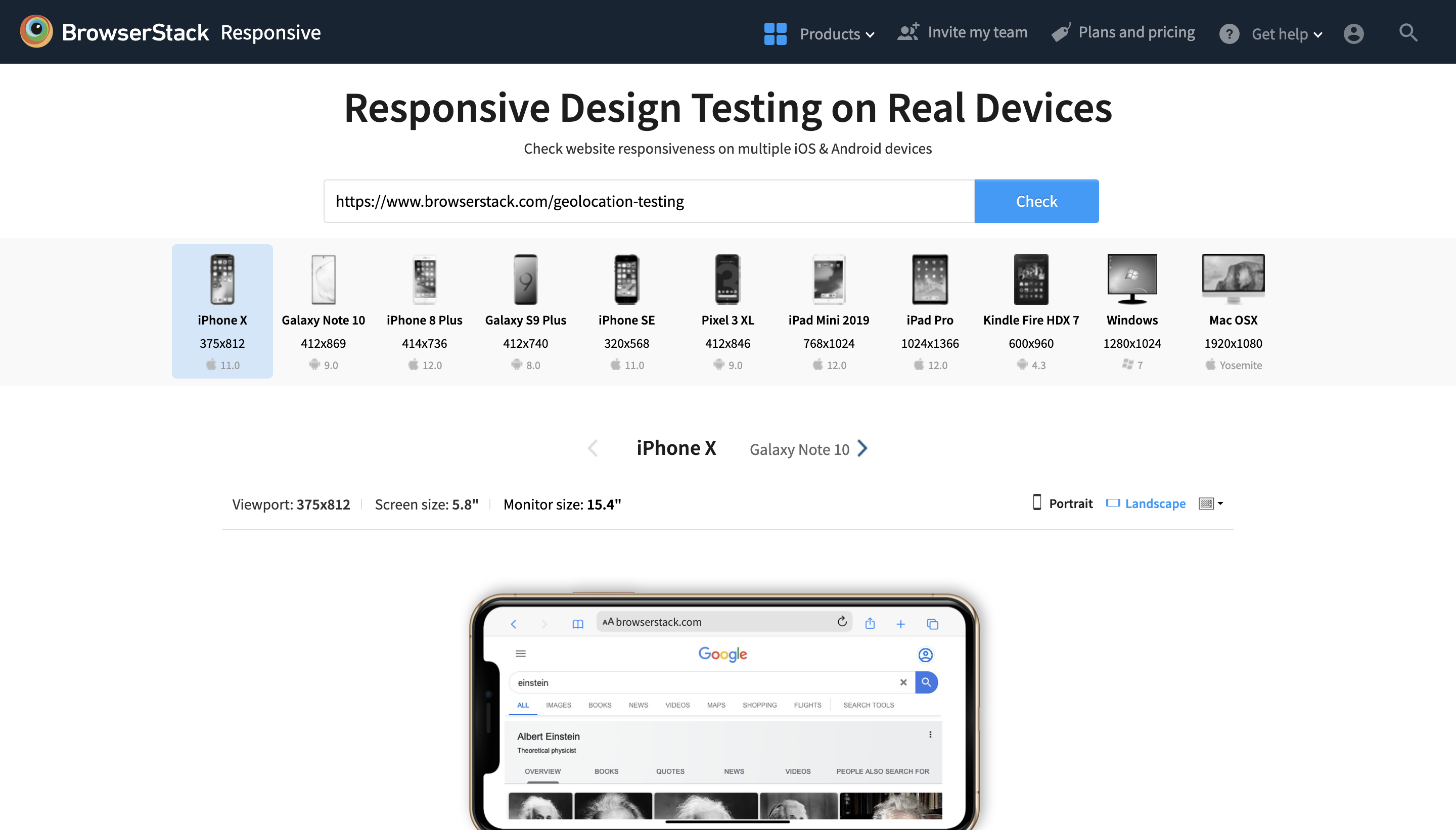
One such tool is Responsive by BrowserStack, which simplifies mobile responsive testing. The responsive tool provides a combination of real devices to test on the fly! The screenshot below gives a clear idea about the tool.
Using a Responsive tool, one can quickly analyze the output rendered across 3500+ devices and figure out any flaws.
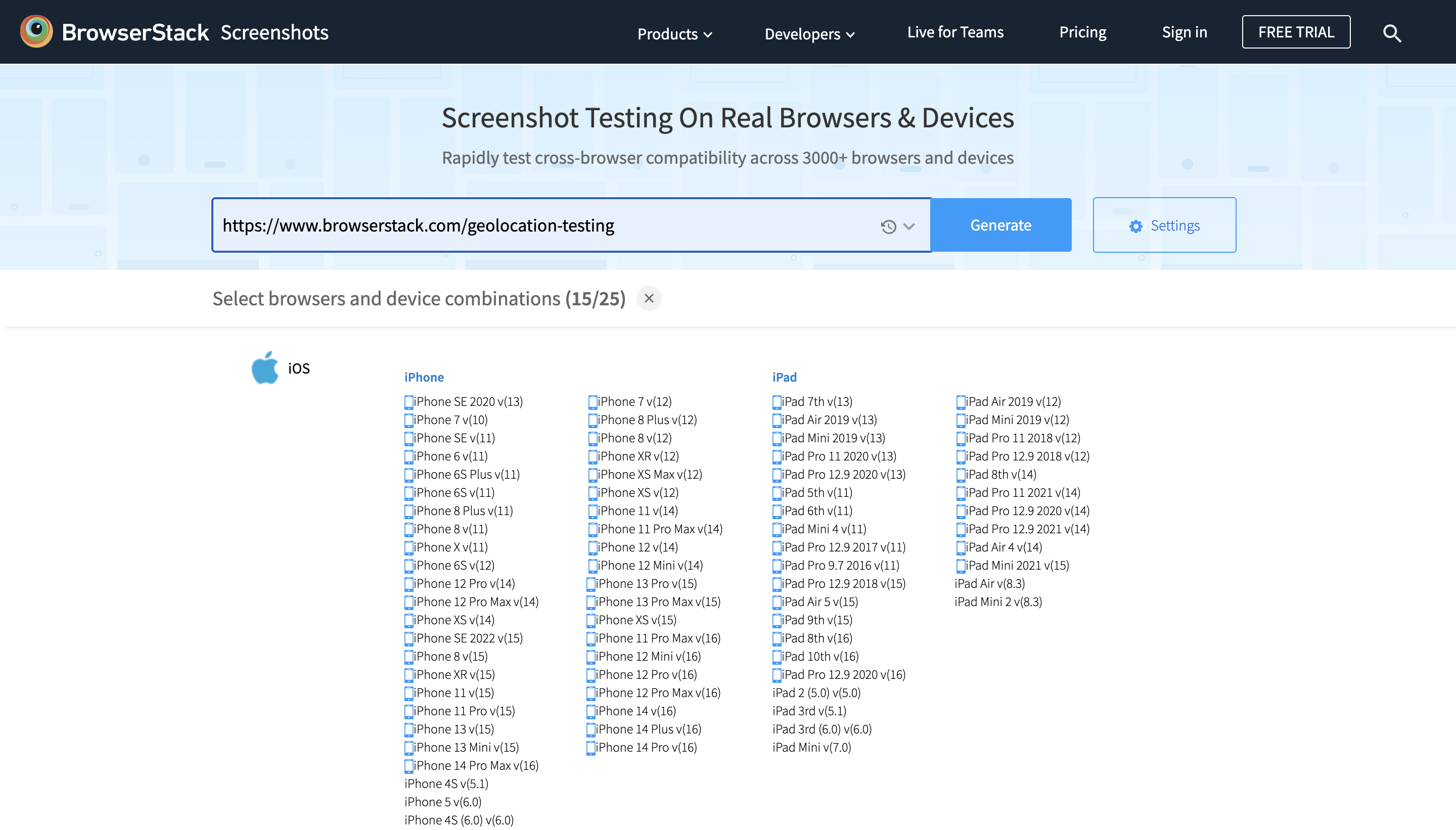
Like the Responsive tool, BrowserStack also provides a tool known as “Screenshots”. Screenshots, as the name suggests, capture the rendered output across various devices and share a link with all the screenshots.
Conclusion
Traffic from mobile devices is up to 60% of all website traffic. Thus, creating a website that works seamlessly on mobile devices is critical. This is achieved by adopting a responsive design. Making the website responsive is not straightforward. Web developers must implement best practices and use handy tools like Responsive and Screenshots. Comprehensive testing ensures excellent user experience and results in better search rankings.
If your QA and UI/UX team is looking to automate your visual testing approach, check out Percy’s capabilities that you can integrate into your existing CI/CD pipeline and review visual changes with every commit.


