In modern web development, HTML and CSS are the core building blocks of any website or web application. While HTML structures the content, CSS styles the pages, allowing developers to control layout and design with ease.
One useful CSS feature is radial gradients, which enable smooth transitions between two or more colors for visually appealing effects.
Overview
Why use Radial Gradients?
- Adds visual depth and interest
- Draws focus to key elements
- Improves overall user experience
- Enables creative design options
- Lightweight and efficient
- Adapts easily to themes and screens
Types of Radial Gradients
- Circular Gradient
- Elliptical Gradient
- Closest-side Gradient
- Farthest-side Gradient
- Closest-corner Gradient
- Farthest-corner Gradient
- Centered Gradient
- Custom-position Gradient
What is the CSS radial-gradient() function?
In CSS gradients, the radial gradients are used to define the colors of a pattern through the centre of the style. In CSS there are value functions, the statements that will invoke special data processing to return a specific CSS value for a specific CSS property.
The radial-gradient() function creates an image as a radial gradient as a background image.
The three main types of gradients are:
- Linear Gradient: The colors go down/up, left/right, or diagonally to make the style
- Radial Gradient: The colors are defined through the centre of the style/pattern
- Conic Gradient: The colors are rotated around a centre point for the style.
The radial gradients provide a great way to beautify a webpage. The main importance of the radial gradient in CSS is that it can create unique color effects to mimic a light source.
A gradient uses gradual blending from one color to another. The radial gradient can mimic the distance to the light source to make the image much more realistic by adding attributes such as blending points and/or colors.
Read More: How to Create Browser Specific CSS Code
Importance of radial gradients in Web Design
Here are some of the reasons why using a Radial Gradient is important in web design:
- Visual Appeal and Depth: Radial gradients transition from a central point outward, which creates a soft, natural progression of colors. This effect can simulate lighting, shadows, or dimensional depth, making the design more engaging and modern than flat color backgrounds.
- Drawing Focus and Attention: Radial gradients help naturally draw attention to specific areas of a page, such as call-to-action buttons, banners, or hero sections. By subtly highlighting a central point, designers can guide users’ eyes toward important content or interactive elements.
- Enhancing User Experience: When used thoughtfully, radial gradients can enhance the overall aesthetic without distraction. They help reduce visual fatigue and provide a more comfortable viewing experience, especially in larger backgrounds or soft UI elements.
- Design Flexibility and Creativity: Radial gradients offer designers more creative control than linear gradients or solid colors. They allow for complex, organic designs that can simulate realistic lighting effects or abstract backgrounds, contributing to a unique visual identity.
- Performance Efficiency: CSS gradients, including radial gradients, are lightweight and scalable compared to image-based backgrounds. They do not require additional image files or HTTP requests, making them more efficient and responsive across different screen sizes and resolutions.
- Dynamic Theming and Responsiveness: Radial gradients can be adjusted dynamically using CSS variables, allowing for adaptable themes and interactive design elements. They respond well to changes in layout, screen size, or user interaction without compromising visual quality.
How does a Radial Gradient work?
Here is how a Radial Gradient works:
- The browser picks a starting point (based on position).
- It draws concentric circles or ellipses outward from that point.
- At each ring, it interpolates the color between the defined color stops.
- The gradient ends based on the defined size, filling the container.
The radial gradient in CSS is defined by its center, so to create a radial gradient at least two colours should be defined. Apart from that, a few other attributes can be used to define the image further. The next section will further elaborate on how those attributes can be used.
Also Read: How to use CSS rgba() function correctly?
Syntax and parameters of radial-gradient()
The syntax of Radial Gradient is shared below:
background: radial-gradient(shape size at position, color-stop1, color-stop2, ...);
Parameters Explained:
Shape (optional):
- circle: Makes the gradient a perfect circle.
- ellipse: Makes the gradient an ellipse (default if no shape is specified).
Size (optional):
- closest-side: Ends the gradient at the closest side of the box from the center.
- farthest-side: Extends the gradient to the farthest side.
- closest-corner: Ends at the closest corner.
- farthest-corner: Extends to the farthest corner (default).
Position (optional):
- Defines where the gradient starts.
- Examples: center, top left, 50% 50%, 30% 70%, etc.
- Default is center.
Color Stops:
- You list two or more colors (with optional positions).
- The browser interpolates between them to form the gradient.
Example:
background: radial-gradient(circle farthest-corner at 40% 60%, #ffcc00, #ff6600, #000000);
Types of Radial Gradient
Here are the main types of radial gradients in CSS based on shape, size, and position:
1. Circular Gradient
A perfect circle expanding outward from a center point.
2. Elliptical Gradient
An oval-shaped gradient (default if shape is not specified).
3. Gradient by Size Keyword
- closest-side: Ends at the closest side of the box.
- farthest-side: Ends at the farthest side of the box.
- closest-corner: Ends at the closest corner of the box.
- farthest-corner: Ends at the farthest corner (default).
4. Gradient by Position
The starting point of the gradient can be adjusted:
- center (default)
- top left, top right, bottom left, bottom right
- Custom positions like 40% 60% or 30px 100px
Creating a basic Radial Gradient
Create a basic Radial Gradient using the following code examples.
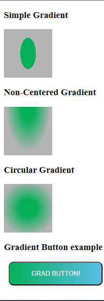
- Simple Gradient: The following code can be used to create a simple gradient.
#simple{

    height: 100px;

    width: 100px;

    background-image: radial-gradient(20% 40%, #05af5a 80%, #b4b4b4 81%);

    /*For the simple gradient

        //1. The proportion in the div are the centre of circle needs to be specified

        ( values for both verticle and horizontal postions should be specified.)

        //2. If needed the postion of centre of the circle can also specified.

        //3. The colours with their percentages on the radial space

    */

}

#noncentered{

    height: 100px;

    width: 100px;

    background-image: radial-gradient(at center top, #05af5a 20%, #b4b4b4 65%);

    /*For the noncentered gradient

     //   1. To create the non centered gradient the starting position of the gradient should be any position other than "center"

    //    2. The proportion of the starting points of the cirlce will be omitted.

    */

}

#circular{

    height: 100px;

    width: 100px;

    background-image: radial-gradient(circle at center, #05af5a 25%, #b4b4b4 81%);

    /*For the circular gradient

      //  1. The "circle" keyword can be used to specify the gradient in circular shape.

    */

}


#btn-grad {

    background-image: linear-gradient(to right, #05af5a 0%, #5bbeec  51%, #b4b4b4  100%);

    margin: 10px;

    padding: 15px 45px;

    text-align: center;

    text-transform: uppercase;

    transition: 0.5s;

    background-size: 200% auto;

    color: white;

    box-shadow: 0 0 20px #eee;

    border-radius: 10px;

    display: block;

  }

  #btn-grad:hover {

    background-position: right center; /* change the direction of the change here */

    color: #fff;

    text-decoration: none;

  }
- Non-centred Gradient: To create a non-centered gradient the start of the gradient can be specified as a location other than the center. To create a non-centered gradient, the following code can be used.
#simple{

    height: 100px;

    width: 100px;

    background-image: radial-gradient(20% 40%, #05af5a 80%, #b4b4b4 81%);

    /*For the simple gradient

     //   1. The proportion in the div are the centre of circle needs to be specified

        ( values for both verticle and horizontal postions should be specified.)

     //   2. If needed the postion of centre of the circle can also specified.

       // 3. The colours with their percentages on the radial space

    */

}

#noncentered{

    height: 100px;

    width: 100px;

    background-image: radial-gradient(at center top, #05af5a 20%, #b4b4b4 65%);

    /*For the noncentered gradient

     //   1. To create the non centered gradient the starting position of the gradient should be any position other than "center"

      //  2. The proportion of the starting points of the cirlce will be omitted.

    */

}

#circular{

    height: 100px;

    width: 100px;

    background-image: radial-gradient(circle at center, #05af5a 25%, #b4b4b4 81%);

    /*For the circular gradient

     //   1. The "circle" keyword can be used to specify the gradient in circular shape.

    */

}


#btn-grad {

    background-image: linear-gradient(to right, #05af5a 0%, #5bbeec  51%, #b4b4b4  100%);

    margin: 10px;

    padding: 15px 45px;

    text-align: center;

    text-transform: uppercase;

    transition: 0.5s;

    background-size: 200% auto;

    color: white;

    box-shadow: 0 0 20px #eee;

    border-radius: 10px;

    display: block;

  }

  #btn-grad:hover {

    background-position: right center; /* change the direction of the change here */

    color: #fff;

    text-decoration: none;

  }
- Circular Gradient: Since the circle is a type of ellipse with a uniform width and height, a simple radial gradient with equal horizontal and vertical proportions can be used or the “circle” keyword can also be used. To create a circular gradient the following code can be used.
#simple{

    height: 100px;

    width: 100px;

    background-image: radial-gradient(20% 40%, #05af5a 80%, #b4b4b4 81%);

    /*For the simple gradient

     //   1. The proportion in the div are the centre of circle needs to be specified

        ( values for both verticle and horizontal postions should be specified.)

     //   2. If needed the postion of centre of the circle can also specified.

     //   3. The colours with their percentages on the radial space

    */

}

#noncentered{

    height: 100px;

    width: 100px;

    background-image: radial-gradient(at center top, #05af5a 20%, #b4b4b4 65%);

    /*For the noncentered gradient

     //   1. To create the non centered gradient the starting position of the gradient should be any position other than "center"

     //   2. The proportion of the starting points of the cirlce will be omitted.

    */

}

#circular{

    height: 100px;

    width: 100px;

    background-image: radial-gradient(circle at center, #05af5a 25%, #b4b4b4 81%);

    /*For the circular gradient

      //  1. The "circle" keyword can be used to specify the gradient in circular shape.

    */

}


#btn-grad {

    background-image: linear-gradient(to right, #05af5a 0%, #5bbeec  51%, #b4b4b4  100%);

    margin: 10px;

    padding: 15px 45px;

    text-align: center;

    text-transform: uppercase;

    transition: 0.5s;

    background-size: 200% auto;

    color: white;

    box-shadow: 0 0 20px #eee;

    border-radius: 10px;

    display: block;

  }

  #btn-grad:hover {

    background-position: right center; /* change the direction of the change here */

    color: #fff;

    text-decoration: none;

  }
How to create a background with a Radial Gradient?
The background-image tag for the body can be used to apply a radial gradient to the background for the body. The background radiant can be used to add a simple but elegant colour pattern for the web pages you are working on.
Example:
body {
background-image: radial-gradient(red, green, blue);
}
Browser Compatibility and Cendor prefixes
To ensure consistent rendering across different browsers, it’s important to consider browser compatibility of CSS gradients. When necessary, use vendor prefixes for radial gradients and other CSS properties.
| Function | Chrome | Edge | Firefox | Safari | Opera |
|---|---|---|---|---|---|
| radial-gradient() | 26.0 *10.0 -webkit- | 10.0 | 16.0 3.6 -moz-* | 6.1 5.1 -webkit-* | 12.1 11.6 -o- |
Note: This version supported to function with the vendor prefixes
Steps to Check Compatibility across Different Browsers
To maintain a consistent user experience, it’s essential to follow a few key steps to check CSS compatibility across different browsers
- Step 1. Prepare your HTML design folder: Ensure all necessary HTML, CSS, and assets (like images, fonts, etc.) are organized and ready for testing.
- Step 2. Set up BrowserStack Local Testing: Follow the “Local Testing with Live” documentation provided by BrowserStack to enable access to your local HTML files through their platform.
- Step 3. Start a BrowserStack Live session: Launch a live test environment on BrowserStack and connect it with your local folder using the local testing setup.
- Step 4. Access your files in various browsers: Use the BrowserStack interface to open your local HTML files in different browsers and versions (for example, Chrome, Firefox, Safari, Edge, Internet Explorer).
- Step 5. Evaluate design consistency: Check how radial gradients and other CSS styles render across different browsers. Note any inconsistencies or rendering issues.
- Step 6. Debug and optimize: Make the necessary CSS adjustments or apply vendor prefixes if needed to ensure uniform styling across platforms.
- Step 7. Retest after modifications: After making changes, repeat the testing process to verify improvements and ensure compatibility.
Read More: Understanding Sibling Selectors in CSS
Conclusion
Radial gradients add visual depth and focus to web designs, offering a scalable and performance-friendly way to enhance user interfaces. They help create modern, engaging layouts without relying on image assets.
BrowserStack Live simplifies and streamlines cross browser testing. It lets developers test local HTML designs on real browsers and devices without hosting them online.


