Businesses need websites that perform seamlessly across a variety of devices. Multi-page responsive websites provide structured navigation and scalability, making them ideal for content-heavy platforms, eCommerce, and businesses with multiple products or services. Unlike single-page sites, they allow for optimized SEO, organized content, and flexible design expansion. However, designing and testing these sites for smaller screens and multiple browsers can be challenging.
Overview
What is a Multi-Page Responsive Website?
- A website with multiple pages, each with a unique URL, linked via navigation menus and sub-menus.
- Suitable for large businesses, eCommerce, or content-heavy sites.
- Supports SEO-friendly content siloing for better visibility and organization.
- Allows scalable design, adding pages and menus as needed.
Advantages
- SEO Benefits → Multiple entry points, page-specific keyword strategies.
- Content Organization → Easier navigation and content siloing.
- Scalability → Add/remove pages and menus without breaking structure.
- Fresh Content → Separate URLs for blogs or updates improve search rankings.
Disadvantages
- Slower Loading → Multiple pages can increase bounce rates.
- Maintenance Complexity → Updates must propagate across all pages.
- Responsive Design Challenges → Ensuring consistency across all devices requires careful calibration.
Multi-Page vs Single-Page Websites
- Single-Page → All content on one page, focused UX, high conversion, limited SEO, less scalable.
- Multi-Page → Multiple pages, scalable design, better SEO, suitable for multiple products/services, supports diverse marketing goals.
This guide explains the key concepts, development steps, testing strategies, and best practices for creating and maintaining a multi-page responsive website.
What is a Multi-page Responsive Website?
As its name suggests, a multi-page responsive website connects different content fields through navigation menus and sub-menus. It provides design scalability with a unique URL for each page and the ability to expand the menu as and when required. It includes a homepage, service pages, blog pages, CTAs, links to other content, etc.
Multi-page websites are usually suited more for big businesses and eCommerce brands, where the vast amount of content has to be organized in a relevant and SEO-optimized manner. If your company offers more than one product/service or promotes a diverse range of topics, then siloing your data through a multi-page layout will add coherence and structure to your content.
Advantages of Creating a Multi-page Responsive Website
- Multi-page responsive websites will give you the highest ROI in your SEO efforts. It provides several entry points to your website through search engine indexing. Since you can create a different keyword strategy for each page, your content gets more visibility and traffic in the longer run.
- Multi-page responsive websites offer an easy-to-follow navigation structure where you can use content-siloing methods to provide extensive information to your clients. Siloing is a popular content structuring process that groups similar content through links.
- When dealing with a large content volume, it is imperative to catalog your data systematically. Creating a multi-page responsive website will help you scale up or down your menus and submenus whenever required.
- Search engines always give preference to fresh content while ranking sites. With a multi-page site, you can quickly generate new content with a blog page, add separate URLs for each blog post, and build external links to your site.
Disadvantages of Creating a Multi-page Responsive Website
- The biggest con of opting for a multi-page responsive website is its effect on the bounce rate. Multi-page websites are usually slow-loading since they have more content. In an era of instant gratification, 83% of users expect a site to load in less than three seconds. The likelihood of a visitor bounce increases by about 123% if a site takes longer than 10 seconds to load.
- A content-heavy site with multiple pages requires more maintenance than a single-page website. Any major update must cascade down every menu and sub-menu, which takes time and effort.
- It is more challenging to design a multi-page website that is responsive across all devices. Design consistency can be an issue when optimizing it for a mobile or a touchscreen experience.
How is it Different from a Single-page Responsive Website?
In a single-page website, the entire content is structured in a single HTML page. Creating this kind of layout often aims to provide explicit, concise content free from distractions. Single-page responsive websites are focused more on the user experience with clear CTA markers and a single navigation menu.
Single-page websites can be an excellent fit for landing pages, single-product sales pages and product/event launches. They usually have a higher conversion rate than a multi-page website (>37.5%). However, single-page sites lack design scalability, might jeopardize your SEO ranking because of limited keyword targeting, and won’t support multiple marketing goals.
How to Create a Multi-Page Responsive Website?
Step 1 Create a folder. Start developing your HTML pages and build them on a fluid grid.
Whether building on a visual editor or using Notepad to create your site, you will need a folder containing all the files.
When you start coding your HTML files, opt for a fluid grid. A fluid grid will adapt all site elements in proportion to the screen size, making it easier to design a responsive layout.
Start with your HTML files adding the below code to a notepad file.
<!DOCTYPE html>
<html lang=”en”>
<head>
<meta charset=”UTF-8”>
<meta http-equiv=”X-UA-Compatible” content=”IE=edge”>
<meta name=”viewport” content=”width=device-width, initial-scale=1.0”>
<title>Document</title>
</head>

<body>

</body>
</html>
Save this in the folder and rename it as index.html – this will be your home page. You can now add additional pages to the folder, like about.html, services.html and contact.html.
Step 2 Set relevant breakpoints
CSS breakpoints are the values at which a site’s layout aligns itself to different screen sizes. For responsive websites, some standard breakpoints are:
Mobile: less than 767px
Tablet: 767px < 1024px
Desktop: 1024px and above
Step 3 Create navigation bars and organize your menus and sub-menus
Once you have created all the HTML pages for your site, you need to link them with a navigation bar.
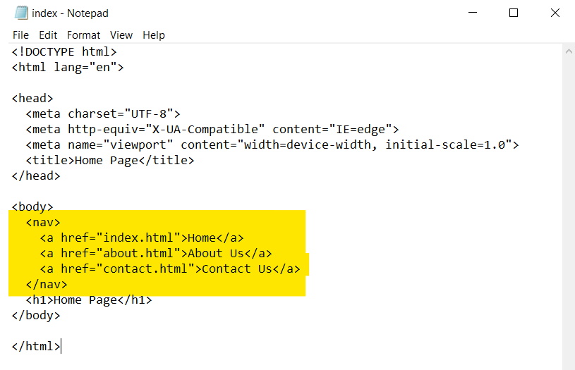
To create a navigation menu, add navigation elements inside the body elements. Then, build links by adding the a element, with each link having the href attribute.
<nav>
<a href=”index.html”> Home </a>
<a href=”about.html”> About </a>
<a href=”contact.html”> Contact </a>
</nav>
Your final code will look something like this:
First, change this code in your index.html, then do the same for the other pages.
Step 4 Optimize each element for mobile and touchscreen
A multi-page responsive website has to be calibrated for mobiles and touchscreen devices. This could mean changing some of your design elements, like opting for a hamburger menu or resizing your CTA button.
Step 5 Choose a responsive/fluid typography
A responsive website will need responsive fonts. Texts that read perfectly on smaller devices can be straining to the eyes on larger screens. Therefore, an optimized text has to focus on font size, color, and spacing. Select fonts that are not too artistic but readable and simple.
Also Read: How to Create a Responsive Website
How to Test a Multi-page Responsive Website? (using BrowserStack Live)
BrowserStack Live is one of the easiest ways to test your multi-page website’s cross browser compatibility and responsiveness. Follow the instructions below to get a live analysis of your website’s performance across a range of devices.
Test your Multi Page Responsive Website on Real Devices
1. Signup for Free on BrowserStack Live.
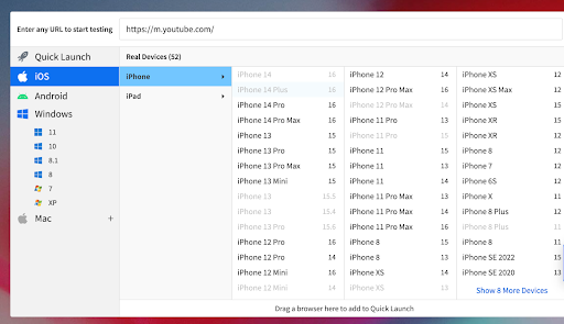
2. Log in and enter the URL of the publicly/privately hosted website on the BrowserStack Live dashboard,that you would want to test.
3. Select the OS, the device, and the browser on which you would like to run the test.
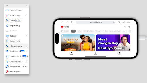
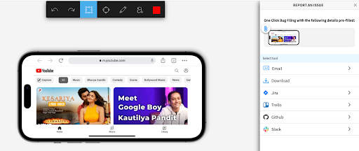
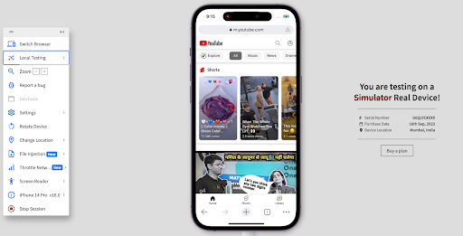
4. Start the Live test. Once the session begins, you can scroll through the site, interact with different design elements, and explore any lagging issues with the layout. You can also record the session simply by clicking the button on the left panel.
5. To view your website’s layout in landscape mode, choose Rotate Device.
6. To report any issue, select Report a bug from the side panel.
7. You can also run local testing by downloading the Local Desktop App given on the link in the left panel.
Best Practices for creating a Multi-Page Responsive Website
It is good to keep these factors in mind while creating a multi-page responsive website:
- Since multi-page websites will be heavily content-focused, look into content management systems (CMS) like WordPress to host your site. They also come with prebuilt, easy-to-use templates and a range of plugins that will let you create beautiful, scalable, responsive sites without needing prior coding skills.
- Strategize your SEO goals for each page. Optimizing your SEO will help search engines index your site more efficiently, improving your rank.
- Use CSS breakpoints to render fluidity in your website layout across devices. Check for cross-platform compatibility using BrowserStack Live.
- Select media files with lesser resolution. Smaller devices often have lesser bandwidth, and with an ever-increasing number of mobile users, you need to create sites that load in 5 to 7 seconds.
- Up your typography game. A good user experience combines fluid design with clean, easily readable font. You can opt between responsive typography or fluid typography. Responsive typography changes with the breakpoints, while fluid typography will resize intuitively to match different screen sizes.
- Try to maintain design consistency across all devices. While some elements, like the navigation menu and CTA buttons, may need to be resized for smaller/touchscreen devices, consistent design elements keep your brand message coherent.
On a closing note
In the end, the decision to opt between a multi-page responsive website and a single-page responsive website depends on these factors:
- Your business goals
Single-page websites may be perfect for event launches, landing pages, or portfolio sites. It might be your best bet if your business has a narrower focus. However, startups and established companies usually prefer traditional, multi-page layouts for their web designs since it provides a lot more flexibility and scalability to expand the site in the future.
- Your content needs
Growing businesses often have multi-level marketing strategies, which means they need to focus on more than one CTA on their website. Additionally, established brands have much more content that reflects the full spectrum of their products and services. Creating a multi-page website makes more sense in this case.
- Your social media goals
Although metrics show that a single-page website gives a higher conversion rate, that is only true if you focus on a single product or service.
However, multi-page sites widen your potential social reach by increasing your ranking and giving your customers several entry points to access the site. It is suggested to delineate your site’s objectives and goals and start building from there for better engagement.
No matter, whether you choose single page responsive website or a multi-page responsive website, testing them on real devices is highly recommended for more accurate test results. This helps deliver a seamless and bug-free user experience to your customers. Tools like BrowserStack Live, that are based on real device cloud, allows users to test on 3000+ real device-browser combinations to ensure consistent user experience across different screen sizes.
