As per WebFX, 94% of first impressions are design-related, and 50% of users consider website design essential to a brand. A good website mockup helps visualize UI concepts accelerates design-to-development, and improves UX.
Overview
What is a Mockup UI?
A UI Mockup refers to a visual representation of the final software product or website, which will include layout, color, icons, typography, and other UI elements.
Benefits of UI/UX Mockups
- Faster Design-to-Development Process
- Enhance User Experience
- Better Stakeholder Communication
- Shares Realistic perspective
- More Flexible
Learn in detail about UI/UX mockups in this detailed article.
What is a Mockup UI?
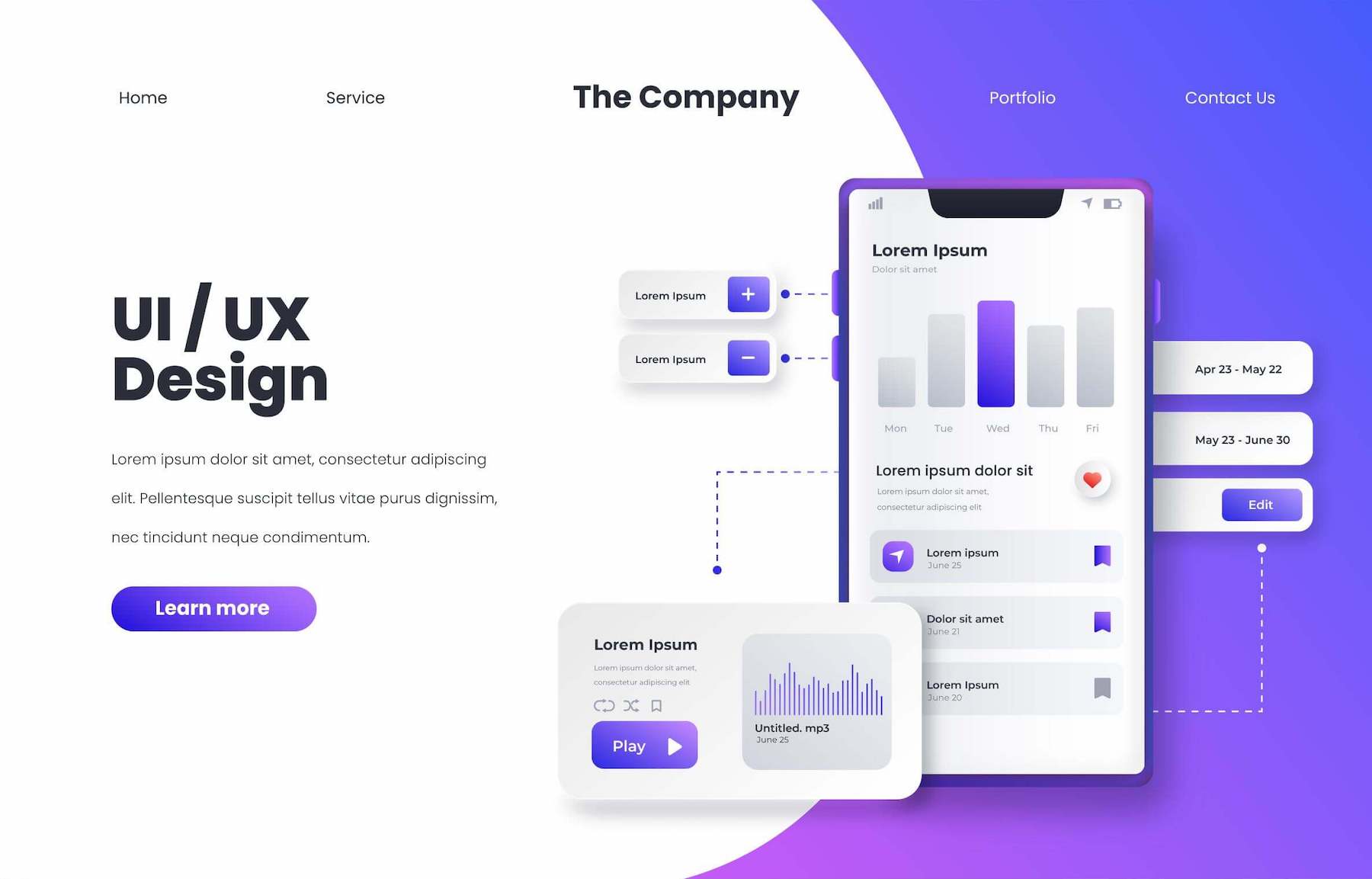
A UI Mockup refers to a visual representation of the final software product or website, which will include layout, color, icons, typography, and other UI elements. Though mockups are high-fidelity designs, they are static and will not have any functionality. Essentially, UI/UX Mockup presents a website or application’s user interface and user experience.
Source: Freepik
- It is a prototype of a product or service that allows product designers to test out their ideas and get user feedback.
- It can be used to create realistic simulations of the final product, allowing designers to ensure that their designs meet the user’s needs and expectations.
- It illustrates how the user will interact with the product and how it will look visually.
- Mockups are typically created using mockup UI tools such as Adobe XD, Photoshop, Sketch, Illustrator, or Figma.
- They are usually used during development to help designers and developers visualize the product’s appearance before it is built out.
- Mockups of UI/UX can also be used to test different design ideas before committing to one design.
A mockup typically comprises added visual details such as:
- Component spacing
- Styled buttons & text
- Colors, graphics, styles, and typography
- Navigation graphics
Mockups are crucial tools to understand and communicate what the final interface must look like and give stakeholders an option to preview style and design choices before committing to building the application in a functional prototype. And, between idea, improvement, and development, there are usually three or four distinct design phases.
At a glance, the phases break down something like this:
- UI sketching lets designers function through all their worst ideas & single out the ideas with great potential.
- Wireframes are wherein the data hierarchy, content alignment, and core functionality are worked out.
- Mockups comprise visual descriptions.
- Prototypes bring together interactivity and visuals in a real-free version of the end product
Such phases let UI designers for iterating and testing on their ideas rapidly and inexpensively and get sign-off from stakeholders. Besides, this is not exclusively applicable to brand-new products. These four phases can be applied to new versions or interface updates too.
Must-Read: How to select the right Visual Testing Tool
Importance of UI/UX Mockups
Mockups are a crucial part of the designing thinking procedure as they answer vital visual questions (such as color, layout, and hierarchy) and let designers commence high-fidelity prototyping. They also offer engineers a visual reference to start the development stage.
- Faster Design-to-Development Process: UI/UX mockup accelerates the design-to-development process by providing a detailed and clear visual reference, reducing ambiguity. Since the focus is on the final look, developers don’t have to interpret vague wireframes.
- Flexibility: It’s simpler to make changes to a mockup UI by using a design tool than by editing code. If product designers function with a design system or UI element library, making alterations is as easy as rearranging the layout or swapping components.
- Realistic perspective: Mockups disclose issues that may not have been obvious during low-fidelity wireframing, such as poor color choices, accessibility considerations, or layout issues.
- Stakeholder Communication and Understanding: Thanks to the great fidelity, mockups necessitate lesser context than low-fidelity sketches and wireframes, giving stakeholders the correct representation of the end product. This facilitates a better understanding of the product and a smoother flow of communication.
- Enhance User Experience: Mockups help spot usability issues early, resulting in an intuitive design.
When to use UI Mockups?
UI mockups are handy when creating new products or features, as they allow designers to experiment with different design ideas without investing in costly development cycles. Here are scenarios when you can use UI mockups:
- Validating Designs: Relying on mockups before development, help visualize the UI and esnures layout, colors etc, aligns with user and stakeholder expectations.
- User Testing: Helps spot usability issues much earier, by testing visual hierarchy and user expectations before focusing building interactive prototypes.
- Documentation and Style Guides: Mockups can help facilitate consistency across teams by acting as a reference for future requirements and branding guidelines.
- For Better Communication: Mockups serve as clear visual guides for developers and other team members, thus reducing misunderstandings, miscommunications and rework.
Read More: How to speed up UI Test Cases
Key Components of Mockup
Here are the main components of a mockup:
- Layout & Structure: This specifies the placement of elements like navigation bars, buttons, images, etc., and represents the overall page/screen composition.
- Typography: Typography specifies font styles, sizes, subheadings, body text, and more. It ensures consistency in text alignment and readability.
- Color Scheme: This defines the brand colors, background colors, and element-specific colors while considering contrast and accessibility.
- Images and Icons: This helps improve usability and aesthetics using relevant visuals and graphical elements.
- Interactive Elements: Displays buttons, menus, and other UI components to depict user interactions.
3 Types of Mockups Tools
There are three key tools for creating mockups– mockup apps, graphic design software, and coded mockups. Each mockup form has its benefits and drawbacks.
1. Mockup Tools
Specialized user experience web design tools offer designers the traits to build mockups rapidly, particularly if they have the elements library or design system. With such mock-up tools, you can easily drag and drop elements from the design system or built-in design libraries for building mockups. Designers can also generate layouts for distinct screen sizes, such as mobile (Android/ iOS), desktop, or tablet.
2. Graphic Design Software
Some web designers still prefer to build mockups via graphic design software, such as Photoshop. The issue with design software is that you cannot add interactions or animations, so you have to recreate the mockups in another app to begin prototyping.
3. Code-based
Some technically capable designers build mockups via Javascript, CSS, and HTML. The advantage of code mockups is zero surprises at the website design handoff. If product designers cannot recreate an idea or visual element in code, they can try something else earlier, handing it over to software developers. The downside to code is that it’s arduous to build, make changes, and fix errors.
With proper tools integration, you do not need to learn code to design in code. Web designers can easily drag and drop MUI’s elements for building mockups and functioning prototypes.
Also Read: What is Automated UI testing?
Choosing a Good UI Mockup Tool
When selecting a UI mockup tool, consider some crucial factors before committing to anything.
- Usage: Choosing a tool that fits your design procedure is important. For instance, use Photoshop or sketch. The mockup tools must import such files rather than separately exporting assets & then building the whole thing from scratch.
- Learning curve: Any tool can be extensively used based on how calmly it is to adopt it with its vibrant features.
- Collaboration: Design relies deeply on collaboration thus, the mockup tool should make it effortless to collaborate across teams.
- Cost: Another point to consider is that fits our requirements and also takes care of basic features for free. There can be a few critical traits that are paid, but it is up to the product designer to go for them or not.
- Fidelity: Depending on whether you must mockup the app layout or some complicated connections, one can categorize the project necessities as high, medium, or low fidelity.
Steps to create UI mockups
You need to follow a structured approach to create a UI mockup. Here are the steps to create UI mockups:
- Analyze the Requirements: Gather and understand user needs, business goals, and design preferences. Identify and analyze the key features, target audience, and branding guidelines.
- Define Layout and Structure: Start with a wireframe to define the basic structure. Then, decide where to place the UI elements like buttons, menus, images etc. For ensuring alignment and consistency, you can use a grid system.
- Select a Color Scheme and Typography: Choose color palletes, font styles, sizes and spacing to align with your brand and ensure readability. Make sure a contrast is maintained for accessibility and overall visual appeal.
- Visual Elements: Use high-quality images and icons and apply visual effects like shadows, gradients, etc, to enhance the visual appeal. Ensure all the elements align with your basic design.
- Design Interactive Components: Create intuitive buttons, forms, and navigation menus and ensure that all elements help users interact and navigate the interface smoothly.
- Review and Iterate: Collect feedback from stakeholders and make the required modifications to enhance usability, consistency, accessibility and branding.
- Export and Share: Save the mockup in a suitable format like PNG, SVG stc. and then share it with your team or clients using collaboration tools like Figma, Sketch etc.
What is Mockup testing?
Mockup testing is when you put the prototype or mockup in front of your niche audience and test its usability (UX) and design (UI). Very often, you have to test the way a mockup looks.
Does a site look clean or cluttered? Is the main menu simple to locate? With a high-fidelity mockup or prototype, users can click buttons and check how they feel while navigating your application or site. Mockup testing is crucial to generate a user-friendly mobile app or website, and it’s a step you should not skip.
- Once the mobile User Interface mockups are validated, and the application is developed, you must test it to validate if its functionalities and features are functioning as expected.
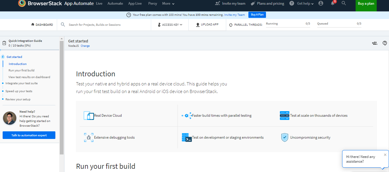
- Conduct automated and manual testing using BrowserStack App Automate, BrowserStack App Live, App Percy, and Percy.
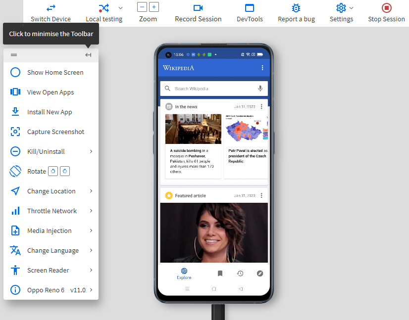
- No matter what Mobile UI mockup tool you turn out using, use BrowserStack real device cloud for prompt access to an extensive range of real Android and iOS gadgets for more accurate test results.
Best Practices to Create UI/UX Mockups
Here are some best practices for User Interface design and generating mockups. Such principles apply to website design, mobile apps, product design, as well as other digital mockups GUI.
Draft or Draw ideas first
With this technique, you can try distinct ideas quickly, rather than attempting to assemble something in a web design program. By different ideas & hitting them next to each other, you can acquire a sense of what will look superior. The obvious advantage of this practice is it can accelerate the procedure and give you extra direction when you dive into the real mock-up.
Choose the Correct Fonts
Fonts that work on Windows don’t always look good on macOS. Besides, some fonts seem better on a Mac but won’t render at all on Windows. This is why it is critical to choose the correct fonts and also opt for compatibility testing.
Mobile-First Tactic
Mobile-first website design prioritizes content while minimizing pointless components and traits. Scaling down from PC often leads to discrepancies or designers compromising to follow reduced screen sizes.
Leverage Proper Design Tools
Design tools have loads of features to make designing and prototyping easier. Read the citations/ documentation to learn shortcuts & leverage features for building the best mockups. This has numerous benefits, and multiple mock-up tools are accessible to mock the UI for mobile apps and eventually conduct visual tests.
Use Smart Objects
As vector-based images can be resized to fit any resolution (without losing excellence), they are perfect for mockups. Particularly those that require a desktop and mobile design. This is why you wish to use vector images when required. Moreover, vector graphics can scale rapidly. This means they can adapt to the highest-definition, retina screens 2 or 3 times their size.
Preview distinct-sized devices
Once you have completed your design, it is a great idea to test it on diverse-sized devices. As well as diverse brands. Preferably, you would like to see how it looks on an Apple and Android phone and on desktops.
This will give you a pretty good indication of what a mockup will look like on all gadgets after they have been printed, coded, or posted on social media.
Read More: UI Testing Tools and Techniques
Conclusion
The mockup phase in web development is often left behind. And, there is high value for any software development team to break down mockup formation into its stage. By generating mockups and iterating on the created web designs, a team enables itself to be intentional about the design selections it makes for a page.
It allows the aesthetics of a given web page to be analyzed by stakeholders in manifold roles offers feedback and makes the web page as best as possible.
If you intend to conduct a mockup test and validate its usability, you can use reliable tools like BrowserStack for accurate results.


