Mobile website testing is essential to ensure that websites deliver optimal performance and user experience across a variety of mobile devices and browsers.
Overview
What is Mobile Website Testing?
Mobile website testing is the process of verifying how a website functions and appears across various mobile browsers and devices. It ensures consistent performance, responsiveness, and usability on browsers like Chrome, Safari, and Firefox.
Methods to Perform Mobile Website Testing
- Using Mobile Emulation in Chrome: Simulates mobile devices in Chrome for testing across screen sizes without physical devices.
- Using a Real Device Cloud for Mobile Website Testing: Tests on real devices remotely, ensuring accurate performance on actual hardware and OS versions.
- Using BrowserStack’s Responsive Checker Tool: Previews website rendering on real devices to identify layout issues and ensure consistent user experience.
This article highlights the importance of mobile web testing and outlines three reliable methods to perform it effectively across real-world mobile environments.
What is Mobile Website Testing?
Mobile website testing refers to the process of evaluating how a website behaves, performs, and appears across a range of mobile devices, browsers, screen sizes, and operating systems.
The goal is to ensure that users have a seamless experience regardless of their device or platform.
It involves checking key aspects such as layout responsiveness, load times, interactive functionality, compatibility across browsers like Chrome, Safari, and Firefox, and overall usability on touchscreens.
Must Read: Types of Mobile Testing
Importance of Mobile Website Testing
With mobile usage dominating online interactions, businesses must ensure their websites function seamlessly across all mobile devices.
Here’s why mobile website testing is essential:
- Ensures cross-device compatibility by verifying website performance on various mobile devices, browsers, and operating systems.
- Improves user experience through optimized layouts, faster loading times, and responsive design.
- Helps identify and fix issues early, reducing the risk of broken features or poor rendering on certain devices.
- Boosts SEO performance, as mobile-friendliness is a key ranking factor for search engines.
- Increases reach and engagement by catering to the growing mobile-first audience.
- Enhances brand perception by offering a smooth, professional experience across all mobile touchpoints.
How to Perform Mobile Website Testing
Here are some key methods that you can use to perform mobile website testing seamlessly.
Method 1: Using Mobile Emulation in Chrome
One can view or test the mobile version of websites using DevTools for mobile emulation. To view the mobile version of a website on Chrome, follow the steps below:
1. Launch Chrome and navigate to the website to be tested on mobile.
2. Open the Developer Tools available in Settings -> More Tools -> Developer Tools. macOS users can use the shortcut fn + f12. Windows users can use Control + Shift + J.
3. Select the Device Toggle Bar.
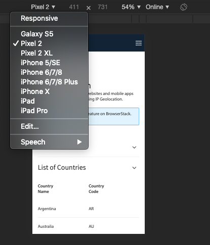
4. Select the device emulated from the available Android and iOS devices list.
Also Read: How to Debug on iPhone Safari for Windows
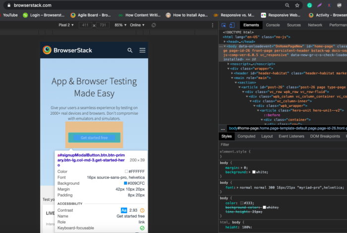
5. Once done, it will display the mobile version of that website on the selected device. One can also inspect specific web elements in the mobile view using the Inspect feature besides the Device Toggle bar. Refer to the image below for clarity:
Note: This method only simulates standard viewports in the Chrome browser. However, it is not the most accurate way to test the mobile version of a website, as it is just a device simulation. It cannot simulate all aspects of a real mobile device.
Method 2: Using a Real Device Cloud for Mobile Website Testing
The most effective and accurate way of running mobile web tests is to test them on real devices. This helps developers and testers evaluate how a website behaves in mobile browsers installed on actual Android or iOS smartphones.
With 3500+ real devices and browsers, BrowserStack’s real device cloud provides QA teams with the ideal testing infrastructure for comprehensive mobile web testing.
Test Your Website on Real Devices Now
The real device cloud offers:
- Latest and legacy versions of real Android smartphones from vendors like Samsung, OnePlus, Google, Vivo, Oppo etc.
- Latest and legacy handsets by Apple, like iPhone X, iPhone 12 Mini, iPhone 13 Pro, iPhone 14 Plus, etc.
- Access the latest OS versions, such as Android 12 & 13, and iOS 15 and 16.
- Support multiple versions of popular mobile browsers like Chrome, Safari, Opera, etc.
- DevTools for Chrome and Safari for accurate inspection of web elements.
To get started with live web testing on real mobile devices, follow the steps below:
- Signup for a free trial on BrowserStack Live.
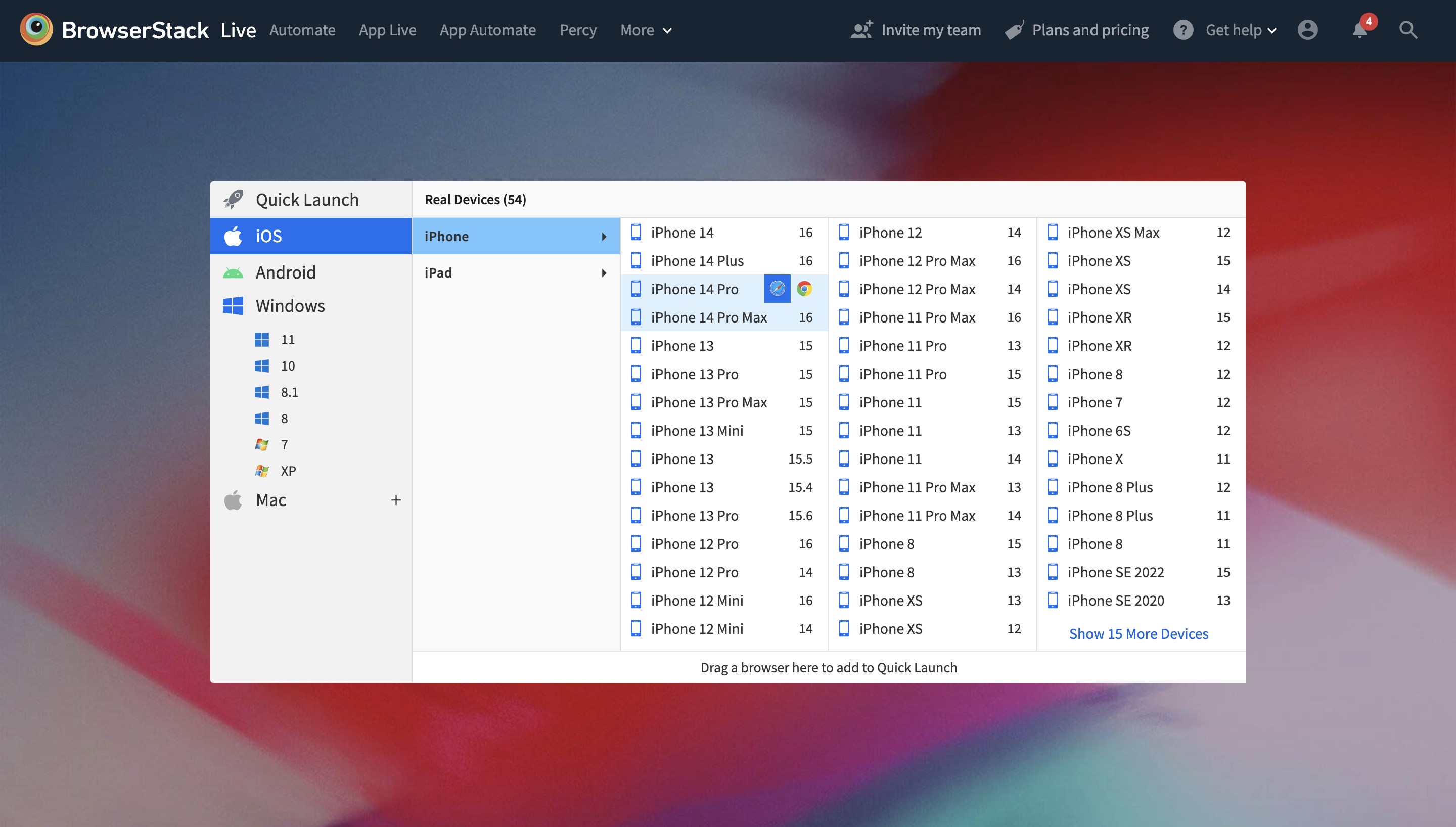
- Once done, choose the OS (Android, iOS) and the desired handset. The image below represents the Live Dashboard, where one can select the desired OS and device-browser combination.
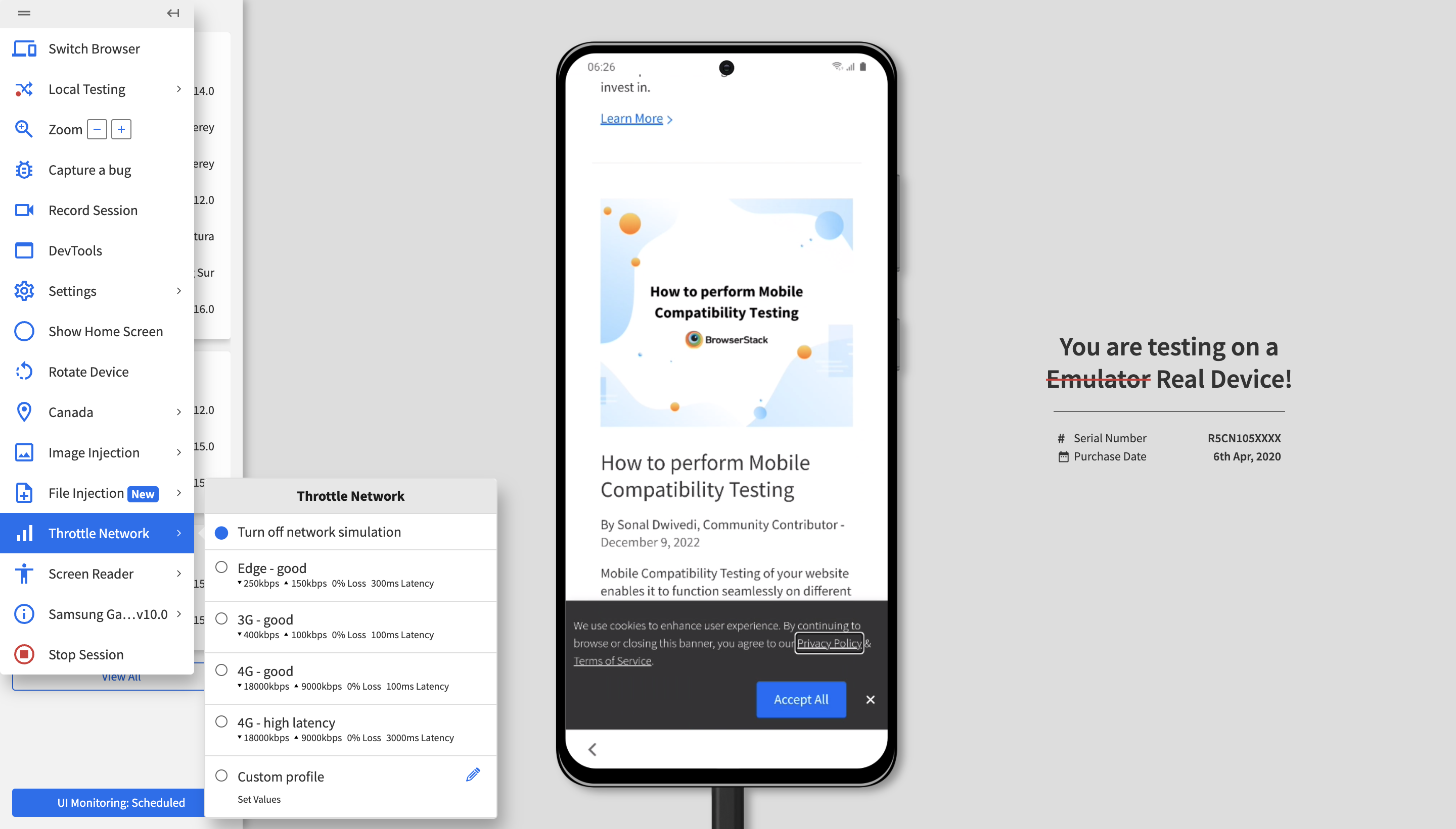
The image above represents a Live mobile website testing session on Chrome running on Samsung S20+.
Try BrowserStack Live for Free
Developers and QA also get access to many valuable features. Listed below are a few:
- Instant access to DevTools for inspection of target web elements.
- Network throttling to simulate the performance of web pages in poor network conditions.
- One can verify whether the website delivers location-specific results using Geo-location Testing.
- Integrations with popular bug reporting tools like Jira, Slack, etc., and CI/CD tools like Jenkins, Maven, etc.
This method of mobile web testing is the most accessible and most convenient, as team members get instant access to a wide range of real devices directly from their browsers without any complex setup. Additionally, the device cloud is updated at regular intervals, which makes the latest gadgets available 24×7 for on-demand testing.
Method 3: Using BrowserStack’s Responsive Checker Tool
With countless device and browser combinations, responsive design is key to delivering consistent user experiences across screens.
BrowserStack’s Responsive Checker is a free tool that helps preview how websites render on real devices like iPhone X, Galaxy Note 10, and iPad Pro. It simplifies identifying layout issues across screen sizes.
Steps to use the Responsive Checker tool:
- Visit the BrowserStack Responsive Checker.
- Enter the URL of the website you want to test.
- View the site across a wide range of real device viewports.
You can click on any device to inspect how your web page renders. This allows you to identify and fix any responsiveness issues before going live.
Challenges of Mobile Website Testing (With Solutions)
Mobile website testing can be challenging due to the diversity of devices, browsers, and operating systems. Below are key challenges and their solutions:
1. Device Fragmentation: Testing across multiple devices and configurations can be time-consuming.
Solution: Use cloud-based testing platforms like BrowserStack to access real devices and emulators, ensuring broad coverage without maintaining a physical lab.
2. Different Screen Sizes and Resolutions: Websites may display differently on various screen sizes and resolutions.
Solution: Adopt responsive design principles and test across devices using tools like BrowserStack’s Responsive Checker.
Read More: Common Screen Resolutions in 2025
3. Cross-Browser Compatibility: Different browsers may render websites inconsistently.
Solution: Test on multiple browsers using automated tools to ensure consistent platform performance.
4. Network Variability: Network speed variations affect website performance.
Solution: Simulate different network conditions (3G, 4G, Wi-Fi) to test performance under real-world scenarios.
5. Operating System Differences: iOS and Android devices may show rendering differences.
Solution: Test on both iOS and Android devices to ensure cross-OS compatibility.
6. Touchscreen Usability: Mobile websites must work seamlessly with touch interactions.
Solution: Ensure all clickable elements are appropriately sized and responsive for smooth touchscreen navigation.
7. Performance on Low-End Devices: Low-end devices may struggle with performance, affecting user experience.
Solution: Test on low-end devices and optimize web pages by reducing heavy images and using lazy loading techniques.
Learn More: How to Lazy Load Images in Javascript
Best Practices for Mobile Web Testing
Few Best Practices to Consider for Mobile Web Testing
- Always test websites on real mobile browsers to get accurate test results.
- Test the mobile website in different network conditions to optimize its performance for every user using different bandwidths.
- Perform Geo-location testing for the website to ensure it delivers accurate results when accessed from different locations on mobile devices
- Check for the most commonly appearing UI bugs and fix them to the earliest, if any.
- Test the website across the devices with the most popular screen sizes.
- Test the website for your target audience’s most commonly used browsers (like Chrome, Safari, Firefox, etc.).
Conclusion
As mentioned earlier, the proliferation of mobile devices will continue. Businesses have no choice but to optimize their websites for mobile platforms to cater to the largest possible audience.
The methods highlighted above will make it convenient for developers and QAs to identify bugs in their websites’ mobile versions. It will keep mobile websites bug-free, implement positive user experiences and retain a competitive edge in a constantly shifting domain.


