It is essential to employ the most efficient methods to make your WordPress site mobile-friendly since users increasingly rely on tablets and mobile phones daily.
Using a mobile-optimized WordPress layout should be your top priority. Employing a responsive web design ensures visitors can access and browse your site from any device.
This guide explores the best Mobile optimization WordPress strategies to make your site mobile-friendly.
What is Mobile Optimization?
Mobile optimization process deals with enhancing a website’s performance on mobile devices, including making it faster, more responsive, and easier to navigate. Businesses and owners of websites need to prioritize mobile optimization to ensure that mobile visitors have an enjoyable time as mobile internet usage continues to rise.
Businesses may boost user engagement, conversion rates & search engine rankings by optimizing their websites for mobile devices.
- To optimize WordPress for mobile, the first step is to use a responsive design strategy, where the site’s structure, text, and graphics are all fluidly adapted to multiple screen sizes & resolutions.
- The flexible design of a website makes it easy for visitors to use the site on any type of mobile device.
- Image optimization is an essential part of making a website mobile-friendly. It is important to compress images while maintaining quality to make the most of a mobile device’s limited bandwidth and processing capacity.
- Improving the site’s responsiveness to mobile users requires optimizing picture file sizes.
- Another important tactic for mobile optimization is to minify JavaScript and CSS files. Reduce the size of these files by using the minification process, which involves deleting all whitespace and line breaks.
- Reduced load times and better performance result from this optimization method, which helps reduce the amount of HTTP requests performed by mobile devices.
What is WordPress Mobile Optimization?
“WordPress Mobile Optimization” describes the steps taken to improve a WordPress website’s performance and usability for mobile users. Making a site compatible with mobile devices calls for several approaches and methods, including responsive design, image optimization, minification of JavaScript and CSS files, and simplification of navigation.
By making their WordPress sites mobile-friendly, businesses & website owners can better serve the growing number of phone users by maximizing user engagement and boosting conversion rates.
Why is WordPress Mobile Optimization Important
Here’s why you should optimize your WordPress website for mobile:
- Improve User Experience: Optimizing your WordPress website for mobile can help deliver smooth navigation and readability on smaller screens, improving experience.
- Higher SEO Ranks: Search engines like Google prioritize mobile-optimized sites with smooth user experience. These sites tend to rank higher on SERP.
- Faster Load Times: Mobile-optimized WordPress sites load faster on mobile devices, which eventually reduces bounce rates and improves retention rates.
Reasons For Slow Mobile Performance On WordPress
Here are the common reasons that slow down the mobile performance of your WordPress site:
- Unoptimized images, such as images with large file sizes, can slow down your website’s loading speed on mobile devices.
- Excessive number of plugins can slow down the load time, eventually causing performance issues.
- Lack of caching can slow down performance, as the content will have to reload fully every time.
- Third-party scripts, ads, fonts etc. will lead to additional load and delay page rendering.
- Basic hosting plans don’t come with the right resources needed for seamless mobile performance.
- If you don’t employ a Content Delivery Network (CDN), the content will load from the main server, thus delaying the load time.
15 Strategies for Mobile Optimization on WordPress
WordPress mobile optimization techniques should center on a few basic tenets to guarantee a fluid user experience across all mobile devices. First, it’s essential to use mobile-friendly WordPress themes, which are responsive and offer optimized layouts for smaller displays. Divi, Avada, & Astra are all mobile-friendly options for a theme.
Further improving performance is using mobile optimization plugins like WPtouch, Jetpack, & AMP (Accelerated Mobile Pages) for WordPress.
Here are some effective strategies to optimize WordPress Website for mobile
Strategies to Optimize WordPress Website for Mobile
- Mobile-Friendly WordPress Themes
- Responsive Design
- Mobile Plugins
- Image and Content Optimization
- Mobile Navigation Optimization
- Mobile Page Speed Optimization:
- Remove Unwanted Plugins and Widgets
- Optimize for Local Search
- Test Mobile Optimization
- Reduce Page Weight
- Minimize the Use of Ads
- Time To First Byte
- Implement Lazy Loading
- Mobile Caching
- Embed Objects Wisely
1. Mobile-Friendly WordPress Themes
WordPress sites often experience sluggishness on mobile devices for a variety of reasons.
So, why is your WordPress Site Slow on Mobile?
One possible explanation is using large or poorly designed images that take too long to load on mobile devices. In addition to slowing down mobile performance, large JavaScript and CSS files might cause issues.
Choosing the right Theme for Mobile Optimization
WordPress themes optimized for mobile devices provide optimal viewing and functionality for mobile users. The responsive design concepts used in their construction make these themes suitable for displays of varying sizes and resolutions.
- Look for themes or a mobile optimization WordPress plugin that boast of their mobile optimization capabilities and have received high marks from users regarding how well they run on mobile devices.
- Popular phone-friendly WordPress themes that offer superb mobile experiences include Divi, Avada, & Astra.
A. Divi
Divi is a responsive WordPress theme that is flexible and extremely configurable, making it ideal for use on various websites. It’s perfect for mobile optimization because of its drag-and-drop creator and numerous layout choices.
B. Avada
The Avada WordPress theme is a favorite among users because of its versatility and mobile readiness. It offers a flexible and responsible design, enhanced functionality, and extensive personalization choices to craft a mobile experience that is aesthetically pleasing and easy to use.
Avada has a retina-friendly design, cross-browser functionality, intelligent admin panel, and unlimited colors and fonts.
C. Astra
Astra – a quick answer to a mobile-friendly, lightweight, and quick-loading WordPress theme. It’s great for mobile-friendly sites because of its fully responsive layout, adaptability, and compatibility with common page builders.
What’s more, to make your mobile responsive even better, the professional starter templates will help you out.
2. Responsive Design
To begin, pick a WordPress theme that’s responsive and made with mobile in consideration. Look for themes with responsive design features that have received high user marks for their efficiency on mobile devices. After deciding on a responsive theme, you can modify it to reflect better your brand’s aesthetic and the subject matter you’ll cover.
- After implementing a responsive layout, testing your WordPress site on various devices and resolutions is essential.
- Testing is undoubtedly essential to provide a positive user experience on various devices.
- You may get a better sense of the website’s responsiveness and usability by manually testing it on actual devices like smartphones & tablets..
Also Read: How to create a Responsive Website?
3. Mobile Plugins
WordPress Mobile plugins optimize sites for mobile devices, boosting the user experience and performance on smartphones and tablets. These plugins offer numerous features and functionalities specifically designed to increase mobile responsiveness, loading speed, & overall mobile optimization.
Here are a few Mobile Optimization WordPress plugins to choose from:
- W3 Total Cache: This powerful plugin boosts website performance by leveraging CDN connectivity by lowering page load times. It additionally results in improved SEO & user experience.
- WP Super Minify: WP Super Minify speeds up pages’ loading time by merging, minifying, & caching HTML, inline CSS, etc JavaScript files.
- WP Smush: WP Smush is a plugin renowned for reducing the size of images. It helps minimize the total size of photographs without diminishing the visual quality.
4. Image and Content Optimization
- Image optimization is a vital part of smartphone optimization. Mobile devices frequently have limited bandwidth and processing power, therefore, optimizing images assists in enhancing the loading speed & general efficiency of a web page on mobile devices.
- Content optimization on mobile devices involves customizing a website’s content to suit the needs of mobile users. This includes reducing and compressing the text to make it easily legible on smaller displays, using shorter paragraphs or simple words. Putting the most relevant and entertaining content first is crucial, ensuring it is presented prominently and minimizing excessive scroll or clutter.
5. Mobile Navigation Optimization
Mobile navigation optimization focuses on providing simple & user-friendly menus for navigation for mobile devices. Since mobile devices have limited space, it is vital to streamline the navigation process to make it easy for consumers to access data and navigate through the website.
Also Read: How to Implement Mobile-First Design?
6. Mobile Page Speed Optimization:
Mobile page speed optimization aims to make a website faster and more functional on mobile devices. Mobile consumers have come to expect lightning-fast loading times and seamless navigation.
How to test for Mobile page speed?
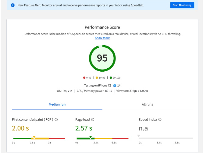
There are several tools available for mobile page speed tests. Google’s PageSpeed Insight is a well-known tool for optimizing mobile performance, offering insights and suggestions. It calculates a grade and offers constructive criticism.
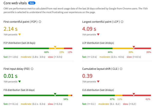
BrowserStack SpeedLab instantly generates detailed test reports and evaluates score out of 100 for both mobile and desktop platforms.
Most importantly, all tests are executed on real devices and browsers.
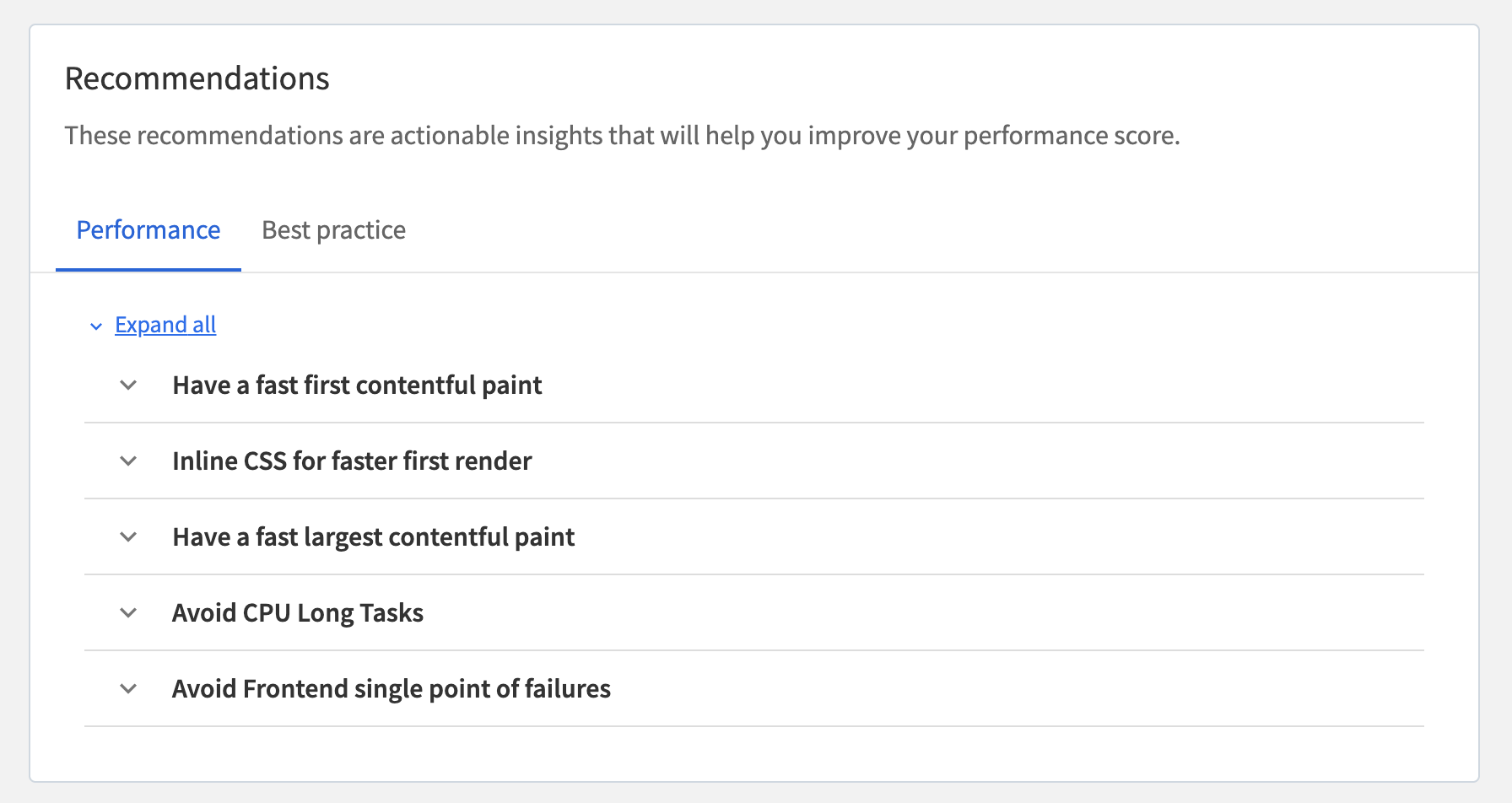
SpeedLab scores indicate the core web vitals along with recommendations and actionable insights to improve your WordPress website score.
7. Remove Unwanted Plugins and Widgets
Eliminating unused add-ons is a crucial part of mobile optimization. A website with unnecessary plugins and widgets might become cumbersome for mobile devices.
- Make it a habit to inspect the list of plugins & widgets and uninstall everything unnecessary. Focus on plugins that improve the mobile user experience while still being lightweight.
- Website owners may speed up page loads for mobile users, simplify the UI, and enhance the overall browsing experience by decreasing the number of plugins & widgets.
8. Optimize for Local Search
Optimizing their website for local search is essential for businesses trying to reach customers in a specific location. Mobile users frequently conduct local service and product searches, making it crucial to optimize the website for local searches.
Read More: How to perform Localization Testing
9. Test Mobile Optimization
The success of a website on mobile devices relies heavily on the results of mobile optimization testing. Evaluate the site’s appearance and operation across various devices and running system configurations. Verify that it is easy to navigate, that images and text scale properly, and that it is mobile-friendly.
Follow-Up Read: Browser Compatibility Check on WordPress Sites
Testing your online presence on a wide range of devices and operating systems (OSs) is essential to guarantee the best mobile SEO. Different mobile devices may display your website differently depending on factors such as screen size, resolution, and operating system.
10. Reduce Page Weight
Make your page lighter by focusing on image optimization. Your page shouldnt be packed with videos, images, scripts etc. Use them only when absolutely necessary.
Minimize or remove unused CSS and compress JavaScript code to reduce page weight.
11.Minimize the Use of Ads
Ads are a source of monetization from your website. However, they can slow down your site’s mobile performance. So, it’s best to avoid Ads whenever possible.
12. Time To First Byte
Time to First Byte (TTFB) measures the time taken for a web browser to receive the first byte of data from a serve upon sending a request. Therefore, ensure you optimize server-side scripts like PHP or SQL to improve time to first byte.
13. Implement Lazy Loading
Employ lazy loading, a technique that ensures your web page loads content only when the user scrolls and reaches that specific content. The content that is yet to be consumed is delayed, which improves the overall performance.
Read More: What is Lazy Loading
14. Mobile Caching
Enabling mobile caching is a common yet important strategy for minimizing the load on an application and its servers. Mobile caching stores data accessed multiple times on a user’s device which lets the application load content sooner without having to repeatedly fetch it from the server.
15. Embed Objects Wisely
YouTube videos and infographics for embedding come with pre-defined width and height settings. Adjust the dimensions or leverage responsive design techniques to make them adapt to different screen sizes efficiently.
How to Check WordPress Mobile Page Speed
Here’s how you can check WordPress mobile page speed:
Ways to Check WordPress Mobile Page Speed
- Google PageSpeed Insights
- GTmetrix
- Lighthouse Metrics
- Chrome Developer Tool
- Google PageSpeed Insights: PageSpeed lets you access the Core Web Vitals of your WordPress site easily. Visit PageSpeed Insights, enter your WordPress site URL , click the Analyze button, and review your core web vitals to analyze the speed.
- GTmetrix: This web performance tool helps you analyze your website speed and performance. You can select the mobile option to check the speed.
- Lighthouse Metrics: Lighthouse Metrics is a tool that lets you check your WordPress site on mobile in various locations. With a single test, you can run tests from 16 regions. You only need to copy and paste your site’s URL and click “Run Test.”
- Chrome Developer Tool: You can use Chrome Dev Tools directly in your browser to check WordPress mobile speed. Open the ‘developer tool’ from your website, select the ‘Lighthouse’ tab, and check ‘Mobile’ underthe ‘Device’ section. Then, simply click on the ‘Analyze page load’ button.
Conclusion
Mentioned above were the best strategies to optimize your WordPress website for mobile. However, the most important thing to do would be to test your website on real devices to see if it performs consistently across different devices, browsers, and operating systems.
Use tools like BrowserStack for real device testing. BrowserStack offers a real device cloud platform. You can access over 3500+ different device, browsers, and OS combinations using this platform.


