Capturing the attention of users and engaging them on your website is challenging but it is also essential for the success of your business. High traffic and engagement rates are crucial for boosting the revenue. This is why you need to build a user-friendly website that provides a flawless experience to your end-users.
Overview
Key Elements of a User-Friendly Website
- Intuitive navigation: consistent menus, minimal clutter, clear structure.
- Impactful color choice: high contrast, readable typography, accessible colors.
- Mobile compatibility: responsive layouts, touch-friendly interfaces, optimized images.
- Cross-browser/Cross-device consistency: test appearances & interactions on real devices/browsers.
- Fast loading: compress images, minimize unused code.
- Accessibility: WCAG compliance, alt text, ARIA attributes, keyboard navigation.
- Simple forms & clear CTA: only required fields, informative errors, visible CTAs.
This guide discusses everything you need to know about building a user-friendly website.
What is a User-Friendly Website?
A user-friendly website is a page designed in such a way that anyone who visits it can seamlessly navigate and access the information they need via any device. i.e. they should enhance usability by offering a simple and effortless user experience.
A user-friendly website should ensure smooth navigation, mobile responsiveness, and accessibility through clear menus, readable content, well-optimized website design, fast loading times, and accessibility features like alt text and compatibility with assistive technologies.
Remember, you not only meet the audience requirements with a user-friendly website but also build trust, engagement, and loyalty.
Importance of a User-Friendly Website
Building a user-friendly website is not an option anymore, but rather a necessity. Here’s why:
- Enhance User Experience: Easy navigation and intuitive design help users complete their tasks easily, providing a positive experience. This will reduce bounce rates and encourage your users to return to your website and even recommend it to others.
- Improved Accessibility: A user-friendly website ensures that it is accessible to all users, including those who are differently abled. When your website is compliant with accessibility standards like WCAG, your audience base broadens.
- Better Engagement and Retention: User-friendly aspects like faster load time, intuitive content, and easy sign-ups keep users engaged longer.
- Build Credibility: A well-designed, responsive website is more reliable for users and helps build credibility.
- Increased Conversion Rates: Intuitive design, easier navigation, and prominent CTAs enhance the user experience and encourage users to make purchases and sign up with your website,
- Better SEO Ranking: Search engines like Google prefer sites with good user experience and tend to rank them higher. These sites ought to be fast, mobile-friendly, and accessible and should have optimized content.
User-Friendly Website Elements
Here are the elements that a user-friendly website should contain:
1. Intuitive Navigation
After landing on a homepage, a user will naturally look to the navigation to get a sense of the site structure. A good website ensures that it is structured for easy navigation and gives users a clear sense of what they can access and from where.
- The navigation bar should be constant throughout the site on every page. Ensure that it serves as a tool that guides the user’s journey through the site.
- Don’t clutter the navigation bar with many categories or items.
- An overly bulky bar is harder to operate and doesn’t look too great.
- Also, the bar should be in the exact location on every page to minimize user effort.
The best way to implement user-friendly navigation is to conduct A/B testing with different menu locations, tab arrangements, and content. Find out which version users prefer and implement that in the final release.
Also-Read: 11-Step Website Design Checklist
2. Impactful Colors
Colors can influence user perception, emotions, and the ease of navigation. Therefore, it is crucial to choose the right colors with the right contrast. While choosing the colors for the website:
- Make sure that it reflects your brand identity and your target audience’s preferences.
- Ensure you use high-contrast combinations (like dark color text on a light background) to enhance readability and accessibility.
- Colors should align with a harmonious scheme to prevent a cluttered appearance.
- Select colors that convey the desired emotions of your content.
- Last but not least, make sure your color scheme fulfills the WCAG standards for all users. This is a crucial aspect, and make sure you test this with the help of accessibility testing tools like BrowserStack. With this tool, you can test your website on real devices and ensure color consistency across devices, identifying the missing ARIA attributes and low-color contrasts.
3. Mobile Compatibility
The lack of a mobile-friendly site could negatively impact site rankings. Any site offering a better mobile experience would potentially receive a rankings boost even for people searching from a desktop device.
To make your website mobile-friendly:
- Ensure you use a responsive design where the layout adapts to different screen sizes.
- Make the UI touch-friendly, i.e the buttons and other elements should be easy to tap.
- Optimize the images and other resources for faster loading times on mobile.
- The website should have simplified menus with clear fonts and scalable texts.
- It should be easy to scroll.
Once a mobile-friendly version of a site has been designed, it needs to be tested for bugs when accessed via real mobile devices under real user conditions.
4. Cross Browser Consistency
Make sure your website appears and functions consistently across all browsers by:
- Using HTML5 and CSS3 best practices.
- Offer alternatives for unsupported features.
- Use a responsive design that adapts to different screen sizes to maintain consistency.
- Use tools like BrowserStack to test your website behavior and appearance across different browsers.
Read More: Website Testing: A Detailed Guide
5. Cross-Device Compatibility
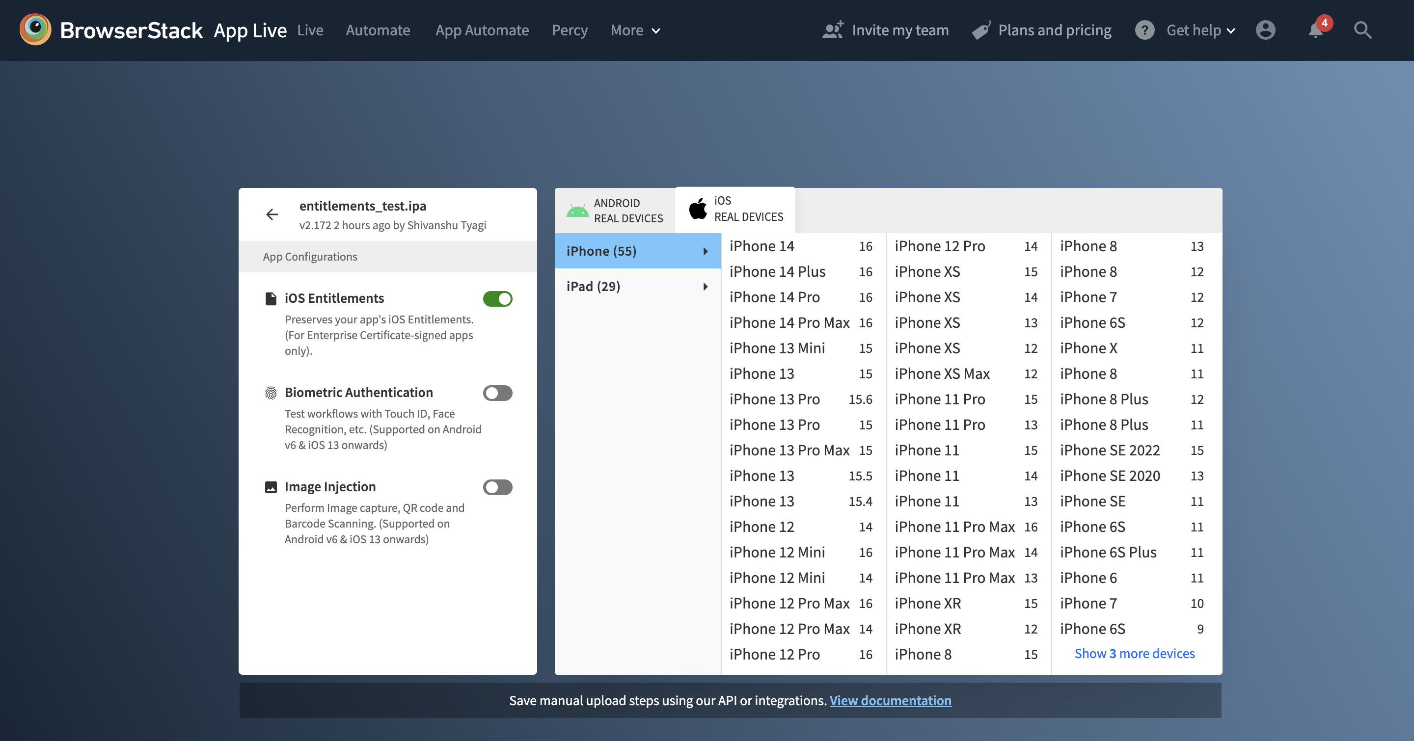
More than 4 billion people access the web through combinations of:
- 9000+ distinct devices
- 21 different OS (vendor + version), along with
- 8 major browser engines that power hundreds of browsers
To maximize its chance of success, a website should be optimized for access from as many unique devices as possible. This can be challenging since new devices are being released with increasing frequency. Unless testers have access to a constantly updated device lab, it is best to go for a cloud-based testing offering real browsers and devices on demand.
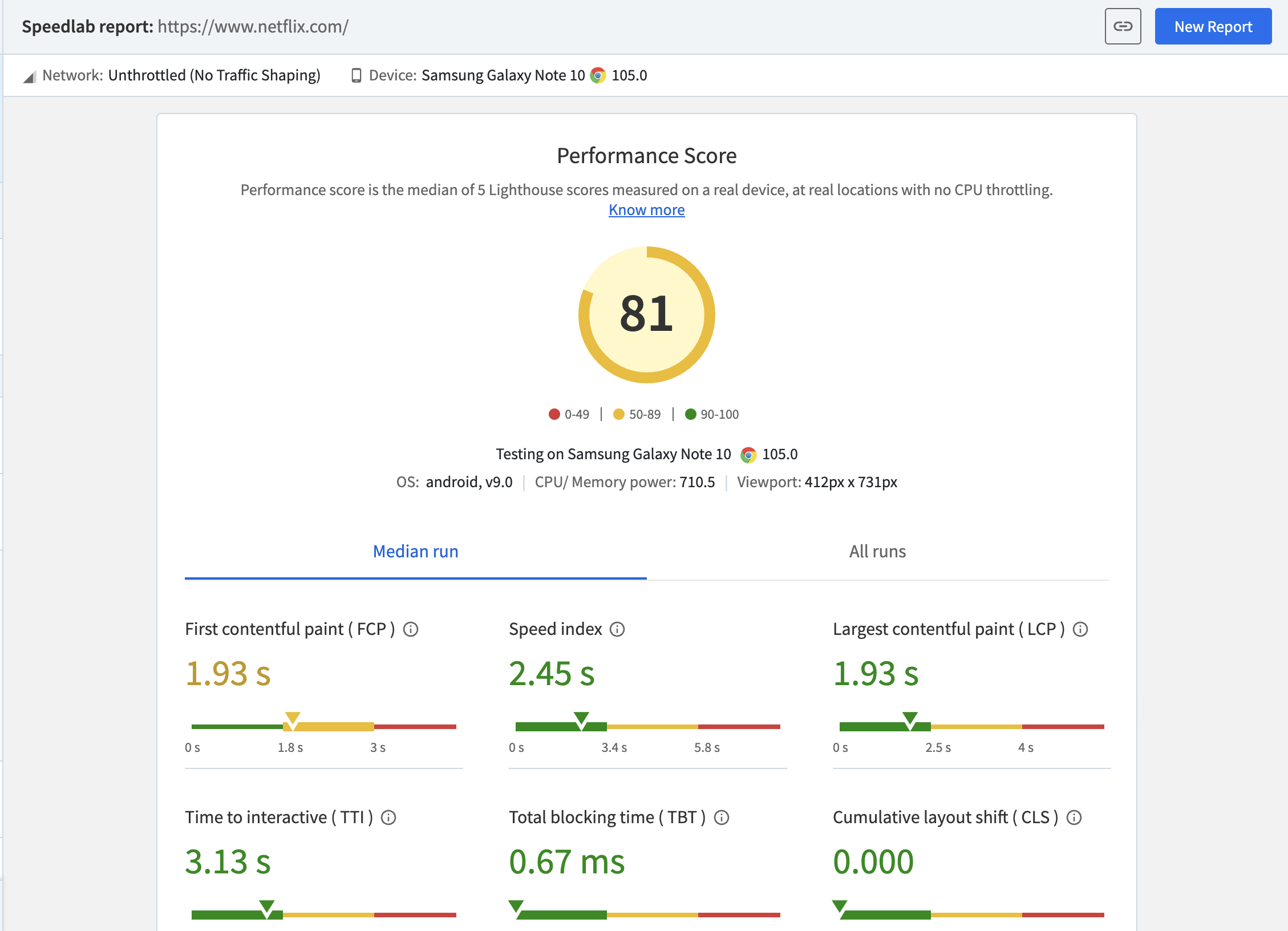
6. Loading Speed
- 53% of website visits are abandoned if a mobile site takes longer than 3 seconds to load.
- 47% of consumers expect a web page to load in two seconds or less.
- 40% of consumers will wait no more than three seconds for a web page to load before abandoning it.
Increasing website speed is a significant factor in user-friendliness. The faster the web page loads, the more it contributes to user satisfaction. And there is plenty one can do for website speed optimization.
- After implementing measures for website speed optimization, one has to check on website speed to ensure that it is working as desired.
- Furthermore, a website might not load at the same speed on different device-browser combinations.
- To determine accurate website speed on different devices and browsers, use a tool that accurately measures the same using real browsers and devices.
BrowserStack SpeedLab allows users to measure website page speed with a single click. Enter the relevant URL, click Start, and get a detailed report of how the page renders across many devices. Run a Free Website Speed Test on SpeedLab to evaluate how a website performs in real user conditions.
7. Ensure Accessibility
You need to ensure that your website is accessible to all website users, including individuals with disabilities.
- Make sure your website complies with WCAG guidelines.
- Provide text alternatives for images and video/audio transcripts.
- The site should be navigable even with a keyboard.
- ARIA attributes ought to be implemented for assistive technologies.
- Use assistive tools like screen readers, contrast checkers, etc.
- Test if your website is accessible via tools like BrowserStack, which lets you test workflows with a single scan, access screen readers on real devices, and more.
8. Create Simple Forms
Simple forms improve user-friendliness and promote quick and easy interactions. While designing your forms, make sure that:
- You ask only necessary questions and reduce the number of fields.
- Offer instructions for input fields. For example, you can provide instructions like ‘Enter your email’ near the field ‘username’.
- Ensure all fields are labeled.
- Display error messages for invalid inputs.
9. Intuitive Content Architecture
Create a content architecture that is easy to follow and navigate through. Your content architecture should have:
- A clear hierarchy where content is organized logically into categories with headings, subheadings, etc.
- The menus should be intuitive, with links that can redirect users to important sections.
- Include a prominent search bar to help users access desirable content easily.
- Content should have a logical flow, ensuring a smooth user journey.
How to make a User-Friendly Website?
Here are things to follow when you create a user-friendly website
1. Create a Responsive Design
A website should render perfectly and function flawlessly, regardless of the screen size or viewport of the device accessing it. This calls for responsive design, which ensures that the website reorients itself to adapt to the current screen size – text and images automatically reformat and resize themselves so that they are easily viewed and spaced correctly.
- By implementing responsive design, developers ensure that users can view a site in optimal conditions, no matter what device or browser they use to view it.
- BrowserStack’s responsive design checker allows them to monitor how a website renders across the screens of the latest and most frequently used devices. Enter the relevant URL, click Check, and check how a website’s responsive design fares across viewports.
Also Read: 9 Core Elements of Modern Web Design
2. Language and Tone
Make sure you use accessible language and tone.
- The text should be easy to read and have crisp yet descriptive headings and sub-headings.
- Avoid using language that is deeply technical.
- You should also make sure that the formatting is consistent and intuitive.
- It is a good idea to provide multiple language options for your content so that is more accessible to audiences from different parts of the world.
3. Use Accessibility-friendly Font and Colors
Using accessibility-friendly fonts and colors plays a major role in improving the website’s user-friendliness.
- Choose intuitive, readable, and clear fonts like Arial with optimal size and sufficient spacing so that users read through your content easily.
- Your colors are high-contrast for better readability and navigation.
- Ensure that you avoid using colors that can’t be differentiated easily by colorblind users (like red and green combinations).
- Avoid using decorative fonts. Use simple, readable, and legible fonts.
4. Optimized website structure
Optimize your website structure to enhance the user-friendliness of your website:
- Organize your website structure logically. The content and menu should be categorized intuitively and should have a natural flow.
- Optimize resources like images, reduce unnecessary codes, and leverage caching to reduce loading time.
- See to it that your website design is adaptable for all screen sizes and devices.
- Link related content for easier user navigation.
5. Optimize the Speed of your Website
If your website loads slowly, then users can abandon your page for your competitors. So, optimizing speed is crucial. Here’s what you can do to improve website speed:
- Compress your website’s images with tools like TinyPNG without impacting the quality.
- Enable browser caching. This way, you can store static resources that have been accessed by visitors and reduce the load time when they return for the same resources.
- Remove unwanted characters and spaces in CSS/HTML codes to reduce file size.
- Distribute your website’s assets across multiple servers globally via content delivery networks. This reduces latency and improves loading times for users across different locations.
- Leverage lazy loading to load images and other resources only when users view them.
Read More: 10 Reasons for Slow Website Loading
6. Clear Calls to Action (CTAs)
Actionable websites are the most powerful. CTAs should be upfront, combining a clear point with the right link. Here are points to remember while placing a CTA on your webpage:
- CTAs should be easy to find, well-placed on every page (as necessary), and be part of an easily executable end-to-end user action.
- A CTA must set clear expectations. No one should find themselves on an event registration page when the CTA might have led them to believe they would be donating.
- The text should be readable and in a contrasting color as opposed to the button.
- Don’t overwhelm visitors with multiple CTAs on a single page.
Follow-Up Read: CTA Design Examples to Boost Conversions
7. Ensure the Website is Visually Appealing
The look of your website is the first aspect that catches the user’s eye. So, it goes without saying how important it is to create a visually appealing site.
- Ensure that your website has a consistent design with a uniform color scheme, font, and layout.
- Avoid clutter by including sufficient white space and enhance readability.
- Use clear images that support your content. However, make sure it is optimized to reduce loading speed.
- Use responsive design to ensure your website functions correctly on all devices.
- Use clear, well-designed, and prominent CTAs
- Make sure the layout of your website is intuitive and simple.
8. Test your Website on Different Devices and Platforms
Ensure you test your website on different devices, browsers, and operating systems to ensure that it functions correctly and offers a consistent user experience across all platforms. Maintaining a physical device lab with updated versions of devices can be a tedious task. Leverage real device testing with tools like BrowserStack. BrowserStack offers a vast real device cloud that lets you access 3500+ real device, OS, and browser combinations.
Conclusion
User-friendliness is a non-negotiable aspect of the modern website. You need to create a proper plan, abiding by the points mentioned above, to balance functionality, accessibility, and aesthetics.
Last but not least, test your website across real devices and browsers with tools like BrowserStack to ensure it delivers a consistent user experience regardless of the platform.


