First impressions matter, and your website layout sets the tone. A strategic, well-structured layout can guide users effortlessly, spark interest, and drive action.
Overview
A website layout is the structural design that arranges content, visuals, and navigation to guide user interaction effectively. The right layout enhances engagement by creating a seamless and visually appealing user journey.
Best Website Layouts to Increase Engagement:
- Zig-Zag Layout: Guides the eye in a Z-pattern, ideal for storytelling and flow.
- F Layout: Follows natural reading patterns, perfect for content-heavy pages.
- Full-Screen Photo Layout: Uses bold visuals to create emotional impact.
- Grid Layout Website: Organizes content in a clean, structured manner.
- Featured Image Layout: Highlights key visuals to draw immediate attention.
- Asymmetrical Layout Website: Breaks the grid for a dynamic, modern look.
- Box-based Layout Website: Uses boxes to group content for clarity and order.
- Cards Layout Website: Compact, clickable units ideal for browsing multiple items.
- Magazine Layout Website: Mimics editorial design for content-rich sites.
- Split Screen Layout: Divides the screen for dual focus areas or options.
- One-Page Layout Website: Streamlined navigation on a single scrolling page.
- Minimalist Layout: Strips down to essentials for a clean, distraction-free experience.
This article explores the most effective website layouts that are proven to boost engagement and enhance overall user experience.
What is a Website Layout?
A website layout is the visual and structural arrangement of elements on a web page including text, images, buttons, and navigation. It plays a key role in guiding how users interact with the site, ensuring content is easy to follow and actions are intuitive.
A well-designed layout enhances both the look and functionality of a website, making it more engaging and user-friendly.
Read More: Website User Experience (UI/UX) Checklist
Importance of Website Layouts
A well-planned website layout shapes how users interact with your site. Here are key reasons why it matters:
- Guides User Navigation: A clear layout helps users move through the site effortlessly, making it easy to find key pages or complete desired actions without confusion.
- Enhances User Experience: When information is logically placed, users enjoy a smoother browsing experience, which increases the likelihood of repeat visits.
- Boosts Engagement: Well-positioned elements like buttons, images, and CTAs capture attention and encourage users to interact with the site.
- Improves Readability: A structured layout breaks content into manageable sections, allowing users to scan quickly and focus on what matters most.
- Supports Branding: Consistent use of layout, fonts, and colors strengthens brand identity and gives your website a professional and cohesive look.
- Optimizes for Mobile Devices: A responsive layout adjusts to different screen sizes, ensuring a pleasant experience for users on smartphones and tablets.
- Reduces Bounce Rate: By delivering a visually appealing and functional layout, users are more likely to stay longer instead of leaving after the first page.
- Drives Business Goals: Whether it’s signing up for a newsletter or making a purchase, a good layout leads users naturally toward important conversion points.
To ensure a consistent and seamless user experience across all devices and browsers, it’s essential that your website layout functions flawlessly everywhere.
This makes thorough testing a critical step in the design process. BrowserStack Responsive makes it easy by allowing you to instantly test your layout across real devices and screen sizes, ensuring your site looks and performs perfectly for every user.
Top 12 Website Layout Ideas to Increase Engagement
Here are 12 effective website layout ideas that enhance visual appeal and drive user engagement by improving navigation, focus, and interaction.
To answer your question, here are the industry standards to consider when designing a website:
- To make the best of your website, you should establish its purpose.
- Make sure the color scheme & font you pick are both readable and in keeping with your brand’s aesthetic.
- Create descriptive titles, then divide your information into logical sections.
- Make your website mobile-friendly & responsive by using photos & graphics to improve the reading experience.
- Put your website’s design through a user test and utilize the results to make adjustments.
Considering the standard parameters, here are 12 website layouts your design and development teams can count on
1. The Zig-Zag Layout
The material in this design is laid out in a zigzag pattern that directs the user’s gaze diagonally across the screen. This technique is especially useful for storytelling websites or those with lots of graphic content. It creates a dynamic visual effect that draws the user’s attention and encourages them to explore the website.
One of the advantages of the Zig-Zag layout is that it can be used to break up long pages of content into more manageable sections. By organizing the content in a diagonal pattern, the user can easily see where one section ends and another begins, making it easier to navigate the website.
- Best Suited For: Story-driven landing pages, marketing campaigns, and product showcases
- Example Website: BBC News
- Key Features: Promotes visual storytelling, enhances readability, and increases conversions by guiding users toward key CTAs.
2. The F Layout
This design follows the “F” pattern most frequently seen in eye-tracking surveys of web users. News sites, blogs, and online shops benefit from this design because of the volume of text they produce. By placing important information in key page areas, these websites can communicate their message effectively and engage users.
In the F Layout, the most critical information is placed at the top-left of the page, where users are most likely to look first. As users scroll down the page, their attention shifts to the left side, creating a vertical stripe of content.
- Best Suited For: News platforms, blogs, educational websites, and content-heavy sites
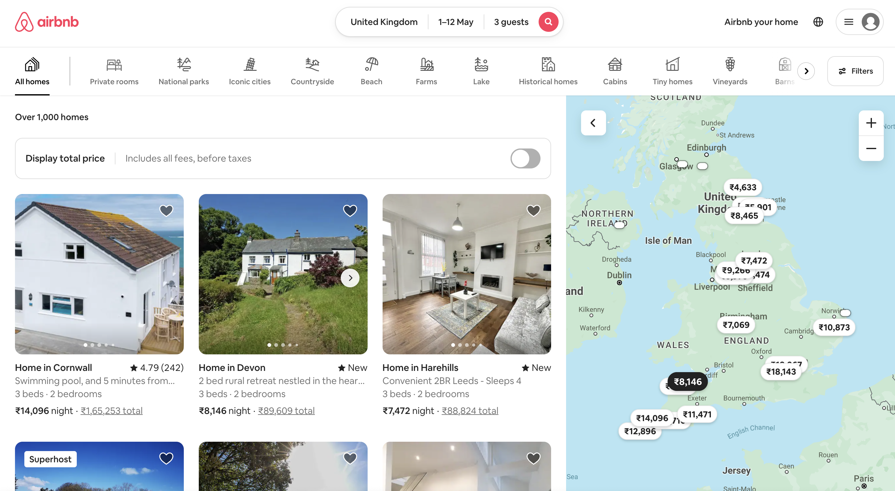
- Example Website: Airbnb
- Key Features: Supports fast content scanning, improves information hierarchy, and works well for text-rich layouts.
Airbnb & Amazon are just a few websites that fit this description.
3. Full-Screen Photo Layout
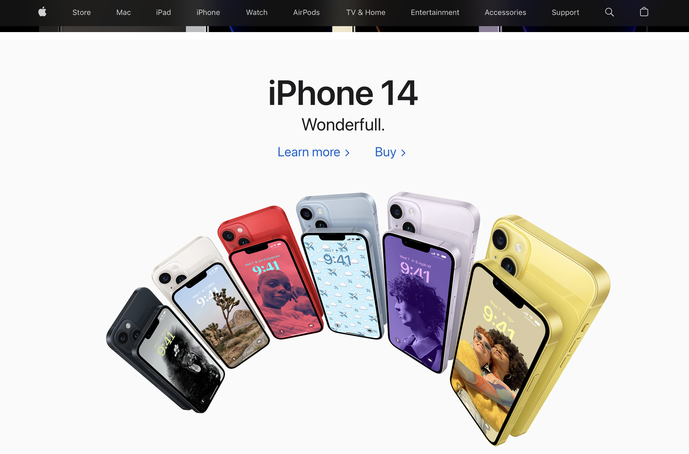
This layout features bold, high-resolution images or videos that span the full width and height of the screen, creating a powerful visual impact. It’s designed to captivate users instantly and convey brand personality or mood.
- Best Suited For: Creative agencies, photographers, travel blogs, and lifestyle brands
- Example Website: Apple
- Key Features: Strong emotional appeal, immersive visuals, and minimal distraction from messaging.
4. Grid Layout Website
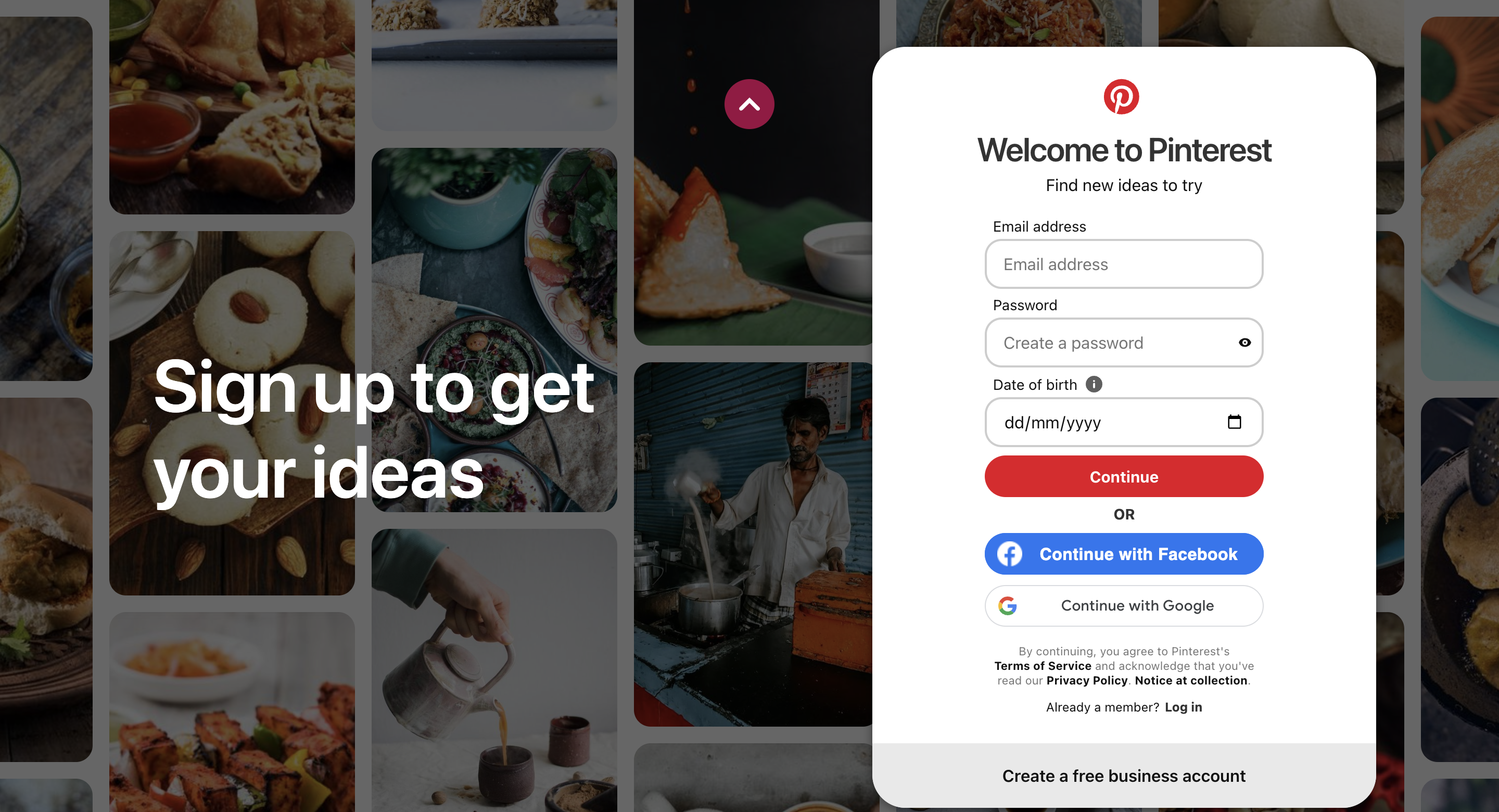
This design arranges elements in a uniform or varied box-size grid. It’s especially useful for sites with many images, like portfolios and galleries.
Pinterest is a prime example of the grid layout website
The Grid Layout system is based on a series of columns and rows that can be customized to create a variety of layouts. These layouts can be adjusted to fit different screen sizes, making them responsive and accessible on a wide range of devices, including desktops, tablets, and smartphones.
- Best Suited For: Portfolios, online stores, design showcases, and service-based websites
- Example Website: Pinterest
- Key Features: Clean organization, scalable structure, and high visual clarity.
5. Featured Image Layout
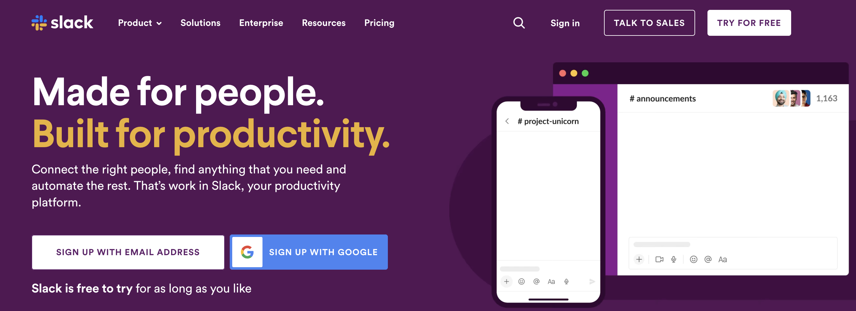
The layout primarily emphasizes the big, bold images. It is popular for online stores and other sites centered on selling goods. The Nike and Slack websites are again two good examples of this.
The Featured Image Layout grabs the user’s attention and creates an immersive experience. The large image at the top of the page serves as a focal point, drawing the user’s eye and setting the tone for the rest of the content on page
- Best Suited For: Blogs, online magazines, and product launch sites
- Example Website: Nike
- Key Features: High-impact visuals, clear content emphasis, and intuitive navigation
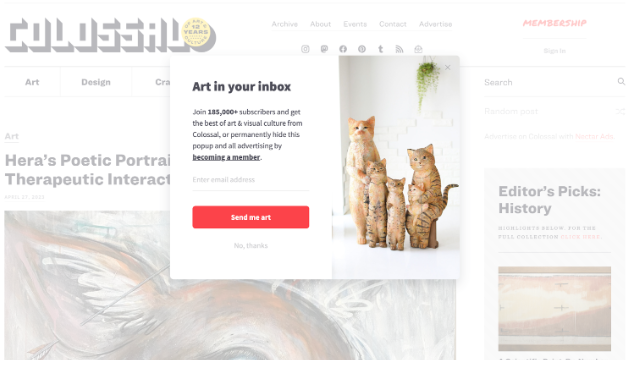
6. Asymmetrical Layout Website
This design takes advantage of content placement that is not uniform to produce a striking visual effect. This layout is often used for websites that want to break away from traditional grid-based designs and create a sense of creativity and movement.
The irregular grid creates a sense of movement and draws the user’s eye to different parts of the page. This layout can highlight specific elements or create a sense of depth and complexity.
A popular example includes Colossal
- Best Suited For: Creative portfolios, fashion and art websites, and modern startups
- Example Website: Colossal, Wix Studio
- Key Features: Bold aesthetics, unique brand expression, and a contemporary look and feel.
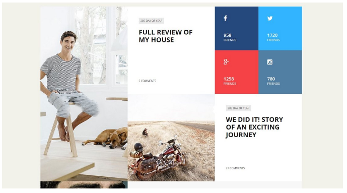
7. Box-based Layout Website
Box-based layouts segment content into separate blocks or modules. Each box contains distinct information, making it easy for users to scan and digest complex data.
- Best Suited For: Corporate websites, service providers, and SaaS platforms
- Example Website: Dropbox, Behance
- Key Features: Logical structure, clear separation of content, and user-friendly experience.
8. Cards Layout Website
Little, standalone “cards” stand in for many forms of information in this design, such as news or products. It’s a common choice for websites with plenty of content or online shopping. The Instagram and Etsy websites are two such examples.
The Cards Layout is a versatile design choice that can be used for various website types, including social media platforms, e-commerce sites, and content-driven websites. It is particularly useful for websites that need to display a large amount of content in a way that is easy to navigate and visually appealing.
- Best Suited For: E-commerce stores, dashboards, blogs, and content libraries
- Example Website: Instagram
- Key Features: Highly interactive, responsive for mobile, and great for organizing large volumes of information.
9. Magazine Layout Website
Inspired by print magazines, this layout supports a multi-column design with rich visuals and varied content modules. It’s ideal for sites with constantly updated or diverse content streams.
- Best Suited For: Editorial blogs, news portals, and digital publications
- Example Website: Vogue
- Key Features: Visually dynamic, supports a variety of media formats, and encourages deep reading.
10. Split Screen Layout
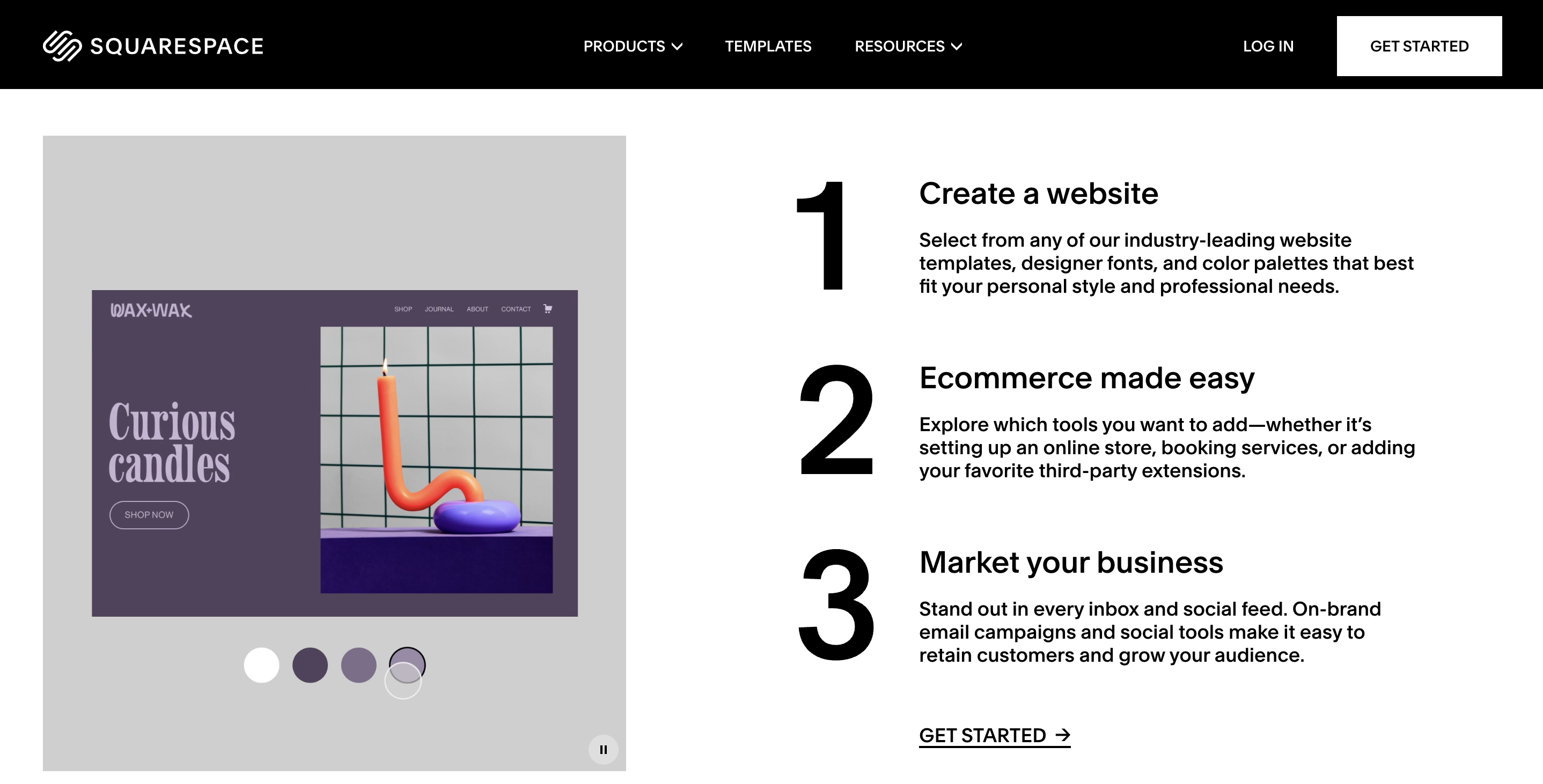
This structure splits the screen into multiple pieces, each displaying a unique type of content. It is useful for sites that have conflicting information or messages. Websites like Squarespace are noteworthy instances.
On the Squarespace website, the left side of the screen is used to display a large image, while the right side is used to provide information about the company’s services.
- Best Suited For: Tech companies, product comparison pages, or service-focused sites
- Example Website: Squarespace
- Key Features: Modern aesthetic, balanced visual attention, and ideal for highlighting contrast.
11. One-Page Layout Website
Using this design, a website’s whole content can fit on a single page, and users can navigate between sections by scrolling or clicking on links. This method is ideal for websites with a simple structure and obvious content hierarchy.
- Best Suited For: Event pages, portfolios, app landing pages, and campaigns
- Example Website: Carrd
- Key Features: Streamlined flow, fast navigation, and mobile-optimized structure.
12. Minimalist Layout
The designers of this layout paid close attention to white space, text, and color. It works particularly well for business websites that have a distinct objective & sense of style. Apple and Dropbox are two instances of this type of illustration.
The overall effect would be a clean, uncluttered design that is easy to navigate and visually appealing. By focusing on typography, negative space, and a limited color palette, this minimalist layout website would create a sense of calm and simplicity.
- Best Suited For: Luxury brands, modern agencies, and personal blogs
- Example Website: Everlane
- Key Features: Fast load times, elegant presentation, and a distraction-free experience.
Key Elements of a Creative Website Layout
A creative website layout is more than just aesthetics; it’s about delivering a memorable experience while maintaining usability and clarity. To design a layout that captures attention and drives engagement, here are the essential elements to include:
- Clear Visual Hierarchy: A strong layout prioritizes content using size, color, contrast, and spacing to guide the user’s attention to the most important elements first, such as headings, images, or call-to-action buttons.
- Intuitive Navigation: Users should be able to find what they need without confusion. Sticky menus, well-labeled sections, and strategically placed navigation links make browsing seamless and enjoyable.
- Strategic Use of Whitespace: Also known as negative space, whitespace prevents clutter, enhances readability, and gives content room to breathe, adding a polished and modern look to the design.
- Engaging Visuals: High-quality images, custom graphics, icons, or videos help break up text and make the layout visually compelling. They should be relevant and optimized for fast loading.
- Consistent Grid Structure: Using a grid-based system helps align content consistently across the site, ensuring visual balance and organization, even in the most creative designs.
- Call-to-Action Elements (CTAs): Every creative layout needs strategically placed CTAs that stand out and encourage users to take action, whether it’s signing up, contacting, or purchasing.
- Typography That Matches the Brand: Typography should be legible and align with the site’s tone and identity. A creative layout combines font sizes and styles to create rhythm and focus.
Best Practices for Choosing a Website Layout
Choosing the right website layout is crucial to aligning your design with your goals, audience needs, and content type. A good layout should support functionality, guide user behavior, and create a smooth user experience. Here are important factors to consider:
- Consider your website’s purpose and audience: Your website’s purpose and target audience should inform your choice of website layout.
- Prioritize mobile responsiveness: With more and more users accessing websites on their mobile devices, it is essential to choose a mobile-responsive layout. The website will adjust to fit different screen sizes, making it easy to use and navigate on any device.
- Keep it simple: A simple and user-friendly website layout is essential for creating a positive user experience. Avoid cluttered or confusing layouts that make it difficult for users to find what they want.
- Focus on Visual Hierarchy: A good layout naturally draws attention to key elements using spacing, size, and positioning.
- Consider usability and accessibility: Usability and accessibility are key considerations when choosing a website layout. Ensure the layout is easy to navigate, with clear labels and intuitive controls. Also, ensure the layout is accessible to all users, including those with disabilities, using appropriate color contrast, font sizes, and other accessibility features.
- Test and iterate: Finally, it’s essential to test your chosen layout and make adjustments as needed. Conduct user testing to get feedback on the layout’s usability and effectiveness, and make iterative changes based on user feedback.
How to Test Your Website Layout?
After you have decided on the layout of your website, it is essential to put it through extensive testing across different browsers. BrowserStack lets you efficiently test it across various browsing engines before you roll it out in the market.
1. Front-end testing
Verifying that the website’s layout is user-friendly & aesthetically beautiful requires rigorous front-end testing in addition to the mockup UI/UX. This entails checking the layout to ensure it’s pleasant to read, easy to navigate and gives a good experience for the user.
2. Test the website on Different Screen resolutions
It is crucial to test your website’s style using a range of screens throughout to guarantee that it is usable & accessible for all people, regardless of the device they are utilizing or the screen size they are viewing.
3. Test the website for mobile-friendliness
It is vital to guarantee that the website layout is compatible with mobile devices as the percentage of consumers accessing websites from their mobile devices continues to rise.
4. Test cross-browser compatibility
This guarantees it will display appropriately on all browsers, including Microsoft Edge, Google Chrome, Firefox, and Safari. The website’s layout must be tested to determine whether it is compatible with different device-browser-OS combinations.
Conclusion
Getting the design of your website just right is essential if you want to attract and keep your target audience. Following these guidelines will give you an advantage in designing a website that attracts visitors, keeps them on the page, and ultimately leads to more business.
Remember that the design needs to be tested extensively on both desktop and mobile platforms to ensure the best possible functionality & user experience.
FAQs
1. What are the 4 basic layout types?
Web designers often employ one of four primary layout types:
- One is the single-column design, which works well for blogs and individual homepages where text is the main focus.
- The second is the two-column design, typical of online newspapers and shops.
- The third format is the three-column design on news sites and digital periodicals.
- The grid layout, our number four choice, works particularly well for portfolio and e-commerce sites with visual material.
2. How do I use HTML to design a website layout?
- Familiarity with HTML and CSS is necessary for creating a site layout. The first stage is making the HTML framework for the website’s header, highlighted area, sidebars, and footer. Afterward, you may adjust the size, placement, & color of each component in the layout with CSS.
- CSS media queries to adapt the layout for various screen sizes are essential for making a website mobile-friendly and responsive.


