How to use Storybook ArgTypes
By GH, Community Contributor - September 3, 2024
Storybook is a tool for developing and testing the UI component. It supports many modern frameworks React, Vue, Angular, etc. It provides a unique way of development and testing by providing component isolation, add-ons, integrations, etc.
Interactive development is one of the unique features of Storybook. With interactive development, one can modify the values of components in the Storybook without modifying the actual application components. Various scenarios can be tested with this feature.
Let’s understand Storybook argTypes in detail
- What are ArgTypes in Storybook?
- When to use Storybook ArgTypes?
- Different types of Storybook argTypes
- Example of argTypes Storybook
- What is Automatic argTypes Inference?
- How to Manually specify argTypes in Storybook?
- Best Practices for using argTypes in Storybook
- Why run Storybook Visual Tests on BrowserStack Percy?
What are ArgTypes in Storybook?
A Story is a component that contains a set of arguments that can define how content needs to be rendered. Args can be used in Storybook in multiple ways such as props, slots, inputs, etc.
This way it helps to develop and test the component without modifying the underlying application components. This not only accelerates the development but also makes the development easy.
When to use Storybook ArgTypes?
Storybook argument is used to control the components of the application during the development or testing. These are useful in understanding the customized behavior of the components. Below are a few lists of when you can use the argTypes.
- ArgTypes can be used to control each property of the components of your Storybook.
- It can also help to increase the readability such as descriptions etc. thus helping to improve the documentation.
- You can set the default values of components in Storybook using arg types
- It helps to assign the categories for the controls, this way you can organize the control
- It can also be used for customizing the interactions
Different types of Storybook argTypes
ArgTypes helps to customize the behavior in Storybook, ArgTypes are automatically inferred from your components. However, you can override the default settings by manually mentioning it.
There are different types of Storybook argTypes, a few of which are listed below:
- control.type: Specifies the type of control used to change the argument value. Here are a few listed below:
| Control Type/Datatype | Description |
|---|---|
| array | arrays are the type of object often used with custom controls Example: { control: ‘object’ } |
| boolean | Switches between two possible states true or false Example: { control: ‘boolean’ } |
| check | Provides a checkbox to select multiple values Example: { control: ‘check’, options: [‘apple’, ‘orange’, ‘banana’] } |
| inline-check | Inline checkboxes for selecting multiple values Example: { control: ‘inline-check’, options: [‘apple’, ‘orange’, ‘banana’] } |
| radio | Provides a set of radio buttons to choose one of them Example: { control: ‘radio’, options: [‘India’, ‘US’, ‘China’] } |
| inline-radio | Provides a set of inline radio buttons to choose one of them { control: ‘inline-radio’, options: [‘India’, ‘US’, ‘China’] } |
| select | A select box to choose a single value from the available box Example: { control: ‘select’, options: [$1, $5, $10, $20] } |
| multi-select | A multi-select box to choose a single value from available box Example: { control: ‘multi-select’, options: [‘India’, ‘US’, ‘UK’, ‘China’] } |
| number | A numeric input to choose from a range of values Example: { control: { type: ‘number’, min:1, max:30, step: 2 } } |
| range | A range slide to include all possible values Example: { control: { type: ‘range’, min: 1, max: 30, step: 3 } } |
| file | A File input that returns an array of URLs. Can be customized to accept specific file types Example: { control: { type: ‘file’, accept: ‘.png’ } } |
| object | A JSON-based editor for object values Example: { control: ‘object’ } |
| color | Provides a color picker to choose color values. You can also include preset colors Example: { control: { type: ‘color’, presetColors: [‘blue’, ‘red’]} } |
| date | A date picker to select the date Example: { control: ‘date’ } |
| text | Freeform text input Example: { control: ‘text’ } |
- control.accept: This will be useful while defining the acceptable file types for a file input
- control.labels: You can map options to the labels. If an option is not part of the object’s keys, it is used verbatim.
- control.max: sets the maximum range for type number or range
- control.min: sets the minimum range for type number or range
- control.presetColors: sets the predefined colors for color control
- control.step: Sets the incremental/decremental values for number and range controls
- description: It can be useful to describe the argument
- options: If the arg accepts a set of values, that can be specified with the options
- table.category: This helps organize and display information about a component’s props in a table format.
A few other types of Storybook argTypes include:
- table.defaultValue
- table.disable
- table.readonly
- table.subcategory
- table.type
- type
- if
- mapping name
Example of argTypes Storybook
Let’s consider a simple example of Button. In the below code, we have two button components namely, primary and secondary. The stories for the button component look as below.
import { fn } from '@Storybook/test';

import { Button } from './Button';

export default {

  title: 'Example/Button',

  component: Button,

  parameters: {

    layout: 'centered',

  },

  tags: ['autodocs'],

  argTypes: {

    backgroundColor: { control: 'color' },

    label: { control: 'text', description: 'Text to display on the button' },

    disabled: { control: 'boolean', description: 'Disable the button' },

    onClick: { action: 'clicked', description: 'Button click handler' },

  },

};

export const Primary = {

  args: {

    primary: false,

    label: 'Button',

  },

};

export const Secondary = {

  args:{

    primary:true,

    label:'Button',

    disabled:false

  },

};
Considering the above example we have defined the few argTypes for the components. Below are the argType defined:
argTypes: {

    backgroundColor: { control: 'color' },

    label: { control: 'text', description: 'Text to display on the button' },

    disabled: { control: 'boolean', description: 'Disable the button' },

    onClick: { action: 'clicked', description: 'Button click handler' },

  },
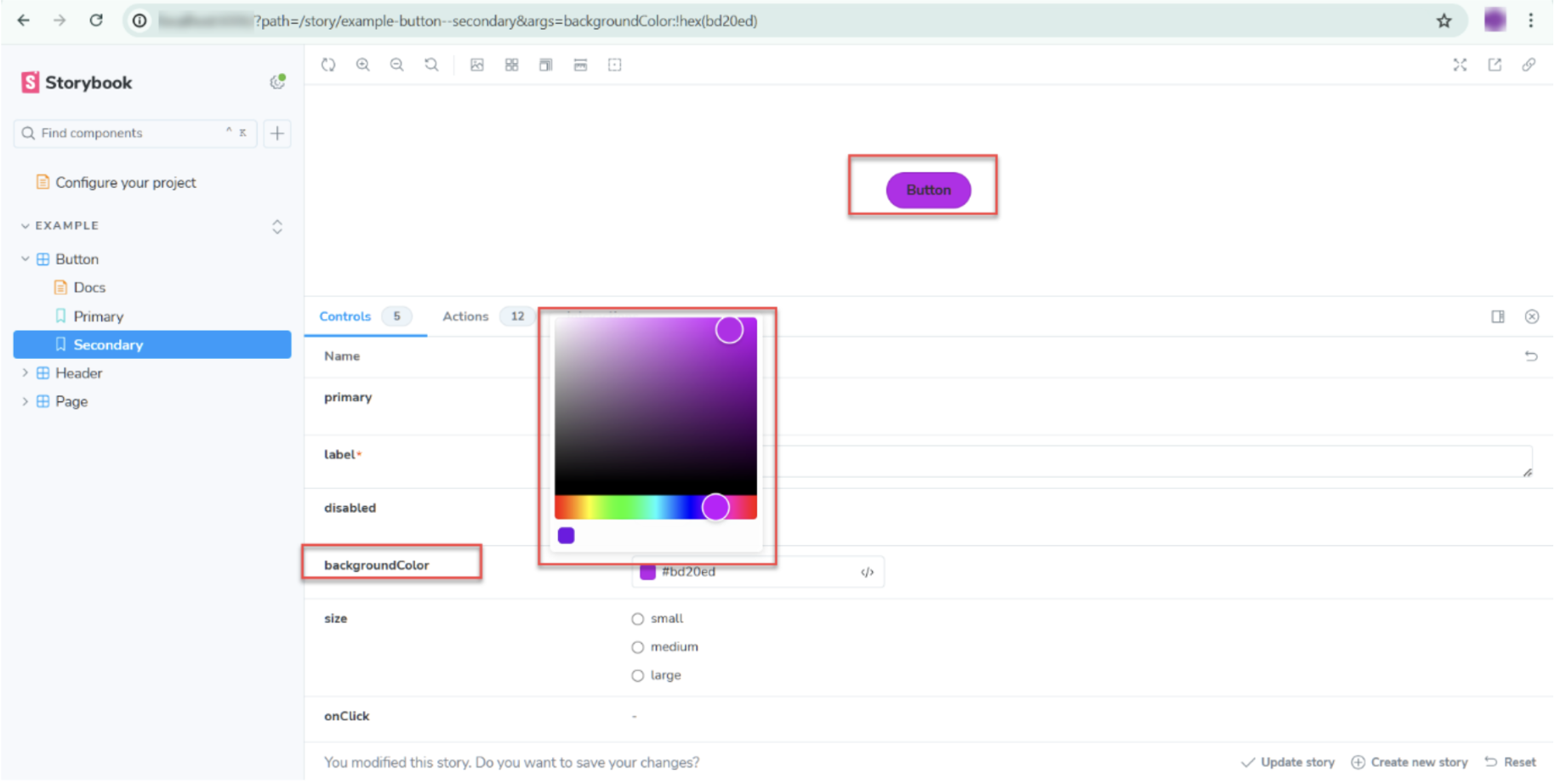
- backgroundColor: Provides color control options to pick the desired background.
- disabled: It helps to set the button enable or disable (show/hide)
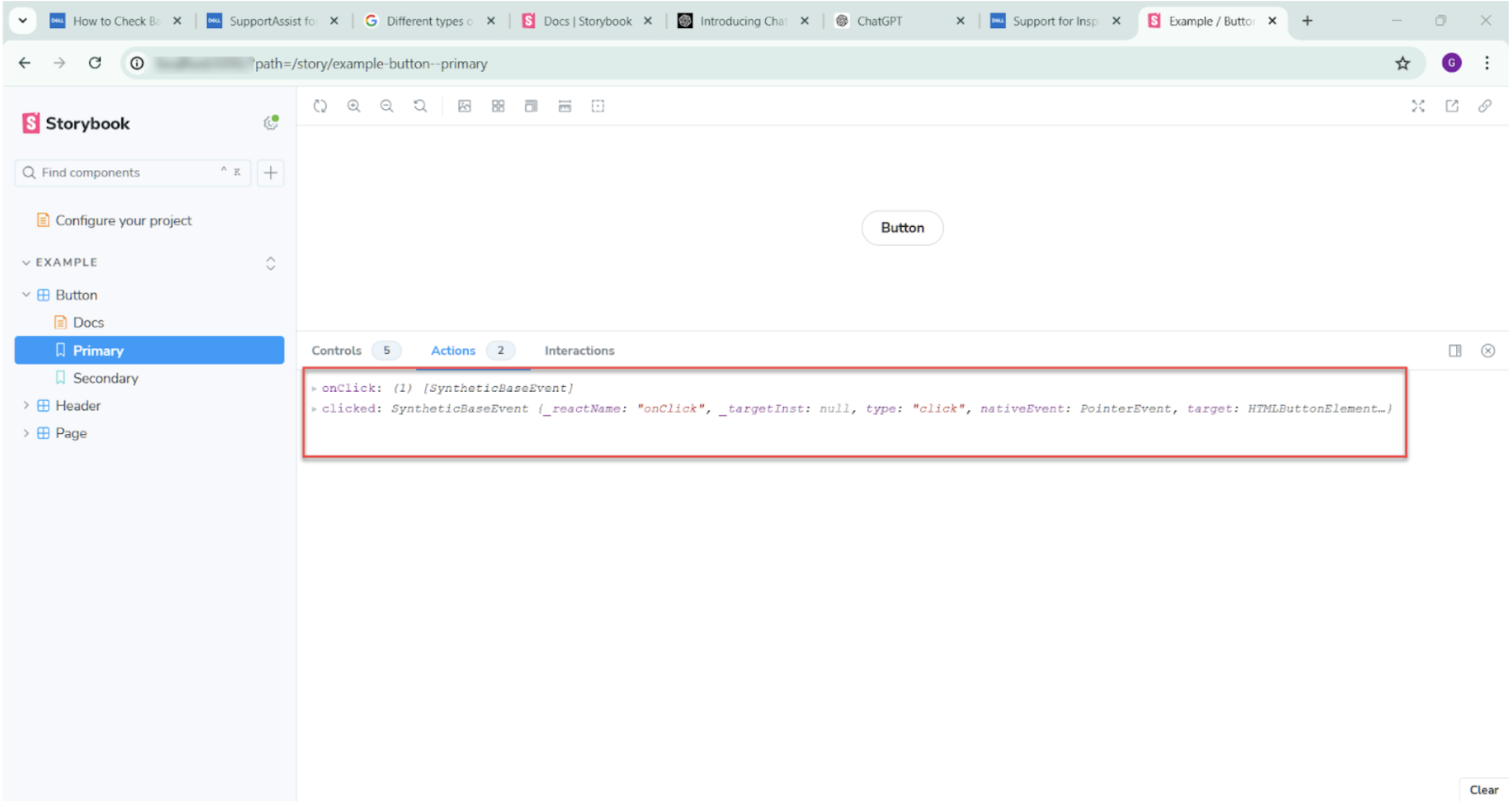
- onClick (): is an action argType upon clicking the button the click event will be fired and it will shown in the action tab of the Storybook.
Below is how it looks:
Background color argTypes
Action argTypes onClick
What is Automatic argTypes Inference?
Automatic argType inference is a feature in Storybook that creates the options for Storybook components based on their types. This helps to manually set up the argTypes for each component and accelerates the development.
Let’s consider an example of a button:
import { fn } from '@Storybook/test';

import { Button } from './Button';

export default {

  title: 'Example/Button',

  component: Button,

  parameters: {

    layout: 'centered',

  },

  tags: ['autodocs'],

};

export const Primary = {

  args: {

    primary: false,

    label: 'Button',

  },

};

export const Secondary = {

  args:{

    primary:false,

    label:'Button',

    disabled:false,

    backgroundColor:"#bd20ed"

  },

};
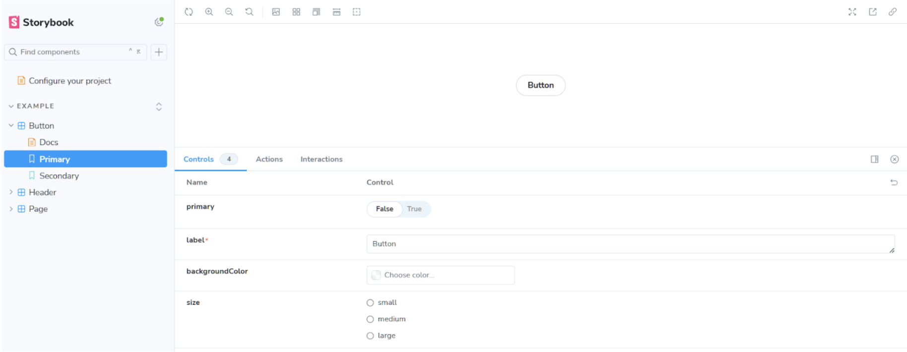
In the above example, any argTypes are not defined but Storybook automatically generates the argTypes in the background. Below is the image of control when opened in the Storybook UI
How to Manually specify argTypes in Storybook?
As mentioned above, Storybook automatically generates a set of archetypes based on the controls. You can also set the argTypes manually, For example, button component if you want to override the default behavior of onClick() function you can mention below:
argTypes: {

    backgroundColor: { control: 'color' },

    label: { control: 'Form Submit', description: 'Text to display on the button' },

    disabled: { control: 'boolean', description: 'Disable the button' },

    onClick: {

      action: 'form-submitted',

      description: 'Function to call on button click',

      table: {

        category: 'Events', // Group in the "Events" category

        type: { summary: '() => void' },

      },

    },

  },
Upon clicking the button, it logs the action as form-submitted
Read More: How to perform Storybook Visual Testing?
Best Practices for using argTypes in Storybook
- Use manual override only when required
- Make use of description, and write clear and readable stories
- Use correct control types such as text, boolean, number, etc.
- Use the category argTypes to organize the group of the related arguments together.
- Provide the default values whenever possible
- Use control argTypes for dynamic controls
- Keep the stories simple and avoid unnecessary customization
- Review and update the controls more often
Why run Storybook Visual Tests on BrowserStack Percy?
Percy is a visual regression testing tool backed by BrowserStack. Percy uses intelligent visual comparison technology to identify any visual or UI defects in the components. It supports integration with various tools. Additionally, you can automate the visual comparison or regression.
Percy provides many benefits when integrated with Storybook, below are a few advantages:
- Catch visual defects early: It’s always less costly to fix the defects in the early stage of the development lifecycle. Percy and Storybook can help to catch the defects early by running the individual components without deploying them to any integrated environments.
- Automated visual regression testing: Visual regression automation helps to avoid the manual effort to compare the UI screens.
- CI/CD integration: Percy can also be integrated as part of the CI/CD pipeline which helps streamline the deployment workflow and accelerate the delivery process
- Cross-browser testing: Percy supports many browsers to test visual regressions thus providing the confidence to release the code to production
- Reporting: Percy provides good reporting with review features that can help to automatically send the reports whenever there is a failure or you can also send the summary report whenever required. No need to configure these reports manually, Percy generates the report automatically.
Conclusion
Storybook argTypes helps to customize the controls of components without modifying the actual application code. This not only helps in development but also helps in testing. There are many different types of argTypes available based on the controls, to gain the full benefit you need to choose the argTypes wisely.
Over-customization can make the stories complex. The Stories should be simple, clear, and descriptive. Testing all the scenarios manually might be time-consuming, visual regression testing helps to automate the process of visual testing and accelerates the testing phase in turn helps to go early to the market.
When it comes to visual regression testing, Percy is the most popular tool that provides integration to many tools including Storybook. Interestingly, it supports many advanced features such as CI/CD integration, cross-browser testing, comprehensive reporting, etc., and helps to increase efficiency, reliability and streamline the process.
