How to make a WordPress Website Mobile Friendly
By Somosree Roy, Community Contributor - December 2, 2022
More than half of all Google searches are conducted on mobile devices, and for several advertisers, mobile users account for the majority of traffic. With the small handy gadget being the all-time companion of its users, the best way to engage, delight, and retain your visitor is by making a mobile-friendly website.
WordPress is one of the most convenient CMS, holding a major share of the market. Due to its robust CMS, a plethora of eCommerce retailers, businesses, organizations, and individuals have adopted WordPress to build their websites.
Apart from a large range of themes, WordPress also offers some powerful plugins to optimize your WordPress website. Undoubtedly, website speed matters for a seamless user experience, and when it comes to mobile versions, speed matters even more.
This article explores how you can make your WordPress website mobile friendly and engage a larger user base.
- Why are mobile-friendly sites important?
- How to make your WordPress Website Mobile Friendly?
- 1. Execute a Responsive Mobile Version of Your Website
- 2. Consider Incorporating Google AMP for WordPress
- 3. Utilize Mobile-Optimized Plugins
- 4. Don’t use Flash
- 5. Keep content on mobile and desktop sites the same
- 6. Simplify on-site graphics
Why are mobile-friendly sites important?
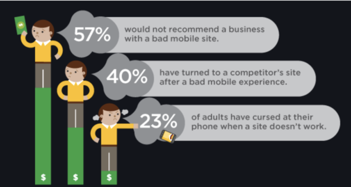
Your website must be optimized to be accessed on any screen size because a larger number of individuals now use mobile devices instead of traditional desktop computers for accessing websites.
To deliver a seamless user experience, a mobile-friendly design is a must for building websites. In addition to the user experience ease, mobile-friendly websites are also important for SEO purposes. Beginning in 2015, Google changed its search algorithm significantly to favor “mobile-friendly” websites. The difference was determined by one very important piece of information: how responsive your website is.
Accordingly, if your website is easy to read on mobile devices, it will rank higher in search results than those that aren’t. If you’ve put in the effort to design a mobile-friendly website, not only your SERP (Search Engine Result Pages) Rank will improve, but it will also ensure better visibility and more user engagement. However, if your website isn’t fully capable of showing on smaller displays, it could harm your traffic.
This guide lists down the crucial actions you must take to make your website mobile-friendly in addition to understanding what exactly qualifies as a mobile-friendly website.
How to make your WordPress Website Mobile Friendly?
Here are some of the ways that can help you make your WordPress website mobile-friendly:
1. Execute a Responsive Mobile Version of Your Website
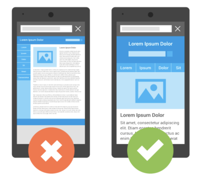
Getting your WordPress site to adjust to various screen widths is the first step in making it mobile-friendly. The term for this is responsive design.
There are several benefits to responsive design. The biggest benefit is that you just need to manage one site, which is a big plus. Every user may access the same site, thanks to responsive themes, eliminating the need to maintain a separate mobile version. This saves effort and time while preserving your brand.
Thankfully, every contemporary WordPress theme in the database has responsive features. Therefore, there is a significant probability that you will find a new theme for your website that is already optimized for mobile devices. Even so, make sure to thoroughly test it.
You have a few options if your existing theme isn’t responsive yet. To begin with, make sure it is the latest. The developer might have introduced responsive features since the time you were using an outdated version. You can choose to make your current theme responsive unless you are adamant about sticking to it.
2. Consider Incorporating Google AMP for WordPress
AMP refers to Accelerated Mobile Pages. It’s a Google-backed attempt to reduce the amount of data required to load a page on a mobile device. On using Google mobile search, you can see websites with the AMP label.
One of the biggest advantages of Google AMP for WordPress, is that the code is simplified, making Google AMP pages blazingly fast and responsive. Therefore, AMP is an excellent alternative if you want to easily make your WordPress site mobile-friendly.
Setting up Google AMP for WordPress is also really simple. You can even do it with the aid of an Official AMP plugin. This plugin has contributors like Google, Automattic, and XWP.
The AMP plugin installation and activation are essentially all that is required. After that, Google will start delivering AMP content to mobile phone users via your website.
If you are seeking other options, then AMP for WP plugin is a great choice if you’d like more control over how your WordPress AMP content appears. With new styling options, options for including ads, and options for social sharing buttons, it improves upon the official AMP plugin:
The following two points are crucial to take into account if you’re worried about how your Google AMP WordPress pages may affect your SEO:
- You won’t face any duplicate content penalties because the AMP plugin automatically applies rel=”canonical” tags to your AMP content.
- Yoast SEO is well connected with the Official AMP Plugin, making SEO easier.
3. Utilize Mobile-Optimized Plugins
Plugins enhance the look and feel of WordPress websites by adding features and functionality. While plugins can provide your website with better designs and components like a call to action or widget button, using the right plugins helps them function seamlessly on mobile devices as well. It gives you a choice to disable certain elements on lower screen sizes or scale well across all screen sizes.
4. Don’t use Flash
Flash on your website will make it slower, impacting SEO and user experience. It can make a page take longer to load and is completely incompatible with mobile devices. Using HTML5 and CSS instead can make your website more responsive and mobile-friendly.
5. Keep content on mobile and desktop sites the same
Google’s mobile-first indexing will lead your site to lose traffic if your mobile site contains less information than your desktop site. Therefore, ensure that the descriptive titles, metadata, and structured data on your desktop and mobile sites are similar. Google advises using the same text, file names, captions, and evocative alt text for mobile and desktop.
Nevertheless, what if your desktop site contains a lot of content, but it’s impossible to fit it on a mobile device’s tiny screen?
Do not remove any content. Instead, use accordions, drop-down menus, or tabs to be more inventive in terms of mobile-friendly design. Make sure to test your site to check on this criterion. Using a mobile friendly website tester to ensure the website is responsive should be your next step.
6. Simplify on-site graphics
Large image files or an excessive amount of graphics might occupy valuable webpage space and detract from the message of the text. Additionally, images and graphics are a significant contributor to delayed page loads, causing a bad user experience on your mobile websites.
For your websites to automatically provide the smallest pictures and graphics based on screen size and device specifications, use the most recent version of WordPress and WordPress themes.
Using Lazy Loading of Images in JavaScript can also help in making WordPress websites faster, as it loads images on a web page only when required. This way can improve the page’s loading time without reducing the page size.
How to take the mobile-friendly test for your WordPress website?
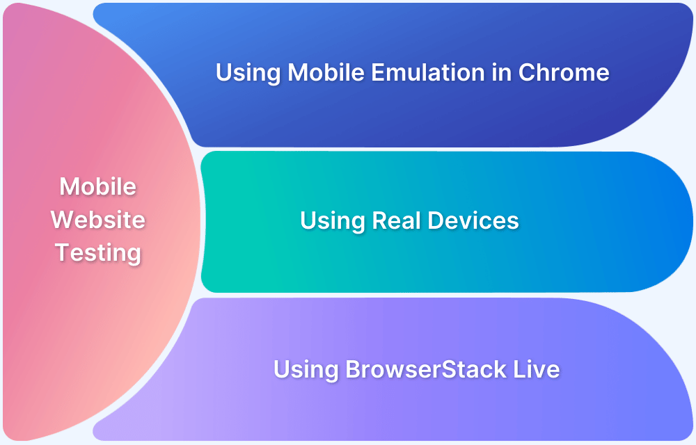
While your website might appear nice on one of the mobile devices, it might not be on another. Since different mobile devices vary in terms of screen size and resolution, it is essential to test on various devices for better mobile-friendliness of the website.
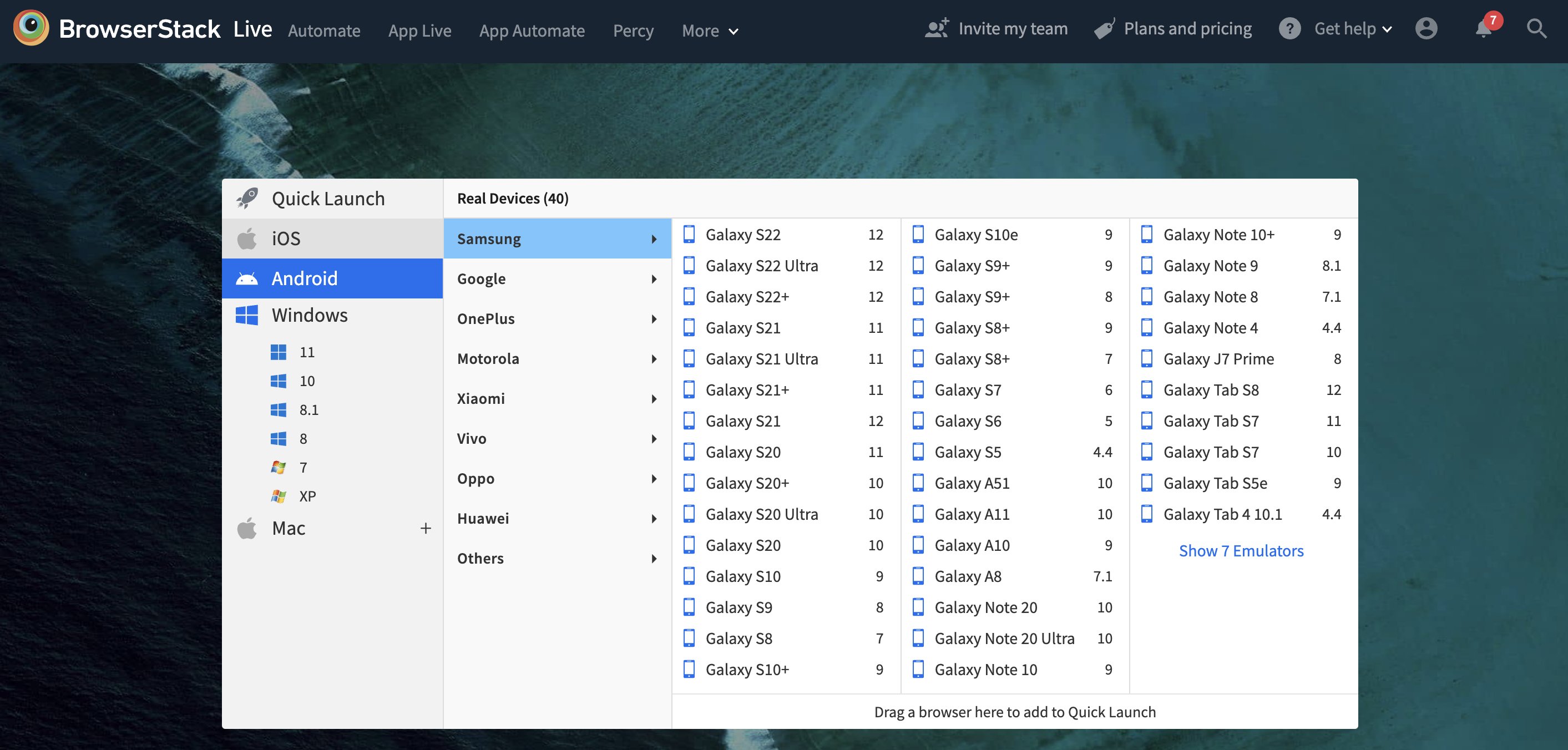
Using BrowserStack Responsive Checker Tool, you can check how your WordPress Website renders on different screen sizes and resolutions by selecting devices of your choice from the real device cloud.
However, if you want to perform a detailed test and even check the functionality on different device-browser-os combinations, then choose BrowserStack Live. It helps you get access to 3000+ real device and browser combinations for a comprehensive testing experience. Using BrowserStack Live, you can test under real user conditions, considering use cases like simulating poor network, geolocation testing, etc.
