Internet is now being accessed with all sizes of devices including smartphones, tablets, and more, it is important to create a website that renders in all the device dimensions perfectly. This practice is called responsive web design, ensuring your site looks great and functions well across any device.
The latest SEO guidelines by Google clearly say how the search engine ranks the websites that are responsive over the ones that are not. One challenging aspect of improving the responsiveness of a website is to adjust the position of images in the DOM.
Overview
Ways to change the Position of an Image in HTML:
- Using object-position Property
Adjusts how an image is positioned inside its container, especially useful with object-fit. - Using float Property
Allows images to wrap text around them by floating them to the left or right. - Using transform Property
Moves an image along the X or Y axis using translation, rotation, or scaling without affecting document flow. - Using CSS position Values
Offers precise control using static, relative, absolute, fixed, and sticky positioning modes. - Using CSS Animation
Enables dynamic movement of images over time using keyframes and animation properties.
This guide helps you understand how to change the position of images in HTML.
What role do HTML and CSS play in a Webpage?
HTML (Hyper-text markup language) is like a skeleton of a webpage which helps in structuring the web elements in an order. It also helps in defining various elements including headings, paragraphs, lists, images, links, forms, etc.
Once the webpage is structured, and a necessary layout is laid down, the website still isn’t good-looking. Therefore, now comes CSS (Cascading Style Sheets) to make the webpage more aesthetically appealing thus attracting users.
HTML also utilizes semantics tags to properly organize the script for developers as well as helps search engines to understand the content on your webpage. Using semantic tags helps in SEO, browser compatibility and accessibility. Accessibility here focuses on making your content accessible and easy to navigate for people with disabilities.
CSS on the other hand is purely focused on making the website look more attractive and contain consistent designs thus improving the overall brand value.
Read More: HTML vs HTML 5
How to add an Image in HTML
To embed an image in an HTML page, use the <img> tag, which is a self-closing tag requiring at least two attributes:
- src: Specifies the path to the image file.
- alt: Provides alternative text for the image, enhancing accessibility and SEO.
Example:
html
<img src="path/to/image.jpg" alt="Description of image">
Key Points:
- The src attribute can point to a local file or an external URL.
- The alt attribute is crucial for screen readers and displays when the image cannot be loaded.
- Additional attributes like width and height can control the image’s display size.
Why do you need to adjust Images in HTML?
The primary purpose of adjusting images in HTML is to make the webpage responsive so that it can be easily viewed in a wide range of screen sizes (from desktop to mobile). Images that are properly resized:
- pair well along alt texts,
- load faster in accordance with the devices they are being viewed on
- improve the experience for people who are relying upon accessibility tools such as screen readers.
It also maintains consistency in the visual appearance of the website, therefore, enhancing the appearance of a webpage. To adjust images in webpages one can modify the HTML script as well as the CSS code.
Read More: How to position text over an image using CSS
Understanding Default Image Alignment
By default, images inserted using the <img> tag are inline elements. This means they align with the baseline of the surrounding text, which can lead to unexpected spacing or alignment issues.
Common Behaviors:
- Vertical Alignment: Images align with the text baseline, potentially causing extra space below the image.
- Horizontal Alignment: Without styling, images appear inline with text, which may not be desirable for layout purposes.
Solutions:
- Use CSS properties like vertical-align, float, or display to adjust alignment.
For example, to center an image horizontally:
css
img {

  display: block;

  margin-left: auto;

  margin-right: auto;

}- To remove the extra space below an image:
css
img {

  display: block;

}
How to change the Position of an Image in HTML?
Here are different ways to change the position of an image in HTML and CSS.
1. Using Object-Position Property
This property gives a better layout control for the image. It is used in scenarios where the image or video doesn’t fit well inside its container (example, it’s zoomed in or cropped. Thus, using this property you can focus on the specific parts of the image to be kept visible aligning the image accordingly.
It is useful when used along with another attribute known as object-fit.
Example:
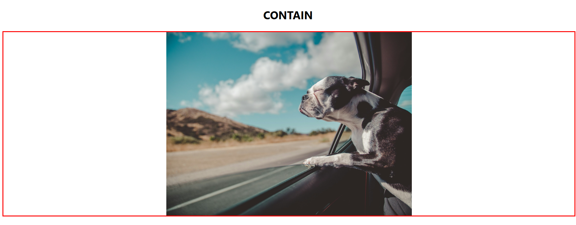
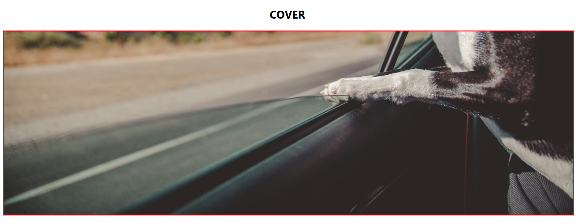
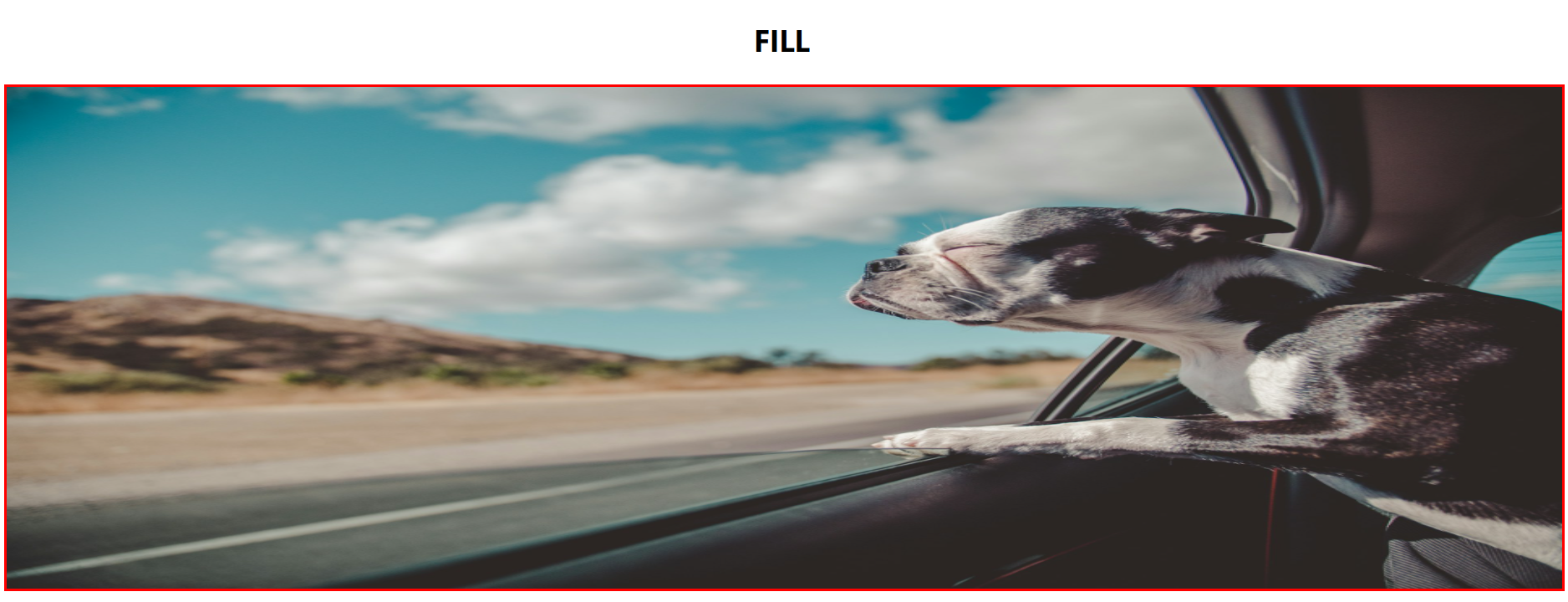
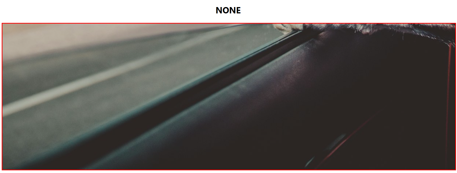
Here the object-fit can take several values.
img {
  width: 100%;
  height: 400px;
  object-fit: cover;
  object-position: bottom;
}
Original Image:
- contain: It resizes the image to make it fully visible, keeping the original aspect ratio intact.
- cover: It resizes the image to cover the entire container, keeping the original aspect ratio constant.
- fill: The image will be filled in the given area, even if it means breaking the image’s original aspect ratio.
- none: The image will remain as it is and will fill the given area.
2. Using Float Property
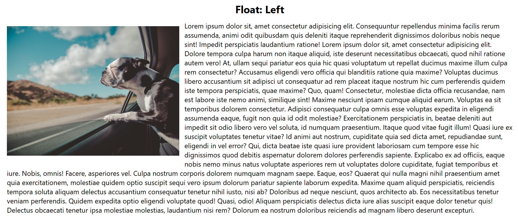
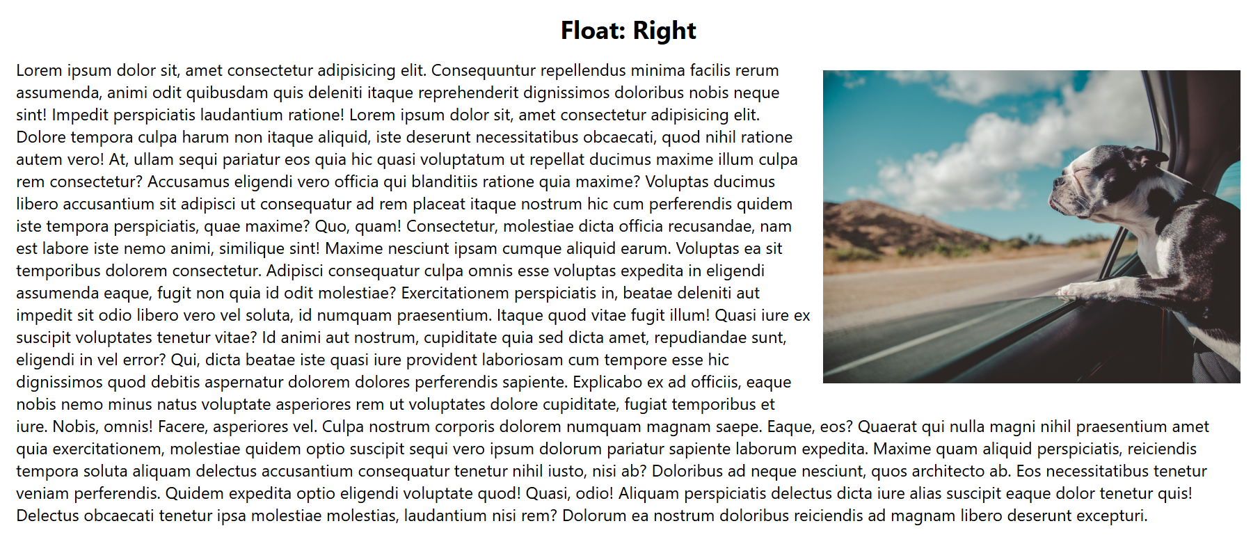
The float property in CSS is used to position the element left or right to its container. It can be used to wrap the text around elements such as images.
Example:
Syntax
element {
  float: left | right | none | inherit;
}- Left: The element (here image) floats to the left and the text wraps around it on the right.
- Right: The element floats to the right and the text wraps around it on the left.
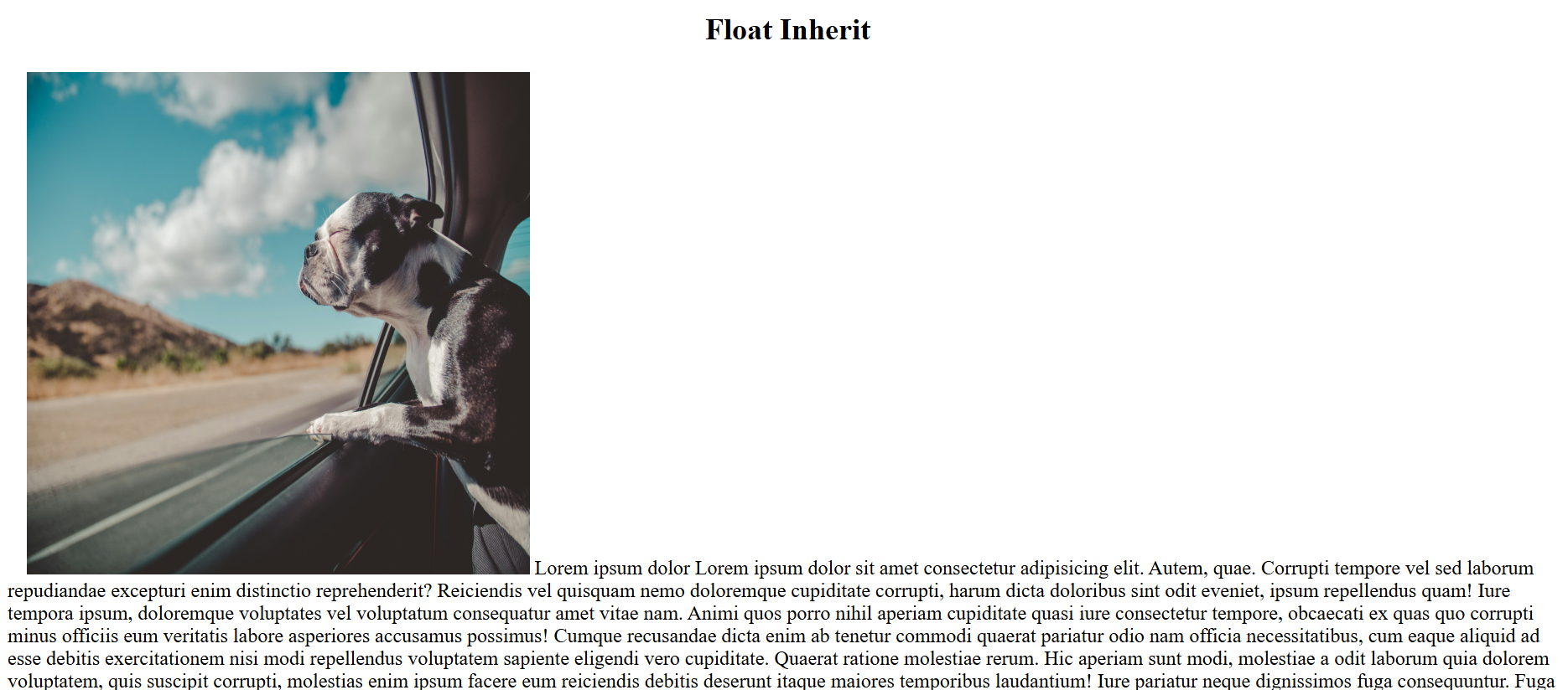
- Inherit: The element inherits the float behaviour from the parent element.
3. CSS Transform
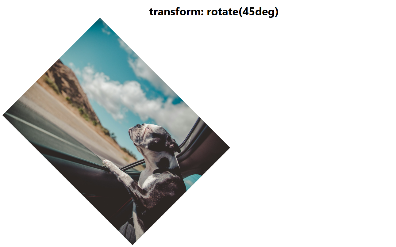
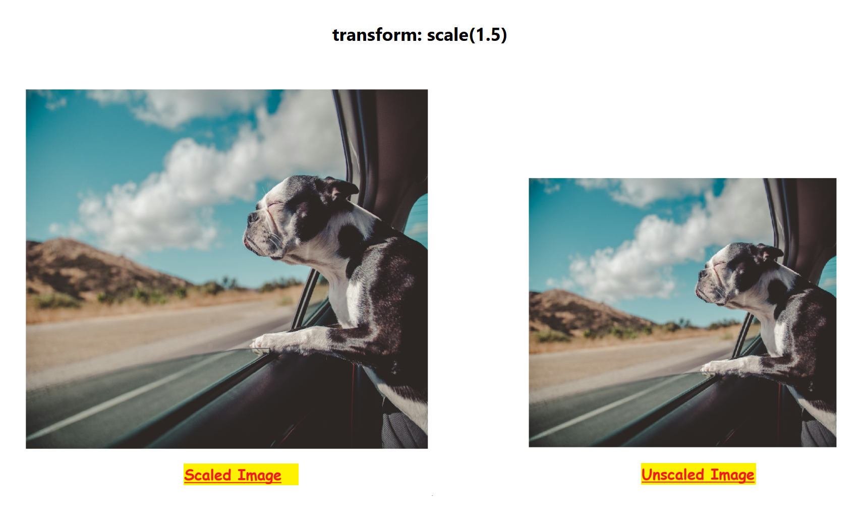
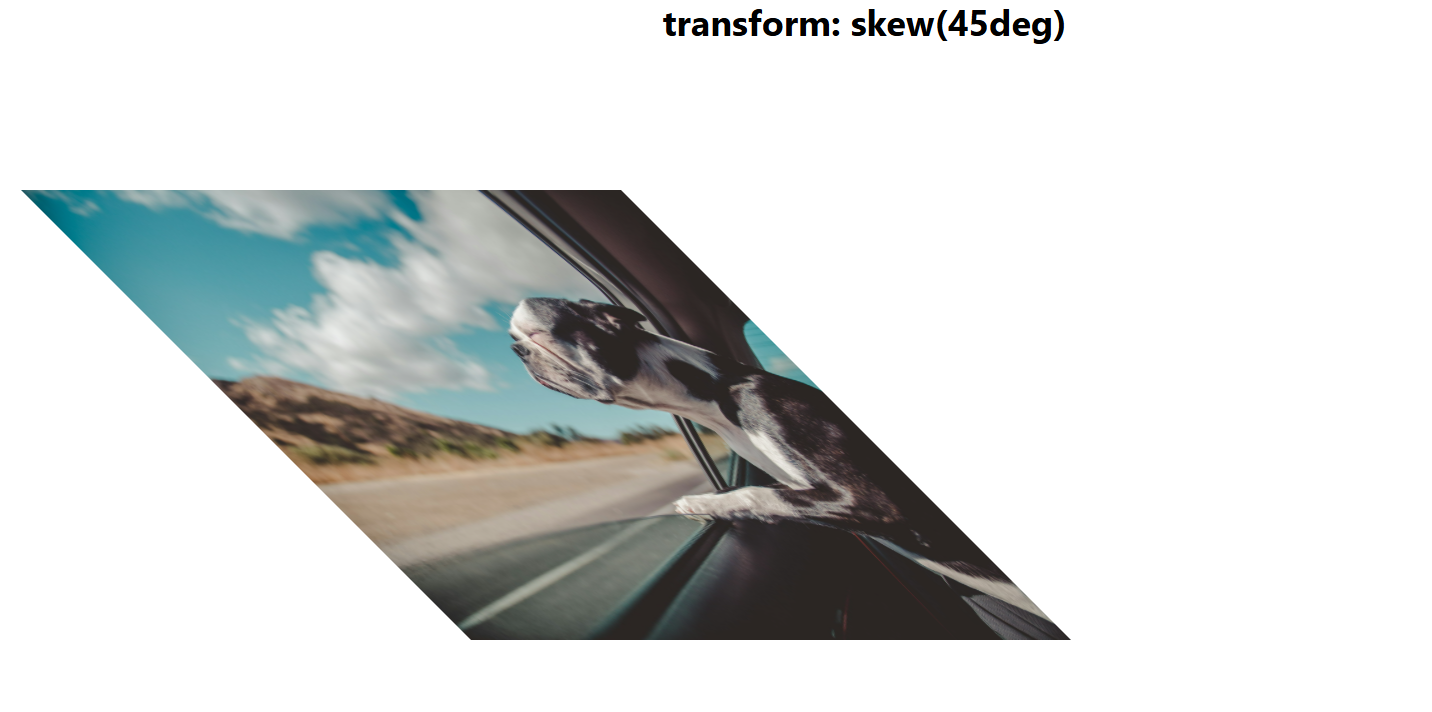
The transform property in CSS allows you to apply various transformations to an element including scaling, rotating, translating (moving), and skewing.
- Translate: It moves the element horizontally, vertically, or in both directions.
- translateX(a): Moves the element horizontally by a units.
- translateY(b): Moves the element vertically by b units.
- translate(a, b): Moves the element horizontally and vertically.
- Rotate: It rotates the element by centre by a specified angle in degrees or radians.
Syntax:
rotate(angle)
- Scale: Resizes the element along the X and Y axes.
- scaleX(a): Scales the element horizontally by a units.
- scaleY(b): Scales the element vertically by b units.
- scale(a, b): Scales both horizontally and vertically.
- Skew: Skews (or slants) the element along the X or Y axis.
- skewX(angle): Skews the element horizontally by the specified angle.
- skewY(angle): Skews the element vertically by the specified angle.
- skew(angleX, angleY): Skews the element both horizontally and vertically
Read More: How to test JavaScript in browsers
4. CSS Position (Static, Relative, Fixed, Absolute, Sticky)
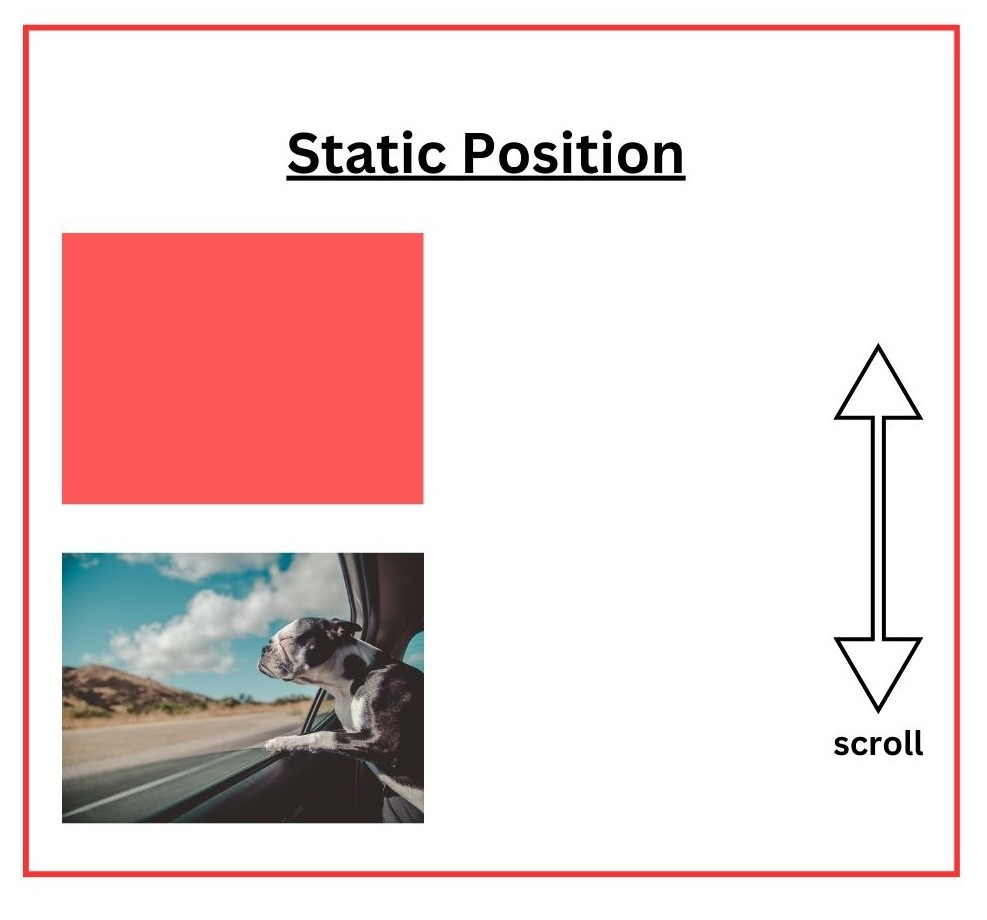
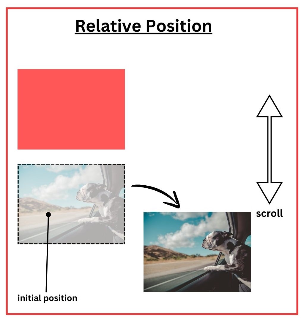
It defines the position of an element with respect to other elements on the DOM as well as the browser window. The position property in CSS can take up to five values including Static, Relative, Fixed, Absolute, and Sticky. Understand each of the values of the property below.
- Static: It is the default value for the position property of CSS. In this, the elements appear in the order they are scripted in the HTML file. This value is very rarely used as it is a default value.
- Relative: Using this value, the element is positioned relative to its initial position. Also, top, right, left, and bottom properties are used to position it with respect to its initial position.
Syntax:
div {

  position: relative;

  top: 20px;

  left: 10px;

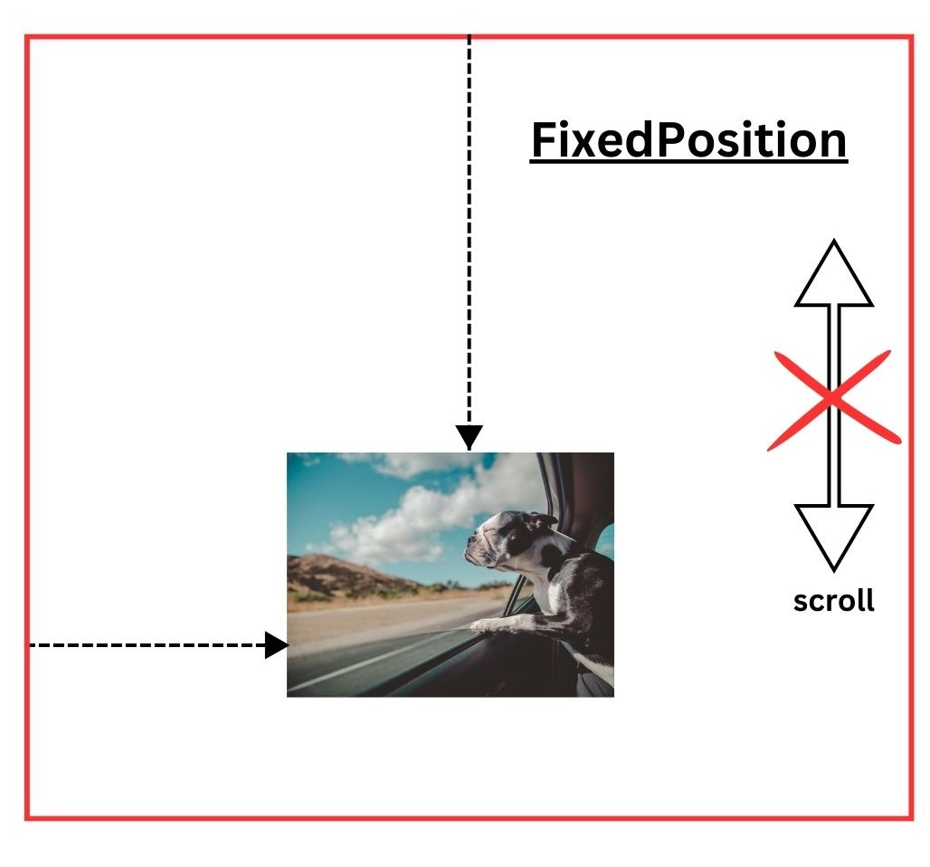
}- Fixed: The element is positioned relative to its browser window or viewport that is it stays in the same position if the window is scrolled.
Syntax:
div {

  position: fixed;

  top: 0;

  right: 0;

  width: 200px;

  height: 100px;

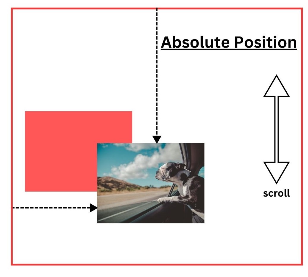
}- Absolute: The element is positioned relative to its nearest positioned ancestor (an ancestor with relative, absolute, fixed, or sticky positioning). It is used in certain cases where elements need to overlap (such as dropdown menus) or need to be positioned independently of the document flow.
- Sticky: It behaves similarly to position: fixed after a specified offset limit is reached, till then it behaves similarly to position: relative. Therefore, it can also be implied that it toggles between the two properties.
Read More: How to test responsive images
5. CSS Animation
CSS also provides a way to animate elements without using JavaScript. The primary purpose of animating is to make the webpage look more visually appealing using dynamic transitions on images such as image slideshow, zoom in/out, and more.
Animation Properties for Images:
- animation-name: Specifies the name of the keyframe animation
- animation-duration: Defines duration of the animation
- animation-timing-function: Sets the speed curve of the animation (example, ease, linear).
- animation-delay: Specifies a delay before the animation starts
- animation-iteration-count: Defines how many times the animation repeats (example, infinite).
- animation-direction: Specifies whether the animation runs forward, backwards, or alternates.
- animation-fill-mode: Defines how the element should be styled before and after the animation.
Understand with an example on how to rotate an image using CSS animation.
/* Define the keyframes */

@keyframes rotateImage {
  0% {
    transform: rotate(0deg);
  }
  100% {
    transform: rotate(360deg);
  }
}

/* Apply the animation to the image */

.rotate {
  width: 300px;
  animation-name: rotateImage;   /* Name of the animation */
  animation-duration: 5s;        /* Duration of 5 seconds */
  animation-timing-function: linear; /* Smooth linear rotation */
  animation-iteration-count: infinite; /* Keep rotating infinitely */
}Best Practices for overcoming common Image Positioning Issues
Positioning images effectively requires understanding common pitfalls and how to address them:
1. Extra Space Below Images:
- Issue: Inline images may have unwanted space below them due to baseline
- Solution: Set display: block; or adjust vertical-align to middle or top.
2. Responsive Design Challenges:
- Issue: Images may not scale properly on different devices.
- Solution: Use CSS properties like max-width: 100%; height: auto; to make images responsive.
3. Overlapping Elements:
- Issue: Positioned images may overlap other elements unintentionally.
- Solution: Utilize z-index to control stacking order and ensure proper layout flow.
4. Alignment Within Containers:
- Issue: Images may not align as expected within parent containers.
- Solution: Use Flexbox or Grid layouts to control alignment precisely.
Example using Flexbox:
css
.container {

  display: flex;

  justify-content: center;

  align-items: center;

}
How to test Image Responsiveness on Real Devices?
The responsiveness of a website is among the crucial factors that determine how effective the website is for its users. Since a website can be accessed from any device, it is important to know how well your website performs for your targetted users.
BrowserStack enables you to test if your website is responsive on targeted devices. It offers a huge collection of real device, browser, and operating system combinations to test upon.
Step 1: Open BrowserStack Responsive dashboard and enter the URL of the webpage containing the responsive image. Your website must be hosted on a web server before testing its responsiveness on BrowserStack.
Step 2: After entering the URL, click Check.
Step 3: It displays the options of devices to choose from upon which you want to test. Pick any device of your choice and test your website.
Read More: Why is responsive design testing important
This process helps spot design issues, allowing you to improve user experience across several devices.
Conclusion
Developing a responsive website is extremely useful as it ensures that the intended version works on all devices your website is being viewed. Moreover, search engines also promote websites that are responsive and rank them higher in the search results.
One essential reason to adjust images in HTML is to meet the responsive website expectations. Adjusting images following HTML and CSS rules ensures that images and other elements align well in all device dimensions.
By using BrowserStack, you can quickly verify responsiveness of your website on a range of real devices, browsers, and operating systems. This process helps identify any design inconsistencies, enabling you to optimize the user experience for your target audience.


