With the internet accessible on all devices, web development has become more complex. Working with images in HTML is crucial for designing responsive and visually engaging websites.
Overview
Resizing images in HTML and CSS is key to creating fast and responsive web pages. Effective image management boosts performance and enhances user experience.
Why Adjusting Image Size is Important?
Optimizing image size is crucial for balancing visual quality and performance. Here’s why adjusting image dimensions is essential for an efficient web experience:
- Improves Page Load Speed: Reduces file size for faster loading.
- Enhances Responsiveness: Ensures images adapt to different screen sizes.
- Saves Bandwidth: Optimized images consume less data.
- Maintains Image Quality: Prevents distortion and pixelation.
- SEO Benefits: Faster pages improve search rankings.
- Better User Experience: Well-sized images enhance readability and design.
This article explores the importance of adjusting image size in HTML, different image file types, resizing techniques in HTML and CSS, and testing responsiveness on real devices.
Why do you need to adjust image size in HTML and CSS?
Adjusting image size in HTML and CSS is essential for creating fast, responsive, and visually appealing web pages. Properly sized images enhance user experience, improve page performance, and ensure compatibility across different devices and screen resolutions. Here are the primary reasons to adjust image sizes in HTML and CSS:
- Improves Page Load Speed: Large, unoptimized images slow down website performance. Resizing images ensures faster load times and better overall efficiency.
- Enhances Responsiveness: Different devices have varying screen sizes, requiring flexible images that adapt seamlessly without distortion.
- Saves Bandwidth and Reduces Data Usage: Optimizing images is a good idea as such images consume less bandwidth, benefiting users on mobile networks and improving website efficiency.
- Maintains Aspect Ratio and Visual Consistency: Properly scaled images prevent distortion, ensuring a balanced and professional look across different layouts.
- Better SEO and Search Rankings: Faster-loading pages contribute to better search engine rankings. Well-optimized images with descriptive text improve accessibility and visibility.
- Prevents Layout Shifting and Broken Designs: Defining appropriate image dimensions helps maintain a stable layout, preventing unexpected shifts that can affect user experience.
Different Types of Image File Formats
Choosing the right image file format balances quality, performance, and compatibility across different devices and browsers. Each format serves a specific purpose, whether for photographs, graphics, or web optimization. Some of the common file formats include:
1. JPEG (Joint Photographic Experts Group)
- Works best for detailed images.
- Uses lossy compression to reduce file size while maintaining good quality.
- Loads quickly on web pages, improving performance.
2. PNG (Portable Network Graphics)
- Supports transparency, making it ideal for logos and graphics.
- Uses lossless compression to preserve image quality but creates larger file sizes.
- Displays sharp images with clear backgrounds.
3. WebP
- Delivers high-quality images at smaller file sizes compared to JPEG and PNG.
- Supports both lossy and lossless compression.
- Works well for web optimization and loads efficiently in modern browsers.
4. GIF (Graphics Interchange Format)
- Supports simple animations but has a limited color palette (256 colors).
- Works well for memes, small animations, and lightweight graphics.
5. SVG (Scalable Vector Graphics)
- Maintains image quality at any resolution.
- Works best for icons, logos, and illustrations.
- Allows easy styling and manipulation with CSS and JavaScript.
6. AVIF (AV1 Image File Format)
- Compresses images better than WebP while maintaining high quality.
- Reduces file sizes significantly, improving web performance.
- Still gaining browser support but offers great potential for future optimization.
Handling Images in HTML and CSS
A responsive website offers significant advantages over a non-responsive one, ensuring smooth functionality across various devices and screen sizes. It dynamically adjusts its layout to fit different screens without distortion.
A key aspect of responsiveness is adjusting image size to maintain visual balance and performance. By using the right HTML attributes and CSS properties, developers can ensure images load quickly, scale seamlessly, and enhance user experience across all devices.
Changing Image Size in HTML for Responsive Web Design
Images in an HTML file have default width and height values, which may not suit all screen sizes. Adjusting image size ensures a responsive design that adapts to different devices. While resizing images, follow these essential guidelines to maintain quality and responsiveness.
1. Let the Height Adjust Automatically
- Changing an image’s width automatically scales its height to maintain the aspect ratio. This prevents distortion and keeps the image visually consistent.
2. Use Relative Units Instead of Absolute Units
- Set image dimensions using percentages instead of fixed pixels.
- Using percentages allows the image to scale dynamically across different screen sizes, ensuring better responsiveness.
- Fixed pixel values keep the image size constant, which may not work well on smaller screens.
3. Ensure Images Fit the Layout
- If an image does not fit well within a webpage layout, resizing it in HTML helps maintain a balanced design. This can be easily achieved using the height and width attributes in the <img> tag. By default, these attributes use pixel values:
<img src="photo.jpg" width="600" height="700" />
Changing Image Size in CSS for Responsive Web Design
As we discussed above, changing height and width values in the HTML does not bring many deals to the responsive aspect of the image in a webpage. Therefore, developers widely opt for CSS to achieve responsive web design on images on their webpage.
Now, let’s unlock more power in achieving responsiveness with the help of CSS.
Step 1. Using relative units
If you use relative units, it will make your images fluid, irrespective of the screen size it is viewed in and works the same for all the screens size.
img {
width: 70%;}
Step 2. Using media queries
Media queries are only used when you want to give different sizes to your image when it is displayed in different viewports. For example, you want your image width to be 40% when displayed on a desktop and 60% when displayed on mobile phones. Moreover, media queries are one of the most used ways to make your page responsive. Let’s take an example of media queries, where the image will take the width of 100% when it is displayed on devices smaller than 720px.
@media only screen and (max-width: 720px) {
img {
width: 100%;
}
}
Step 3. Using max-width property
One other feature in CSS is to use the max-width property. It prevents the image width from becoming larger than the value of max-width specified by you. However, it is not widely accepted for making images responsive, especially when your image is being viewed on a variety of devices.
For an instance, if the size of the image is 500px and the device width is 360px, then the complete image is not visible, due to lack of space.
img {
max-width: 100%;
width: 400px;
}
Although, if you apply the max-width to 100% the image will shrink itself to fit in the layout of the webpage, still, if the screen size increase more than 500px, the size of the image won’t increase, not following the responsiveness law.
Step 4. Using object-fit property
After a lot of attempts to make the image responsive, the ultimate attempt to bring all the responsive features under one roof is achieved when the object-fit property is introduced. The object-fit property brings the most amount of control when customizing the CSS for responsiveness.
- contain: It resizes the image to make it fully visible, keeping the original aspect ratio intact.
- cover: It resizes the image to cover the entire container, keeping the original aspect ratio constant.
- fill: The image will be filled in the given area, even if it means breaking the original aspect ratio of the image.
- none: The image will remain as it is and will fill the given area.
img {
width: 100%;
height: 400px;
object-fit: cover;
object-position: bottom;
}
How to test Image Responsiveness on Real Devices?
Testing Responsiveness of Images on Real Devices is a must to ensure it renders correctly on different devices of varying resolutions and screen sizes. Follow the easy steps below to test image responsiveness on real devices:
Read More: How to test Responsive Images
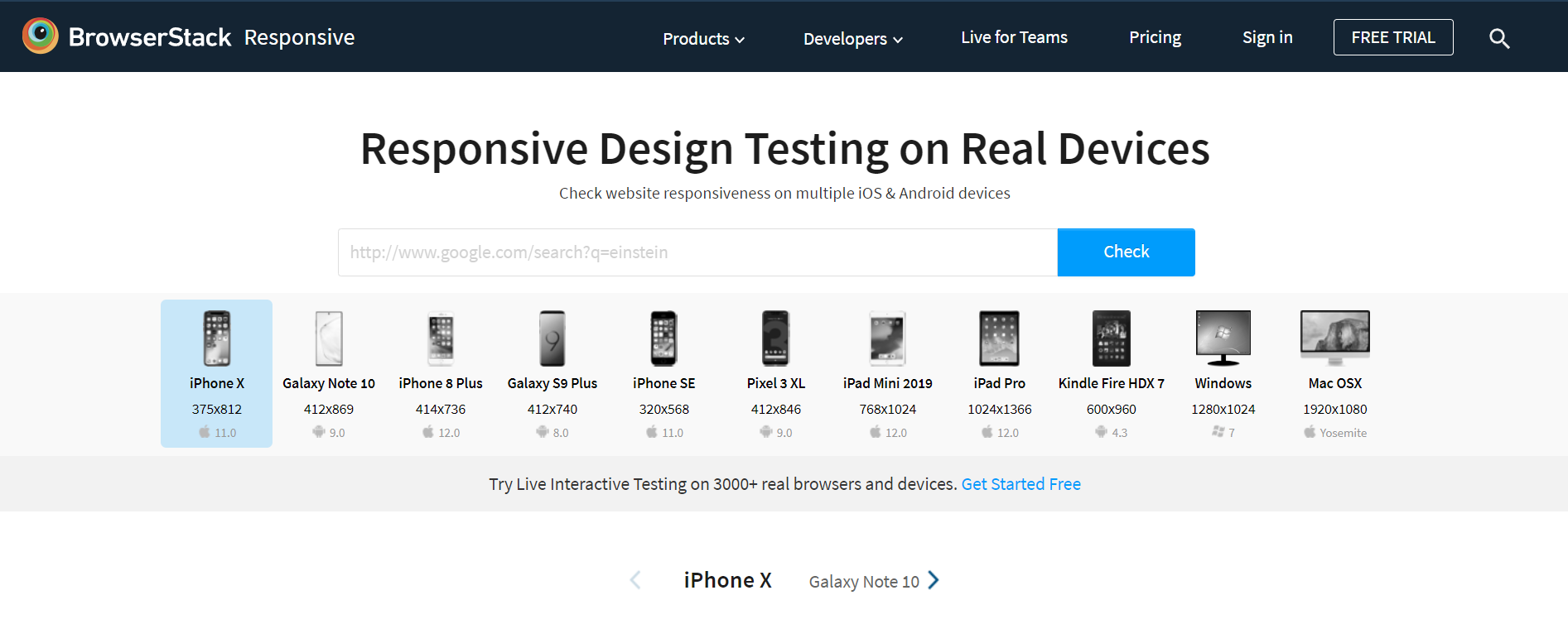
Step 1: Open BrowserStack Responsive Dashboard and enter the URL of the webpage containing the responsive image. If you have created a website on your local machine, you must host your website to test its responsiveness on BrowserStack Responsive.
Step 2: To check responsiveness, click Check.
Step 3: The user can check how the site appears on a certain device after choosing it.
Conclusion
As the number of mobile users is growing exponentially, the need of making responsive websites will only become more obvious. People are now accessing the web through smartphones and other portable devices, which is only increasing the challenge to bring more features to the responsiveness of the website.
If your website is responsive, it is automatically inviting more mobile traffic, lowers the bounce rate as per Google SEO rule, and gets more conversions, due to an aesthetic user experience. Moreover, why would you not want your website to be viewed across a variety of devices?
Testing on real devices is essential for true responsiveness. BrowserStack Responsive enables developers to test websites across real browsers and devices, ensuring perfect layouts, images, and performance without needing physical device labs.


