Prior to the tutorial, it is important to understand what is responsive design mode.
What is Responsive Design Mode?
Responsive Design Mode is a feature that allows you to check how the web page appears and adjusts when height, width and pixel resolution change. It helps users or developers view the mobile or tablet versions of the web page.
Using Responsive Design mode, a developer can verify whether the web page can appropriately resize the content on different resolutions.
Responsive design mode is a standard feature available across leading browsers like Chrome, Safari, Firefox, etc.
Now, let’s understand how one can enable the responsive design mode in Safari in Firefox.
How to Enable Responsive Design Mode or Development Mode in Safari
Note: To start with, bear in mind that the Safari development mode is, by default, disabled for the Safari browser. In order to access the Responsive Design Mode, enable the Safari Develop menu.
To enable the Safari development mode, follow the steps listed below:
Steps to Enable Responsive Design Mode in Safari:
- Launch the Safari browser
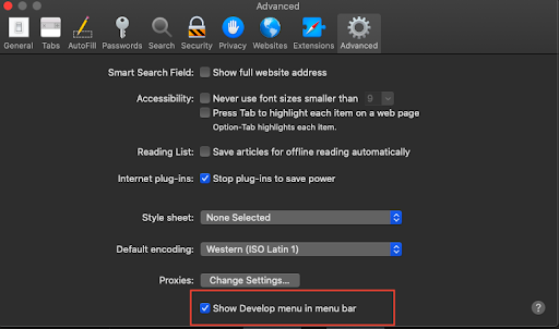
- Click Safari -> Preferences -> Advanced
- Select the checkbox Show Develop menu in the menu bar.
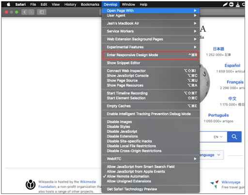
Once the Develop menu is enabled, ‘Enter Responsive Design Mode’ will show up in the menu bar, as shown in the image below:
Note: It’s vital to bear in mind that this feature is built to check the responsive design in Safari. For verifying or testing the features, functions, and offerings of a website, it is best to opt for a platform that offers a real device cloud for interactive testing.
Now, to view the mobile version of a web page using Safari responsive design mode:
- Launch Safari.
- Navigate to the target URL that needs to be loaded in mobile view.
- Click on the Develop menu and select Enter Responsive Design Mode.
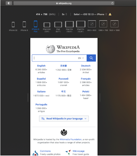
- As shown in the image below, the target URL (Wikipedia in this example) can be viewed on the desired device (like an iPad or iPhone).
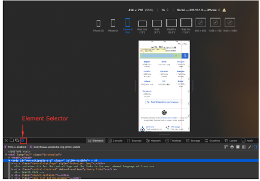
If developers or users need to inspect any particular element for debugging a specific issue, they can use the web inspector feature. One can find the web inspector in the Develop menu. Once the web inspector is active, inspect a particular element using the element selector.
Refer to the image below:
That’s how one can use the responsive design mode in Safari.
Did you know: How To Test Website on Different Screen Sizes in Minutes
Responsive Design Mode in Firefox
To use the responsive design mode in Firefox, follow three simple steps:
Steps to Enable Responsive Design Mode in Firefox:
- Launch Firefox.
- Navigate to the desired web page that needs to be loaded in mobile view.
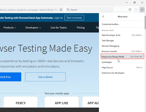
- Click on the hamburger menu on the top right -> click More Tools -> Responsive Design Mode.
Alternatively, you can also use the shortcut to directly open the responsive design mode in Firefox >> Ctrl + Shift + M
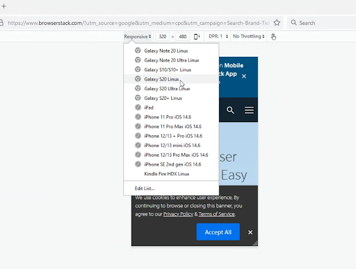
Once you click on the responsive design mode, the web page will be rendered in a mobile view of your choice. As shown in the image below, one can manually define the resolution or choose from a set of widely used mobile handsets.
That’s how one can use responsive mode in Firefox.
Note: The approach illustrated above simulates different viewports on a desktop browser. It is not an accurate way to test the mobile version of a website on Safari or Firefox, as it is just a device simulation. It cannot simulate all aspects of a real mobile device or real user conditions.
An ideal way of testing a website for responsiveness is to test it on real devices. One can opt for an online responsive checker tool that allows you to load pages on real devices.
To run live interactive tests and debug on actual mobile handsets remotely, one can also leverage BrowserStack Live. It allows you to run website tests on the desired mobile handsets from popular vendors like Samsung, Apple, OnePlus, Motorola, Google, etc.
One simply needs to Signup for free -> Navigate to the Live dashboard -> Select the desired device-browser-OS combination and start testing on a real device directly from the browser.
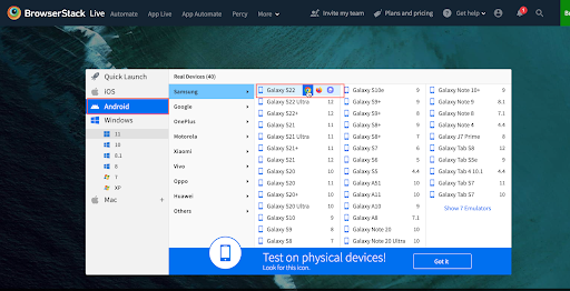
Let’s consider testing on Chrome on Samsung S22.
The image below represents the Live dashboard. Here users can select the device-browser-OS combination of their choice.
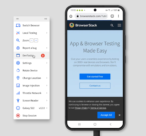
Once the user selects the desired device-browser-OS combination, a new session is initiated on that specific device. (Chrome on Samsung S22 in this case).
Now users can interact with the website on that particular real device. Users can scroll through the website, interact with specific web elements and verify whether there are any rendering issues.
Try Live Testing on Real Devices for Free
The methods demonstrated above will help web users or developers leverage the responsive design mode in their respective browsers. Using this feature will help them validate the ability of web pages to resize their content for an optimal viewing experience.


