20 Core Website Elements of Modern Web Design
By Shreya Bose, Community Contributor - November 15, 2024
Modern web design combines functionality, user experience, and visual appeal to meet user expectations and business goals. Websites must load quickly, adapt to various screen sizes, and offer smooth navigation.
This list of 20 essential web design elements covers the features that make a website functional and engaging.
- What is Modern Web Design?
- Top 20 Core Elements of Modern Web Design in 2023
- 1. Mobile-Optimized Design
- 2. Consistent Typography
- 3. Hamburger Menus
- 4. Optimize for Speed
- 5. White Space
- 6. SEO Optimized Elements
- 7. Ensure Cross Browser Compatibility
- 8. Intuitive Navigation
- 9. Card Design
- 10. CTA Buttons
- 11. Accessibility
- 12. Ecosystem-based Design
- 13. Minimalistic Design
- 14. Flat and Semi-Flat Design
- 15. Hero Images
- 16. Giant Product Images
- 17. Ghost Buttons
- 18. Color Palette
- 19. Short Videos
- 20. Vertical Navigation Menu
What is Modern Web Design?
Modern web design refers to the approach of designing and developing websites that prioritize user experience, aesthetics, and functionality. Modern web design emphasizes a mobile-first approach, meaning that websites are designed to be responsive and optimized for mobile devices, which are increasingly used for accessing the internet.
Modern web design also prioritizes simplicity and minimalism, using clean, uncluttered designs that make it easy for users to navigate and find the information they need. This is achieved through the use of intuitive navigation, strong typography, and high-quality images and graphics.
Other key elements of modern web design include accessibility, usability, and speed. Websites should be designed to be accessible to all users, including those with disabilities, and should be optimized for fast load times to ensure a smooth user experience.
Top 20 Core Elements of Modern Web Design in 2023
There are certain core elements are essential for creating a modern, user-centered web design.
Below are 20 essential elements of modern web design that enhance functionality and visual appeal, making websites more effective and accessible.
1. Mobile-Optimized Design
As mobile usage continues dominating online traffic, a mobile-optimized website is essential.
Below are some important factors that are driving the need for mobile-optimized design:
- 85% of adults think a company’s website design features on mobiles should be as good or better than its desktop version.
- Any website that is not responsive will offer an unsatisfactory UX, leading to traffic, revenue, and credibility loss.
- Mobile-optimized design enables a responsive website – a strategy that adapts to different screen sizes without compromising usability and UX.
- Consequently, implementing a mobile-first design lies at the core of modern web design.
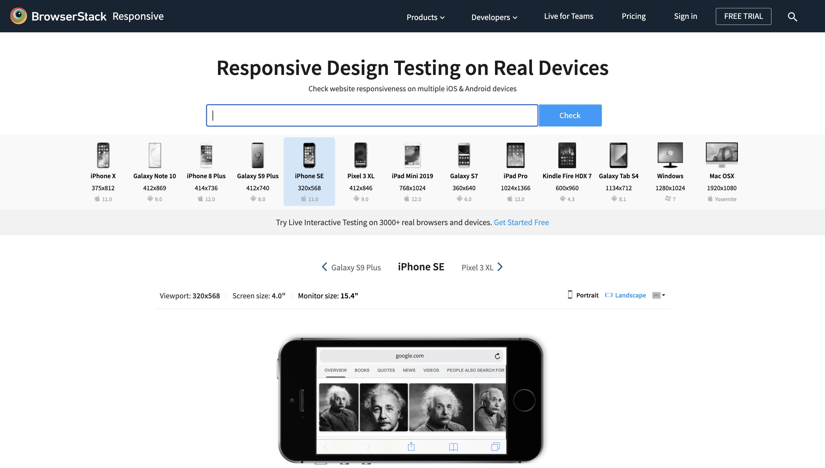
To implement this, you can inch towards a mobile-first design by running a quick test using BrowserStack’s Responsive Design Testing. Designers can quickly check the overall mobile-friendliness to optimize the website for different devices.
How to use BrowserStack Responsive to optimize mobile web design elements?
- Enter the URL of the website that is being tested.
- Once you sign in, enter the website URL and click Check to test responsiveness.
- When a particular device is selected, the user will see what the site looks like.
Try Responsive Testing for Free
2. Consistent Typography
One of the core website elements must feature safe, clean, and bold typography – a pillar of minimalist design.
Clean typography must include the following:
- Appropriately sized text, which is usually larger than 16px
- Black/gray typography, per the background hues or images
- Web-standard fonts
- Adequate space between lines to facilitate easy reading
Most organizations use a particular font or typography as their brand identity. For example, The New Yorker uses Adobe Caslon to create its highly recognizable typeset. Consider adopting a font for your website that will remain consistent across pages and other online resources you may provide.
3. Hamburger Menus
Most websites offer a long menu of options and features for users. While this may make for more straightforward navigation (since the user can go directly to whatever option they want from the home page), it also takes up a lot of screen space – especially on mobile devices.
Solve this quickly with a hamburger menu – a button that opens up to a broader menu or navigation drawer. This saves space and keeps the interface clean and uncluttered without removing navigational ease for website visitors.
4. Optimize for Speed
A slow-loading website design is not only one of the common web design mistakes but also a blunder for all your SEO and CRO campaigns. A mere 1-second delay in page response can result in a 7% conversion reduction. Stats like these depict the significance of speed in modern web design – both on desktop and mobile devices.
In the age of instant gratification, websites are expected to load immediately, or they will be abandoned. Fortunately, building core aspects of web design to increase speed is not a difficult task. A few quick steps would be:
- Optimize all images, regardless of size.
- Choose a robust hosting environment, be it VPS hosting, shared hosting, or even a server dedicated to your site.
- Use compression to keep files smaller.
- Minimize HTTP requests in Chrome’s Developer Tools.
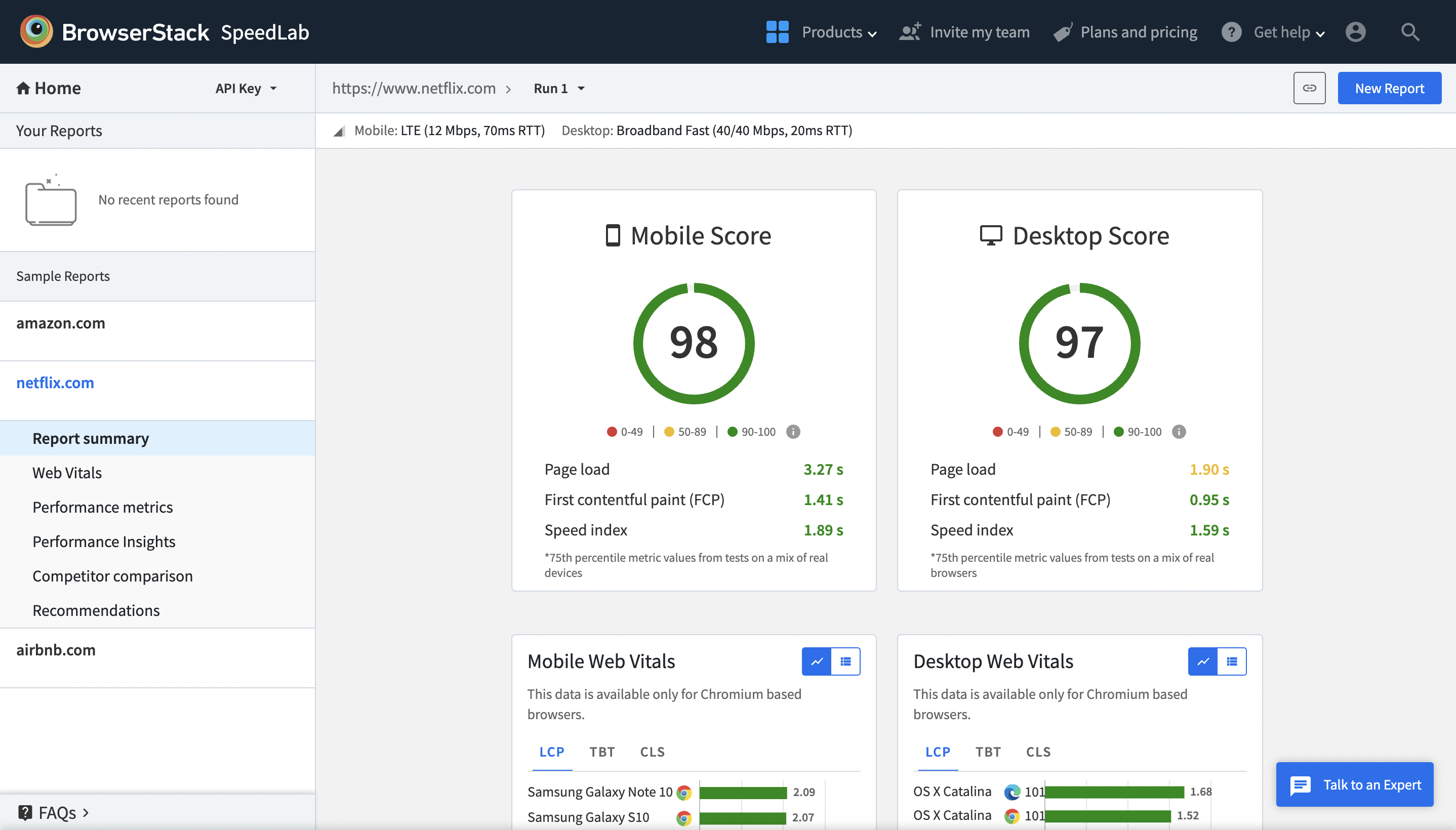
Using BrowserStack SpeedLab you get consolidated reports on how fast (or slow) the website is in terms of site speed metrics.
You also get access to crucial improvements and insights that your frontend team can work on.
5. White Space
As an element of minimalist design, white space is essential for modern homepage design that lets it breathe. Since the internet subjects every user to an infinite barrage of information, they can quickly reach a point of intellectual exhaustion. Using a balance of white space and content ensures that the site looks clean, organized, readable, and easy to navigate.
When it comes to white space, one can take inspiration from Apple on of their pre-launch days. No wonder they’re synonymous with one of the design leaders in the tech space.
6. SEO Optimized Elements
Modern website design elements can go a long way in improving a site’s SEO-based ranking. Some of them are invisible, such as meta tags, heading tags, and other HTML coding hacks belonging to the website’s back-end code. Insert, tweak, and optimize these elements so the website can reap the full benefits of Google’s SEO algorithm.
Know that Google is speed-obsessed with its products and services. Therefore developers and designers should be aware of the SEO implications of their web design elements.
7. Ensure Cross Browser Compatibility
Every design element being coded into a site needs to be displayed and function perfectly on every device and browser with which the site is viewed. The only way to achieve this level of consistency is through iterative testing on real browsers and devices. That means every batch of designs pushed into staging must be verified through a browser compatibility matrix.
Run Browser Compatibility Test of Website
8. Intuitive Navigation
Intuitiveness and modern web design go hand in hand. If your website cannot be used by children and elders alike, consider your design to have a major flaw. Whether your team opts for hamburgers, accordions, drop-downs, or mega menus, do a quick analytical check to see whether your target audience can intuitively grasp your website design and navigation.
Any error or overlapping navigation will put a question mark on your brand. Visual testing is an industry-leading technique that will help you solve this.
- For example, your food delivery app and website need thorough testing of different screens for navigation screens.
- Automated visual testing will help you scan the entire setup to highlight the improvement areas.
- This would ensure zero hiccups when speed and accuracy through food visuals are essential.
9. Card Design
Cards, or tiles, are versatile layout components that organize and display similar content in an easily digestible and readable format.
They are arranged in a grid, and each card appears as a self-contained unit within the layout. Cards can hold information about a single item, such as an image, title, and action buttons.
For instance, a product card on an e-commerce site might showcase a product image, title, price, and quick actions like Add to Cart or Save to Wishlist. This approach helps users scan information and interact easily with content.
10. CTA Buttons
A call-to-action (CTA) button is a key element that prompts users to take specific actions, such as Talk to us or Subscribe Now. It transforms a passive visitor into an active participant, contributing to conversions on a page.
CTA buttons stand out intentionally, often appearing bold and eye-catching to quickly draw attention and encourage users to engage.
11. Accessibility
Modern web design should prioritize accessibility, making the website usable for people with disabilities. This includes designing for screen readers, ensuring color contrast for people with visual impairments, and making the website user-friendly.
12. Ecosystem-based Design
Remember that design for design’s sake would not work for you. Your web design elements should reflect your brand USP or key offerings. If you’re designing e-commerce websites, your color palettes should ideally revolve around red, yellow, blue, and green. Similarly, if you’re creating a health and wellness website, think of soothing schemes full of sky blue, white, purple, and orange.
- Designing for the ecosystem that your website caters to should encompass every other core element in some way or the other.
- As product designers, understand the user’s goals and intentions at various stages in their website journey.
- Keeping complexity in mind, allow your visitors to discover easier pages first and then lead them to deep dive into your complex sections.
13. Minimalistic Design
Minimalism in web design ensures that only essential elements are placed on a landing page. This allows users to focus on key actions without unnecessary distractions.
By reducing visual clutter, minimalistic design promotes ease of navigation and boosts engagement.
For Example, Apple’s website often emphasizes minimalist layouts to showcase products with few distractions.
14. Flat and Semi-Flat Design
Flat design emphasizes simplicity using two-dimensional illustrations without added effects, while semi-flat design incorporates minimal shadows and layering.
This modern approach enhances clarity and aligns with minimalist trends.
15. Hero Images
Hero images are large, eye-catching banners typically at the top of a webpage. They quickly communicate a brand’s main message or highlight key content through bold, immersive visuals.
16. Giant Product Images
Large product images focus user attention on crucial product details, helping drive conversions, especially on e-commerce sites. They allow users to explore the product visually, enhancing engagement.
17. Ghost Buttons
Ghost buttons are transparent buttons with minimal styling, and are often used as secondary calls-to-action.
Their subtle appearance contrasts with bold CTA buttons, helping differentiate primary from secondary actions.
18. Color Palette
Choosing a harmonious color palette can strongly impact a website’s appeal. Consistent colors create visual unity and aid in brand recognition.
The color scheme on your website can convey meanings, like blue for trust or yellow for gourmet products, influencing how users perceive your brand. This enhances brand value and boosts sales conversions.
19. Short Videos
Short, engaging videos communicate product features, brand stories, or tutorials quickly, making content more interactive and visually appealing.
Videos cn explaining complex concepts in a short time.
20. Vertical Navigation Menu
Vertical navigation menus are effective for websites where space constraints or user experience considerations make a sidebar more practical than top navigation.
They can make a site feel modern and are helpful in cases where hierarchy is essential.
Key Elements of a Web Page
The above section covers all the core elements that should be included in a modern web design. However, some non-negotiable elements have to be a part of every webpage.
Below are the key elements that are essential on a webpage:
- Header: The top section contains branding, navigation, and critical call-to-action elements.
- Navigation: A defined area for users to easily explore and navigate the website’s sections or content.
- Main Content Section: The primary area of the page where the main information or services are presented.
- Footer: The bottom section that includes contact information, links to legal terms, and additional navigation.
- Search Bar: A crucial element for helping users quickly find information on larger sites.
- Forms: Allow users to submit information or interact, such as in sign-ups, feedback, or purchases.
- Call-to-Action (CTA): Clearly visible buttons or links prompting users to take specific actions.
- Breadcrumbs: Provide users with easy navigation by showing their current position within the website’s hierarchy.
- Content Organization: These are sections, cards, or tiles, which visually categorize and display related information efficiently.
Top Website Design Tips
Now that you have understood the core elements of modern web design, let us look at some essential website design tips that will help you increase engagement and improve user experience. Listed below are some of the most important website design tips that one must follow to build an amazing website.
- Follow visual hierarchy to guide user attention and ensure headlines clearly communicate the problem and value proposition.
- Strategically place CTAs across the page, especially when user interest peaks.
- Keep the design clean by avoiding clutter, false bottoms, and rotating sliders that confuse users.
- Use standard layouts and visual cues to enhance usability and direct user actions.
- Make navigation easy with descriptive links and ensure the website is easy to read and navigate.
- Compatibility across devices can be ensured by designing with mobile users in mind.
Conclusion
Since every website must compete with thousands, sometimes millions of options online, it cannot afford to release anything but the most effective and aesthetically pleasing design.
When discussing web design elements and plans, use these website design tips as best practices, and continue to build creatively without excluding these stipulations. It is also important to perform cross-browser testing to ensure your website functions and is compatible with different browsers, devices, and OS combinations.
BrowserStack offers a real device cloud platform where you can access over 3500+ different devices, browsers, and OS combinations using this platform. There are different use cases when the test results alter in the dev environment and in real user conditions, so it is recommended to test on real devices for accurate test results.
