User experience plays a decisive role in eCommerce success. A poor interface can drive customers away, while a seamless and visually consistent platform builds trust and boosts conversions. With global online shopping projected to rise significantly in the coming years, businesses must ensure that every interaction—from navigation to checkout—is intuitive and reliable. Visual testing helps identify design inconsistencies, broken layouts, and usability issues before they impact sales.
Overview
Why Visual Testing Matters in eCommerce
- 76% of users abandon purchases due to poor UX.
- Online shopping share → 18% now, projected 24%+.
- First impressions = credibility + conversions.
- Visual assurance ensures trust, faster decisions, and repeat buyers.
What Visual Testing Covers
- Navigation & menus → clear product discovery.
- Page loading speed → under 3 seconds is critical.
- Session handling → prevent timeouts during checkout.
- Product detail pages → fast, complete, accessible content.
Common Visual Errors Impacting ROI
- Product pages failing to load.
- Broken links or misaligned layouts.
- Session expiration during payments.
- Non-functional or inaccurate search filters.
Optimization Factors for Higher Conversions
- Homepage → every clickable section tested across devices.
- Search → filters by category, brand, price, ratings.
- Product Details → load speed + structured info (payment, delivery, stock).
- Shopping Cart → real-time updates across pages.
- Recommendations → related/top-rated products for engagement.
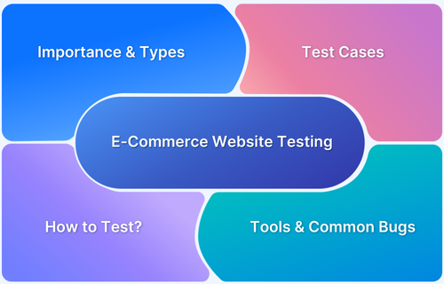
This guide explains how visual testing improves eCommerce ROI, common pitfalls to avoid, and the tools that help deliver flawless user experiences.
How Does Visual Testing Dominate User Experience & eCommerce ROI?
eCommerce visual testing involves a few checks that establish the scale of quality in terms of the overall look and comprehensiveness of the website. Even a minor glitch with no context can deviate buyers’ attention and confuse them in the purchasing funnel.
Learn More: Visual Testing Definitions
To keep the ball running on an eCommerce platform and enable a seamless flow regularly, developers assess the following elements:
- Navigation Formatting: An easy way to product catalog and menu sections is like ushering your buyers to the right product aisle. It is an essential part of eCommerce visual assurance.
- Pade Loading Speed: Online buyers these days stick to a 3-second rule to make sure they are buying from a reliable store. If your website loads slowly, you will end up losing potential buyers. Want to run a quick speed test? Try Now.
- Session Expiration: This type of error is probably the fastest and most common method to lose a buyer for good.
- Content Loading Time: When your buyers click on a product, they should be able to view its description and specifications in the simplest way possible. Here’s what an ideal product description page should look like:
Let’s move to the next section of this guide which contains the top visual testing tools to optimize and improve an eCommerce platform.
Visual Testing Tools for eCommerce Platforms
Percy by BrowserStack
This tool was designed to alleviate visual testing in extensive and impactful ways. Parallelized testing is the standout feature of Percy by BrowserStack as it allows developers to perform multiple tests concurrently with a custom setup. It captures DOM snapshots to render the comparison and highlight the elements that require modification. Percy has built-in support for complex test suites that run in parallelized CI services or parallel test runners. There are two different ways that you can set up Percy for parallel test suites: across many machines or running parallel tests on the same machine.
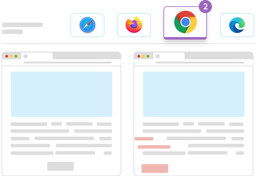
Cross-browser rendering is also a feature of this tool that detects the needed visual changes by rendering a page in numerous browsers. Responsive Diffs and Snapshot Stabilization come up as a handly improvement to the overall visual testing arrangement and facilitate a faster and more comprehensive outcome.
This tool has been a powerful tool for the Shopify team when they were looking for a reliable automation method to maintain the authenticity of their most crucial design system. Shopify Polaris Design System is a unified passage used by thousands of professional developers to conceptualize user-friendly eCommerce design and apps.
It is a vital component library that guides developers with the right UI design patterns. With automated testing on the scale of priority, Percy assisted Shopify by integrating a schematic and far less time-consuming review system in their workflow so their team could perform pivotal checks in a few seconds.
Intercom, as a global enterprise that revolutionized business communication for good, caters to 30,000+ firms at present. Even though they have a gigantic team of 130 engineers: an automated paradigm for visual testing was the need of the hour. With the help of Percy, their team can quickly review the designs before deploying and spot the bugs. The tool also allows them to establish a control on test implementation and needed updates.
BrowserStack Live
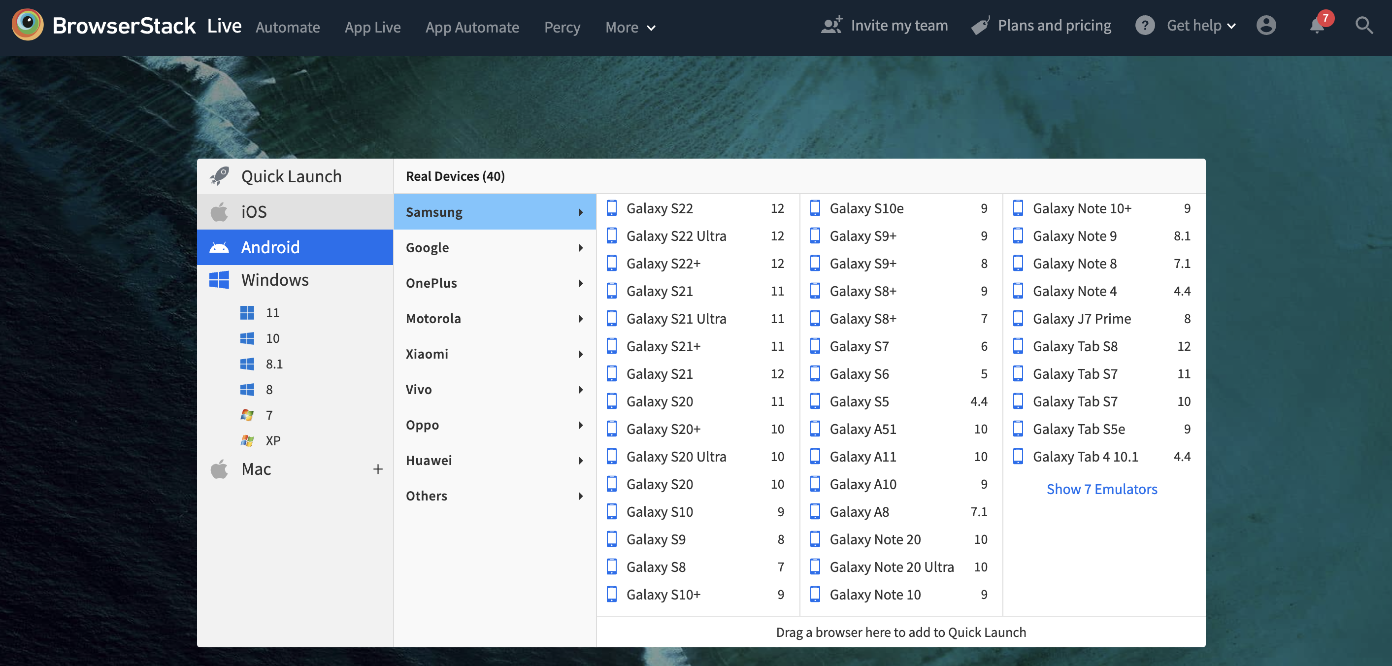
Besides Percy, BrowserStack Live is another influential feature set to set your eCommerce website free from potential errors. Tested by millions of developers on over 3000+ real devices, it is a prolific choice as a visual testing tool for eCommerce assessment. Even as a cross-browser testing tool, the Live tool plays its role in enhanced user engagement and eliminates the possibility of technical errors on the eCommerce platform.
How Do Visual Errors Affect Conversions & ROI?
To understand this interdependence better, let’s look at the common visual errors that drive buyers away and affect the e-commerce conversion rate:
1. Product Page not loading properly
When your buyers can’t read the complete description of the product or product categories, they are more likely to discard the purchase (and probably never come back).
2. Broken Web Formatting
Broken links with no context also put a question mark on the credibility of your online shopping platform. Broken web formatting needs quick rectification. Otherwise, it will keep affecting the overall conversion and ROI.
Read More: Testing Universal Links on iOS & Android
3. Session Expiration
It is a common occurrence during the online payment process. Most buyers address this issue as a security red flag and immediately leave your shopping portal to protect their financial details.
4. Search Filters not Functioning
Search options need category-wise customization to showcase the right selection of products. Despite adding precise search keywords, many visitors don’t find the products they wish to buy despite adding precise search keywords. If the search filters don’t function properly, it will cost you the ongoing sales and your brand’s trustability.
Follow-up Read: What Are Visual Bugs?
Visual Testing Factors to Optimize eCommerce Conversions & ROI
Automated visual testing validates user experience and helps identify common bugs before a potential buyer can spot them. The following factors can be treated to a visual check on an eCommerce website to maintain the UX quotient of the platform:
1. Commencement with Home Page
It is the busiest corner of your online shopping platform. Every section on this page plays its part in building the hype of your brand. You will need to go through each segment to check if it’s clickable or not. Rendering this page on different browsers and screen sizes is vital for boosting eCommerce ROI via visual testing.
2. Search Assessment
The search module should be customized as per different product categories, brand’s name, price range, reviews, and ratings. The search bar on the product category page should be tailored to show sub-categories.
3. Product Detail Section
Besides quick loading time, the product detail section should also contain the information schematic format. Available payment methods, delivery options, in-stock/out of stock, and check-out details must be given on all product pages.
4. Shopping Cart
Your buyers should be able to add and edit products in the shopping cart. If a user increases or decreases the quantity on the product page, it should be updated automatically on the checkout page.
5. Categories & Related Products
Other than categories and sub-categories, related products, recommended products, and top-rated products must appear on all product pages. This section should be tailored for returning buyers.
In Conclusion,
Automated visual testing is an emerging practice in the eCommerce realm. It allows developers to test their online store’s functional and visual aspects before launching it. In some ways, visual testing of eCommerce websites establishes the qualitative periphery of a brand and lays the path for profitable advancement. Percy by BrowserStack is your best bet on fundamental ROI strategies that sustain buyers’ trust in your products and services.
Follow-Up Read: The Essential Website Launch Checklist
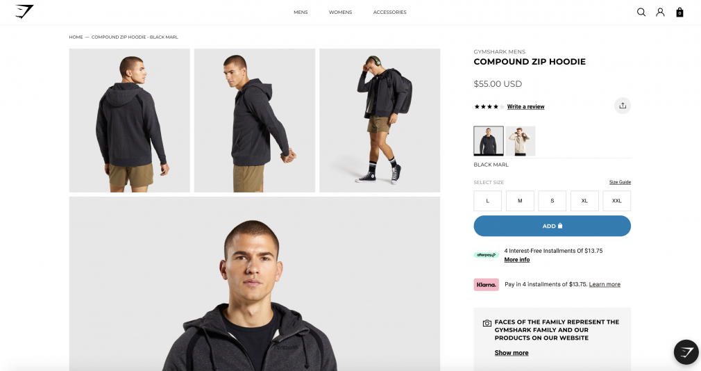 Image Source
