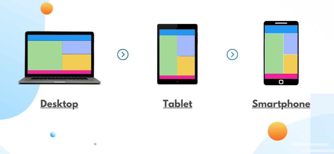
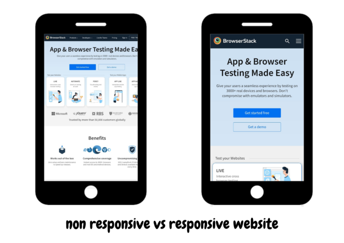
With users browsing the web on screens of all sizes – from mobile phones to widescreen monitors, designing flexible layouts has become a key part of modern web development. CSS Media Queries help address this need by allowing developers to apply different styles based on a device’s screen size, orientation, and other features.
Overview
What is CSS Media Query?
CSS Media Query is a CSS technique used to apply styles based on a device’s characteristics like screen size, resolution, or orientation.
Why use CSS Media Query?
- Enhanced User Experience
- Search Engine Optimization
- Better Reach of Website
Media Types in CSS3:
- all – Default media type, used for all devices
- screen – Devices with screens (desktops, laptops, smartphones, etc.)
- print – Styles applied when the document is printed
- speech – For speech synthesis and screen reader devices
- projection – Projectors and presentation displays
- handheld – Handheld devices like smartphones and tablets
- tv – Television screens
- braille – Braille devices used by visually impaired users
- 3d-glasses – Devices like 3D glasses
- grid – Devices with grid-based output (though rarely used today)
This guide walks you through CSS Media Query, why it is important, Media types in CSS3, example code, and best practices.
Read More: How to build a website using HTML and CSS?
What is CSS Media Query?
CSS Media query is a technique for modifying a website’s behavior and appearance based on the user’s device conditions, such as display size, orientation, resolution, the type of device used, and other browser settings.
Other ways to access Media Queries are HTML and JavaScript. However, CSS offers the most features and is the most popular place to script Media Queries for a website.
Instead of targeting device types, CSS Media Queries adapt layouts for desktops, laptops, tablets, and phones using the @media rule.
Read More: How to create a Browser specific CSS code?
Why use CSS Media Query?
CSS Media Queries are key for building responsive, accessible, and user-friendly websites across all devices. Here’s why they matter:
- Better User Experience Across Devices: Media queries allow your layout to adapt based on screen size, resolution, and orientation. It makes the website easier to read, navigate, and interact with on phones, tablets, laptops, and desktops.
- Improved Accessibility: Responsive design plays a major role in accessibility. Adjusting font sizes, layout spacing, or contrast for different screen types or resolutions ensures that all users, including those with visual or motor impairments.
- Targeting Specific Screen Sizes Strategically: Media queries let you define breakpoints that suit your content and layout needs, not just standard device sizes. This gives you control over how and when design changes occur, creating a smoother visual flow for users.
- Enhanced SEO and Mobile Friendliness: Search engines prioritize mobile-optimized websites. Media queries help you build layouts that meet these standards, boosting visibility in search results.
- Wider Audience Reach: With a large portion of global users browsing through mobile devices, responsive design powered by media queries helps you reach and retain that audience effectively.
- Future-Ready Design: Devices keep evolving, and screen dimensions vary widely. Media queries allow your design to scale gracefully without needing complete overhauls as new technologies emerge.
- Content Prioritization: By modifying the layout or hiding/showing elements based on screen size, you can prioritize key content for smaller screens without overwhelming users with clutter.
CSS Media Query Syntax
A media query uses the @media rule followed by a media type and one or more conditions. If the conditions are true, the styles inside the block are applied.
@media media-type and (condition) {

  /* CSS rules */

}
Example:
@media screen and (max-width: 768px) {

  body {

    font-size: 14px;

  }

}
In this example, the styles apply only when the screen width is 768px or less.
Media Types in CSS3
CSS3 is the latest version of CSS (Cascading Style Sheet) which is built upon its precedence versions. The media types in CSS3 specify the type of media or device the which a particular set of styles should apply. There are several media types available that describe the target devices for which the particular property works the best.
| Media Types in CSS3 | Description |
|---|---|
| all | Default media types, used for all devices |
| screen | Devices with screens, such as desktops, laptops, phones, and more |
| Styles are applied when the document is printed | |
| speech | For devices used in speech synthesis and screen reading |
| projection | Devices like projectors, and presentation screens |
| handheld | Handheld devices such as smartphones, tablets, and more |
| tv | Specific for TV screens |
| braille | Devices targeting Braille devices used for visual disablement |
| 3d-glasses | Devices like 3D glasses |
| grid | Grid-based devices like e-book readers |
Read More: How to resize an image using CSS?
CSS Media Queries Example
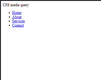
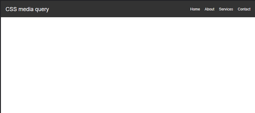
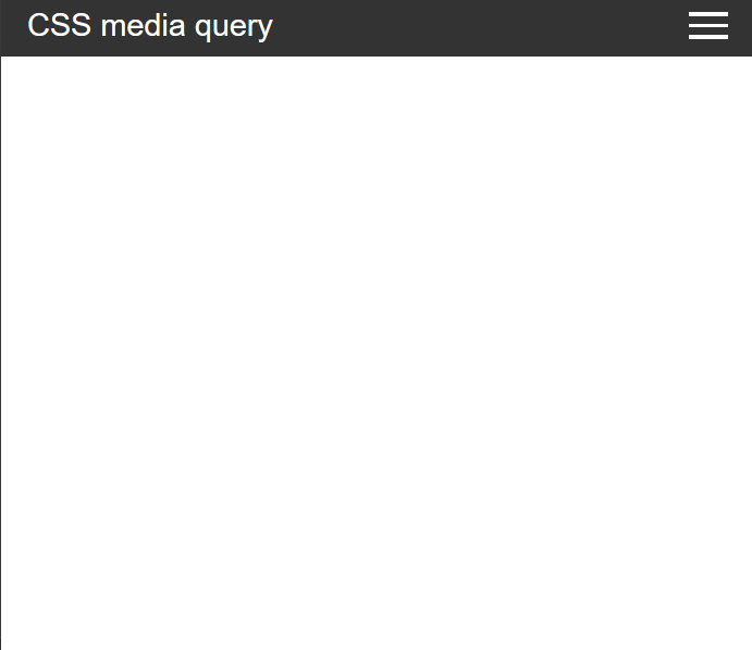
Now, with a practical demonstration, understand how to use CSS media queries to create a fully responsive web application. In this example, create a responsive navbar with a hamburger menu icon that appears on smaller screens.
Step 1: Create an HTML file
<html>
<head>
  <link rel="stylesheet" href="styles.css">
  <title>A complete guide to CSS Media Query</title>
</head>
<body>
  <nav class="navbar">
    <div class="logo">CSS media query</div>
    <div class="menu-toggle">
      <span></span>
      <span></span>
      <span></span>
    </div>
    <ul class="nav-links">
      <li><a href="#">Home</a></li>
      <li><a href="#">About</a></li>
      <li><a href="#">Services</a></li>
      <li><a href="#">Contact</a></li>
    </ul>
  </nav>
</body>
</html>
Step 2: Write CSS
.navbar {
    background-color: #333;
    color: #fff;
    display: flex;
    justify-content: space-between;
    align-items: center;
    padding: 10px 20px;
  }

  .logo {
    font-size: 24px;
  }

  .menu-toggle {
    display: none;
    flex-direction: column;
    cursor: pointer;
  }

  .menu-toggle span {
    width: 30px;
    height: 3px;
    background-color: #fff;
    margin: 3px 0;
  }

  .nav-links {
    list-style: none;
    display: flex;
    gap: 20px;
  }

  .nav-links a {
    color: #fff;
    text-decoration: none;
  }
Step 3: Write CSS using Media Queries
@media screen and (max-width: 600px) {
    .menu-toggle {
      display: flex;
    }

    .nav-links {
      display: none;
      flex-direction: column;
      position: absolute;
      top: 60px;
      width: 100%;
    }

    .nav-links.active {
      display: flex;
    }
  }
What are Breakpoints in CSS Media Query?
Breakpoints are specific screen widths at which your website’s layout or design needs to change to better fit the device.
In CSS Media Queries, breakpoints define the conditions under which certain styles are applied, allowing your design to respond to different screen sizes like mobile, tablet, or desktop.
Example:
@media (min-width: 768px) {

  /* Styles for tablets and up */

}
Common breakpoints are based on typical device widths, such as:
- Mobile: max-width: 480px
- Tablet: min-width: 481px and max-width: 768px
- Small Desktop: min-width: 769px and max-width: 1024px
- Large Desktop: min-width: 1025px
Media Features and Logical Operators in CSS Media Queries
CSS Media Queries evaluates media features using logical operators to apply specific styles depending on a device’s characteristics. Understanding both is key to writing powerful and flexible responsive designs.
What are Media Features?
Media features are the conditions that your media query checks before applying styles. These features describe aspects of the device or viewport such as width, height, orientation, resolution, and more.
Here are some commonly used media features:
| Media Feature | Description |
|---|---|
| width | Width of the viewport. |
| min-width / max-width | Minimum/maximum width of the viewport (often used for breakpoints). |
| height | Height of the viewport. |
| min-height / max-height | Minimum/maximum height of the viewport. |
| orientation | Specifies whether the device is in portrait or landscape mode. |
| resolution | Used to target screens with high DPI (e.g., Retina displays). |
| aspect-ratio | The ratio between the width and height of the screen. |
| hover | Checks if the primary input method supports hover (useful for touch vs desktop). |
| pointer | Describes the accuracy of the pointing device (fine, coarse, none). |
| prefers-color-scheme | Detects if the user prefers light or dark mode. |
Logical Operators in Media Queries
Logical operators help combine or refine multiple conditions in a single media query. The most commonly used operators are:
1. and Operator
Used to combine multiple conditions. All must be true for the styles to apply.
@media screen and (min-width: 768px) and (orientation: landscape) {

  body {

    background-color: lightblue;

  }

}
2. not Operator
Used to exclude a particular media type or condition.
@media not screen and (min-width: 768px) {

  body {

    background-color: pink;

  }

}
3. only Operator
It prevents older browsers that don’t understand media queries from applying the styles. It’s mostly used for backward compatibility.
@media only screen and (max-width: 600px) {

  body {

    font-size: 14px;

  }

}
4. Comma , (Comma as OR Operator)
Acts as a logical OR, where styles are applied if any one of the conditions is true.
@media screen and (max-width: 600px), screen and (orientation: portrait) {

  body {

    background-color: beige;

  }

}
Using CSS Media Query to support older browser versions
Media queries are not supported in early versions of web browsers, notably Internet Explorer 8 and prior versions. Our website must be able to interact with visitors using outdated browsers as well to reach a broader spectrum of users globally. Here are a few techniques for making these older browsers responsive.
1. Using Conditional Statements as Comments
Internet Explorer allows conditional comments, which are HTML comments to target different versions of the browser. Here’s how to use Conditional comments for Internet Explorer 8 and earlier versions.
<!--[if lte IE 8]>

  <link rel="stylesheet" href="fallback-styles.css">

<![endif]-->
2. Create Fallback Styles
The file targeted by the conditional statements leads to an alternative CSS file that activates only when you meet the conditions, in our case it is Internet Explorer version 8 and earlier.
/* Fallback styles for older IE versions */

.header {

  background-color: #333;

  color: #fff;

  padding: 10px;

}Best Practices for Writing Media Queries
Writing effective media queries helps maintain clean, scalable, and responsive designs. Here are some best practices to follow:
1. Use Mobile-First Approach: Start with styles for smaller screens, then use media queries to add styles for larger devices (min-width). This improves performance and maintainability.
/* Base styles for mobile */

body {

  font-size: 14px;

}


@media (min-width: 768px) {

  body {

    font-size: 16px;

  }

}
2. Group Media Queries Logically: Organize media queries alongside related components or group them by breakpoint ranges to keep your code readable.
3. Avoid Too Many Breakpoints: Use breakpoints only when the layout needs adjustment. Stick to common ranges instead of targeting every device size.
4. Write Reusable Styles: Keep your CSS modular so styles work across multiple breakpoints with minimal duplication.
5. Test Across Real Devices: Always test media queries on devices or emulators to validate your layout’s behavior in real scenarios.
6. Use Relative Units: To improve scalability and accessibility, prefer em, rem, or % over fixed units like px.
7. Avoid Overlapping Rules: Make sure your queries don’t unintentionally override each other. Keep breakpoints consistent and clear.
8. Document Your Breakpoints: Comment on your breakpoints in the CSS for better collaboration and easier future updates.
/* Tablet breakpoint: 768px */

@media (min-width: 768px) { ... }
Testing CSS Media Queries
BrowserStack is a cloud-testing infrastructure that allows users to test their website in numerous operating systems and web browsers before releasing it to real-world users. Learn how to test the website’s responsiveness using BrowserStack in three easy steps.
1. Sign up/Login on BrowserStack: Get started free by opening up BrowserStack Responsive Design Testing.
2. Enter the Website: For example, enter any popular website.
3. Select the device for the test: Select from the wide range of devices on which you want to run the test. After that, hit the check button to run the testing and see the result.
Conclusion
The CSS Media Query is an effective way for our website to reach a large audience across the globe. Media Queries allows web applications to be responsive offering a seamless expansion among several devices with a wide range of screen sizes, resolutions, and orientations.
CSS Media Query has contributed equally to the progress of websites from their infancy to the current stage of fully-fledged web pages. The proper understanding of Media Queries, Grid, and Flexbox, and their combination leverages the full potential of CSS.


