CSS Grid and Bootstrap are two widely used tools for building responsive web layouts. While both serve the same purpose of structuring content across devices, they differ significantly in approach and flexibility.
Overview
What is CSS Grid?
CSS Grid is a native CSS layout system that enables two-dimensional layouts using rows and columns, offering precise control over positioning without external libraries.
What is Bootstrap?
Bootstrap is a front-end framework that provides a mobile-first, 12-column grid system along with a rich set of pre-built UI components and utility classes.
CSS Grid vs Bootstrap
- Layout Model: CSS Grid uses CSS properties for layout; Bootstrap relies on HTML classes.
- Flexibility: CSS Grid supports complex, overlapping layouts; Bootstrap follows a fixed 12-column structure.
- Components: Bootstrap includes UI components (buttons, modals, forms); CSS Grid handles layout only.
- Learning Curve: CSS Grid requires understanding of native CSS concepts; Bootstrap offers faster onboarding with ready-to-use classes.
- Customization: CSS Grid allows full design freedom; Bootstrap is more opinionated and structured.
This guide will break down the key differences between CSS Grid and Bootstrap, explore their pros and cons, outline practical use cases, and help you decide the right choice for your next web project.
CSS Grid vs Bootstrap: Key Comparison
CSS Grid and Bootstrap differ in how they structure layouts and flexibility, ease of use, and additional capabilities.
Here’s a side-by-side comparison:
| Feature | CSS Grid | Bootstrap |
|---|---|---|
| Type | Native CSS layout system | Front-end framework with grid and UI components |
| Layout Direction | Two-dimensional (rows and columns) | Primarily one-dimensional (rows into columns) |
| Implementation | Pure CSS with properties like display: grid | HTML class-based (.row, .col-*) |
| Flexibility | Allows custom, overlapping, and complex layouts | Fixed 12-column layout; limited customization |
| Components Included | No built-in components; layout-only | Includes buttons, modals, navbars, forms, and more |
| Learning Curve | Requires CSS knowledge | Easier for beginners; quick setup with classes |
| Performance | Lightweight; no dependencies | Heavier due to bundled CSS/JS |
| Customization | Full control over layout and style | Needs overrides or custom builds to heavily customize |
| Use Cases | Custom layouts, design systems, advanced UIs | Rapid prototyping, admin panels, consistent UI frameworks |
What is CSS Grid?
CSS Grid is a two-dimensional grid system used to work on the layout of UI elements and segments of a webpage. The Grid comprises horizontal and vertical lines to form rows and columns, much like a table.
Using CSS Grid to place UI elements helps to position them precisely which is beneficial for implementing responsive design for the site. The Grid uses pixels to fix the track sizes, and these too can be flexible on a percentage basis. This helps the same webpage adjust its design according to the screen size of various devices like phones, tablets, desktop, etc.
Key Features of CSS Grid
CSS Grid offers a native, two-dimensional layout system that brings structure and flexibility to web design.
- Two-Dimensional Layouts: Allows control over both rows and columns simultaneously.
- Grid Tracks and Areas: Define precise layout sections using grid-template-rows, grid-template-columns, and named areas.
- Auto Placement: Automatically positions elements without needing manual row/column assignments.
- Responsive Design: Easily adapts layouts using media queries and fr units for flexible sizing.
- Explicit and Implicit Grids: Supports auto-generated tracks and developer-defined grids.
- Gap Management: Simplifies spacing using grid-gap, row-gap, and column-gap.
Advantages of CSS Grid
CSS Grid delivers high flexibility, enabling developers to design complex, adaptable interfaces with cleaner code.
- Greater Layout Control: Enables intricate layouts like overlapping elements or nested grids.
- Cleaner Markup: Reduces need for wrapper <div> elements used in framework-based layouts.
- Native to CSS: No need for external libraries or dependencies.
- Separation of Concerns: Keeps layout logic in CSS instead of mixing it with HTML classes.
- Improved Responsiveness: Makes adaptive layouts easier with fewer breakpoints.
Disadvantages of CSS Grid
Despite its power, CSS Grid has some limitations, especially for teams or projects needing ready-made components.
- Steeper Learning Curve: Requires understanding of new layout properties and units.
- Browser Support Limitations: Older browsers may lack full support (especially IE11).
- Lacks UI Components: Only handles layout—no pre-built components like buttons or navbars.
- More Code for Simple Layouts: For basic grids, CSS Grid might be overkill compared to simpler frameworks.
- Not Ideal for Legacy Projects: Integrating CSS Grid into older codebases can be complex.
Learn More: Building Responsive Layouts with CSS
Use Cases of CSS Grid
CSS Grid is best suited for projects that require advanced layout control and custom UI design.
- Dashboards & Admin Panels: Complex, multi-panel interfaces with dynamic resizing.
- Magazine-Style Layouts: Asymmetrical, content-rich pages with overlapping sections.
- Design Systems: Creating reusable layout templates across large-scale apps.
- Portfolio or Showcase Sites: Creative layouts that need flexibility beyond traditional grid systems.
- Landing Pages: Custom promotional pages with pixel-perfect alignment.
Read More: What is Multi-Page Responsive Website
How does CSS Grid work?
CSS Grid divides the website page space using rows and columns, which can be allocated in a fixed manner by specifying the pixels or the fraction (using fr) of the available space which is to be allocated to a designated section. fr is used to make the layout responsive and cross platform compatible.
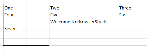
Here is an example with a layout defining 7 areas, that are divided using fractions – columns: 2 fractions, 3 fractions, 1 fraction, and in rows: 1 fraction, 2 fractions, 3 fractions.
Here’s how the layout will look:
Page Layout
HTML (calling the wrapper class defined using CSS Grid)
<div class="wrapper">
<div>One</div>
<div>Two</div>
<div>Three</div>
<div>Four</div>
<div>Five</div>
<div>Six</div>
<div>Seven</div>
</div>
CSS (defining layout using flexible CSS grid)
.wrapper {
display: grid;
grid-template-columns: 2fr 3fr 1fr;
grid-template-rows: 1fr 2fr 3fr
}
* {box-sizing: border-box;}
The following code will add text to the Area defined by box Five “Welcome to BrowserStack!”
Since the layout is the same, the CSS class will remain unchanged and only HTML code will be altered.
HTML (calling the wrapper class defined using CSS Grid)
<div class="wrapper">
<div>One</div>
<div>Two</div>
<div>Three</div>
<div>Four</div>
<div>Five
</p> Welcome to BrowserStack! </div>
<div>Six</div>
<div>Seven</div>
</div>
Page Layout upon adding Text in Box Five
What is Bootstrap?
Bootstrap is a suite carrying a collection of HTML, CSS, and JavaScript toolkits used for building websites. It is flexible and offers cross browser compatibility through its reusable UI components. This article will focus on the Bootstrap Grid System that can help readers understand a layout comparison.
Bootstrap has a responsive grid system, with custom breakpoints. It offers a mobile-first design that makes a single code scale for multiple devices like phones, tablets, and desktops. Much like the CSS Grid, this too is defined using a two-dimensional grid made up of horizontal and vertical lines forming rows and columns.
Key Features of Bootstrap
Bootstrap is a comprehensive front-end framework that streamlines UI development with pre-built components and a responsive grid.
- 12-Column Grid System: Simplifies responsive layout creation using .row and .col-* classes.
- Pre-Styled Components: Includes buttons, forms, navbars, modals, carousels, and more.
- Responsive Utilities: Offers visibility classes and media query helpers for mobile-first design.
- Customizable with Sass: Modify theme colors, spacing, and components using variables.
- JavaScript Plugins: Comes bundled with jQuery-based plugins like dropdowns, tooltips, and alerts.
- Extensive Documentation: Well-maintained guides and examples for quick adoption.
Advantages of Bootstrap
Bootstrap speeds up front-end development and provides consistency across teams and projects.
- Quick Prototyping: Ready-to-use components accelerate UI creation.
- Cross-Browser Compatibility: Ensures consistent rendering across major browsers.
- Large Community & Ecosystem: Rich themes, extensions, and support library.
- Mobile-First Design: Built-in responsiveness with minimal configuration.
- Consistent UI: Promotes design consistency in multi-developer environments.
Disadvantages of Bootstrap
While Bootstrap offers convenience, it can lead to bloated or less-custom layouts if not used thoughtfully.
- Heavy CSS/JS Overhead: Includes styles and scripts that may not all be used.
- Generic Look: Without customization, sites can feel templated or similar.
- Class-Heavy Markup: HTML can become cluttered with utility and grid classes.
- Less Layout Flexibility: Complex, non-grid-based designs may be harder to implement.
- Dependency on jQuery: Some JavaScript components still rely on jQuery in older versions.
Use Cases of Bootstrap
Bootstrap is ideal for projects that need rapid development, consistency, and built-in components.
- MVPs & Prototypes: Quickly build functional UIs for validation and testing.
- Internal Tools: Create admin dashboards, CRUD interfaces, and portals.
- Marketing Websites: Launch responsive landing pages or product sites fast.
- Corporate Sites: Ensure consistent branding across multiple pages.
- Educational Projects: Great for teaching responsive design and component-based development.
How does Bootstrap Grid work?
Unlike CSS Grid, in Bootstrap Grid, column elements are placed within row elements, creating a horizontal group of columns with each row. The columns remain the immediate children of the respective rows where they are being placed. In a full row, the maximum number of columns shall be 12.
It offers four tiers of classes namely xs, sm, md, and lg, that are classified as follows according to device size:
- xs class is meant for phones with size <768 px.
- sm class is for tablets with size >= 768 px and <992 px.
- md class is used for desktops with size >=992 px and <1200 px.
- lg class is defined for larger desktops with size >= 1200 px.
This classification according to device size works helps implement website responsiveness for devices of different sizes to deliver a pixel-perfect UI.
Let’s look at an example with a layout defining 7 areas – 3 columns in the first row and 4 in the second row. The area defined by the fifth box contains the text “Welcome to BrowserStack!”
Here’s how the layout will look:
Page Layout for md class tier i.e. desktop >=992 px
<div class="row">
<div class="col-md-4">One</div>
<div class="col-md-4">Two</div>
<div class="col-md-4">Three</div>
</div>
<div class="row">
<div class="col-md-3">Four</div>
<div class="col-md-3">Five Welcome to BrowserStack!</div>
<div class="col-md-3">Six</div>
<div class="col-md-3">Seven</div>
</div>
This layout may have areas overlapping for the tablets and phones. Thus, one can combine different class tiers to get different visuals on mobile and desktop views.
<div class="row">
<div class="col-xs-12 col-md-4">One</div>
<div class="col-xs-12 col-md-4">Two</div>
<div class="col-xs-12 col-md-4">Three</div>
</div>
<div class="row">
<div class="col-xs-12 col-md-3">Four</div>
<div class="col-xs-12 col-md-3">Five Welcome to BrowserStack!</div>
<div class="col-xs-12 col-md-3">Six</div>
<div class="col-xs-12 col-md-3">Seven</div>
</div>
The above code would result in creating the same layout for desktop devices (md tier), but will look differently on phones.
Page Layout for xs class tier i.e. mobile phones<786 px
CSS Grid vs Bootstrap: A Detailed Comparison
CSS Grid and Bootstrap take different approaches to layout design. Here’s how they compare across core aspects:
- Layout Model: CSS Grid supports two-dimensional layouts (rows and columns), while Bootstrap uses a one-dimensional, 12-column system optimized for vertical stacking.
- Implementation & Syntax: CSS Grid relies on native CSS properties, enabling cleaner, semantic HTML. Bootstrap requires predefined class-based HTML markup, which can become bulky.
- Responsiveness & Flexibility: Bootstrap provides mobile-first responsiveness out of the box with preset breakpoints. CSS Grid requires manual setup via media queries but offers greater control.
- Components & Ecosystem: Bootstrap includes a full suite of UI components (buttons, modals, navbars), while CSS Grid is purely a layout system with no UI elements included.
- Ease of Use vs. Customization: Bootstrap is easier for beginners and ideal for rapid prototyping. CSS Grid has a steeper learning curve but allows for highly customized, design-rich layouts.
- Performance: CSS Grid is lighter and browser-native. Bootstrap includes additional CSS and JavaScript, which can increase page size if not optimized.
- Best Fit Use Cases: CSS Grid suits complex, design-intensive layouts. Bootstrap is best for fast, consistent UIs and projects with standardized components.
Tailwind vs CSS Grid vs Bootstrap: Quick Overview
Each of these tools serves a different purpose in front-end development. Here’s a quick comparison across critical aspects:
| Feature/Aspect | CSS Grid | Bootstrap | Tailwind CSS |
|---|---|---|---|
| Type | Native CSS layout system | Front-end framework with grid + UI components | Utility-first CSS framework |
| Layout Direction | Two-dimensional (rows & columns) | One-dimensional (flex/grid-based, 12-column) | Utility-based, customizable with Flex/Grid |
| Setup & Usage | Requires custom CSS | Class-based, plug-and-play | Class-based, requires configuration |
| Components Included | None | Extensive (buttons, navs, modals, etc.) | None (can integrate with libraries like Headless UI) |
| Customization | High, with CSS | Limited unless overridden | Very high, built for design flexibility |
| Learning Curve | Moderate | Low for basic use | Moderate (due to utility class naming) |
| Performance | Lightweight (pure CSS) | Can be heavier with unused components | Lean with PurgeCSS or tree-shaking |
| Best Use Case | Complex, design-heavy custom layouts | Fast development with standard UI | Custom design systems, scalable UI |
CSS Grid vs Bootstrap: Which One To Choose?
Choosing between CSS Grid and Bootstrap hinges on your project’s specific needs. Consider your design goals, performance targets, and team skills.
Opt for CSS Grid (or vanilla CSS) for:
- Highly custom, unique visual designs.
- Peak performance and minimal file sizes.
- Full semantic control over HTML and complex 2D layouts.
- Teams skilled in modern CSS.
Select Bootstrap for:
- Rapid development and quick prototyping.
- Standard, responsive layouts with ready-made UI components.
- Projects needing many consistent UI elements fast.
- Teams already proficient with Bootstrap.
- Quick cross-browser compatibility needs.
Is CSS Grid better than Bootstrap?
For cases where Layout is the primary concern, then CSS Grid should be choice because it allows you to segregate the page and divide it into different areas prior to adding content. It helps give a defined look to the webpage with different areas within the Grid designated to various sections. Also, CSS Grid provides good Cross Browser Compatibility
Cross Browser Compatibility of CSS Grid and Bootstrap
Creating responsive layouts is only part of the equation; it is critical to ensure they render consistently across all browsers and devices.
- CSS Grid enjoys broad support across modern browsers like Chrome, Firefox, Safari, and Edge. However, it may exhibit inconsistent behavior or require fallbacks in older browsers like Internet Explorer.
- Bootstrap, based on Flexbox, is more backward-compatible and offers a stable layout experience across a wider range of browsers.
Despite this, layout inconsistencies, rendering bugs, and interaction issues often go unnoticed in local or emulated environments.
Why Real Device Testing Matters
Testing layouts under real user conditions is essential to catching real-world issues, especially differences in browser engines, screen sizes, and OS behaviors.
This is where BrowserStack’s real device cloud is beneficial.
BrowserStack Live enables:
- Interactive testing on 3,500+ real devices and browsers including iOS, Android, macOS, and Windows
- Responsive design checks across multiple screen sizes and resolutions
- Access to legacy and latest browser versions, such as Internet Explorer, Safari 10+, and Chrome Beta
- Built-in DevTools to inspect, debug, and fix layout issues in real time
- Local testing support for staging or internal environments behind firewalls
- Geolocation and network throttling to test global performance and responsiveness
Conclusion
CSS Grid and Bootstrap both offer powerful tools for building responsive layouts—CSS Grid provides fine-grained control for custom designs, while Bootstrap delivers speed and consistency with its component-based system.
The right choice depends on your project’s needs:
- Choose CSS Grid for modern, flexible layouts with fewer dependencies.
- Opt for Bootstrap when you need quick setup, built-in components, and cross-browser consistency.
Whichever you choose, real device testing with tools like BrowserStack Live ensures your UI performs seamlessly across all environments.
Useful Resources for CSS
Tutorials
- Advanced CSS Tutorial
- Understanding Sibling Selectors in CSS
- Understanding CSS radial-gradient() function
- How to position Text Over an Image using CSS
- How to resize an image using CSS
- How to use CSS rgba() function correctly?
- Handling Images in HTML and CSS: Everything you need to know
- Dynamic Rendering using HTML and CSS
- Why CSS Position Sticky is Not Working
- A complete guide to CSS Media Query
- CSS Subgrid: What is it and Why do you need it
- What are CSS Breakpoints and Media Query Breakpoints
- How to Create Responsive Designs with CSS
- CSS Selectors in Cypress
- CSS Selector in Selenium: Locate Elements with Examples
- CSS Selectors Cheat Sheet (Basic & Advanced)
Differences
- CSS Grid vs Bootstrap: Which one is better for you?
- What is Responsive CSS vs Reactive CSS?
- Xpath Vs CSS Selector: Key Differences
Frameworks
- Top Responsive CSS Frameworks
- Top 7 CSS Frameworks for Developers
- What are CSS Modules and why use them?
Browser Compatibility & Cross-Browser Testing
- Browser compatibility with CSS Gradients
- Browser Compatibility of Cursor Grab & Grabbing in CSS
- How to Create Browser Compatible Smooth Scrolling with CSS and JavaScript
- How to Create Browser Specific CSS Code
- Fixing Browser Compatibility Issues with CSS Opacity & RGBA
- CSS techniques for Improved Cross Browser Compatibility


