Cross browser compatibility is mandatory in software development, as every site should function perfectly across various OS platforms and browsers. CSS is a styling aspect used across websites to make them look stylistically superior. Given the extent of device-browser fragmentation in the world, CSS will naturally have to be compatible with multiple browsers to allow a site to render perfectly for users with different browser preferences.
Overview
Key Techniques for Cross-Browser Compatibility
- Set gradient color on div in different browsers
- Set border-radius in Popular Browsers
- Set background image for select tags in Chrome
Commonly Observed Cross-Browser Compatibility Issues
- Issues with page alignment.
- Incompatibility of browser with the operating system.
This article will explore the various CSS techniques used to improve a website’s cross browser compatibility.
3 CSS techniques for Improved Cross Browser Compatibility
1. Setting gradient color on div in different browsers
Before we begin, let’s understand what a gradient is. Color gradients, or color transitions, are defined as a gradual blending from one color to another. This blending can occur between colors of the same tone (from light blue to navy blue), colors of two different tones (from blue to yellow), or even between more than two colors (from blue to purple to red to orange).
Decide carefully how to use the gradient on a website. It is better to use the gradient as an enhancement. Remember some browsers will not display the gradient well. Therefore, it will have to degrade gracefully. If a browser doesn’t display the gradient, then the design shouldn’t be dependent on it and should be able to function perfectly without it.
Gradients are applied to block elements like DIV tags. The following example uses a simple DIV tag.
A simple class will be set up to build the DIV that the gradient will be displayed in. The DIV will be 100px wide by 100px tall. Here is the CSS to build the DIV:
example {

border:1px solid #999;

width: 100px;

height: 100px;

padding:5px;

color:#fff;

}
Now let’s add the gradient to the above example using the WebKit method. WebKit is a web browser engine mainly used by browsers like Safari and Chrome. It offers features such as animation, transform, transition, and more through the use of the -webkit prefix in a site’s CSS.
background: linear-gradient(to left, #333, #333 50%, #eee 75%, #333 75%);
Now that you know what to do, try running this code on real browsers on BrowserStack’s real device cloud. Sign up for free, choose the real browser-device combination and run your CSS code. Choose from 3000+ real browsers and devices.
Test CSS on real browsers for free
Example:
.gradient {background: -webkit-gradient(linear, left top, left bottom, from(#314bb8), to(#1a3356));}To apply the gradient for Firefox browser then take a look at the command below:
-moz-linear-gradient(start location, start color, end color)
Example:
background: -moz-linear-gradient(to top, #354bb8, #1a3366);
Read More: How to Create Browser Specific CSS Code
2. Setting border-radius in Popular Browsers (Mozilla, Chrome, Safari, Opera)
The CSS3 border-radius property lets developers easily use rounded corners in their design elements, without using corner images or multiple div tags. It is considered the most popular aspect of CSS3.

#div1 {
border-radius: 3px;
}
However, one might have to use the -moz- prefix to support Firefox:
Note: -moz- prefix is not needed for Mozilla versions above 3.
#div1 {
-moz-border-radius: 3px;
border-radius: 3px;
}
The border-*-radius properties accept two values which are expressed as a length or a percentage. The border-radius property is a shorthand property for the border-top-left-radius, border-top-right-radius, border-bottom-right-radius and border-bottom-left-radius properties.
Syntax:
border-*-*-radius: [ <length> | <%> ] [ <length> | <%> ]
Example:
border-bottom-left-radius: 7px 3px;
border-bottom-right-radius: 7% 6%;
border-top-left-radius: 7px;
Here is the code for the Firefox browser:
-moz-border-radius: 2px;
-webkit-border-radius: 2px;
-khtml-border-radius: 2px;
border-radius: 2px;
Border-radius is set at the bottom: 2px, all around. The code uses vendor-prefixed rules first, for Mozilla, Webkit, and Khtml browser.
Want to quickly check your website on different devices and browsers? Try now for FREE.
3. Setting background image for select tags in Chrome
In this case, let’s use a snapshot for the background of a select-dropdown. The CSS code below works fine in Firefox and IE browser, but not in Chrome:
select {
Width: 80px;
Height: 30px;
Border: none;
Background-color: Transparent;
Background: url(image/bk_select.png) no-repeat 0 0;
Padding: 4px;
Line-height: 5px;
}
Solve this issue by simple adding one line above CSS styles:
select
{
…
-webkit-appearance: none;
}
rs.
The webkit-appearance property enables web authors to change the appearance of HTML elements to resemble native User Interface (UI) controls. WebKit extensions contain the -webkit- prefix, which indicates that it belongs to the WebKit open-source framework.
People also read: Did you know the difference between CSS Grid vs Bootstrap
Commonly Observed Cross-Browser Compatibility Issues
- One can figure out the issues with HTML and CSS while implementing features that use CSS prefixes.
- Older versions of most browsers do not support more recent features like HTML5 Audio/Video, FlexBox, CSS Grids, etc.
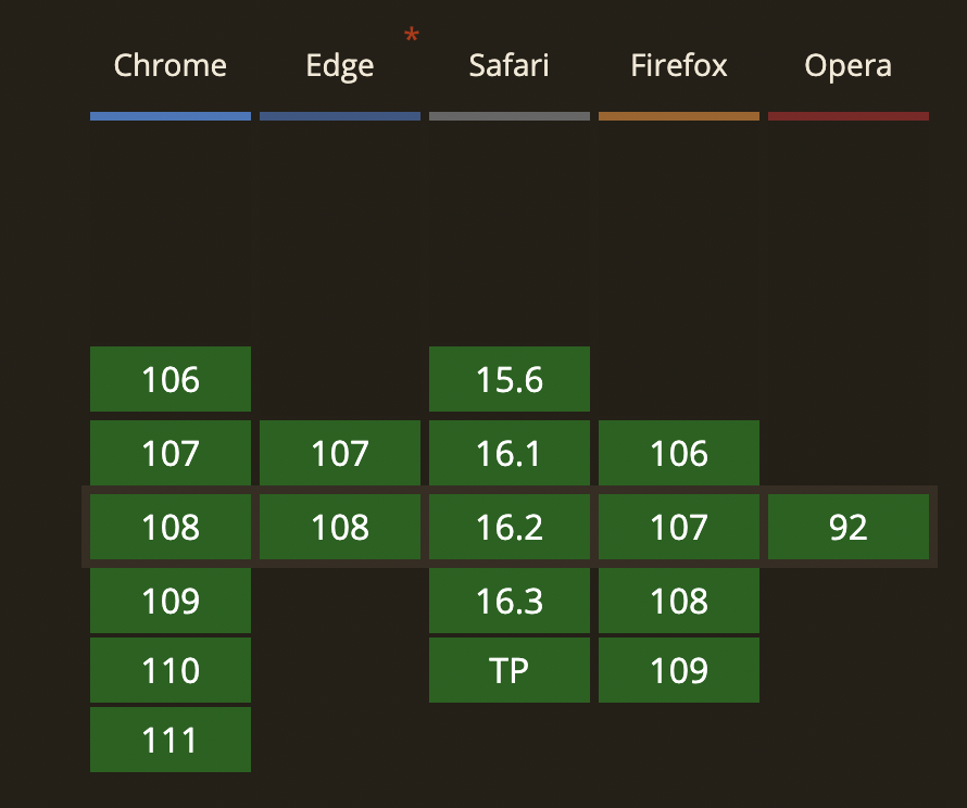
- Older versions of Internet Explorer do not support many CSS functionalities like CSS3 selectors, CSS3 Colors, CSS Namespaces, etc. Therefore it is necessary to know the CSS supported browsers. As per the information from Caniuse.com, browsers that support CSS are – Chrome (above 106), Edge (107, 108), Safari (above 15.6), Firefox (above 106) and Opera (92).
- Other common reasons that trigger cross-browser compatibility issues are:
- Incompatibility of browser with the operating system (OS).Different implementations of JavaScript
- Bugs in browsers
- Issues with page alignment
Check browser compatibility of CSS by testing websites on real browsers. All the debugging in the world will not match up to the ease and accuracy of monitoring website behavior in real user conditions. Among many other reasons, detecting browser compatibility flaws in CSS makes cross browser testing indispensable in website development.
BrowserStack offers 3000+ real browsers and devices for manual and automated website testing. Testers can simply sign up for free, pick the device-browser-OS combination they want, and start testing their website performance. It is easy enough to see what features do not render or function on which browsers – and then backtrack to the CSS to identify and resolve the issue.
Since BrowserStack only provides real browsers and devices, testers do not have to deal with the limitations of emulators and simulators. They get instant feedback on a website’s UX as it appears in the real world.
Try Cross Browser Compatibility Testing for Free
In a world where each website is accessed through multiple browsers and browser versions, developers, testers, and organizations cannot afford to alienate users of a particular browser by letting incompatible CSS escape into production.
Incorporate the information in this article when creating CSS code for website development. It will ensure that devs and testers don’t have to work as hard to provide a positive, highly optimized user experience as part of every website they create.


