With 15% of the global population living with disabilities, accessibility on websites remains a major issue. Despite this, many websites fail to prioritize accessibility.
Accessibility testing ensures that all users, regardless of their abilities or disabilities, can access and interact with web content. It promotes inclusivity, legal compliance, and better user experiences for everyone.
This guide will talk about the most common web accessibility issues that need to be addressed to ensure equal access for all users, especially those with disabilities.
10 Most Common Accessibility Issues to Solve for
Ensuring web accessibility is essential for creating an inclusive digital environment. Many websites still face common accessibility issues that prevent users with disabilities from interacting effectively with content.
Common Web Accessibility Challenges:
- Using inappropriate or unclear alternative text for images
- Poor contrast between text and background, making content hard to read
- Inconsistent or missing heading hierarchy, making navigation confusing
- Too many navigation links leading to overwhelming or confusing user experience
- Poorly structured form labels that hinder form completion and understanding
- Using non-descriptive links that do not convey their purpose or destination
- Lack of keyboard accessibility, preventing users from navigating without a mouse
- Embedding documents that are not accessible to screen readers or other assistive tools
- Neglecting mobile-first design, affecting users with mobile devices or smaller screens
- Failing to add subtitles or captions to videos, limiting access for hearing-impaired users
Identifying and addressing these issues is crucial for improving usability and ensuring equal access to information for all users. Below are the 10 most common web accessibility issues along with their solutions.
1. Inappropriate Alternative Text on Images
Alternative text (alt text) for images is a critical web accessibility element that is often overlooked. Studies, such as one from WebAIM, show that 30% of homepage banners lack alternative text. This issue has persisted for years, highlighting the ongoing challenge of ensuring proper alt text usage. Without accurate alt text, visually impaired users may struggle to understand the content conveyed by images, impacting their overall web experience.
Solution – Ensure that alt text is concise, descriptive, and relevant to the image’s context, providing clear information to assist users with visual impairments in understanding the content.
Developers can add the alt texts in any of the three ways mentioned below:
- Use the “aria-labelby” attribute when describing the image as the content of a varied component
- For a background image with a distinct tag, using the “aria-label” attribute also works
- Adding up an “alt” attribute in case the image is revealed under the“img” tag
2. Poor Contrast Text
Low-contrast text is the most common accessibility issue across many websites, making it difficult for users to distinguish the edges and shapes of elements. According to WebAIM’s analysis, 86.4% of homepages have this issue.
To address this, WCAG guidelines recommend 1.4.6 Contrast (Enhanced), 1.4.3 Contrast (Minimum), and 1.4.11 Non-text Contrast.
Solution– The text-to-background contrast ratio must be 4.5:1. You can prevent this web accessibility error by using a color contrast checker in the web design phase to make certain all background colors, text, and interactive elements have the perfect color contrast ratio.
3. Heading Hierarchy
Website users with disabilities hardly ever read an entire web page. They use AT (Assistive Technologies) to navigate the web page. A screen reader is one such Assistive technology that persons with vision impairments often use to access websites. The majority of screen reader users use headings to navigate any website. Hence, it is crucial to maintain the heading hierarchy logically (H1>H6) to ensure that users have no difficulties navigating your site.
Solution– Adhere to the correct form of headings & a separate presentation from the structure by using Cascading Style Sheets (CSS). Examples of proper use of headings:
- Use <h1> for the page’s title. Avoid using <h1> other than the title of particular pages.
- Use headings to specify & organize your content structure.
- Don’t skip heading levels (<h1> to <h3>), as screen reader users will be unsure if the content is missing.
Read More: How to Test Websites with Screen Readers
4. Too Many Navigation Links
Cluttered navigation links present a common accessibility issue that testing experts often detect. Users with visual impairments follow the navigation when they load a new webpage. However, screen readers cannot detect navigation if not coded well.
Solution – To address this, ensure ARIA roles are properly assigned to navigation menus to define their purpose and make them easily navigable. Additionally, include a Skip to Main Content link to allow screen reader users to bypass navigation and directly access the main content.
Browserstack Automate can be used to check how your website behaves by simulating the real user conditions combinations. By running accessibility tests on websites, you can ensure that your website complies with the WCAG and other crucial guidelines, thus ensuring your site is accessible to every user on the Internet.
5. Poorly Structured Form labels
Form fields without labels make it difficult for screen reader users to understand the input’s purpose, hindering accessibility.
Solution: Ensure each field has a clear, descriptive label using the <label> tag to associate it with the form field. Implement automated accessibility testing early in the QA process to ensure proper label functionality.
6. Using Non-descriptive Links
When including links in any content, use text that correctly describes where the link can go. So that, assistive technology can swiftly navigate screen readers to specific web page links. Using phrases like Read More, Click Here, or Here doesn’t make sense for a screen reader user.
Solution– When focused on creating exceptional user experiences, it is better to make your descriptive text unique and relevant.
7. Lack of Keyboard Accessibility and Navigability
Users with mobility impairments may struggle to navigate websites using a mouse or trackpad. For them, assistive technologies like voice commands or sip-and-puff devices are more accessible.
Solution – Ensure websites are optimized for keyboard navigation and logical content flow. Manual testing with screen readers can help identify issues. Tools like BrowserStack allow testing for non-visual navigation across platforms.
8. Embedding Inaccessible Documents
Accessibility issues extend to elements like documents hosted on your site. PDFs and other documents considered digital products (for example Word documents and PowerPoint presentations) should be made accessible for users with disabilities. Some of these programs have an accessibility checker built into programs to help.
Solution– Ensure that visually impaired website visitors never have to undergo a negative user experience. Start by scanning your entire website for free. When you are conducting accessibility tests, remember to keep the user experience at the forefront.
9. Forgetting about Mobile-First
Mobile-first design is critical for delivering a seamless UX across devices. It ensures accessibility is prioritized for a large segment of internet users.
Solution: Optimize websites for mobile and ensure compliance with web accessibility guidelines.
Use tools like BrowserStack’s Chrome extension for:
- Quick website audits and scans
- Automated accessibility report generation
- Free accessibility tests and trial versions.
10. Add Subtitles and Captions to Videos
Using subtitles and captions for video clips is also one of the common accessibility problems faced over the past few decades. Content creators now realize that omitting them leaves your website standing out from the crowd (obviously not in a positive sense). Deaf people necessitate some form of caption for accessing video content.
Solution– Using voice recognition software can assist in setting up subtitles and captions and make content more accessible. This isn’t just useful for someone who has deafness yet also for somebody who might need to understand video content in a public space with no headset.
Importance of Website Accessibility
Website accessibility is crucial in ensuring that all users, regardless of their abilities, can access and interact with your content effectively.
- Legal Compliance: Safeguard against lawsuits and fines by ensuring your website is accessible to all users.
- Equal Access: Provide a fair opportunity for everyone to access your site, content, and services, regardless of their abilities.
- Brand Inclusivity: Demonstrate your brand’s commitment to inclusivity and accessibility, enhancing your reputation.
- Improved User Experience: Accessible websites often provide a better experience for all users, not just those with disabilities.
- SEO Benefits: Accessibility improvements can enhance your site’s search engine optimization (SEO), leading to better visibility.
- Broader Audience Reach: By catering to diverse needs, you expand your potential audience and improve customer satisfaction.
Key Accessibility Considerations
When designing an accessible website, consider the following impairments:
- Visual Impairments: Accommodate users with low vision or color blindness.
- Seizure Risks: Ensure your website is safe for users with photosensitive epilepsy.
- Mobility Impairments: Cater to users with motor issues or wheelchair concerns.
- Auditory Impairments: Provide alternatives for users with hearing difficulties.
- Cognitive Impairments: Support individuals with conditions like dyslexia, dyspraxia, dyscalculia, and dysgraphia.
While these are key focus areas, it’s important to address other potential accessibility issues to create a truly inclusive experience.
Four Key Principles of Accessibility
Before diving into common web accessibility issues, it’s essential to first understand the Web Content Accessibility Guidelines (WCAG). These guidelines outline a comprehensive set of accessibility standards, organized around four key principles:
- Perceivable: Ensure content is accessible to all users, with text alternatives for non-text content, captions for multimedia, and assistive technology compatibility.
- Operable: Make all functionality accessible via keyboard, allow enough time for content interaction, avoid seizure-triggering content, and facilitate easy navigation.
- Understandable: Create clear, readable text, ensure predictable content behavior, and help users avoid and correct errors.
- Robust: Boost compatibility with existing and future user tools, ensuring long-term accessibility.
How to run Quick Accessibility Tests on BrowserStack?
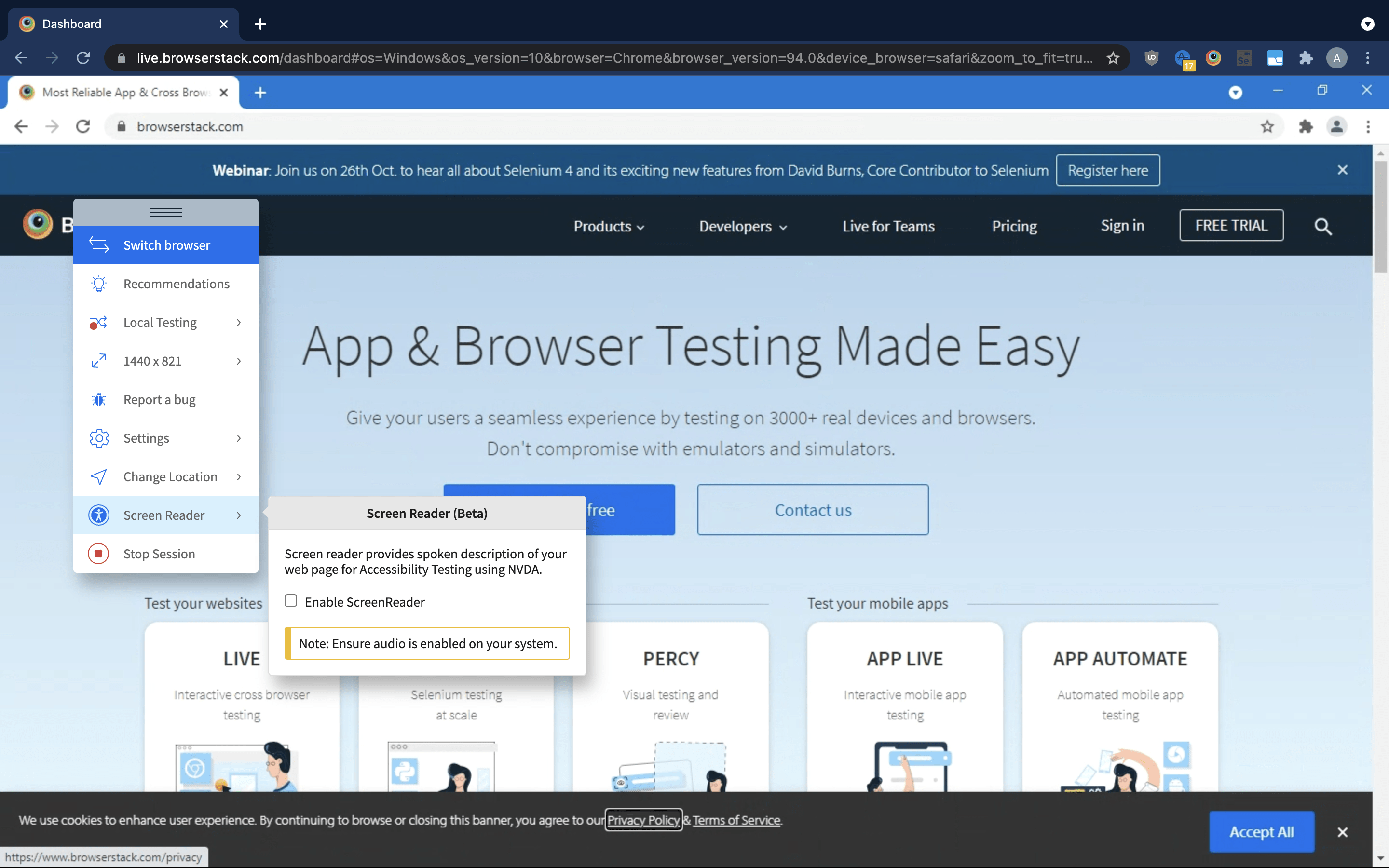
Ensure that visually-impaired visitors never have to suffer a bad user experience. Employ BrowserStack’s Live Screen Reader feature for desktop (macOS &Windows) sessions for manual testing, non- usability, and visual navigation of websites.
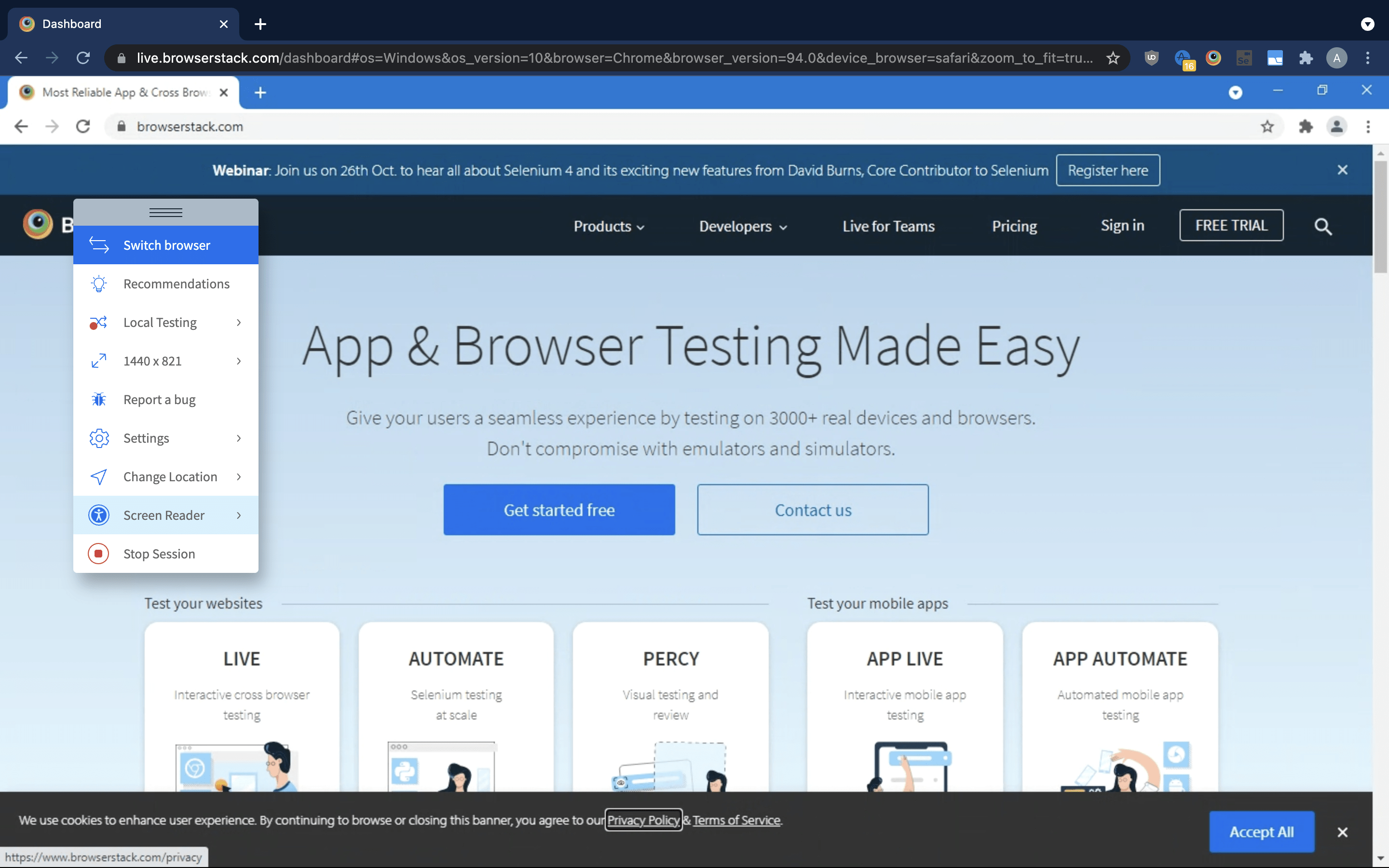
Step 1: Ensure that audio is turned on on your preferred machine or device. Screen Reader for a macOS or Windows session in Live can be easily turned on by accessing the option called Screen Reader from the drop-down in-session toolbar.
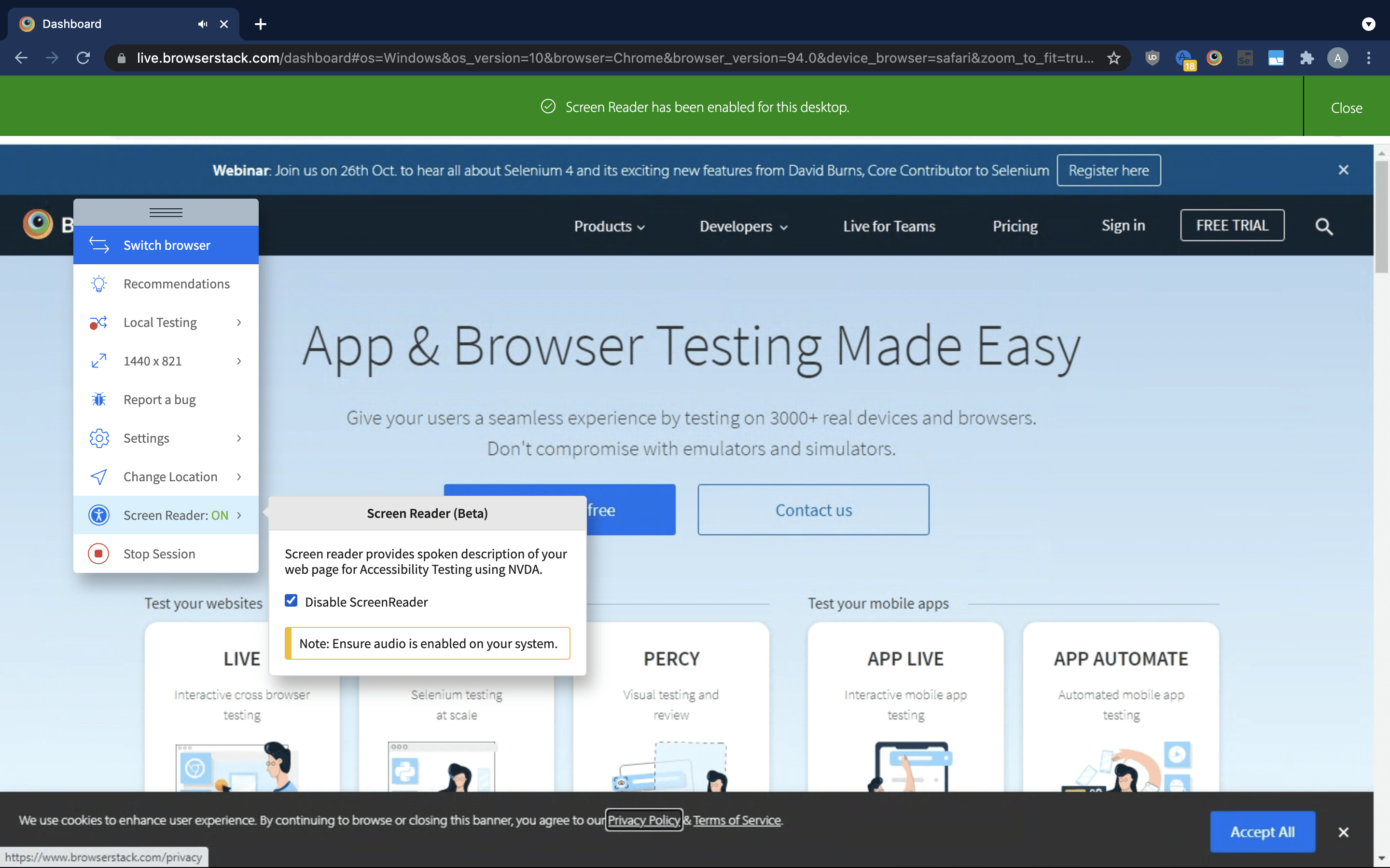
Step 2: Checking on the Enable ScreenReader checkbox, hover and enable the ScreenReader trait that will start after a few seconds
Try Accessibility Testing on Real Device Cloud
You can also head into Automated Accessibility Tests
- To run automated accessibility testing, you can easily make use of axe, a lightweight and fastest tool that checks your site against accessibility guidelines and rules and produce a report highlighting the violations.
- By running automated accessibility testing on sites with Automate and axe, you can scrutinize if a website complies with the WCAG and other guidelines, ensuring your site is accessible to all users (counting disabled people) on the Internet.
All accessibility tests on BrowserStack will be implemented on real devices and browsers– both the newest & older models. This counts multiple versions of all major browsers (Chrome, Edge, Firefox, Safari, Internet Explorer, and more) as well as 1000s of desktop and mobile devices (Windows, Android, iOS,). You won’t have to restrict your tests with the insufficiencies of simulators and emulators.
Conclusion
Designing your website with accessibility will help you cater content to your whole audience without leaving anybody behind and ensure that your audience has a flawless experience navigating your website, irrespective of their disabilities.
In a nutshell, by increasing web accessibility, we’ll ultimately ensure that everybody can gain equal access to the digital world and its rich bounty of resources.
