Many teams assume that testing a website on a handful of popular screen sizes is enough to ensure a good user experience.
I used to think the same, until a layout that looked flawless on my laptop and phone started breaking on tablets and smaller mobile devices.
I remember spending hours adjusting breakpoints and media queries, only to realize the problem wasn’t the implementation but the lack of visibility into how users actually view the site across different screen resolutions.
That moment changed how I approached responsive design and testing.
Understanding common screen resolutions, and testing across them, became critical to delivering a consistent experience.
Overview
Screen resolution refers to the number of pixels displayed on a screen, usually expressed as width × height, and it determines how content is rendered and viewed across different devices.
Why Screen Resolutions Matter:
- Different screen resolutions affect layout, readability, and usability across devices
- Poor resolution handling can cause misaligned elements, hidden content, or broken layouts
- Testing across common resolutions helps ensure a consistent and accessible user experience
Top Common Screen Resolutions Worldwide
- Desktop: 1920×1080, 1366×768, 1536×864, 1280×720
- Mobile: 360×800, 390×844, 393×873, 412×915
- Tablet: 768×1024, 1280×800, 800×1280, 820×1180
This article explores common screen resolutions in 2026 across mobile, desktop, and tablet, why they matter, and how to test and design for them effectively.
What is Screen Resolution?
Screen resolution defines the sharpness and detail of your screen. Resolution can also be understood as a collection of pixels that make an image. By designing applications to adapt to different resolutions, you can guarantee a smooth and enjoyable experience for users on all kinds of devices.
Higher resolutions provide sharper images and more detailed graphics, enhancing readability and overall aesthetics. Conversely, lower resolutions can result in blurred or pixelated visuals, making it difficult to read text and view images clearly.
As screen resolution testing expands across multiple devices and form factors, validating layouts locally becomes limiting.
Platforms BrowserStack enables teams to test web applications across real devices and screen resolutions, ensuring visual clarity and responsive behavior without maintaining physical hardware.
Why Screen Resolutions Matter?
Screen resolution should matter to you while testing your web application because of the following reasons:
- Visual clarity: Sharp and clear text in images, text, and other visual elements ensures higher screen resolution resulting in better user experience.
- Seamless user experience: As smartphone adoption increases, the types of devices and the screen sizes differ, making it essential to test across screen sizes.
- Accessibility: Ensuring your web application is accessible with screen readers, etc is more important now than ever.
- Responsive design: Modern web design often involves responsive layouts that adapt to different screen sizes.
Read More: Top 25 Essential Website Testing Tools
Top Screen Resolutions Worldwide
When you are testing your web application, due to device fragmentation identifying which device sizes one must use to ensure maximum coverage is important.
Here are the top most common screen resolution sizes are:
- 1920×1080 (Full HD) – Widely used for desktops, laptops, and larger smartphones.
- 1366×768 – Common in budget laptops and older displays.
- 1440×900 – Popular among older and mid-range monitors.
- 1536×864 – Found in some mid-range laptops.
- 1280×720 (HD) – Standard for lower-end laptops and entry-level monitors.
- 1600×900 – Used in mid-range laptops and monitors.
- 2560×1440 (QHD) – Preferred for high-end monitors and some premium devices.
- 3840×2160 (4K UHD) – Common for high-resolution monitors, TVs, and premium laptops.
- 1360×768 – Found in budget laptops and older TVs.
- 768×1024 – Used in tablets and small monitors.
- 1024×768 – Common in older monitors and tablets.
- 320×480 – Typical for older or smaller smartphones.
- 360×640 – Common for low-end smartphones.
- 414×896 – Seen on some iPhone models (for example, iPhone 11).
- 375×812 – Standard for iPhone X and similar models.
- 412×915 – Popular on mid-range Android smartphones.
- 390×844 – Standard on iPhone 14 Pro models.
- 828×1792 – Common on iPhone XR and similar models.
- 1284×2778 – Used in high-end iPhones like the iPhone 14 Pro Max.
- 1440×3200 – Found on premium Android devices like the Samsung Galaxy S series.
- 1206×2622 pixels – Used in high-end iPhones like the iPhone 16 Pro.
- 1320×2868 pixels – Used in high-end iPhones like the iPhone 16 Pro Max.
- 1080×2400 pixels – Common on devices like the Google Pixel 8.
- 1080×2424 pixels – Standard on the Google Pixel 9.
Common Screen Resolutions for Desktop
If you making a decision about the most common screen resolutions for Desktops, see the following:
- 1920 x 1080
- 1366 x 768
- 1536 x 864
- 1280 x 720
- 1440 x 900
- 1600 x 900
Common Screen Resolutions for Mobile
For common screen resolutions for mobile, see the following:
- 360 x 800
- 390 x 844
- 393 x 873
- 412 x 915
- 414 x 896
- 360 x 780
Common Screen Resolutions for Tablet
With the popularity of tablets rising worldwide, if you want to identify the common screen resolutions for tablet, see the following:
- 768 x 1024
- 810 x 1080
- 820 x 1180
- 1280 x 800
- 800 x 1280
- 601 x 962
Mobile vs Desktop vs Tablet Screen Resolutions
Here is a comparison between mobile, desktop, and tablet screen resolutions and how they differ.
| Device Type | Resolution Range (Width x Height) | Aspect Ratio | Typical Orientation | Pixel Density (ppi) |
|---|---|---|---|---|
| Desktop | 1024 x 768 – 5120 x 2880 | 16:9 (most common), 4:3 (older models) | Landscape (primary), Portrait (supported) | Low to High (100 – 300+) |
| Mobile | 320 x 480 – 1440 x 3200 | 9:16 (common), 4:3 (older models) | Portrait (primary), Landscape | High (260 – 600+) |
| Tablet | 768 x 1024 – 2560 x 1600 | 4:3, 16:9 | Portrait (common), Landscape | Medium (170 – 350) |
How to Test Website on Different Screen Resolutions using BrowserStack?
BrowserStack Live is a cloud-based cross-browser manual testing platform that allows teams to interactively test and debug websites and web applications on 3500+ real desktop and mobile browser combinations.
It enables testers to see exactly how an application behaves across different devices and screen resolutions in real time.
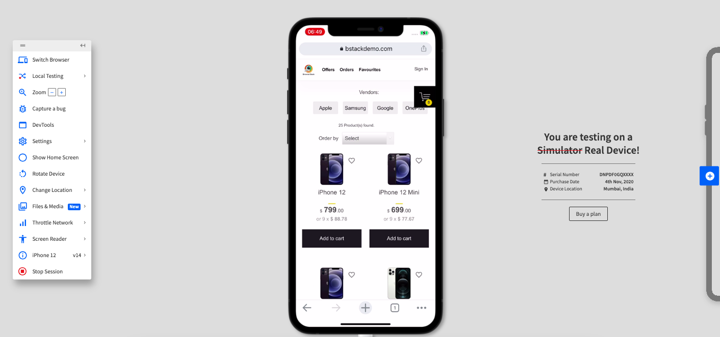
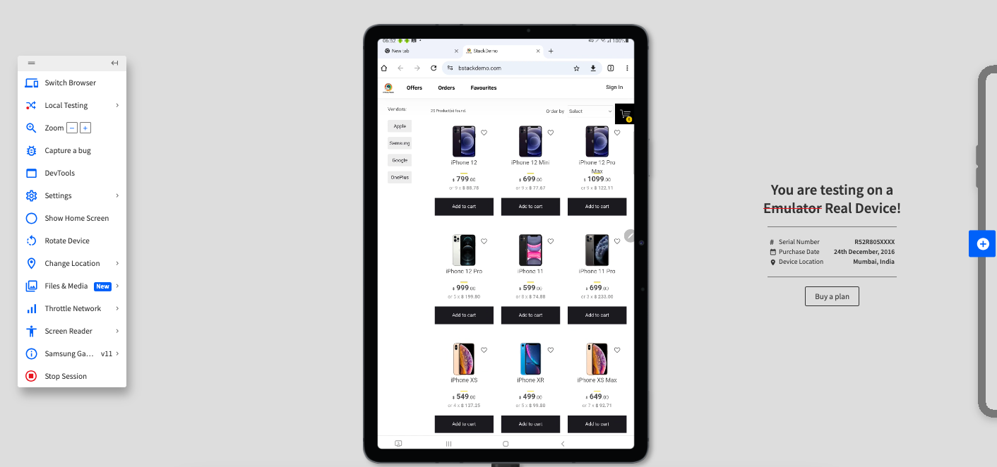
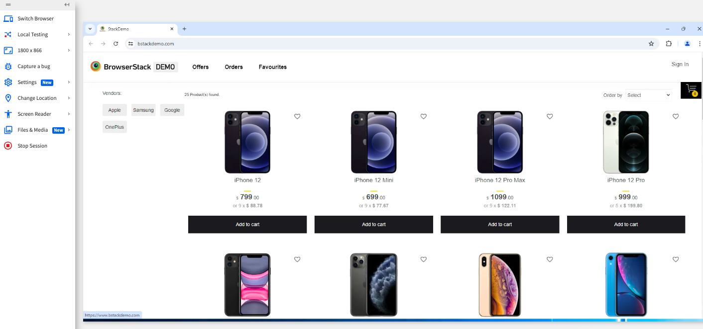
In this example, we’ll navigate to www.bstackdemo.com to observe how varying screen resolutions impact the user experience. By using the Chrome browser across different devices, you can clearly see how a responsive web application adapts its layout as screen sizes change.
To test your application across different screen resolutions using Live, do the following:
Step 1. Sign up on BrowserStack Live for a free trial or purchase a plan.
Step 2. Navigate to the Live Dashboard after successful sign-up.
Step 3. Click iOS > iPhone 12, and then select Chrome
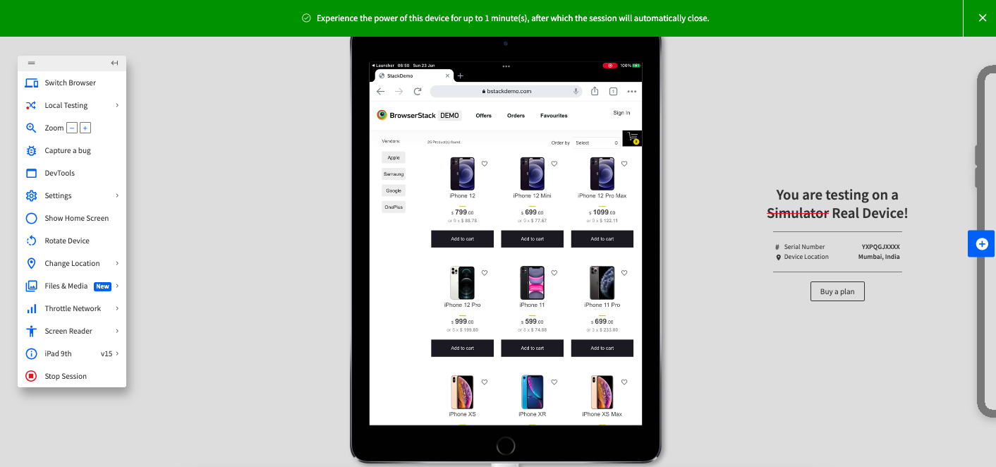
Step 4. Click Switch Browser, and then click iOS > iPad 9th.
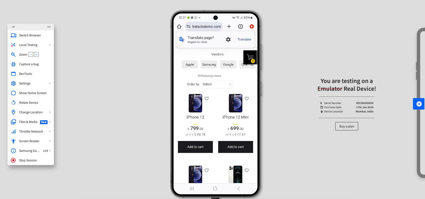
Step 5. Click Switch Browser, and then click Android > Samsung S24.
Step 6. Click Switch Browser, and then click Android > Samsung Galaxy Tab S7.
Step 7. Click Switch Browser, and then click Windows > 11> Chrome 126.
As you see, a web application that is responsively created optimizes the screen as you change the devices. BrowserStack Live makes it easy to switch between devices and browsers without adding the overhead of maintaining the repository of these devices.
5 Best Practices for Implementing Responsive Design
If you are starting your journey of implementing responsive design, consider the following best practices before you begin:
- Prioritize mobile-first testing: Begin by conducting initial website testing on mobile devices such as smartphones and tablets. Because a large number of users visit websites using mobile devices, this step ensures a seamless user experience for most visitors.
- Define breakpoints and test thoroughly: Breakpoints are specific screen widths where the layout changes. Work closely with developers to understand these breakpoints and test the site at each one to ensure smooth transitions across devices. According to Kevin Powell, a CSS Educator, relying only on fixed breakpoints isn’t enough, continuously resizing the viewport helps uncover layout issues that appear between breakpoints and are often missed when testing only popular screen sizes.
- Try resolutions other than popular resolutions: Avoid limiting testing to popular screen sizes. While testing at popular resolutions is crucial, utilize emulators or cloud-based testing tools to examine a broader range of resolutions, including those that are less common. This approach helps to pinpoint potential layout issues on less typical devices.
- Utilize Responsive Design Testing Tools: Explore cloud-based testing platforms that provide real device testing on a wide array of devices and browsers. This approach can greatly enhance your testing effectiveness and breadth.
Responsive Web Design for seamless UX across Screen Resolutions
When you start designing your applications, consider the following so that your application gives a seamless UX experience for users across devices.
- Flexible layouts: Use fluid grids and percentage-based widths to ensure elements adjust automatically across different screen sizes.
- Media Queries: Apply CSS media queries to create styles for specific screen resolutions, enhancing adaptability.
- Test across various devices: Test across devices so that you can identify any issues during testing.
- Mobile-first design: Prioritize mobile design and progressively design for increasing sizes. Smaller screens have lesser screen area to play around with so this approach helps reduce issues later.
- Viewport meta tag: Set the viewport meta tag for proper scaling on different devices, improving readability and layout consistency.
- Touch-friendly elements: Ensure buttons and interactive elements are appropriately sized for touch screens, improving usability.
Read More: How to create a Responsive Website
Why Choose BrowserStack Live to test Websites on Different Screen Resolutions?
Testing screen resolution behavior locally is often limited by the number of devices and browsers available. BrowserStack Live removes this constraint by providing instant access to real devices and browsers, allowing teams to validate responsive behavior under real-user conditions.
BrowserStack Live is ideal for screen resolution testing because it:
- Provides access to 3500+ real desktop and mobile browser combinations, not emulators
- Allows interactive, real-time testing to quickly spot layout and UI issues
- Makes it easy to switch between different screen sizes and resolutions on the fly
- Helps validate responsive designs across mobile, tablet, and desktop devices
- Enables quick debugging with developer tools and live inspection
- Eliminates the need to maintain physical devices or local test infrastructure
With BrowserStack Live, teams can confidently ensure their websites deliver a consistent and accessible experience across all screen resolutions users rely on.
Conclusion
Testing across multiple devices using browser developer tools can help validate a few popular screen sizes, but this approach quickly falls short when your application is built for a wide and diverse user base.
Relying on limited device coverage can lead to missed layout issues and inconsistent user experiences.
BrowserStack Live goes beyond basic testing by providing access to 3500+ real browser and device combinations, along with powerful features such as media injection, payment workflows, physical SIM support, location settings, and local testing.
Together, these capabilities help teams deliver a consistent, high-quality user experience across all screen resolutions and devices.
