Browser compatibility with CSS Gradients
By The Nerdy Geek, Community Contributor - December 2, 2022
Visual aesthetics are vital for customer engagement. Using different CSS properties, developers make websites look visually pleasing and engaging to drive more users and retain them. One such property is Gradients in CSS. CSS Gradients have empowered developers to display a smooth transition between numerous colors for creating beautiful backgrounds.
What are CSS Gradients?
CSS is basically a way to add style to various web documents. Gradients in CSS help in creating those various styles of images, which ultimately makes your websites attractive and user-friendly.
Gradients in CSS are a special type of image, which are made up of smooth and progressive transitions between two or more colors. An important attribute to note about CSS Gradients is that they belong only to data type and, as a result, can only be applied to background-image properties rather than other CSS properties like background-color or color.
Why use Gradients in CSS?
CSS Gradients are a special type of image that has a progressive transition of colors in different patterns (discussed below). It is mainly used for backgrounds as an <image>. Prior to CSS Gradients, developers had to use images to create such effects, which had the massive drawback of slowing down the website’s performance. But with CSS Gradients, the performance, as well as resolution, were both improved and simplified. It replaces the need for Raster Images to create patterns in the background by giving the option to generate dynamic gradients.
Gradients in CSS are not only used for headers or backgrounds but also for text, buttons, borders, etc. With their wide usage and applications, they have now become a crucial aspect when it comes to UI designs and can play a major role in attracting users to web pages.
CSS gradients do not have any intrinsic dimensions defined as such. In simple terms, they do not have a specific size or ratio. They simply adapt to the dimension of the element they have been applied to.
This article discusses CSS Gradients, their types, examples, and the browser compatibility range that these gradients offer.
Types of CSS Gradients
Here are the three major types of gradients defined by CSS:
- Linear Gradients (goes up/down/left/right/diagonally)
- Radial Gradients (defined by their center)
- Conic Gradients (rotated around a center point)
CSS Linear Gradients
CSS Linear Gradients are used for creating smooth transitions between colors along a straight line. Linear Gradients can move in– up, down, left, right, or diagonal directions. To create a linear gradient, you need a minimum of two colors, also known as Color Stops. We can also optionally set a starting point and specify a direction (or an angle) along with the gradient effect.
Syntax
background-image: linear-gradient(direction, color-stop1, color-stop2, ...);
Top to Bottom Linear CSS Gradients (Default)
The below example shows a Linear CSS Gradient which starts at the top. It starts from red on the top and transitions to yellow on the bottom.
Example
#grad {

  background-image: linear-gradient(red, yellow);

}
Left to Right Linear CSS Gradients
The below example shows a Linear CSS Gradient that starts from the left. It starts from red on the left and transitions to yellow on the right.
Example
#grad {

  background-image: linear-gradient(to right, red , yellow);

}
Diagonal Linear CSS Gradients
Diagonal Gradients can be made by specifying both the vertical and horizontal starting positions. The below example shows a Linear CSS Gradient that starts at the top left from the red and transitions to the bottom right towards yellow.
Example
#grad {

  background-image: linear-gradient(to bottom right, red, yellow);

}
There are a few other types of Linear Gradients where you can use Angles, Transparency and even multiple colour stops.
Read More: How to Create Browser-Specific CSS Code
CSS Radial Gradients
CSS radial-gradient() function is used to create a smooth and progressive transition between two or more colors radiating from a single point of origin called center instead of a straight line which was the case with CSS linear gradients. By default, the shape of Radial Gradients is elliptical.
A Radial CSS Gradient starts from center and radiates outwards to form concentric shapes which would be in the form of circles or ellipses. Similar to Linear Gradients, in order to create a radial gradient also needs to define at least two color stops.
Syntax
background-image: radial-gradient(shape size at position, start-color, ..., last-color);
CSS Radial Gradient with evenly spaced Color Stops (Default)
The below example shows a CSS Radial Gradient with evenly spaced color stops
Example
#grad {

  background-image: radial-gradient(red, yellow, green);

}
CSS Radial Gradient With Differently Spaced Color Stops
The below example shows a CSS Radial Gradient with differently spaced color stops:
Example
#grad {

  background-image: radial-gradient(red 4%, yellow 16%, green 60%);

}
With CSS Radial Gradients, you can further set the shape and size of the gradients using the Shape and Size keywords.
Setting the shape of a Radial Gradient
The below example shows setting a CSS Radial Gradient with the shape of a circle:
Example
#grad {

  background-image: radial-gradient(circle, red, yellow, green);

}
Setting size of a Radial Gradient
The size parameter of CSS Radial Gradient can take 4 values.
- closest-corner
- farthest-corner
- closest-side
- farthest-side
The below example shows how you can use the size parameter.
Example
#grad1 {

  background-image: radial-gradient(closest-side at 59% 56%, red, yellow, black);

}

#grad2 {

  background-image: radial-gradient(farthest-side at 59% 56%, red, yellow, black);

}
CSS Conical Gradients
CSS Conical gradient is a gradient with color transitions rotated around a center point. By default, the angle of Conical Gradients is 0 (Zero) degrees, and the position is center.
If no degree is specified, the colors will be spread equally around the center point. Conical Gradients are very similar to Radial Gradients, the only difference being, that Radial Gradients create a pattern in which color stops radiating outwards starting from the center position, but Conical Gradients, color stops are placed around the center of origin.
Syntax
background-image: conic-gradient([from angle] [at position,] color [degree], color [degree], ...);
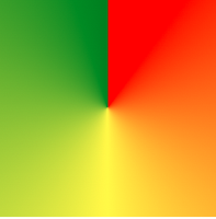
Basic CSS Conic Gradient with Three Colors
The below example shows a basic CSS Conical Gradient with three colors:
Example
#grad {

  background-image: conic-gradient(red, yellow, green);
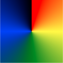
CSS Conical Gradient with Five Colors
The below example shows a CSS Conical Gradient with five colors:
Example
#grad {

  background-image: conic-gradient(red, yellow, green, blue, black);

}
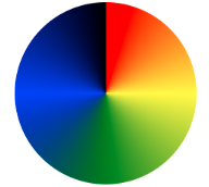
CSS Conical Gradient Pie Charts
You can make Pie Charts using Conical Gradients by just adding border-radius: 50% as shown below.
Example
#grad {

  background-image: conic-gradient(red, yellow, green, blue, black);

  border-radius: 51%;

}Limitation of CSS Gradients
One of the biggest limitations of CSS Gradients is that it does not support all browsers and their versions completely, especially the Conical Gradients, which do not support older versions of browsers. Developers need to find workarounds in the code to ensure a seamless user experience. Let’s understand how to make Cross Browser Compatible CSS Gradients in the section below.
Browser Compatibility Tests for CSS Gradients
With CSS Gradients and the provision of various Color Stops, it becomes crucial to support cross-browser compatibility tests in order to ensure that there is a seamless and same user experience along all supported browsers.
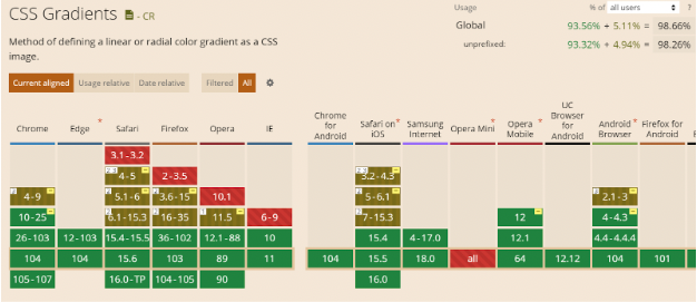
Let us understand the browser compatibility of the various CSS Gradients discussed in previous sections by using caniuse.com which lists the compatibility of different browser versions for CSS Gradients.
Browser Compatibility For Linear Gradients
As seen below, almost all desktop browsers including Microsoft Edge and IE11 provide browser support for Linear CSS Gradients. Except for a few older versions of Safari, Firefox, Opera, and IE, which do not support Linear CSS Gradients, overall it enjoys a quite vast browser support from different browsers.
Caniuse Cross browser compatibility table for CSS Linear Gradients
Source: Caniuse.com
Browser Compatibility For Radial Gradients
Radial CSS Gradients also enjoy the same browser support as CSS Linear Gradients as seen above, and thus, offer great cross-browser compatibility. All modern browsers like Chrome, Firefox, Opera, Safari, and Edge support Radial CSS Gradients; while the newer versions provide full support, some older versions provide partial or no support.
Caniuse Cross browser compatibility table for CSS Radial Gradients
Source: Caniuse.com
Also Read: How to test on older browser versions easily
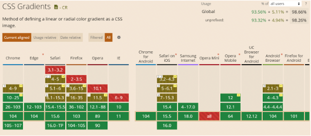
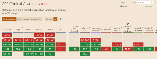
Browser Compatibility For Conical Gradients
CSS Conical gradients are supported by most of the new browser versions; however, as you can see below, most of the older versions of browsers such as Chrome, Edge, Firefox, Opera, and Safari do not support CSS Conical Gradients. While browsers like IE, Opera Mini, and UC Browser for Android do not support CSS Conical Gradients at all. Hence, cross-browser compatibility tests are more pivotal in case your web page is making use of Conical Gradients.
Caniuse Cross Browser Compatibility table for CSS Conical Gradients
Source: Caniuse.com
The above images clearly emphasize the need for Browser Compatibility tests for web pages making use of CSS Gradients.
But, maintaining a lot of devices and browsers is not a cakewalk and can cost a lot of time and effort. It is important to choose between Build vs Buy, when it comes to testing on real devices. Buying a subscription of real device cloud like BrowserStack can help you get rid of the task of maintaining those devices and can actually focus on the testing cycle.
BrowserStack gives you access to 3000+ browsers and real devices (mobile and desktop), providing wide coverage for Cross Browser & Platform Testing. QAs can also leverage the power of automation testing to check cross-browser compatibility with BrowserStack as it integrates with most of the test automation frameworks such as Selenium, Cypress, Playwright, Puppeteer, WebdriverIO, TestCafe, etc., saving both time and cost incurred.
You can also save time by using parallel testing to run tests on different browser-device combinations simultaneously with BrowserStack. This allows devs and testers to build applications to retain and delight users through its seamless user experience.


