Variable fonts offer a flexible and efficient way to deliver rich typographic styles through a single font file, reducing load times and improving scalability. However, their effectiveness depends on how well they are supported across browsers.
Overview
What are Variable Fonts?
Variable fonts are a type of OpenType font that combine multiple font styles and weights into a single file.
Unlike static fonts, which require separate files for each style, variable fonts use adjustable axes to deliver multiple variations with better performance and flexibility.
Benefits of Variable Fonts
- Reduce page load times by minimizing HTTP requests
- Allow smoother transitions between font weights and styles
- Improve design responsiveness and accessibility
- Enable more consistent typography across devices
Ensuring Browser Compatibility for Variable Fonts
To ensure variable fonts render consistently across browsers and devices, thorough testing is essential. BrowserStack allows developers to preview and validate font behavior on a wide range of real devices and browsers, without relying on emulators.
It helps identify rendering issues early, verify fallback behavior, and ensure a seamless typographic experience for all users.
This article covers what variable fonts are, how they function, and their key advantages. It also addresses browser compatibility considerations, approaches for supporting older browsers, and how to use variable fonts with Google Fonts.
What are Variable Fonts?
Variable fonts are a modern type of font that allows multiple styles (such as weight, width, or slant) to be contained in a single file.
Unlike traditional fonts, which require separate files for each style or weight, variable fonts use a set of axes to enable dynamic changes in these properties. This makes them highly versatile and efficient, as a single variable font can replace several static fonts, reducing file size and HTTP requests.
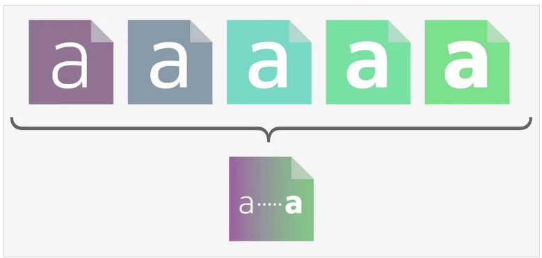
For example, a single variable font file can include variations like light, regular, bold, and italic, with users able to smoothly transition between these styles based on design needs.
Source: Type01
Variable Fonts vs. Static Fonts
Static fonts are individual font files for each variation (e.g., regular, bold, italic), requiring multiple files to achieve different styles. In contrast, variable fonts store all these variations in one file, using adjustable axes for flexibility in weight, width, and other properties.
| Aspect | Static Fonts | Variable Fonts |
|---|---|---|
| File Size | Multiple files for each style | Single file for all variations |
| Flexibility | Limited to predefined styles | Adjustable properties (weight, width, etc.) |
| Performance | Slower load times due to multiple requests | Faster load times with fewer requests |
| Design Control | Fixed styles | Precise, dynamic control over typography |
To ensure variable fonts render consistently across different browsers and devices, testing their compatibility in real user conditions is essential.
BrowserStack enables teams to do this effectively by providing access to a wide range of real browsers and devices, helping catch rendering issues early and ensuring a seamless typographic experience.
Advantages of Variable Fonts
Variable fonts offer several benefits, making them a powerful choice for modern web design and development. By combining various font styles within one file, they improve performance, design flexibility, and user experience.
Key Advantages:
- Improved Performance: Variable fonts reduce the number of font files needed, which minimizes HTTP requests and decreases page load times.
- Design Flexibility: Designers can fine-tune properties like weight, width, slant, and optical size along continuous ranges, enabling smoother transitions and more responsive typography.
- Reduced File Management: Instead of managing separate files for each font style, teams work with a single file, simplifying development and maintenance.
- Enhanced Responsiveness: Variable fonts adapt more easily to various screen sizes and resolutions, making them well-suited for responsive layouts.
- Accessibility Support: With more control over font weight and spacing, designers can create text that is easier to read, supporting better accessibility.
- Smoother Animations: Since font properties can be animated along axes, variable fonts enable more fluid text animations with minimal performance cost.
How do Variable Fonts work?
Variable fonts include five registered axes that define the variations within a typeface. In this context, axes refer to adjustable parameters such as weight, width, and slant that connect different styles within a single font family.
A variable font allows continuous variation along these axes, enabling a virtually infinite number of style combinations from a single file. This flexibility applies across all supported axes and offers precise control over typography.
Source: Variable Fonts
1. Weight
This axis determines the weight of the font. Weight defines the design axis of how thin (light) or thick (dark) the strokes of the letterforms can be. The number ranges from 1 to 1000 depending on the different fonts. This gives the designer more options to choose from.
CSS Value = wght
Syntaxes:
- font-weight:<weight> ;
- font-variation-settings: ‘wght’ <weight>;
An example for the typeface Roboto Flex is given below:
.roboto-flex {

font-family: “Roboto Flex”;

font-variation-settings: 'wght' 400; }
2. Width
This axis determines the width of the font. The width refers to how relatively narrow or wide a font is in relation to the normal design. The number ranges from 1 to 1000 depending on the different fonts and is expressed as a percentage.
CSS Value = wdth
Syntaxes:
- font-stretch: <width>%;
- font-variation-settings: ‘wdth’ <width>;
An example for the typeface Roboto Flex is given below:
.roboto-flex {

font-family: “Roboto Flex”;

Font-stretch: 151%;  }
3. Italic
This axis controls if the font will be in Italic style or not i.e. it is meant to be an on/off switch: value 0 is off and will show the regular (upright) style, and value 1 will show the italics.
CSS Value = ital
Syntaxes:
- font-style: italic;
- font-variation-settings: ‘ital’ <switch value>; // 0 or 1
An example below:
.italic {

font-variation-settings: 'ital’ 1;  }
4. Slant
This axis controls the slant of the letters. It is often referred to as ‘oblique’. It changes the angle of the letterforms. By default, the value is 0. Any value between -90 to 90 is valid.
CSS Value = slnt
Syntaxes:
- font-style: oblique <degree>deg;
- font-variation-settings: ‘slnt’ <degree>;
An example for the typeface Roboto Flex is given below:
.roboto-flex {

font-style: “Roboto Flex”;

font-variation-settings: 'slnt’ 10;  }
5. Optical Size
This axis adjusts the overall stroke thickness of letterforms based on their physical size. At smaller sizes (such as 10 or 12px), characters have thicker strokes and subtle modifications to enhance readability.
At larger sizes (such as 48 or 60px), the design reveals greater contrast between thick and thin strokes, reflecting the typeface’s original intent more clearly.
CSS Value = opsz
Syntaxes:
- font-optical-sizing: auto; // none or auto
- font-variation-settings: ‘opsz’ <size>;
- font-size: <size>
- font-variation-settings: ‘opsz’ <size>;
Below is letter ‘a’ in Roboto Flex at different pixel sizes, then scaled to be the same size, shows the differences in design:
Example:
The following CSS would cause text to be displayed at a large size, but at an optical size as if it were printed in 8px:
.small-and-large {

  font-size: 100px;

  font-variation-settings: 'opsz' 8; }
6. Using Custom axes
Custom axes are not mapped to the existing CSS property and are always set through font-variation-settings. Their tags are ALWAYS in UPPERCASE to distinguish them from registered axes. There are a variety of custom axes that can be used by designers. You can find them here. This section only focuses on GRAD.
7. GRAD
This axis changes the weight of the font without changing the widths, so line breaks do not change. They act as a sort of “equalizer”—a way of visually correcting a typeface across workflows, so it appears the same in every environment. It can also be handy for responding to low-resolution screens, where the type can easily become spindly.
CSS Value = GRAD
Syntax:
- font-size: <size>
font-variation-settings: ‘GRAD’ <number>;
Examples for the typeface Roboto Flex (range of -200 to 150) are given below:
.grade-light {

font-variation-settings: `GRAD` -200;  }
.grade-heavy {
font-variation-settings: `GRAD` 150; }Read More: Responsive Web Design Trends
Browser Compatibility for Variable Fonts
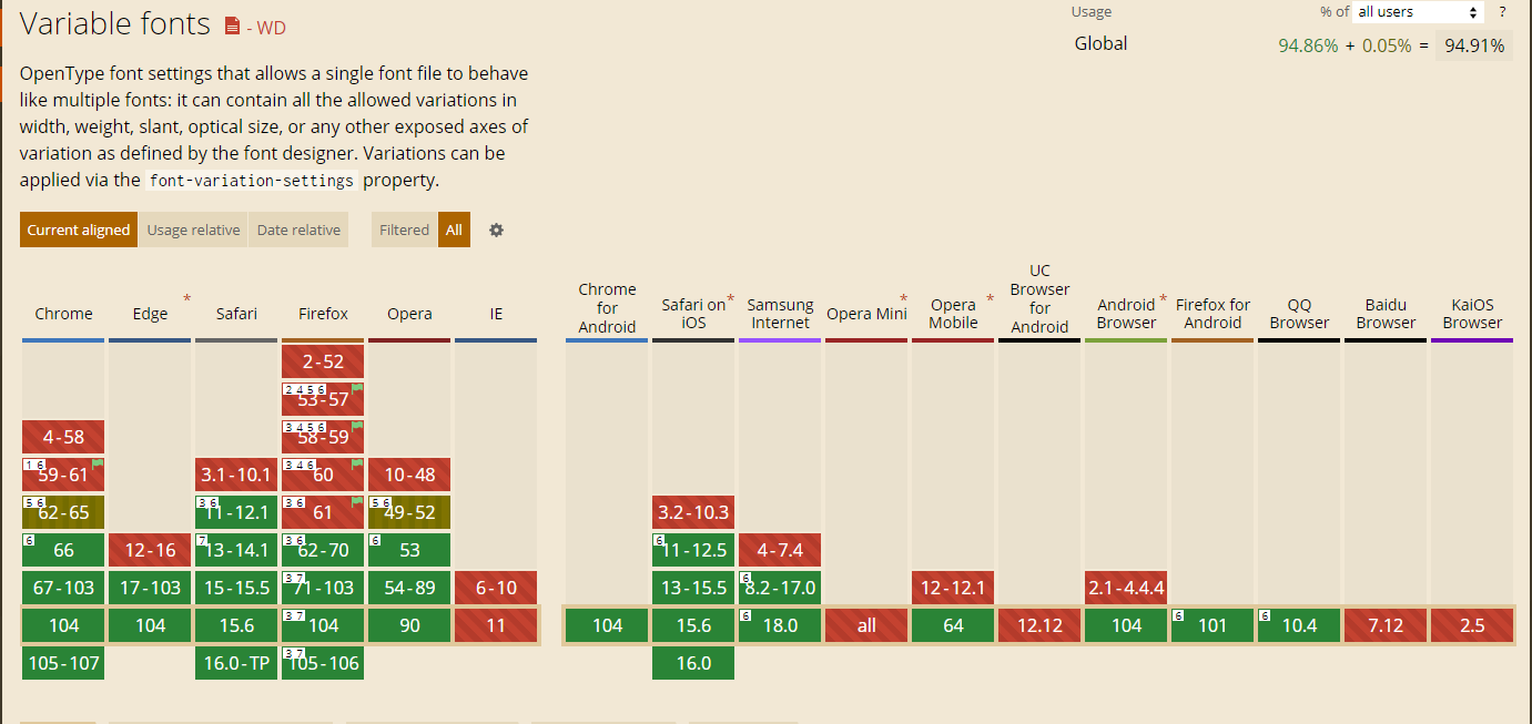
Browser compatibility is essential for users to have a consistent experience as they operate across different browsers, devices, and platforms. The browser versions’ support for Variable Fonts can be analyzed using Caniuse.com as shown below:
- It can be observed that Chrome, Edge, Safari, Opera, Chrome for Android, Safari on iOS, Opera Mobile, and Android Browser are fully compatible with Variable Fonts.
- As for Firefox 105-106, it is fully compatible only when the requirements – Require macOS 10.13 High Sierra or later or Windows 10 1709 “Fall Creators Update” or later – are fulfilled with the exception that it doesn’t support OpenType-CFF2 fonts.
- Samsung Internet 18.0, Firefox for Android, and QQ Browser also don’t support OpenType-CFF2 fonts.
Hence, it is recommended to perform diligent cross-browser compatibility tests on these browsers to identify bottlenecks and limited capabilities. These limitations can be overcome by tweaking code to match the overall user experience across browsers.
BrowserStack helps streamline this process by offering instant access to 3500+ real browser and device combinations, enabling accurate testing and faster debugging in real-world conditions.
With support for automation frameworks and parallel testing, teams can quickly validate font behavior across multiple browser-device combinations, saving time and ensuring a consistent user experience.
Working with Old Browsers
In case you need to support older browsers, you can choose to build your site with static fonts, and use variable fonts as progressive enhancement.
Example of setting Roboto for Old Browser (regular, bold only) below:
@supports not (font-variation-settings: normal) {

  @font-face {

    font-family: Roboto;

    src: url('Roboto-Regular.woff2');

    font-weight: normal;

  }

  @font-face {

    font-family: Roboto;

    src: url('Roboto-Bold.woff2');

    font-weight: bold;

  }

  body {

    font-family: Roboto;

  }

  .super-bold {

    font-weight: bold;

  }

}
Working with Google Fonts
If you are using the Google Fonts API, it will take care of loading the proper fonts for your visitor’s browsers.
Example: A request for Font Oswald in weight range 200 to 700 will look something like this:
<link href=”https://fonts.googleapis.com/css2?family=Oswald:wght@200..700&display=swap” rel=”stylesheet”>
Conclusion
Variable fonts are here to stay – beyond providing a faster and more efficient format for the Web. The ability to change the width and style of texts without impacting the space they occupy is a feature that has considerate implications for interfaces. Not only has it made the life of designers and developers easier, but it also opened up new possibilities for accessible design.
To ensure that web applications deliver a consistent UX across different browsers and platforms, cross-browser testing on a real device cloud is essential. By performing tests on real browsers and devices, testers can detect and highlight functionality inconsistencies across specific browser versions.
BrowserStack offers access to a real device cloud, allowing teams to conduct comprehensive cross-browser tests and identify UX issues, ensuring a seamless experience for users on every platform.


