It is important to create responsive websites as they ensure a seamless user experience across all devices. Bootstrap is a framework that helps with this by providing pre-built components, a flexible grid system, and responsive design tools.
Overview
What is Bootstrap?
Bootstrap is a free, open-source framework that enables developers to build responsive, mobile-first websites with ease. It includes a 12-column grid system, utility classes for layout and design, and ready-to-use components, all aimed at ensuring consistent, adaptable user interfaces across different screen sizes.
How Bootstrap Helps Create Responsive Websites?
Bootstrap simplifies responsive web design with key features:
- Grid System: A 12-column layout that adjusts to screen sizes for flexible layouts.
- Utility Classes: Predefined classes for visibility, spacing, and alignment across devices.
- Responsive Breakpoints: Classes like .col-sm-, .col-md-, and .col-lg- adjust content based on screen size.
- Mobile-First Approach: Optimized for smaller screens and scales up for larger devices.
- Predefined Components: Ready-made UI elements ike buttons, modals, navbars, and dropdowns that adapt to different screen sizes.
This article explains what Bootstrap is, its key components, best practices, and test scenarios.
What is Bootstrap Responsive?
Bootstrap is a free and open-source web development framework used to build responsive and mobile-first websites. It offers a combination of CSS and JavaScript features to help developers create consistent layouts, components, and designs quickly without writing everything from scratch.
Benefits of using Bootstrap Responsive
Some of the benefits of using Bootstrap Responsive are:
- Efficient Design Process: The pre-built responsive grid system allows developers to create adaptable layouts that automatically adjust to various screen sizes, significantly reducing the time spent on custom CSS.
- Comprehensive Component Library: Bootstrap provides a wide range of responsive components, such as navigation bars, modals, and forms, that integrate seamlessly, facilitating the development of complex features with minimal effort.
- Enhanced Usability: With responsive utility classes, developers can easily show or hide elements based on the device, ensuring a clean and focused layout that improves user navigation and experience.
- Consistent User Experience: Bootstrap ensures that components behave predictably across different platforms, resulting in a cohesive look and feel that enhances user satisfaction.
- Customization Options: Bootstrap can be easily customized to fit specific project needs, allowing developers to modify styles, components, and grid layouts while retaining responsiveness.
- Community Support and Documentation: As one of the most popular frameworks, Bootstrap boasts extensive documentation and a vibrant community, providing resources and support for developers of all skill levels.
Read More: Website User Experience (UI/UX) Checklist
Responsive Breakpoints in the Grid System
The Grid System in Bootstrap is a framework that divides the page into a series of columns and rows, allowing developers to create flexible and responsive layouts. It is based on a 12-column layout, meaning the page is divided into 12 equal-width columns that can be used to structure content.
Bootstrap defines the following breakpoints for different screen sizes:
- Extra Small (xs): This is the default and applies to all screen sizes smaller than 576px.
- Small (sm): For screens that are 576px and larger.
- Medium (md): For screens that are 768px and larger.
- Large (lg): For screens that are 992px and larger.
- Extra Large (xl): For screens that are 1200px and larger.
- Extra Extra Large (xxl): For screens that are 1400px and larger (available in Bootstrap 5).
These breakpoints allow developers to create layouts that change based on the screen size, so content can be displayed optimally across various devices.
Responsive Grid Classes
Building on the Responsive Breakpoints in the Grid System, the next step is to apply Responsive Grid Classes to create adaptable layouts.
Here are the key responsive grid classes you can use:
- .col: Automatically adapts the column to the available space in the row.
- Breakpoint-specific classes: These classes define how much space an element should occupy at different screen widths:
- .col-sm-: For small screens (≥576px).
- .col-md-: For medium screens (≥768px).
- .col-lg-: For large screens (≥992px).
- .col-xl-: For extra large screens (≥1200px).
- .col-xxl-: For extra extra large screens (≥1400px, available in Bootstrap 5).
Here is an example of using responsive grid classes in Bootstrap.
<div class="row">

  <div class="col-sm-6 col-md-4 col-lg-3">

    Column 1

  </div>

  <div class="col-sm-6 col-md-4 col-lg-3">

    Column 2

  </div>

  <div class="col-sm-6 col-md-4 col-lg-3">

    Column 3

  </div>

  <div class="col-sm-6 col-md-4 col-lg-3">

    Column 4

  </div>

</div>
In this example:
- .col-sm-6: On small screens, each column takes up 50% of the row.
- .col-md-4: On medium screens, each column occupies 33.33% of the row.
- .col-lg-3: On large screens, each column takes up 25% of the row.
Read More: Bootstrap Breakpoints and Media Queries
Responsive Utility Classes in Bootstrap
Responsive utility classes in Bootstrap provide predefined methods for controlling the visibility and layout of elements based on screen sizes. These classes enable developers to display or hide content at specific breakpoints, making it easy to build responsive web pages.
Here’s a list of key responsive utility classes:
| Responsive Utility Classes | Description |
|---|---|
| .d-none | Hides content on all screen sizes. |
| .d-none .d-sm-block | Hides content on all sizes except small devices (≥576px). |
| .d-sm-none .d-md-block | Hides content on small devices (≤576px) and displays on medium devices (≥768px). |
| .d-md-none .d-lg-block | Hides content on medium devices (≤768px) and displays on large devices (≥992px). |
| .d-lg-none .d-xl-block | Hides content on large devices (≤992px) and displays on extra-large devices (≥1200px). |
| .d-xl-none .d-xxl-block | Hides content on extra-large devices (≤1200px) and displays on extra-extra-large devices (≥1400px). |
| .d-block | Displays content on all screen sizes. |
| .d-block .d-sm-none | Displays content on extra small devices (≤576px) only. |
| .d-none .d-sm-block .d-md-none | Displays content only on small devices (≥576px and <768px). |
| .d-none .d-md-block .d-lg-none | Displays content only on medium devices (≥768px and <992px). |
| .d-none .d-lg-block .d-xl-none | Displays content only on large devices (≥992px and <1200px). |
| .d-none .d-xl-block .d-xxl-none | Displays content only on extra-large devices (≥1200px and <1400px). |
How to Use Bootstrap to Create a Responsive Website?
Bootstrap makes it easy to create responsive websites by using its grid system and pre-built components. Below are steps to build essential elements like navigation bars, content areas, sidebars, and footers.
1. Navigation bar
The primary element of a navigation bar is the navbar class. Here is the basic structure of a navigation bar.
<nav class="navbar fixed-top navbar-expand-md navbar-light bg-light">
<div class="container">

<!-- more navigation code here -->

</div>
</nav>
The Containers hold the contents within a navigation bar. The basic element of a container is a .container class.
Here is a code for the responsive navigation bar–
<!DOCTYPE html>
<html lang="en">
<head>
<meta charset="utf-8">
<meta name="viewport" content="width=device-width, initial-scale=1">
<title>Bootstrap Static Navbar</title>
<link href="https://cdn.jsdelivr.net/npm/bootstrap@5.0.2/dist/css/bootstrap.min.css" rel="stylesheet">
<script src="https://cdn.jsdelivr.net/npm/bootstrap@5.0.2/dist/js/bootstrap.bundle.min.js"></script>
</head>
<body>
<div class="m-4">
<nav class="navbar navbar-expand-lg navbar-light bg-light">
<div class="container-fluid">
<a href="#" class="navbar-brand">Brand</a>
<button type="button" class="navbar-toggler" data-bs-toggle="collapse" data-bs-target="#navbarCollapse">
<span class="navbar-toggler-icon"></span>
</button>
<div class="collapse navbar-collapse" id="navbarCollapse">
<div class="navbar-nav">
<a href="#" class="nav-item nav-link active">Home</a>
<a href="#" class="nav-item nav-link">Profile</a>
<a href="#" class="nav-item nav-link">Messages</a>
<a href="#" class="nav-item nav-link disabled" tabindex="-1">Reports</a>

</div>
<div class="navbar-nav ms-auto">
<a href="#" class="nav-item nav-link">Login</a>
</div>
</div>
</div>
</nav>
</div>
</body>
</html>
2. Content area
The content area is the mandatory part of a website. You have to ensure that the content (including all the texts, paragraphs, images, tables, audio-visual area, etc. all published elements) is clearly visible and the user must has a positive impression after visiting your site. That indicates a positive user experience and high content reach, which helps to grow your ultimate business strategy.
- The col-md-* class creates the columns layout for content.
- The bootstrap grid has a total number of 12 columns.
- Also, there is mb-4 class which creates a margin at the end of every column.
Note: You can’t be permitted to use more than 12 columns in bootstrap.
Here is a basic bootstrap structure for the content area–
<!DOCTYPE html>
<html>
<meta name="viewport" content="width=device-width, initial-scale=1.0">
<body>

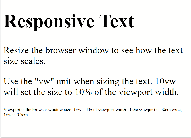
<h1 style="font-size:10vw;">Responsive Text</h1>

<p style="font-size:5vw;">Resize the browser window to see how the text size scales.</p>

<p style="font-size:5vw;">Use the "vw" unit when sizing the text. 10vw will set the size to 10% of the viewport width.</p>

<p>Viewport is the browser window size. 1vw = 1% of viewport width. If the viewport is 50cm wide, 1vw is 0.5cm.</p>

</body>
</html>
3. Sidebar
Sidebars are the important parts of a site. The main function of a sidebar is to help in navigation. It’s a strong navigating element.
- So, use <nav> element for permitting responsive navigation to your website.
- You need a .sidebar class to create a responsive sidebar.
- Use .sidebar-nav class to avail overall navigation on a web page. Furthermore, this class supports dropdowns.
Code for the basic sidebar
<!-- Basic Sidebar -->
<nav class="navbar navbar-expand-lg fixed-top navbar-dark bg-dark pmd-navbar pmd-z-depth">

<!-- Sidebar Toggle Button-->
<a href="javascript:void(0);" data-target="basicSidebar" data-placement="left" data-position="slidepush" is-open="true" is-open-width="1000" class="btn btn-sm pmd-btn-fab pmd-btn-flat pmd-ripple-effect pmd-sidebar-toggle"><i class="material-icons md-light">menu</i></a>
<a class="navbar-brand" href="#">Brand</a>

<!-- Navbar Right icon -->
<div class="pmd-navbar-right-icon ml-auto">
<a href="javascript:void(0);" class="btn btn-sm pmd-btn-fab pmd-btn-flat pmd-ripple-effect"><i class="material-icons pmd-sm md-light">search</i></a>
</div>

</nav>
<section id="pmd-main">
<!-- Left sidebar -->
<aside id="basicSidebar" class="pmd-sidebar bg-light pmd-z-depth" role="navigation">
<ul class="nav flex-column pmd-sidebar-nav">
<li class="nav-item pmd-user-info">
<a data-toggle="collapse" href="#collapseExample" class="nav-link btn-user media align-items-center">
<img class="mr-3" src=" " width="40" height="40" alt="avatar">
<div class="media-body">
User
</div>
<i class="material-icons md-light ml-2 pmd-sm">more_vert</i>
</a>
<ul class="collapse" id="collapseExample" data-parent="#basicSidebar">
<li class="nav-item">
<a class="nav-link" href="#">
<i class="material-icons pmd-list-icon pmd-sm">delete</i>
<span class="media-body">View Profile</span>
</a>
</li>
<li class="nav-item">
<a class="nav-link" href="#">
<i class="material-icons pmd-list-icon pmd-sm">delete</i>
<span class="media-body">Settings</span>
</a>
</li>
<li class="nav-item">
<a class="nav-link" href="#">
<i class="material-icons pmd-list-icon pmd-sm">delete</i>
<span class="media-body">Logout</span>
</a>
</li>
</ul>
</li>

<li class="nav-item">
<a class="nav-link" href="#inbox">
<i class="material-icons pmd-list-icon pmd-sm">inbox</i>
<span class="media-body">Inbox</span>
</a>
</li>

<li class="nav-item">
<a class="nav-link active" href="#">
<i class="material-icons pmd-list-icon pmd-sm">star</i>
<span class="media-body">Stared</span>
</a>
</li>

<li class="nav-item">
<a class="nav-link" href="#">
<i class="material-icons pmd-list-icon pmd-sm">send</i>
<span class="media-body">Sent Email</span>
</a>
</li>

<li class="nav-item">
<a class="nav-link" href="#">
<i class="material-icons pmd-list-icon pmd-sm">drafts</i>
<span class="media-body">Drafts</span>
</a>
</li>
</ul>
</aside>
<div class="pmd-sidebar-overlay"></div>
<!-- Start Content -->
<div class="pmd-content custom-pmd-content" id="content">
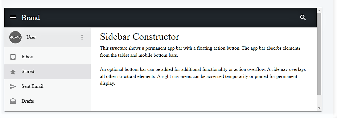
<h2 class="headline">Sidebar Constructor</h2>
<p>This structure shows a permanent app bar with a floating action button. The app bar absorbs elements from the tablet and mobile bottom bars.</p>
<p style="margin-bottom:0;">An optional bottom bar can be added for additional functionality or action overflow. A side nav overlays all other structural elements. A right nav menu can be accessed temporarily or pinned for permanent display.<br><br></p>
</div>
</section>
4. Footer
It’s an extra navigation process. It makes your website more attractive and gives the feeling of completeness. Footers hold company info, copyrights, and other links.
Here, is a basic script for the footer-
footer> <div class="container"> <div class="row"> <div class="col-md-4 footer-column"> <ul class="nav flex-column"> <li class="nav-item"> <span class="footer-title">Product</span> </li> <li class="nav-item"> <a class="nav-link" href="#">Product 1</a> </li> <li class="nav-item"> <a class="nav-link" href="#">Product 2</a> </li> <li class="nav-item"> <a class="nav-link" href="#">Plans & Prices</a> </li> <li class="nav-item"> <a class="nav-link" href="#">Frequently asked questions</a> </li> </ul> </div> <div class="col-md-4 footer-column"> <ul class="nav flex-column"> <li class="nav-item"> <span class="footer-title">Company</span> </li> <li class="nav-item"> <a class="nav-link" href="#">About us</a> </li> <li class="nav-item"> <a class="nav-link" href="#">Job postings</a> </li> <li class="nav-item"> <a class="nav-link" href="#">News and articles</a> </li> </ul> </div> <div class="col-md-4 footer-column"> <ul class="nav flex-column"> <li class="nav-item"> <span class="footer-title">Contact & Support</span> </li> <li class="nav-item"> <span class="nav-link"><i class="fas fa-phone"></i>+47 45 80 80 80</span> </li> <li class="nav-item"> <a class="nav-link" href="#"><i class="fas fa-comments"></i>Live chat</a> </li> <li class="nav-item"> <a class="nav-link" href="#"><i class="fas fa-envelope"></i>Contact us</a> </li> <li class="nav-item"> <a class="nav-link" href="#"><i class="fas fa-star"></i>Give feedback</a> </li> </ul> </div> </div> <div class="text-center"><i class="fas fa-ellipsis-h"></i></div> <div class="row text-center"> <div class="col-md-4 box"> <span class="copyright quick-links">Copyright © Your Website <script>document.write(new Date().getFullYear())</script> </span> </div> <div class="col-md-4 box"> <ul class="list-inline social-buttons"> <li class="list-inline-item"> <a href="#"> <i class="fab fa-twitter"></i> </a> </li> <li class="list-inline-item"> <a href="#"> <i class="fab fa-facebook-f"></i> </a> </li> <li class="list-inline-item"> <a href="#"> <i class="fab fa-linkedin-in"></i> </a> </li> </ul> </div> <div class="col-md-4 box"> <ul class="list-inline quick-links"> <li class="list-inline-item"> <a href="#">Privacy Policy</a> </li> <li class="list-inline-item"> <a href="#">Terms of Use</a> </li> </ul> </div> </div> </div> </footer>
Best Practices for using Bootstrap Responsive
Here are some best practices to consider when incorporating Bootstrap into your web development projects:
- Utilize the Grid System: Master Bootstrap’s 12-column grid to create fluid, adaptable layouts. Ensure balanced content across columns for visual consistency.
- Implement Mobile-First Design: Design for smaller screens first and progressively enhance for larger devices. This approach improves performance and aligns with user behavior.
- Leverage Responsive Utility Classes: Use responsive utility classes to manage element visibility based on screen size, ensuring users see relevant content without clutter.
- Optimize Images and Media: Employ the img-fluid class for responsive images and utilize srcset for different resolutions to enhance loading times and visual quality.
Read More: How to make images responsive
- Customize and Extend Bootstrap: Tailor Bootstrap components to fit your branding by modifying SASS variables and adding custom styles, while maintaining responsiveness.
- Test Across Multiple Devices: Conduct thorough testing on various devices and screen sizes using browser tools and real devices to ensure a seamless user experience.
Test the Responsiveness of a Website on Real Devices
Testing your website on real devices is crucial to ensure it delivers the best user experience across all platforms. Unlike simulated tests, real device testing accounts for device-specific factors like screen resolution, touch interactions, and device fragmentation. This ensures that your website performs as intended on a wide range of devices and screen sizes.
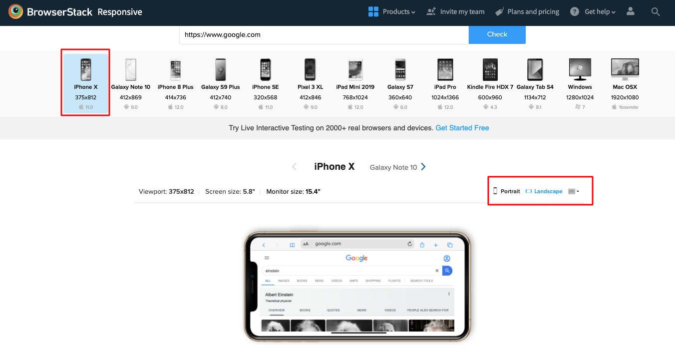
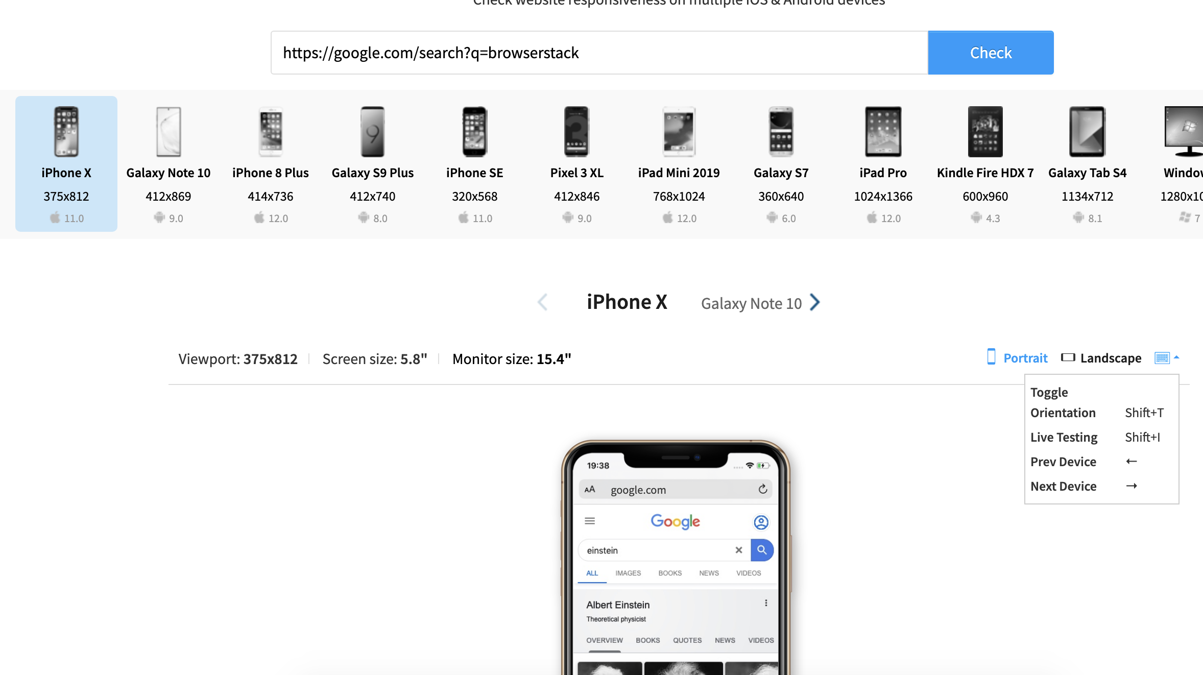
BrowserStack Responsive is a free tool that allows you to test the responsiveness of a website on real devices. With BrowserStack, you can test on over 3,500+ real Android and iOS devices across various browsers. You can also test your website in both landscape and portrait modes to ensure that it adapts seamlessly to different screen orientations and resolutions.
Steps to perform Responsive Test using BrowserStack Responsive
Follow these steps to check if your website is responsive using BrowserStack.
Step 1: Launch the BrowserStack Responsive Checker Tool and enter the URL of the website you want to test.
Step 2: Select the device from the list of available Android and iOS devices to test on.
Step 3: Click “Check” to start testing.
Conclusion
Creating a responsive website is essential for delivering a consistent user experience across all devices. Bootstrap provides a solid foundation through its grid system, utility classes, and responsive components, making designing layouts that adapt to different screen sizes easier.
However, testing the website on real browsers and devices is equally important to ensure it works across various layouts and orientations. BrowserStack gives you access to real Android and iOS devices to test your website’s responsiveness. You can also switch between portrait and landscape modes to verify consistent behavior across different orientations.


