Advanced CSS is the backbone of modern web design, enabling developers to go beyond basic styling and create dynamic, responsive, and visually appealing websites. It involves powerful techniques such as pseudo-classes, transitions, blend modes, and animations — all aimed at improving user experience and performance.
Overview
1. What is Advanced CSS in Web Development?
- Advanced CSS refers to complex styling techniques that extend beyond simple properties like colors, fonts, and margins.
- It includes features like pseudo-classes, pseudo-elements, transitions, animations, and responsive layouts.
- These capabilities help developers design engaging, scalable, and future-ready interfaces.
2. Why is Advanced CSS Important for Modern Websites?
- Enhanced Interactivity: Enables hover effects, focus states, and transitions for smoother user experiences.
- Improved Layouts: Tools like Flexbox and Grid reduce reliance on JavaScript for responsive designs.
- Better Performance: Cleaner, modular code with reduced duplication improves maintainability.
- Future-Proof Design: Ensures compatibility with evolving browser capabilities and design standards.
3. How to Use Advanced CSS Techniques Effectively?
- Pseudo-Classes: Style elements in different states (:hover, :active, :focus, :first-child, :nth-child).
- Pseudo-Elements: Target specific parts of an element (::before, ::after, ::first-letter) for refined design control.
- Transitions & Animations: Add motion and interactivity to elements for a more engaging UI.
- Blend Modes & Z-Index: Create layered effects and manage element stacking for complex visual designs.
4. Key Best Practices for Writing Advanced CSS
- Use modular and reusable classes to keep code maintainable.
- Always test browser compatibility for advanced features.
- Leverage CSS variables for consistent styling and easier updates.
- Combine advanced CSS with responsive design principles for seamless performance across devices.
This article explains what advanced CSS is, why it’s essential, how to implement its key techniques, and the best practices to follow for scalable, modern web design.
What is Advanced CSS?
As the name suggests, advanced CSS is a set of styling techniques that go beyond a website’s basic styling capabilities such as fonts, colors, margins, and more.
Whereas advanced CSS contains complex and advanced style design features such as pseudo-classes, animations, transitions, and more that enhance aesthetics and functionality, ultimately improving the user experience.
Incorporating advanced CSS into your projects enhances a website’s visuals, creates a scalable codebase, and improves its responsiveness.
Also Read: 10 Core Elements of Modern Web Design
Why is Advanced CSS Important?
As the internet evolves, expectations for aesthetics, performance, and responsiveness also increase. Therefore, advanced CSS is important to tackle such a situation and create a future-proof website.
Here are a few reasons why Advanced CSS is essential:
- Techniques such as Flexbox and CSS Grid reduce the dependency upon JavaScript and frameworks for creating responsive layouts.
- It leverages animations and transitions to create a smooth user experience that increases the satisfaction rate of users who visit your websites.
- Advanced CSS techniques allow for a cleaner codebase, avoid duplication, and are scalable.
- Advanced CSS techniques also allow you to future-proof your projects by ensuring modern web designs that are adaptable and compatible with evolving browser standards.
CSS Pseudo Classes
CSS Pseudo Classes are a set of keywords that are used along CSS selectors to style a dynamic state of an element.
For example, you want to design a button. However, you want to ensure a slightly different design when the mouse hovers over the button and when it is clicked. In situations where you want to style the dynamic conditions of an element, pseudo-classes are used.
A pseudo-class consists of a colon (:) followed by the pseudo-class name (e.g., hover) and is attached to anchor element (e.g., button in case button: hover).
Hover pseudo class
The hover pseudo-class applies styles when the mouse hovers over an element.
Syntax:
selector:hover {

    /* styles */

  }
Example:
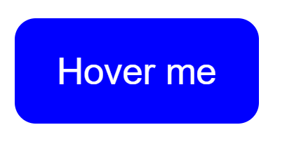
Consider an example where a button is created, and the pseudo-class is used to change its appearance when hovered.
Index.html:
<!DOCTYPE html>

<html>

<head>

<link rel="stylesheet" href="style.css">

</head>

<body>

<button class="button">Hover me</button>

</body>

</html>
Style.css:
.button{

    background-color: blue;

    border-radius: 8px;

    border-style: none;

    color: white;

    cursor: pointer;

    font-family: sans-serif;

    font-size: 14px;

    padding: 10px 16px;

    text-align: center;

  }
.button:hover{
background-color: red;
}Active pseudo class
The active pseudo-class is applied to an element when the user clicks (presses down) an element that has yet to be released.
Syntax:
selector:active {

    /* styles */

  }
Example:
To demonstrate, create a placeholder(input box), which changes its appearance when the user clicks on it.
Note that the effect restores to the original upon releasing the mouse button.
input {

    padding: 10px;

    font-size: 16px;

    border: 2px solid #ccc;

    border-radius: 5px;

    transition: background-color 0.3s ease;

  }

  /* Styling the placeholder */

  input::placeholder {

    color: gray;

  }
input:active::placeholder {
color: red;
}
input:active {
border-color: blue;
background-color: #f0f8ff;
outline: none;
}First child and last child
The first-child and last-child pseudo-classes are used to style the first and last-child elements within a parent container, respectively.
Syntax:
selector:first-child {

    /* styles */

  }

  selector:last-child {

    /* styles */

  }
Example:
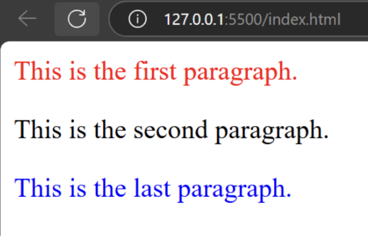
To demonstrate, consider a scenario with multiple paragraph elements within a container, where only the first and last paragraphs need to be styled, leaving the rest unchanged.
<div>

    <p>This is the first paragraph.</p>

    <p>This is the second paragraph.</p>

    <p>This is the last paragraph.</p>

  </div>


  <style>

    p:first-child {

      color: red;

    }

    p:last-child {

      color: blue;

    }

  </style>
Nth child()
The nth-child() pseudo-class lets you select elements for styling based on their position with the parent element.
Syntax:
selector:nth-child(n) {

    /* styles */

  }
Here, “n” takes values of the position of the children to select. It can take numeric values as well as a keyword such as odd and even.
Example:
To demonstrate, consider a scenario with multiple paragraph elements within a container, where only the third paragraph needs to be styled while the others remain unchanged.
<div>

    <p>This is the first paragraph.</p>

    <p>This is the middle paragraph.</p>

    <p>This is the last paragraph.</p>

  </div>


  <style>

    p:nth-child(3){

      color: red;

    }

  </style>
Focus
The focus pseudo-class lets you style elements when an element is focused through keyboard navigation or mouse clicks.
Unlike the active pseudo-class, the mouse can be released and not pressed all the time. It is a helpful technique while designing form elements such as <input>, <textarea>, and <select>.
Syntax:
selector:focus {

    /* styles */

  }
Example:
input {

    padding: 10px;

    font-size: 16px;

    border: 2px solid #ccc;

    border-radius: 5px;

  }

  /* Styling the placeholder */

  input::placeholder {

    color: gray;

  }
input:focus::placeholder {
color: rgb(60, 0, 255);
}
input:focus {
border-color: rgb(255, 42, 0);
background-color: #f4ae95;
outline: none;
}Target
The target pseudo-class allows you to style an element when the URL contains a hash (#) followed by the id of that element to be styled. This is often combined with anchor links to show or hide content dynamically.
Syntax:
selector:target {

    /* styles */

  }
Also Read: Top Responsive CSS Frameworks
CSS Pseudo-Elements
Pseudo-elements in CSS are also special keywords in CSS tusing which you can style specific parts of an element without changing the underlying HTML structure. Unlike Pseudo classes that style different states or conditions of an element, the CSS pseudo-elements style part of an element and can also insert, remove, and modify an element without changing the HTML structure.
CSS pseudo-element consists of a double colon (::) followed by the pseudo-element keyword(e.g., h1::before).
First letter pseudo element
The first-letter pseudo-element styles only the first letter of block-level text elements, such as paragraphs, headings, and other text-displaying content. It can’t be used for inline elements as it leverages elements’ ability to break lines for larger text formatting.
Syntax:
selector::first-letter {

    /* styles */

}
Example:
p::first-letter {

    font-size: 3em;  /* Make the first letter 3 times larger */

    color: red;      /* Change its color to red */

    font-weight: bold; /* Make it bold */

    float: left;     /* Float the letter to the left */

    margin-right: 5px; /* Add space between the letter and the rest of the text */

}
before Pseudo element
The before pseudo-element is used to insert content before the content of any element without altering its HTML structure.
Syntax:
selector::before {

    /* styles or content */

}
Example:
Index.html:
<!DOCTYPE html>

<html lang="en">

<head>

    <title>Pseudo-Elements </title>

    <link rel="stylesheet" href="styles.css">

</head>

<body>

    <h1>Pseudo Elements: BrowserStack</h1>

</body>

</html>
Style.css:
h1::before {

    content: "★\A ";

    color: gold;

    font-size: 1.5em;

    white-space: pre; }
Also Read: How to position text over image using CSS
CSS Z-Index
The Z-Index in CSS is a property used to control how the elements are stacked on a webpage. In simpler words, it ensures how elements are placed on top of one another.
To place any aspect on top of another, the element must have a z-index value higher than that element to be placed below.
It is used to manage overlapping elements, such as in designing a dropdown, a tooltip, floating elements, dialogue boxes, and more.
Also Read: Why CSS Position Sticky is Not Working
Syntax:
selector {

    z-index: value;

}
Here value can take inputs such as a positive number, a negative number, and an auto. Auto is the default value and follows the natural order of elements. Element with a higher value of Z-index will be at the top.
Example:
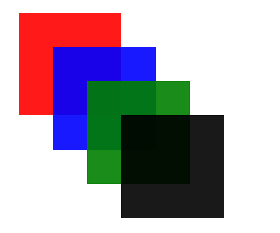
In this example, let’s create four boxes and manage their stacking with the help of z-index.
Index.html:
<!DOCTYPE html>

<html lang="en">

<head>

    <title>z-index Example</title>

<link rel="stylesheet" href="style.css">

</head>

<body>

    <div class="box box1"></div>

    <div class="box box2"></div>

    <div class="box box3"></div>

    <div class="box box4"></div>

</body>

</html>
Style.css:
.box {

    width: 150px;

    height: 150px;

    position: absolute;

    opacity: 0.9;

}

.box1 {

    background-color: red;

    top: 50px;

    left: 50px;

    z-index: 4; /* Highest stacking order */

}

.box2 {

    background-color: blue;

    top: 100px;

    left: 100px;

    z-index: 3; /* Higher stacking order */

}

.box3 {

    background-color: green;

    top: 150px;

    left: 150px;

    z-index: 2; /* High stacking order */

}

.box4 {

    background-color: black;

    top: 200px;

    left: 200px;

    z-index: 1; /* Lowest stacking order */

}
However, the natural order of elements is as:
What is CSS User Interface?
CSS User Interface contains several properties that allow control of the behavior and appearance of user interface elements on a webpage. CSS provides many user interface features, such as resizing elements, outlines, box-sizing, and more.
Resize and Outline-offset are the most common and important CSS UI features.
Learn More: How to Create Browser Specific CSS Code
Syntax for CSS UI resizing
It allows the element to be resized by the user and is most commonly found in text areas and div.
selector {

    resize: value;

}
Value: none, both, horizontal, or vertical.
Syntax for CSS UI outline
It is used to draw a line outside the element’s border for better focus.
selector {

    outline: value;

}
Value: outline-width, outline-style, or outline-color.
CSS Blend Modes
This feature of CSS is inspired by photo editing software, where images are often blended to create a good composition and make it visually appealing.
CSS offers two blend modes to directly blend colours within the webpage.
background-blend-mode
It controls how multiple background layers blend.
selector {

    mix-blend-mode: value;

}
Here value takes blending operations such as multiply, screen, overlay, darken, lighten, color-dodge, color-burn, difference, and more.
Mix-blend-mode
It controls how the content of an element blends with the content of its parent or sibling elements(or background).
selector {

    background-blend-mode: value;

}
Here value takes the blending mode used between background layers such as overlay, screen, multiply, and more.
CSS Transitions and Animations
CSS Transitions provide a change from one property to another over a specific duration rather than instantly, whereas CSS Animations set keyframes to animate transitions.
Both are very powerful CSS features that create appealing visuals for a website.
CSS Transitions Syntax
transition: property duration timing-function delay;
property: The CSS property you want to animate (e.g., background-color, width, height).
duration: duration of transition (e.g., 1s for one second).
timing-function: Specifies the speed curve of the transition (e.g., ease, linear, ease-in-out).
delay: Specifies the delay before the transition starts.
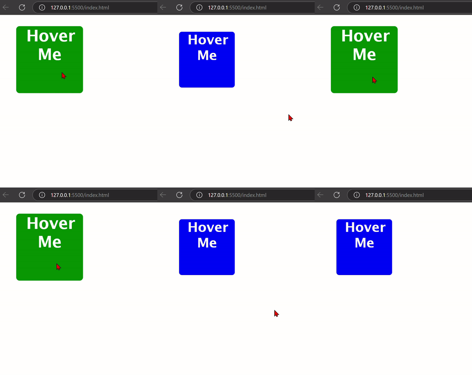
Example: In this example, a blue box turns into green and scales up (size increases) when it is hovered, however, the transition property makes this change occur over 0.5s with an ease timing function.
Index.html:
<!DOCTYPE html>

<html lang="en">

<head>

<title>CSS Transition</title>

<link rel="stylesheet" href="style.css">

</head>

<body>

  <div class="box"><h2>Hover Me</h2></div>

</body>

</html>
Style.css:
.box {

    width: 100px;

    height: 100px;

    background-color: blue;

    transition: background-color 0.3s ease, transform 0.3s ease;

  }

  .box:hover {

    background-color: green;

    transform: scale(1.2);

  }
CSS Animations Syntax
1. @keyframes
@keyframes animation-name {

    0% { /* Starting state */ }

    50% { /* Midpoint state */ }

    100% { /* Ending state */ }

}
2. Animation Properties
animation: animation-name duration timing-function delay iteration-count direction;
- animation-name: Name of the animation defined by @keyframes.
- duration: duration fo the animation(e.g., 2s).
- timing-function: speed of the animation (ease, linear, ease-in, etc.).
- delay: Time before the animation starts (e.g., 1s).
- iteration-count: Number of times the animation should run (infinite for continuous looping).
- direction: The direction of the animation (normal, reverse, alternate, etc.).
Example:
A simple example of a box moving horizontally and changing color.
Index.html:
<!DOCTYPE html>

<html lang="en">

<head>

    <link rel="stylesheet" href="style.css">

</head>

<body>

  <div class="box"></div>

</body>

</html>
Style.css:
.box {

    width: 100px;

    height: 100px;

    background-color: red;

    position: relative;

    animation: moveAndChange 3s ease-in-out infinite alternate;

  }

  @keyframes moveAndChange {

    0% {

      left: 0;

      background-color: red;

    }

    50% {

      left: 150px;

      background-color: green;

    }

    100% {

      left: 300px;

      background-color: blue;

    }

  }
The animation runs for 3s, with an ease-in-out timing with alternate back and forth and infinite running.
- At 0%, the box has a red background at the leftmost part.
- At 50%, the box moves 150px right and turns green.
- At 100%, the box moves 300px right and turns blue.
After that, it repeats back and forth motion infinitely.
Browser Compatibility of Advanced CSS
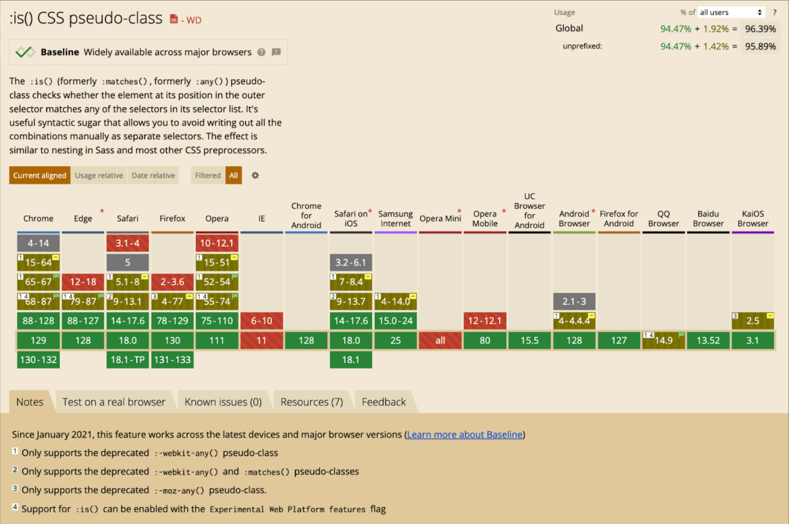
If you’re using these Advanced CSS techniques in your project, you must understand that although the newer versions of browsers show robust support for these methods and practices, the older versions of popular browsers mostly don’t, which leads to inconsistent behaviour across different platforms.
Browser Compatibility is a crucial factor in determining the success of your website. Therefore, you must perform ample testing on your project before rolling it out to the world to ensure maximum test coverage.
However, setting up a lab of physical devices can be both costly and bothersome.
A great solution is to set up a real device cloud. BrowserStack gives you access to 3500+ browsers and actual device combinations (mobile and desktop), providing wide coverage for Cross Browser & Platform Testing.
You can also save time by leveraging parallel testing on BrowserStack, running tests across multiple browser-device combinations simultaneously. This helps developers and testers create applications that deliver a seamless user experience, enhancing user retention and satisfaction.
Here’s an example of pseudo-class support on different browser versions from older to the latest on Can I Use.
Advanced CSS Best Practices
The primary concern behind knowing the best practices is to create an efficient code base that is scalable, maintainable, easy to update, and properly structured.
Here are some of the best Advanced CSS practices to maintain healthy and efficient coding:
1. Use CSS variables for reusable values such as fonts, colors, and more.
:root {

    --primary-color: #3498db;

    --secondary-color: #2ecc71;

    --font-size-base: 16px;

}

body {

    background-color: var(--primary-color);

    font-size: var(--font-size-base);

}

button {

    background-color: var(--secondary-color);

}
2. To create layouts, prefer Flexbox and CSS grid as they align with the website’s responsiveness.
3. As the number of mobile users is increasing rapidly, you must consider the mobile-first approach. According to this, you first design the website for mobile and then gradually expand to larger screens. This also creates good responsiveness on your website.
4. Use animations and transitions appropriately and wisely. Although they enhance user experience, using them extensively slows down your website.
5. Use CSS Shorthand to make your script more concise, and readable, and reduce the amount of code.
margin-top: 10px;

margin-right: 20px;

margin-bottom: 15px;

margin-left: 30px;

/* Use this */

margin: 10px 20px 15px 30px;
Advanced CSS is a set of techniques that is built upon the foundation of basic CSS. It contains advanced techniques such as pseudo-classes, animations, and transitions that enhance both aesthetics and functionality, ultimately improving the user experience.
Older browser versions don’t support many advanced CSS techniques. Therefore, to ensure maximum coverage, you must perform Cross-Browser Testing before launching your application for real-world users.


