Adaptive design provides fixed, predefined layouts built for specific screen sizes, while responsive design offers a single layout that fluidly alters itself to any screen size.
Overview
Differences between Adaptive Design and Responsive Design
- Layout behavior: Responsive uses a fluid layout, while adaptive uses fixed layouts per device.
- Flexibility: Responsive adapts dynamically; adaptive switches between preset layouts.
- Setup: Responsive is easier to maintain with a single codebase; adaptive requires multiple layouts.
- Performance: Adaptive can be faster per device; responsive ensures broader compatibility.
- User experience: Responsive delivers a consistent experience; adaptive offers device-specific optimization.
Adaptive vs Responsive Design: Which One to Choose?
- Choose responsive design for simpler maintenance, consistent UX, and broader device support.
- Choose adaptive design if you need high performance and custom layouts for specific devices.
This guide explores adaptive and responsive design in detail, along with examples, pros and cons, and best practices, to help you choose the right strategy for your website.
Adaptive vs Responsive Design: Core Differences
Adaptive and responsive designs aim to provide optimal user experiences across devices, but they take fundamentally different approaches.
Responsive design uses flexible layouts that adjust fluidly to any screen size, while adaptive design relies on predefined layouts for specific device breakpoints.
Here’s a side-by-side comparison of their core differences:
| Criteria | Responsive Design | Adaptive Design |
|---|---|---|
| Layout Behavior | Fluid layout that adjusts seamlessly across all screen sizes | Fixed layouts designed for specific screen widths |
| Flexibility | Highly flexible, adjusts based on screen size and orientation | Limited flexibility, switches between predefined layouts |
| Device Targeting | One layout for all devices using media queries | Multiple layouts created for specific device categories |
| Implementation Approach | Uses CSS media queries and flexible grids | Uses static layouts and server/client-side detection |
| Development Time | Requires more initial planning and testing across breakpoints | Requires more design work for multiple screen versions |
| Performance | May load unnecessary elements if not optimized | Can optimize content per device, potentially improving speed |
| Maintenance | Easier to maintain a single codebase | More complex maintenance due to multiple layout versions |
| User Experience | Seamless transitions and consistent UX across all screens | Optimized experience per device, but less consistent overall |
What is Responsive Design?
Responsive web design is a development approach that ensures a website’s layout, images, and elements automatically adjust to fit any screen size or device. It uses flexible grids, fluid layouts, and CSS media queries to adapt seamlessly to varying resolutions, providing a consistent user experience across desktops, tablets, and mobile devices.
This design method eliminates the need for separate versions of a site, making it cost-effective and efficient for modern, multi-device usage.
What is Adaptive Design?
Instead of working on a single layout structure, the adaptive design approaches tailor-made layouts for different devices. Each layout is pre-designed to fit a particular screen size, ensuring the best possible user experience for those devices.
Unlike responsive design, adaptive design doesn’t adjust dynamically but switches between predefined layouts based on the user’s device. This method offers greater control over design elements for targeted resolutions but requires more development effort.
How to determine if a website is responsive or adaptive?
Here’s how you can determine if a website is responsive or adaptive:
1. Resize your Browser Window:
- Open a window on your desktop and resize the browser window.
- If the elements keep adjusting themselves continuously at every width, the website will most probably be responsive.
- However, if the layout goes through sudden changes at certain breakpoints or snaps into different fixed layouts, the site can be adaptive.
2. Check the Website on Different Devices:
- You can load a website on various devices to see what the site looks like in different environments.
- If the site looks different on different types of devices (like mobile and desktop), but looks the same on similar devices (like two mobile devices), the design is likely to be adaptive.
- The site can be responsive if the layout and content modify themselves smoothly across all devices without any jumps.
3. Inspect with Developer Tools:
- Open your browser’s developer tool and go to the device toolbar. Change screen sizes and study the design.
- While you see seamless changes for a responsive design, you will see the design snap into preset layouts at specific breakpoints for adaptive designs.
4. CSS Frameworks or Media Queries:
- If you see the site using CSS media queries with flexible grid systems, when you access its CSS, the design is most likely responsive.
- Adaptive designs, on the other hand, uses media queries with fixed pixel values or styles for specific breakpoints.
Read More: How to make an App Responsive
Understanding Responsive Design
Here’s an in-depth look into responsive design:
Why choose Responsive Design
Here are the reasons to choose a responsive design:
- Enhance User Experience: Responsive design adjusts itself seamlessly to varying screen sizes, thus providing a smooth user experience.
- Future-proof: Your site can handle new devices and screen sizes with a responsive design due to the latter’s fluidity.
- Boost SEO: As a site with responsive design offers a seamless user experience, search engines like Google prefer it more and, therefore, tend to rank it higher.
- Cost-Effective: With a responsive design in place, you don’t need to have multiple versions of your site for multiple devices.
- Ease of Use: With the help of themes accessible through CMS platforms like WordPress, even less experienced designers and developers can implement responsive designs.
Examples of Responsive Design
Here are some popular examples of responsive design:
1. Dropbox
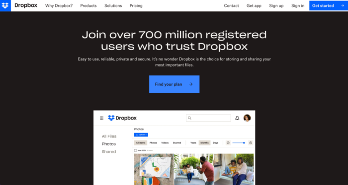
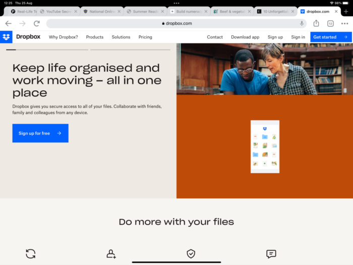
Dropbox has used the fluid grid strategically to enhance user experience across multiple devices. For starters, the hamburger menu for mobile expands to a full navigation bar in the tablet and desktop versions. While the image orientation changes with screen sizes, the sign-up form on the desktop version also changes to a CTA button on the mobile and tablet versions. The desktop version uses an arrow pointer to direct users to scroll down.
For the mobile version, however, it is assumed touchscreen users will automatically scroll down, making the arrow pointer redundant.
2. Shopify
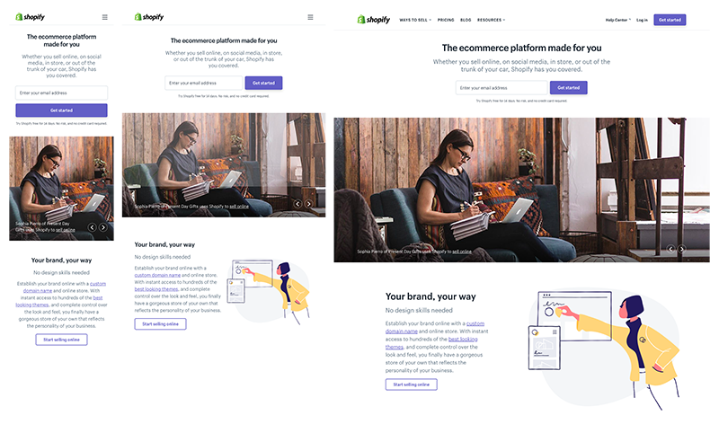
The globally renowned eCommerce site has maintained a consistent design flow across all interfaces. The hamburger menu for the mobile version is replaced with a full-fledged navigation bar for desktop versions.
For the mobile version, Shopify uses a lighter color palette in the user interface, giving a sense of expansiveness to the smallest real estate in screen sizes. They have also changed the position of their CTA button on different screens. While on mobile versions, you can find it beneath the form field, for tablets and desktop versions, it is placed on the right.
3. Slack
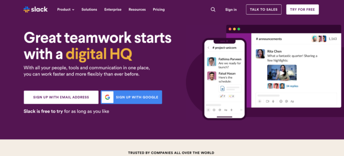
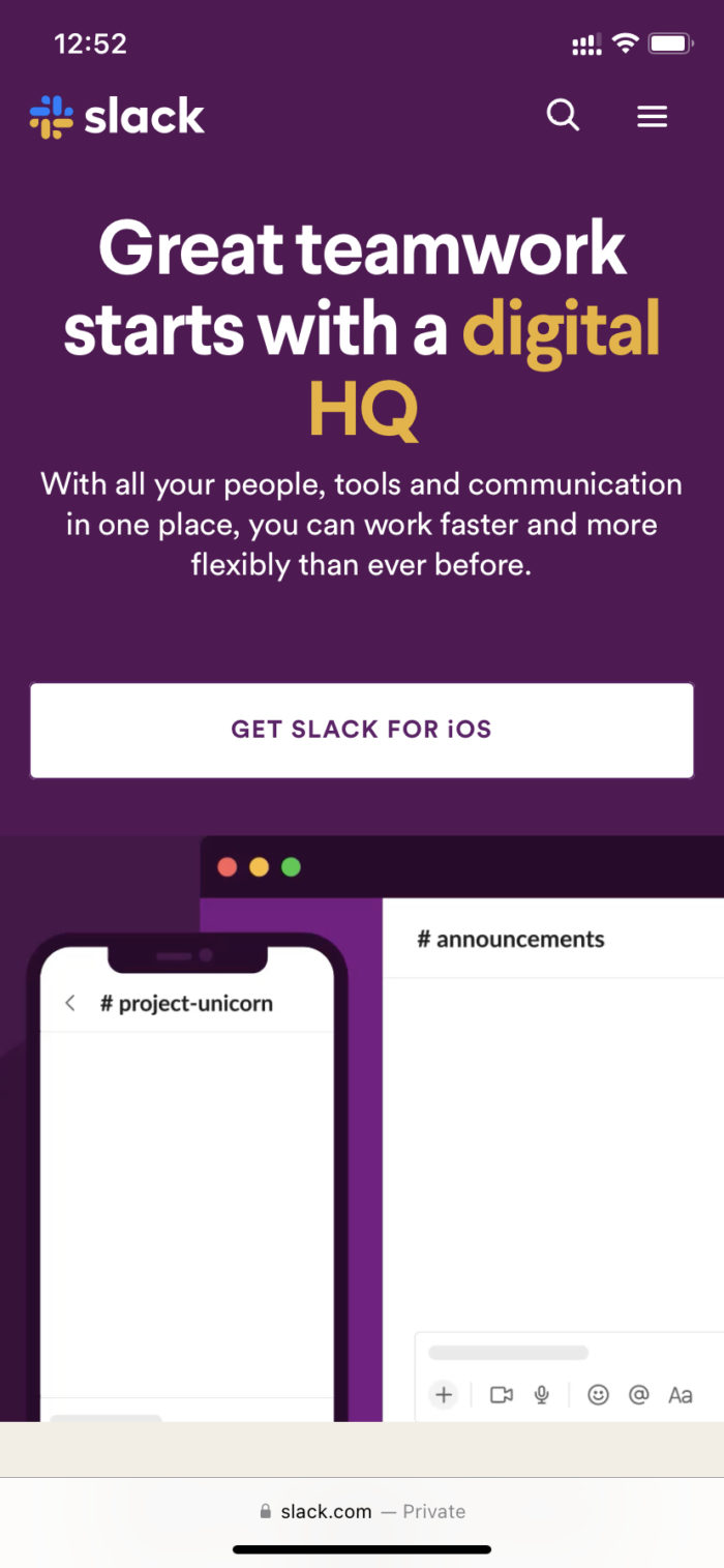
The fun and quirky messaging platform integrates its human-centric approach well into its core design interface. The three-column design layout for its desktop version changes to a single-column layout for mobile users. Slack has also personalized the CTA button for different screens.
For mobile and tablet versions, it expands along the entire column width with the text “Get Slack for iOS,” while for the desktop version, the CTA button is marginally smaller, placed on the top left margin, with the text “Try for free.”
Also Read: Responsive Web Design Trends
Advantages of Responsive Design
Here are the main advantages of a responsive design:
- This approach is more cost and time-efficient since designers focus on building a single layout.
- It is also easier to maintain and update since it uses a single URL for each page.
- SEO friendly.
- It gives a consistent UI experience across all devices.
- Since this approach is more popular, many pre-built templates are available with advanced functionality on popular CMS like WordPress or Joomla.
Disadvantages of Responsive Design
Here are some limitations of a responsive design that you should know about:
- The process requires more coding from the developers to ensure optimization across all devices.
- Responsive sites can have a longer load time since some heavier design elements may upload faster on desktops than on mobiles.
- It requires a lot of testing to maintain the visual hierarchy of design elements with changing screen sizes.
- A responsive design approach gives you less control over the design layout in different screen sizes.
Common Mistakes and Best Practices of Responsive Design
Explore the common mistakes along with the best practices of responsive designs
Common Mistakes
- Overlooking Mobile Performance: Make sure you don’t overload your website design with large images, scripts or animations. It will slow down the mobile loading time. You should optimize these assets before adding them.
- Missing out to Test on Multiple Devices: Don’t miss out to test your responsive design on a wide range of screen resolutions. Limiting it to one or two devices will not do. Use platforms like BrowserStack to test your website across 3500+ devices and browsers through a real device cloud.
- Neglecting Touch-friendly Design: Closely spaced touch targets can make navigation difficult on smaller devices. Your buttons and links ought to be touch-friendly.
Best Practices
- Use percentage-based flexible grids to enable elements to scale seamlessly across screen sizes.
- Optimize media and images. Leverage responsive images (srcset in HTML) and compression to speed up loading times on all devices.
- Go for a mobile-first approach for your content. Start with mobile-first design and then work on larger screens.
- Use CSS media queries efficiently. Define breakpoints that align with content requirements instead of specific device sizes. This will enable seamless adjustments irrespective of screen size.
- Test regularly. Test on real devices to understand how your responsive design works on different devices and optimize it accordingly.
Understanding Adaptive Design
Here’s an in-depth look into adaptive design:
Why Choose Adaptive Design
Here are the reasons to choose an adaptive design
- Control over layouts: Adaptive designs give the designers control over how the content should appear at each specified breakpoint. This helps them ensure elements are displayed as planned for specific screen sizes.
- Optimize Performance: Adaptive designs can better your site performance (especially for mobile devices with poor network) since assets are loaded only when they are required for a specific layout.
- Legacy Device Support: Adaptive designs can be set for specific designs, which could be older versions or less common ones that may not be able to support responsive layouts well.
- Specific User Experience: By providing layouts customized for specific screen resolutions, adaptive design ensures optimized user experience tailored for specific devices.
- Great for Fixed Content Layouts: If your project is designed to work for particular configurations, then adaptive design is the best choice to create specific layouts.
Read More: Building Responsive Layouts with CSS
Adaptive Website Examples
Here are some popular examples of adaptive design:
1. Amazon
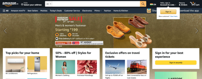
Amazon uses a different hierarchy for its desktop and mobile versions. Adopting this design approach has helped Amazon to increase its access speed on the mobile app by 40% compared to its previous reactive design. At the same time, it preserves the desired functionality by keeping the search bar and common navigation menu structure the same across devices.
2. IHG
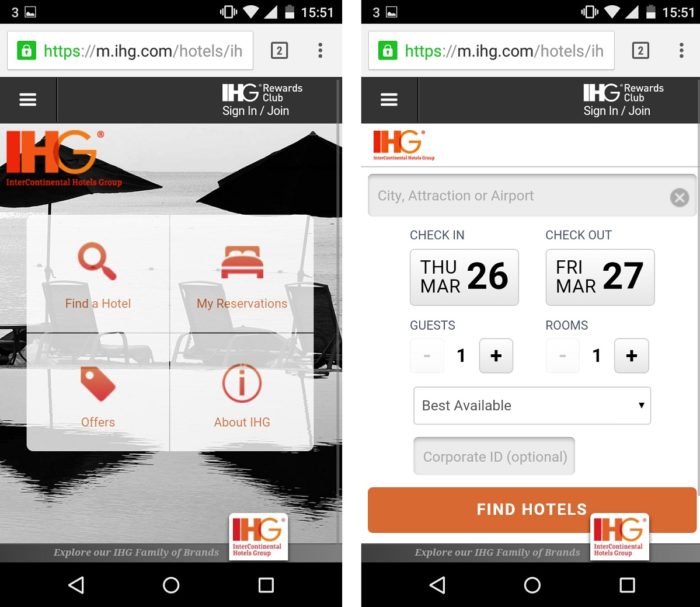
Having realized that most users access the mobile app for booking reservations, the IHG designed its mobile app to be functionally more action-oriented, with GPS-based location services, quick links to nearby hotels and current offers.
The desktop version, however, features a more traditional structure with an expanded search bar at the top.
3. IKEA
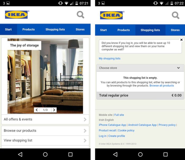
IKEA’s mobile version offers a more streamlined experience to users. For example, the navigation menu highlights product options, shopping lists, and physical stores nearby, unlike the desktop version, which highlights an expanded search bar.
Advantages of Adaptive Design
Here are the main advantages of adaptive design:
- When revamping your existing website, starting from ground zero is sometimes not an option. Complex websites often follow legacy code. Hence, an adaptive design approach will eliminate the need to recode your site.
- Websites built on this approach usually outperform speed tests by 2 to 3 times compared to responsive sites.
- It enhances the user experience across devices since each layout is custom-built for specific screens.
- Adopting this approach results in a quicker load time because layouts are optimized categorically.
- Designers have much more control over design elements
Disadvantages of Adaptive Design
Here are some limitations of an adaptive design that you should know about:
- The development process is time-consuming and more expensive since each layout has to be created separately.
- There are multiple URLs for each page. Hence, every layout will need to be updated and maintained separately.
- Rare screen sizes, like extra wide screens, are not usually considered while developing sites using this approach. If users access the site on a device that it was not optimized for, the design format will go for a toss.
Common Mistakes and Best Practices of Adaptive Design
Explore the common mistakes along with the best practices of adaptive designs
Common Mistakes
- Adding too many breakpoints: Including an excessive amount of breakpoints can make maintenance difficult and slow down the load times. Only use breakpoints when necessary.
- Over-customization: Bringing too many customizations for each device can lead to a fragmented user experience as the site content or feature shows too much variation across screen sizes. Remember, consistency is key.
- Ignoring Non-Standard Screen Sizes: Designers often tend to focus only on a few popular screen sizes but ignore uncommon ones. This can lead to poor usability.
- Overlooking Orientation: Designing for specific widths and overlooking device orientation can lead to layout issues while switching from portrait to landscape mode.
Best Practices
- Define important breakpoints strategically. Base it on the most common screen sizes used by your target audience and optimize the layouts accordingly.
- Load assets only when necessary and use compressed images for mobile layouts. This will help better loading speed and performance.
- To provide a good user experience, maintain consistency across devices by ensuring that your brand elements and core features are consistent across all layouts.
- Focus on orientation flexibility. Test and modify layouts to cater to both portrait and landscape orientations of devices to improve user experience.
- Test your adaptive layouts on real devices to ensure consistent performance, appearance, and usability across different screen resolutions.
Read More: How to check Website Loading Time
Adaptive vs Responsive Design: Which is the best?
Both adaptive and responsive designs have their own merits and demerits. The best design will depend on your business goals and how it aligns with your website’s needs.
So it is important to analyze your objectives with the functionalities and characteristics of responsive and adaptive design to decide which is best suited for your site.
You can consider individual design elements and review how different screen sizes will impact the hierarchy since your design approach will affect the website’s overall functionality,
Some of the main design components you should focus on are:
- Header content: The header content is the first thing that impresses a visitor. It contains basic information about the brand, product offerings, CTAs etc. While a desktop version may have plenty of wiggle room, you must prioritize your information logically for a smaller screen.
- Font size and readability: When choosing the design approach, consider that smaller screens demand a different font size than larger screens.
- Menu icon and navigation bar: While the hamburger icon is a typical choice for smaller screen devices, an extended navigation bar works well with desktop variants.
- Visual hierarchy: Maintaining a consistent visual hierarchy across all devices dramatically enhances the user experience. It is essential to structure elements coherently so that a user switching from desktop to mobile doesn’t get confused.
- Media files: While adaptive designs don’t usually face a problem loading media files, in responsive design, larger media files can considerably slow down your access time, increasing the bounce rate of visitors.
- Interactive elements: Interactive elements tend to differ from one platform to another. While a mobile user will expect to dial a customer assistance number directly from his phone, a desktop user will type it out on his mobile before placing the call. The placement of such elements will change with the platform.
While designing a website, the context becomes as important as the content. As designers, you need to evaluate both aspects carefully before implementing the design.
Testing Adaptive and Responsive Websites on BrowserStack
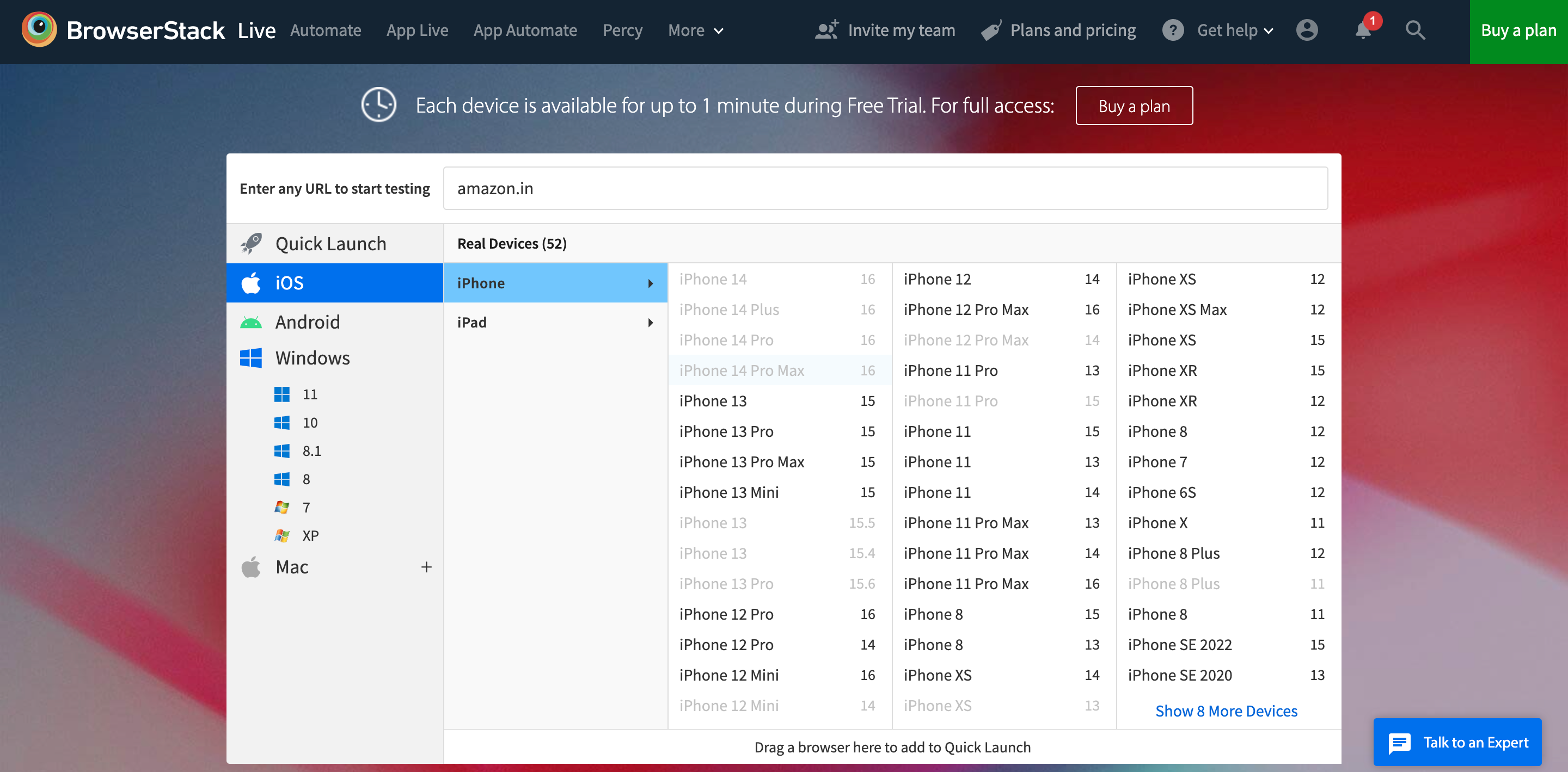
Irrespective of whether you choose Adaptive or Responsive, it is necessary to test your website on real devices. BrowserStack Live is a cloud-based platform that offers real-time analysis of your website’s design compatibility across 3500+ devices and browsers. To do so, you first need to sign up for a free account on BrowserStack.
- Login to your BrowserStack profile and go to the dashboard. Select the OS, device and browser version.
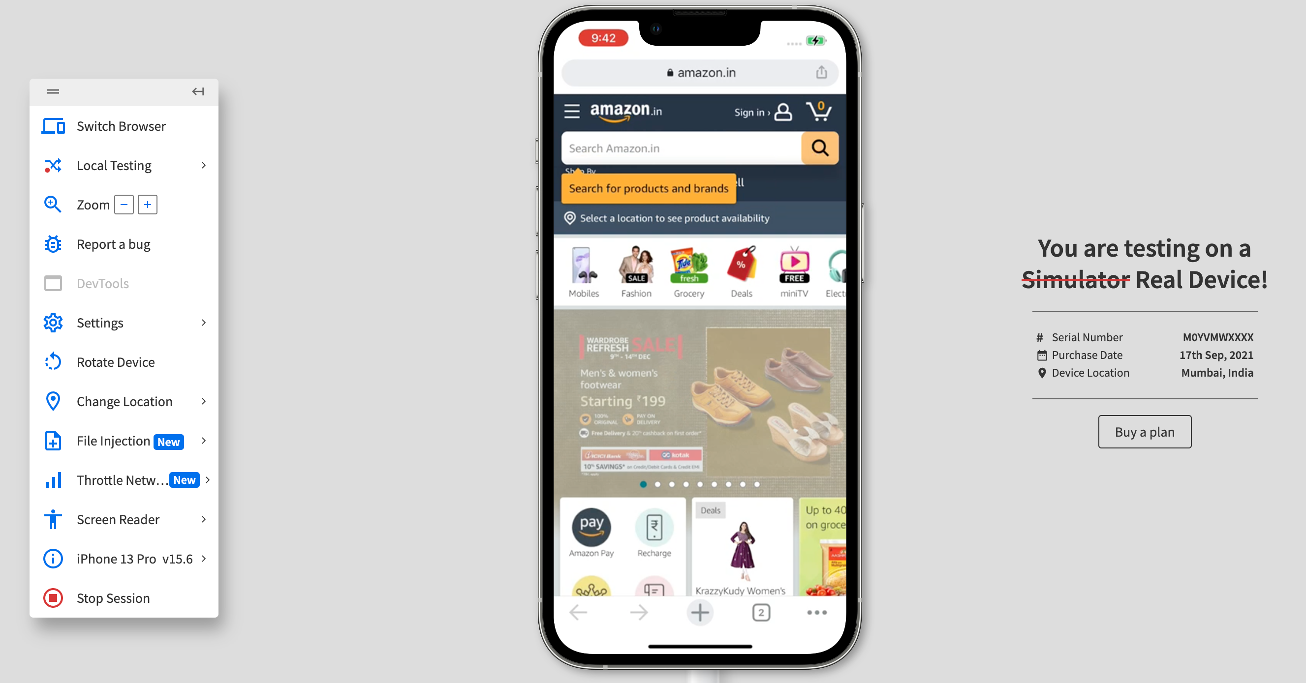
- Enter the URL of the website, and select the device and the browser. Wait for the live test results to upload.
- If you wish to change orientation, report a bug, or switch to a new device, you can do so from the menu option in the right side panel.
Conclusion
Responsive and adaptive design approaches have their own unique advantages and disadvantages. Choosing the right design depends on your website goals, audience, and content requirements.
But no matter what design you choose, make it a point to test it on real devices to verify that it functions and looks consistent across multiple screen resolutions.
Use tools like BrowserStack to access a vast real-device cloud that allows you to test your designs on 3500+ real-device-browser-OS combinations.
Useful Resources for Responsive Design
Understanding Responsive Design
- Responsive Web Design: What is it and How to Use it?
- Why is Responsive Design and Testing Important?
- A Beginner’s Guide to Mobile Responsive Design
- Responsive Web Design Trends
- What is Multi-Page Responsive Website
- Adaptive vs Responsive Design: Which one to choose?
- What are Responsive Apps?
- What is Bootstrap Responsive & How to use it?
- What is Responsive CSS vs Reactive CSS?
Implementing Responsive Design
- How to make an App Responsive
- How to make React Native App Responsive?
- How to make a Responsive App in Android Studio?
- How to create a Responsive Website
- How to make Flutter App Responsive
- How to make images responsive
- How to create Responsive Web Design for E-Commerce Platforms
- How to test Responsive Images
- How to make React App Responsive using react-responsive?
- How to use React-Responsive for Responsive Design?
- How to Create Responsive Designs with CSS
- How to Define and Use Responsive CSS Sizes for Dynamic Web Layouts
- How to make Angular Project Responsive?
- How to Create Responsive Div Containers Using CSS: Techniques and Examples
- Building Responsive Layouts with CSS
- Creating a Responsive About Us Page with HTML and CSS: Example Code
- Mastering Media Queries for Responsive Web Design: A Comprehensive Guide
- Breakpoints for Responsive Web Design
Testing & Troubleshooting Responsive Design
- What is the Ideal Screen Size for Responsive Design?
- Using Xcode iOS Simulator for Responsive Testing
- Top Responsive CSS Frameworks
- What is Multi-Page Responsive Website
- What is UI Responsiveness Testing?
- Top 15 Responsive Design Testing tools
- Top Responsive Web Design Challenges And Their Solution
- Cross Browser Testing vs Responsive Design Testing – When to choose Which
- How to enable Responsive Design Mode in Safari and Firefox?
- How to Perform Responsive Testing for a Locally Hosted Website
- How to check Responsive Websites in Chrome

