“Testing for Fragmentation” is a blog series. It takes a look at the market data on devices, platforms, browsers, etc. in use today, how this diversity comes into play during software development and testing—and what 2 million+ developers on BrowserStack do to account for it.
In this post, Hylke talks about building an ideal mobile test strategy across browsers.
Everyone who has been involved with testing apps or web applications on mobile browsers knows the trouble different platforms and browsers can cause. Things that work perfectly fine in one mobile browser, break down suddenly and spectacularly in another one (I’m looking at you, IE11).
There are multiple mobile devices, browsers and operating systems you need to take into account. But having so many possibilities brings up one rather important question: how do you know which browsers or devices to test on?
Let's dive in and see how to come up with a solid cross browser, mobile test strategy.
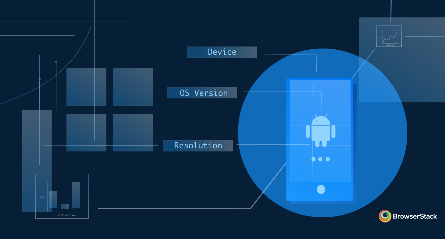
Differentiators
For the sake of simplicity I’ll be using an example of a native Android app, but the approach for iOS or a web application shouldn’t differ that much. What we want to know first is which mobile devices and Android versions are used most by customers. This information can usually be extracted from your analytics data.
Let’s start with devices first. We need to determine what actually differentiates them.
Screen size might sound like an obvious thing to look at, but actually isn’t a great differentiator. Your app will look the same on a 5”, 5.5” or 6” screen, as long as they all use the same resolution (e.g. 1920x1080). Elements will just be a bit bigger or smaller.
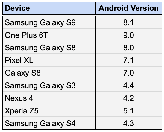
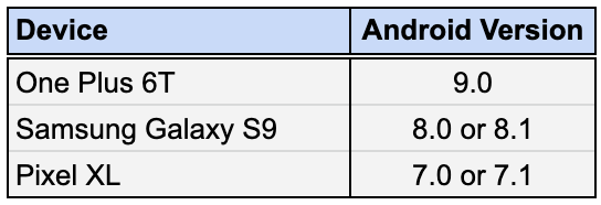
Therefore, it’s better to look at screen resolution of the mobile phones. In the table below, I’ve already indicated mobile devices that have a unique screen width.
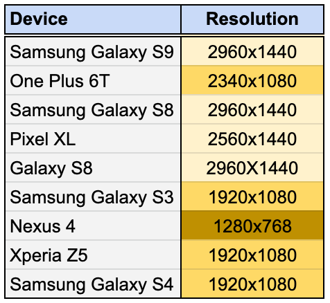
So why are we just looking at width and not screen height? Simple. Our app only works in portrait mode. Having a higher or lower device screen only shows you more information vertically, but is doesn’t impact the rendering of the whole app, while screen width does. Without too much trouble, we brought down our list of 9 mobile devices to just 3. Up next: Android versions.
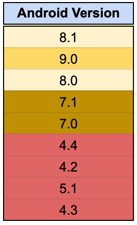
The Android versions at the bottom, marked in red, are too old to support and will be out of scope. That leaves us with 5 other Android versions.
I grouped these together as well. This time, I did it based on whichever is the major Android version. Now, this might be controversial for some people, but I have yet to come across the first case in which something worked in Android 8.0 and didn’t in Android 8.1.
I can imagine that this might not be the case for you. It’s perfectly fine to add a version which you know is causing trouble, even if it’s not that high in usage. Testing is all about containing risks and increasing confidence, so do what is necessary within your context to achieve that.
With this information, it’s just a matter of mix and match. By combining devices (or screen widths) with Android versions, we can be done in just 3 test runs.
Some might opt to test every mobile device against every Android version (for a total of 9 runs), but that’s overdoing it, in my opinion. Don’t get too hung up by device names, either. If, for whatever reason, one isn’t available, move onto a mobile device with the same screen resolution (not size!), since that’s our differentiator.
Adjust when necessary
Of course, it’s key that you keep an eye on your analytics data. Over time, a certain Android version might see more usage, or a new device might suddenly become popular. But again, use it wisely. Resist the temptation to add more and more OS versions and devices under the guise of “coverage”.
There is a diminishing return for every additional test run you do. Think about the added value of yet another test, and if it’s actually providing you with that much more confidence before releasing.
Remember, the example above was applicable only for Android. For iOS, you can easily repeat the procedure. Keep in mind that the app we tested worked only in Portrait mode, so we ruled screen height out of the equation. If your app works on both Portrait and Landscape modes, screen height might become an important differentiator.
For web testing, there are a couple more factors that come into play: different operating systems, different browsers, a wider array of resolutions, etc. Key here is to really take a hard look at the extent of their fragmentation, and combine it with your analytics data to see where the differentiators are. For instance, is the latest version of Chrome really that different on Windows and macOS, or is browser behavior the same regardless of operating system?
The not so obvious differentiators…
Even with a solid mobile testing strategy in place, you sometimes get hit from an angle you didn’t expect.
Recently, we noticed an increase in app crashes for customers who were trying to get into our checkout. There were a couple of things that were odd here.
First, why did the app randomly fail for some customers, even though we didn't release any new updates?
Second, our mobile apps are hybrid apps—90% of them are native build for iOS and Android, and for the rest 10% we use a WebView which redirects to our mobile website.
Our current checkout is an example of this. A quick walk over to our checkout team confirmed that they didn’t release any new updates either. So where were these issues coming from? After some digging around in the logs, the culprit became clear: it was the Android WebView.
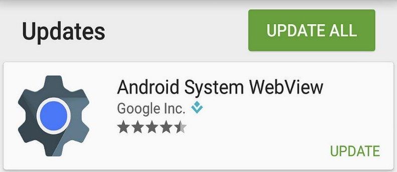
Android WebView used to be an android system component up until Android 5. This meant, if Google wanted to update or fix bugs in WebView, they needed to issue a complete Android update.
Because of that, the Android WebView component was separated from Android and listed in the Play Store, so it could be updated independent of Android OS version.
That was exactly what happened to us. The Android WebView received an update which broke our (web) checkout after customers started installing the update. Fortunately, one of our front-enders could build and release a fix within a couple of hours, and all was well again.
Automatic updates
But how do you mitigate this, and why didn’t our tests catch it? Well, tests for this release were done using emulators. Emulators are great for quickly checking multiple mobile devices locally.
But they also have some drawbacks. They don’t always behave the same way an actual mobile device does, and they don’t update automatically. The lack of automatic updates was the reason we hadn't found this issue earlier. When emulators are created, they come with that version of WebView which is the most recent one at that time. But, in order to update an emulator, you need to fire up the SDK tools of Android Studio, which is a hassle, which means we tend to not do it consistently.
Real devices don’t have this problem since they run the Google Play store and can update the WebView just fine that way. It’s one of the things that doesn’t normally come to mind when talking about the benefits of testing on real devices. You only start to really appreciate it when you run into trouble.
In the above example, I deliberately made a couple of choices to come up with a set of differentiators to make a distinction between devices and OS versions.
It’s important to keep in mind that context is very important while having a look at different testing strategies regarding cross device and cross browser testing. We were able to reduce devices drastically by ignoring screen height, as our app only runs in portrait mode. Ask yourself what differences really impact the functionalities of your website or app, and use that as input for which devices/os versions/browsers you need to test on.
Analyse your usage data and use it wisely. And don’t be afraid to change things up. You’re probably at one point going to miss something (see the WebView example above) and that’s fine. Learn from it, adapt to it and adjust your strategy accordingly.
One of the key things that defines good test automation is maintenance. This applies not only to the code you're writing, but also for all layers of your project, including test strategy. In all probability, everything you believe to be the correct step at this point in time, will need adjustment somewhere in the near future.
As such, there is no one correct answer to the question “how do you know which browsers or devices to test on?" It depends. But I hope I created some pointers for everyone to come up with an acceptable answer.