“Testing for Fragmentation” is a blog series. It takes a look at the market data on devices, platforms, browsers, etc. in use today, how this diversity comes into play during software development and testing—and what 2 million+ developers on BrowserStack do to account for it.
In this post, we’ll deconstruct fragmentation as it exists, and what that means for application quality.
More than 4 billion people access the web through combinations of:
- 9000+ distinct devices, shipped with
- 21 different operating systems (vendor + version), along with
- 8 major browser engines that power hundreds of browsers.
Combined, they make at least 63,000 possible browser-platform-device combinations. And those are the ones we know of, at this time.
That’s the scale of fragmentation.
What exactly is fragmentation, really?
The sum total of differences—between devices, platforms, browsers, variables like network providers and more.
Why is fragmentation a problem?
Because the differences between devices, platforms, browsers, and more cannot be abstracted by a single, universally interoperable framework.
So when it comes to software development:
“Fragmentation is the inability to "write once and run anywhere”.
—Damith C. Rajapakse
(Prof. of Software Engineering, National University of Singapore)
Since your website or app can’t have universal interoperability on every possible combination of device, operating system, and browser in the market, you have to settle for its watered-down counterpart, compatibility.
To achieve compatibility, you have to test every bit of code across browsers, platforms, and devices. Or you have to keep your developers busy with an endless barrage of cross-browser and cross-platform bugs that creep into the builds (or worse, production).
So we do compatibility testing?
Early and continuously, because the market evolves fast. The browsers, platforms, and devices your application works on today will lose their market share with each new:
- Platform update: macOS pushes platform updates once a year. Windows 10 editions hit the market sporadically.
- Browser update: Chrome releases major browser updates every six weeks or so.
- Device launch: Number of devices in the market grows by 20%, every year. Some of them will be used by your customers to access your site.
Which combinations do I test on?
For an existing website or app, you’ll start with analytics. But that’ll give you an implicitly biased answer. Your website/app only gets traffic from devices/platforms and browsers it supports in the first place.
To figure out the variety of combinations of devices/platforms and browsers you must support (to keep the lights on at work, or expand your reach), look at market data.
“Since it is the diversity that drives fragmentation, a closer look at diversity may provide us with clues as to how to deal with fragmentation.”
—Damith C. Rajapakse
In that spirit, here is a look at the depth of fragmentation—in devices, operating systems, browsers, and screen resolutions. These are the first four components you’ll account for during your development and testing.
Device fragmentation
In 2019, global web traffic is split cleanly between mobile, desktop, and tablet.
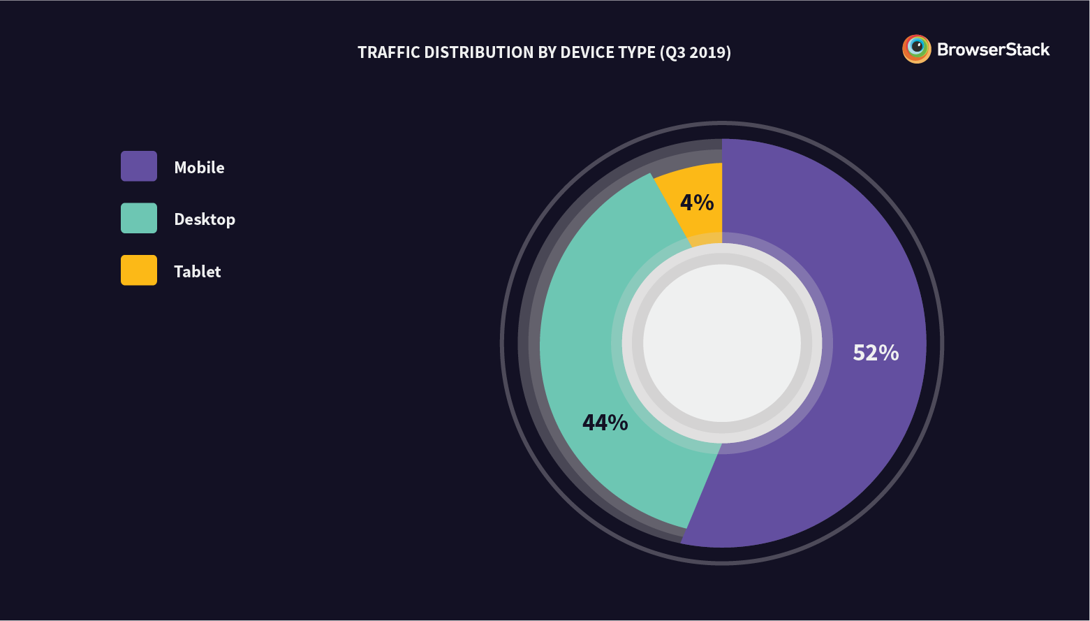
No surprises there. But even if your website’s (or app’s) traffic patterns don’t match this split, the graph is still relevant. That’s because it quantifies a behavioral shift: The Mobile Tipping Point.
“The Mobile Tipping Point is the point at which consumers spend longer online per day on their mobiles than all other devices combined.”
An average person on the internet spends about ~7 hours online—split equally between desktop and mobile. And so you have to test on both desktop and mobile.
Is that enough? Not really. You see, there’s a multiplier effect. Fragmentation becomes a bigger problem not just with every new mobile or desktop device—but also with the operating system they come equipped with. And fragmentation within operating systems is staggering.
Fragmentation in Operating system (OS)
We would split the fragmentation in operating system by device type. But in web development, desktop OS will be of concern when you’re looking at how many browsers a desktop platform supports. So let’s jump directly to the bigger problem, that of mobile OS fragmentation.
To understand this, we’ll have to start with mobile device manufacturers.
There are 6 mobile device vendors with a global market share of ~77%.
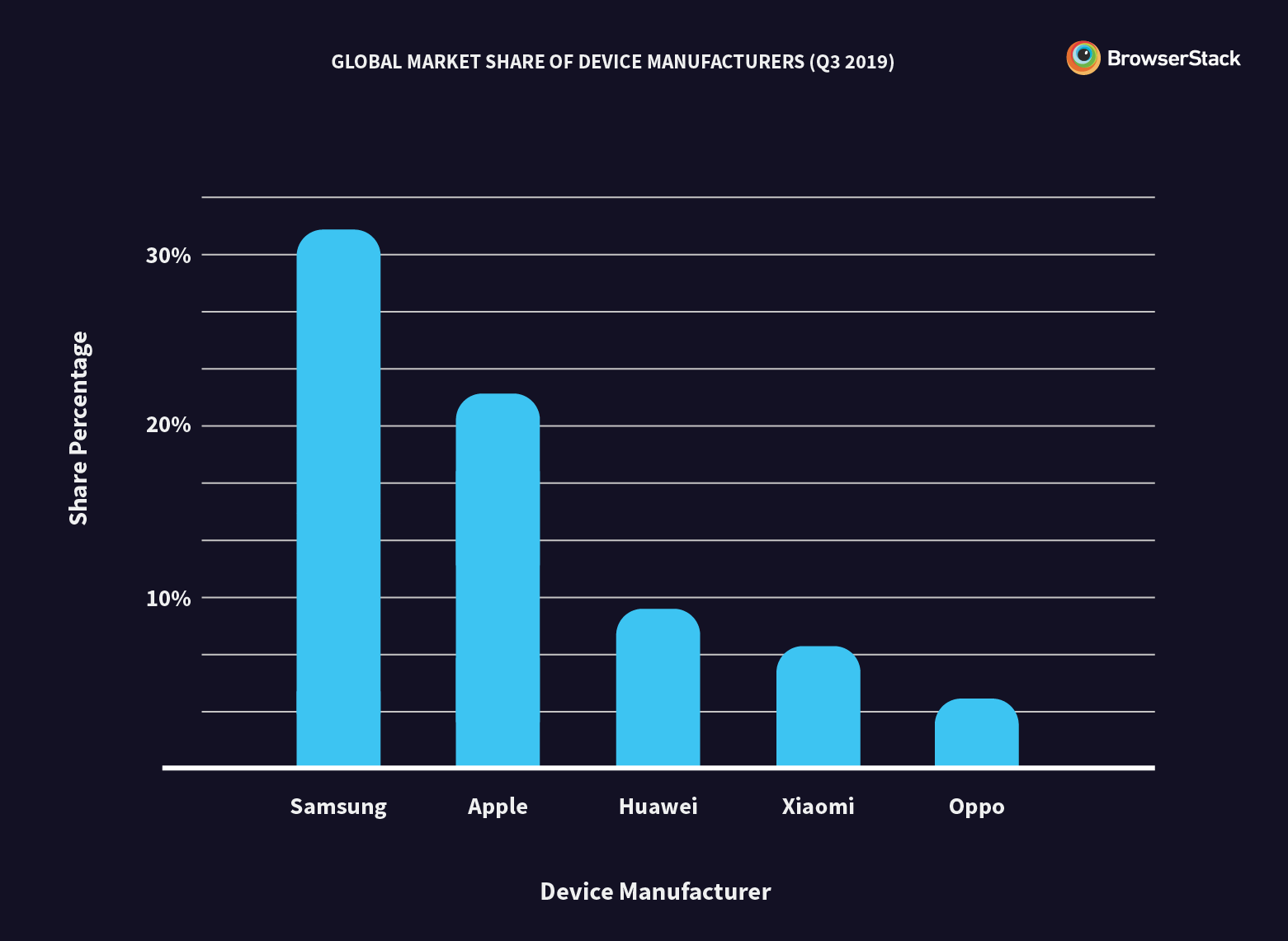
This graph will look very different for your traffic, or when filtered by countries. However, in most countries, you’ll notice a common thread: Android-powered smartphones are gaining the upper hand over Apple iPhones.
At the time of writing this, 40% of all web traffic comes from devices powered by Android.
That’s 1.7 billion online users across the world. That wouldn't be a huge deal, if the Android fragmentation weren't a triple-layered problem:
- There are 6 different stock Android (the core open-source platform) versions in the market:
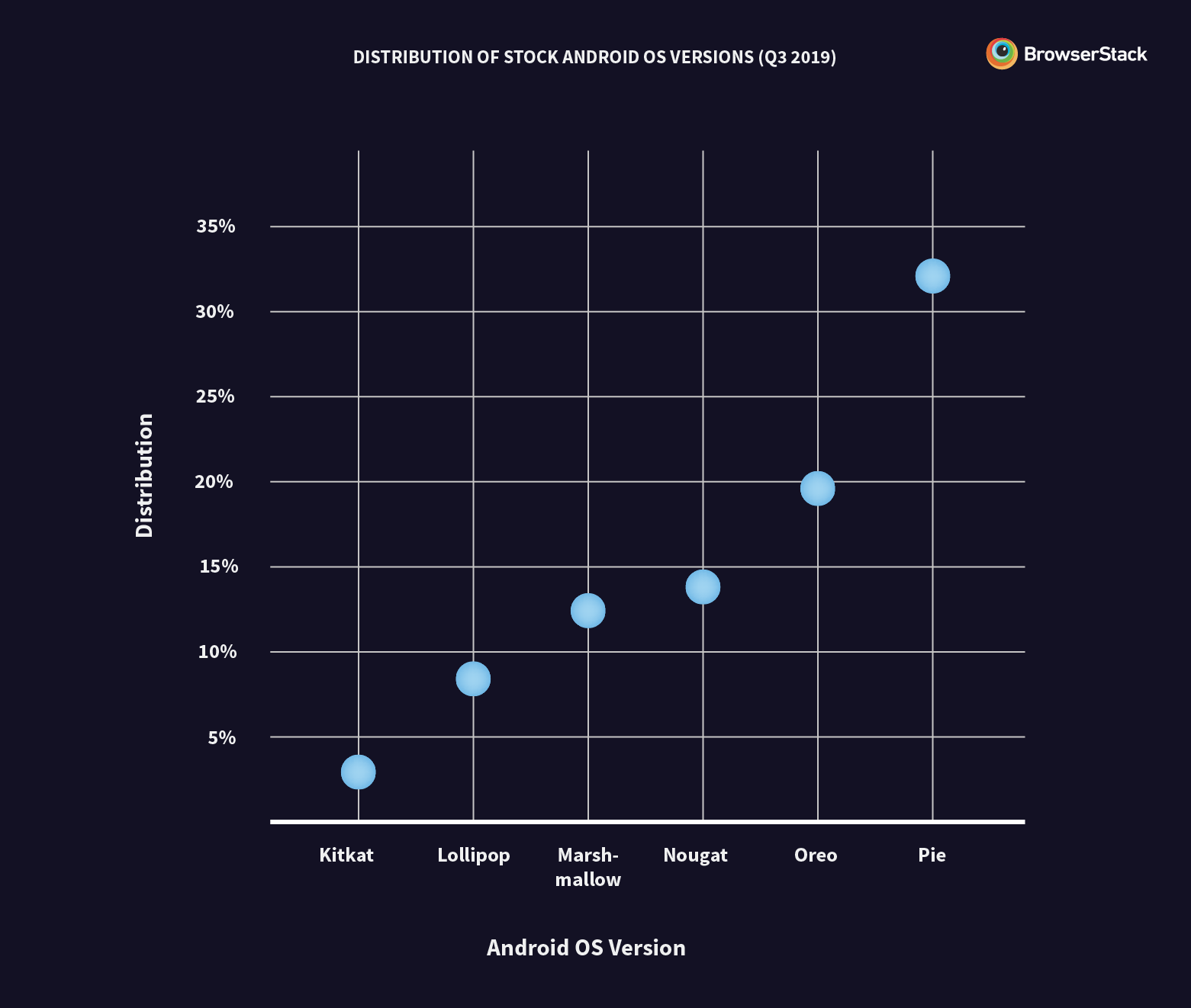
2. Stock Android—all 6 versions of it—only powers Google Pixel (and some LG) smartphones. Most device manufacturers create custom platforms out of stock Android for their devices, further adding to the problem of Android fragmentation.
At the moment, some of the more recognizable Android-based operating systems are:
- One UI by Samsung (for Galaxy series)
- OxygenOS by One Plus
- MIUI by Xiaomi (a popular smartphone manufacturer in APAC)
- Huawei EMUI
3. Manufacturers who power their devices with Android-based operating systems don’t update them consistently.
So at any given point in time, an Android app that wants to be globally accessible has to maintain compatibility with:
- 4-5 different versions of core Android, along with
- 8-10 custom-Android implementations.
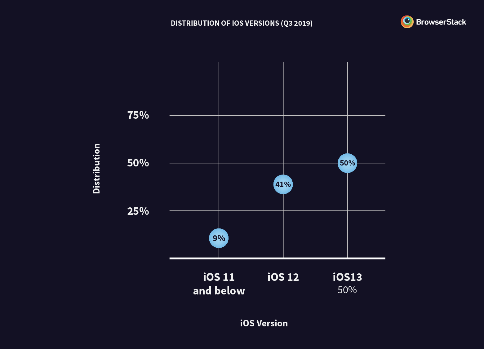
Compared to iOS, where your app has to be compatible with 2 major iOS versions in a given year, accounting for Android fragmentation is difficult.
The two factors—device and operating systems—are important when we speak of native applications. For the web, you have to throw browsers into the mix.
Browser
There are 6 dominant browser families in the world. Here’s what their market share looks like:
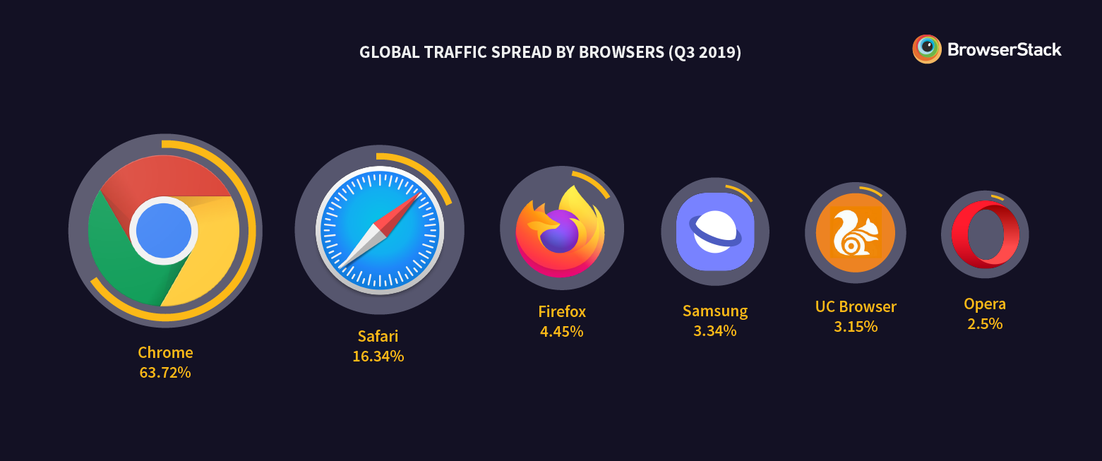
The W3C (World Wide Web Consortium) laid out a set of standards in an attempt to ‘homogenize’ how browsers render pages. So why does your web app not render the same across them all?
- They have different rendering engines. Safari and Opera are built on WebKit, but Chrome uses Blink, Firefox uses Gecko, and so on. These affect what your web pages look like on the client-side (to the users).
- Browser vendors don’t really implement W3C standards in the exact same way. Imagine a race: W3C laid out the track and set the rules, but browsers get to the finish line by finding their own shortcuts.
And so it falls on developers to test across browsers. But nailing the right ones is difficult. Consider the chart below:
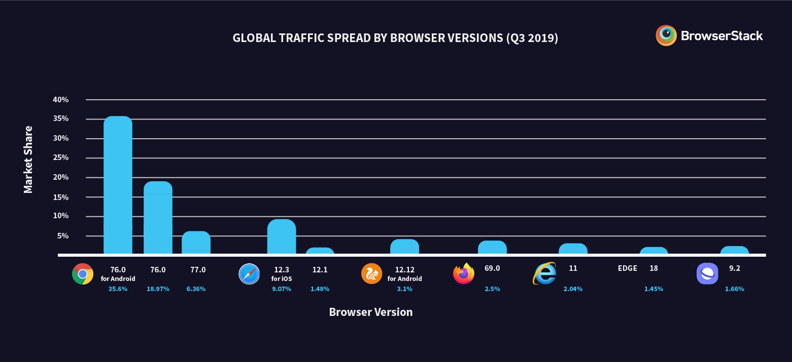
There are two key takeaways from this data:
- Each browser family has multiple versions in the market, and these versions have their own (significant) market shares. Just look at Chrome and Safari.
- A browser version will behave differently on desktop and mobile.
For instance:
- Chrome 76 on desktop vs Android. HTTP Live Streaming (HLS) works on all versions of Chrome for Android, but not on Chrome for desktop.
- Any version of Safari on macOS vs iOS. PNG favicons work perfectly on all versions of Safari on macOS, but not on any version of Safari for iOS.
Now that you have context on browsers, platforms, and device types, here’s the final piece of the ideal coverage puzzle, particularly for web developers across the world.
Screen resolution
Here are the most popular screen resolutions across the world:
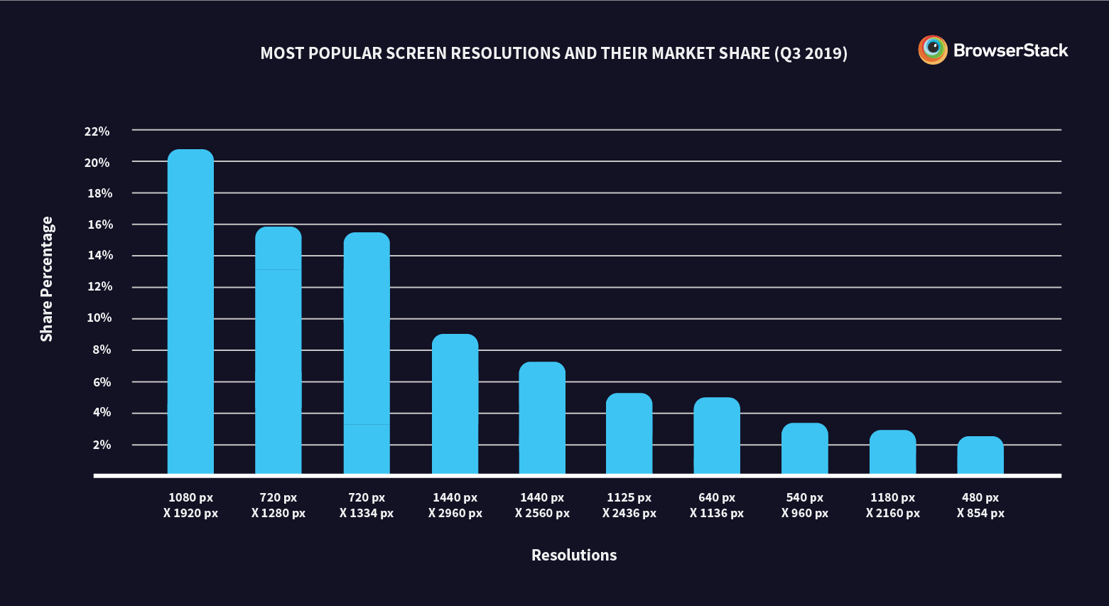
To cover 80% of the global online traffic, you will need to test on 10 different screen resolutions.
Takeaway
For 70-80% global coverage, your website/app needs to work across:
- 3 device types—mobile, desktop, and tablet
- 2 iOS versions
- 5 stock Android versions
- 8-10 custom implementations of stock Android versions
- 6 browser families
- Popular browser versions within each browser family
- 10 screen resolutions
If you multiply them, and leave room for healthy skepticism (not all browsers work on all operating systems), the number of possible combinations racks up to—pretty discouraging.
And testing on them all will give you 80% global coverage for a brief few weeks.
As you’re reading this, the market is evolving. Within the month, Chrome 77’s market share will increase. More Android smartphone manufacturers will have released platform updates and moved to a Pie-based implementation. iOS 13 jumped from 5% to 50% market share while we were writing this post.
The only way to keep up with this market is through early, continuous compatibility testing.
To learn more, refer to this infographic on fragmentation.
Recommended reading:
References:
- github.com/damithc, Damith C. Rajapakse, professor of Software Engineering at National University of Singapore.
- blog.globalwebindex.com, Device landscape.
- www.thenextweb.com, Android Phone brands ranked by update frequency.
- Statcounter.com, Deviceatlas.com; Global device, platform, browser, and screen resolution data.
- Statista.com, Number of users online in 2019.
- CanIuse.com, Browser version market share.
